- Published on
6 Tips To Make A Wallet App Layout With Tailwind CSS
- What is Tailwind CSS?
- The description of Wallet App Layout ui component
- Why use Tailwind CSS to create a Wallet App Layout ui component?
- The preview of Wallet App Layout ui component.
- The source code of Wallet App Layout ui component.
- How to create a Wallet App Layout with Tailwind CSS?
- 1. Use Flexbox to create a responsive layout
- 2. Use Grid to create a grid layout
- 3. Use Background Colors to create a visually appealing layout
- 4. Use Typography to make your content stand out
- 5. Use Icons to improve usability
- 6. Use Responsive Design to ensure your layout looks great on all devices
- Conclusion
As a FrontEnd technology blogger, I'm always on the lookout for new and innovative ways to create beautiful and functional user interfaces. One of the most popular CSS frameworks out there is Tailwind CSS. In this article, I will show you how to create a Wallet App Layout ui component using Tailwind CSS.
What is Tailwind CSS?
Tailwind CSS is a utility-first CSS framework that allows you to create custom designs without writing any CSS. It provides a set of pre-defined classes that you can use to style your HTML elements. With Tailwind CSS, you can create beautiful and responsive designs quickly and efficiently.
The description of Wallet App Layout ui component
A Wallet App Layout is a user interface component that displays a user's financial information, such as their account balance, recent transactions, and payment methods. This layout is commonly used in mobile banking applications and e-wallets.
Why use Tailwind CSS to create a Wallet App Layout ui component?
Tailwind CSS provides a set of pre-defined classes that you can use to style your HTML elements. This makes it easy to create a Wallet App Layout ui component without writing any CSS. Additionally, Tailwind CSS is highly customizable, which means you can easily customize the design to match your brand's style.
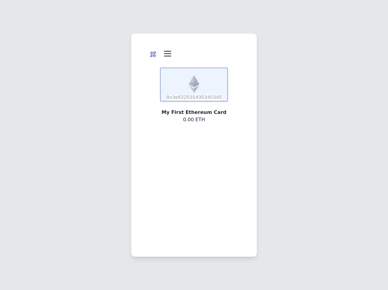
The preview of Wallet App Layout ui component.
To create a Wallet App Layout ui component, we will use Tailwind CSS classes to style our HTML elements. Here's a preview of what the Wallet App Layout ui component will look like:
Free download of the Wallet App Layout's source code
The source code of Wallet App Layout ui component.
Here's the source code for the Wallet App Layout ui component:
<div class="min-w-screen min-h-screen bg-gray-200 flex items-center justify-center px-5 py-5">
    <div class="bg-white text-gray-800 rounded-xl shadow-lg overflow-hidden relative flex" style="width:414px;height:736px">
        <div class="bg-white h-full w-full px-5 pt-6 pb-20 overflow-y-auto">
            <div class="relative pt-6 px-4 sm:px-6 lg:px-8">
<nav class="relative flex items-center justify-between sm:h-10 lg:justify-start" aria-label="Global">
<div class="flex items-center flex-grow flex-shrink-0 lg:flex-grow-0">
<div class="flex items-center justify-between w-full md:w-auto">
<a href="#">
<img class="h-10 w-auto sm:h-10" src="data:image/png;base64,iVBORw0KGgoAAAANSUhEUgAAAOEAAADhCAMAAAAJbSJIAAAAdVBMVEX///9casRYZ8NVZMLz9PpQYMFTYsFhbsZ5hM12gcxXZsNebMVNXcBib8aCjNDr7Pfg4vORmtX6+v2WntfO0uzl5/XAxebv8Pl8h87c3vFIWb+6v+TGyuiAis+Kk9PT1u2lrNxwfMuyuOGcpNlodcjDx+eqsN4Gl8uZAAAG1UlEQVR4nO2ca3uqOhCFuQhaGrxVrdW21tp9/v9PPKIFZnIT6S4M+1nvt7bAk9U1ZDIhSRAAAAAAAAAAAAAAAAAAAAAAAAAAAAAAAAAAAAAAAAAAAEAQzNbLdjcuZ+v1rOW9HbIfK5Wc7r5ttHn/Uhfy9/3oF9r115iq8Ew6vq+Rh61Ksyi8kqXq4fBLzfs50/TayugeifMHVar7JlLHl99r5E8oBZ7bGDaWeNpp+i73755+s6FtqQU2d3F5TE19l0j/kvc6Tllbo8cmLRyNM7vA8/sYzX69yfcx1cxo4uJobInQFpHeCbrAJhK9As8ufnXS8oaYAm9LHD16BZ7fRUHdjU3gWWLuk6g7GKdJkvLXcicmadgF+l+lUcgEpuFifzjsnx4Ter+UONV60UYucgejZF/+YRMTH9WqIwl+mMAo38YNXOQOxkdy1XJSPy966EiDFy4wngUPTKLVRe5gPOF/fatdVM+daPDCBV7SNJdo6VF5L5pN9L/XCtO9cXPXGA4WTPwStV50bDz0tepusvcONHjhArNyoOV10UgTZtrLq3v77k2tDhZ4XDQTfbLQn3uq4jTpt+p3OFjg7G5sQzVD4qZ6cL9djUeg7mKVNLRE75B4qF5Ete5GixVniF6xuugabCf8XZSh0JImOBYX7Q6aLu4lROkNBwsMF/WhmtPFRXVnfz3NJxshZ/Z6XJM4z6nAdPvCxrPExWV1XY/ZgrbN7mABD9REH6rNHS7WQRobiaQrZoo0LXfPqDAXKfFlTG2XOKofnm46kWNhTRRG2/r3o4/jcTEnF07sEsvB9pwH6lXisfZa9TZXs6T//LiqcVYqjaJMfZArrS7Wd8xpMFwlkjuytw41aTyllgZvdt//+U9ypcVFWi4ZLtLrVY/TGEs2urxK/FP5EdM+3nAxZnUtdzHOSYnfbwGsFbHHs4N1UxX7tjLhaT7V6sG5Y5YnDHd9DtmMiYgtERgmbH7lmfWYekWv96jkKR+dibGjjVCoE+z94dfpDhbYXTRr/85xTulGtGz3z8lcsbmYfQn4IOyqFHYr1zWxo+8wJd71DfL3sEukyYL7bHewQA9UIQLtgcoENnKwgA/DxQi0ucgEhs0cPLNtNlfeA3pRm7Zy0DXpIQItaZCCjou3pYmKBvPkPcKFZFWl0SRNfCPZwQJ7Sued0IAdLNDEXFxs7aCcXpRiunhHJ3PzQ44INInb53/LwQIeqNqk0/AdLHAvHfE6KL+TqXHNZw820ZvYXRx4muDYXBx0ojcxXbzDQcmdTM0o5xLvcFB+iF7htXrzNBEmc8+lgmg7VBuMh22HaoN5D++o6C1fMwbQl7at6AfjYtuKfjAutu9kBuJi64qeVSHNVvj3QvuK/nk7iJHNjyr6IQzemk7dB/aKnv9OYqC2drAUI93FtomeSBFeRrFmt6zoRbu4oisNWteDkl1c0MUTW8+FfhGCXaQVYepZ/3JLgr0TEsCK1byps5C9nRKkTg0v+CDTVas3CUKhgaqPou0Sm/kj0sWVsYjCFqhN3ZE4f7owN/IqQ6I26USXbr+88gVi4pLG0lbq6S7qk051zjzkKlEZ3dskzkUzSE0X3WsTP6978RU9ZkLrc3tfF7WwechddK8v/SxHQ2w3LPuH9L8VmGyGZC9k7aJ7jXAlMMyYDi6xc0mcOkij95M19bvWeT8QgWF0ZE+li4dUz+cO1D1p8hos2BaMa150rtXPvugZE6wgmeXkul2/CklPqs5dgilxwjbWJK6vxOkHeegsppc99qXtSh2k2bT4mUtMX7Z8D/Q8d0ikm5tmEb2IrYnvARakl1/wHSL6YjzHt371Wj+SO5hOe1JWUuspN2AtHEu2fXvXFNkXM8tECdSDtMAh0bP/UP2pnyjMQTNIC55sEj17SAU7SHtSukvwZI7FPfuAU8ECaZDWu+ZHf6ZGHPr2ctfxLS5EbUE62ryp9IZA5/4LcQ4GQT3qugTpWV5iyrt9psJ1saZAB3mQuuQ1ORfj4iJP9CIEkiDNFrbg/BbY4GyTs0SBDrIpqMw14Awzx7yn9q3jLRco0F7dc2J1dE1DaCv86V1CBNqmoDR5SbLwHILkPHxAisDAb2GcxD55BY5huBiBviAt5DU4oNO6uU+MQNcUVCEvveVeicVFOQKNyfxSXtZUXoEhUZDAtbLJS5oEJ0ULVEEC+akRLdwrYS5KEkgPHLvIU/e6V0KShiyBwX8Jde8HRxtXLgoTGASTpHz3fni24WhczMhFSprAIPiMlGr17hmcEqXynqcN7az/1qEOy7W0M4MBAAAAAAAAAAAAAAAAAAAAAAAAAAAAAAAAAAAAAAAAAP3wPz5GSZ8oYh1DAAAAAElFTkSuQmCC" alt="Add your logo!">
</a>
<div class="-mr-2 flex items-center md:hidden">
</div>
</div>
</div>

<div class="">
<div class="group inline-block">
<button class="outline-none focus:outline-none  px-3 py-1  flex items-center min-w-32">
<span>
<svg class="fill-current h-8 w-8" xmlns="http://www.w3.org/2000/svg" fill="none" viewBox="0 0 24 24" stroke="currentColor">
  <path stroke-linecap="round" stroke-linejoin="round" stroke-width="2" d="M4 6h16M4 12h16M4 18h16" />
</svg>

</span>
</button>
</div>
</div>
</nav>
</div><br><center>
<div id="empty-cover-art" class="shadow-md py-5 h-28 rounded w-56 bg-blue-100 text-center opacity-50 md:border-solid md:border-2 md:border-blue-800">
<center><img src="https://upload.wikimedia.org/wikipedia/commons/thumb/6/6f/Ethereum-icon-purple.svg/1200px-Ethereum-icon-purple.svg.png" class="h-16 "></center><div class="">
    <span class="font-mono bg-white rounded">0x3e622535435345345</span>
  </div>
</div>
<br><strong>My First Ethereum Card</strong><br>
0.00 ETH<br><br>

</div>
</center>


</div>
    </div>
</div>
How to create a Wallet App Layout with Tailwind CSS?
Now that we've covered the basics, let's dive into the six tips for creating a Wallet App Layout with Tailwind CSS.
1. Use Flexbox to create a responsive layout
Flexbox is a layout mode in CSS that allows you to create flexible and responsive layouts. With Tailwind CSS, you can use the flexbox classes to create a responsive Wallet App Layout. Here's an example:
<div class="flex flex-col md:flex-row">
  <!-- Your content here -->
</div>
In this example, we're using the flex and flex-col classes to create a column layout on mobile devices and the md:flex-row class to create a row layout on larger devices.
2. Use Grid to create a grid layout
Grid is another layout mode in CSS that allows you to create grid-based layouts. With Tailwind CSS, you can use the grid classes to create a grid-based Wallet App Layout. Here's an example:
<div class="grid grid-cols-1 md:grid-cols-2 gap-4">
  <!-- Your content here -->
</div>
In this example, we're using the grid class to create a grid layout with one column on mobile devices and two columns on larger devices. We're also using the gap-4 class to add a 4-pixel gap between the grid items.
3. Use Background Colors to create a visually appealing layout
Background colors can be used to create a visually appealing Wallet App Layout. With Tailwind CSS, you can use the background color classes to add color to your layout. Here's an example:
<div class="bg-gray-100">
  <!-- Your content here -->
</div>
In this example, we're using the bg-gray-100 class to add a light gray background color to the layout.
4. Use Typography to make your content stand out
Typography can be used to make your content stand out and improve readability. With Tailwind CSS, you can use the typography classes to style your text. Here's an example:
<h2 class="text-2xl font-bold text-gray-800">Account Balance</h2>
In this example, we're using the text-2xl class to set the font size to 2xl, the font-bold class to make the text bold, and the text-gray-800 class to set the text color to gray-800.
5. Use Icons to improve usability
Icons can be used to improve the usability of your Wallet App Layout. With Tailwind CSS, you can use the icon classes to add icons to your layout. Here's an example:
<i class="fas fa-wallet"></i>
In this example, we're using the fas fa-wallet class to add a wallet icon to the layout.
6. Use Responsive Design to ensure your layout looks great on all devices
Responsive design is essential to ensure your Wallet App Layout looks great on all devices. With Tailwind CSS, you can use the responsive classes to create a responsive layout. Here's an example:
<div class="w-full md:w-1/2 lg:w-1/3">
  <!-- Your content here -->
</div>
In this example, we're using the w-full class to set the width to 100% on mobile devices and the md:w-1/2 lg:w-1/3 classes to set the width to 50% on medium devices and 33.33% on large devices.
Conclusion
In this article, we've covered six tips for creating a Wallet App Layout with Tailwind CSS. By using these tips, you can create a beautiful and functional Wallet App Layout without writing any CSS. Tailwind CSS is a powerful tool that can help you create custom designs quickly and efficiently.