- Published on
Ultimate Guide: Make A Traditional alert With Tailwind CSS
- What is Tailwind CSS?
- The description of Traditional alert ui component
- Why use Tailwind CSS to create a Traditional alert ui component?
- The preview of Traditional alert ui component.
- The source code of Traditional alert ui component.
- How to create a Traditional alert with Tailwind CSS?
- Conclusion
As a FrontEnd technology blogger, it's important to stay up-to-date with the latest trends and tools in the industry. One such tool that has gained popularity in recent years is Tailwind CSS. In this article, we'll explore how to use Tailwind CSS to create a traditional alert ui component.
What is Tailwind CSS?
Tailwind CSS is a utility-first CSS framework that allows developers to quickly and easily create custom designs without writing any CSS. It provides a wide range of pre-built classes that can be used to style HTML elements. Tailwind CSS is highly customizable and can be used with any JavaScript framework or library.
The description of Traditional alert ui component
A traditional alert ui component is a pop-up message that appears on a web page to notify the user of important information. It typically contains a message, an icon, and a button to dismiss the alert.
Why use Tailwind CSS to create a Traditional alert ui component?
Tailwind CSS makes it easy to create custom designs without writing any CSS. It provides a wide range of pre-built classes that can be used to style HTML elements. This makes it a great choice for creating a traditional alert ui component, as it allows us to quickly and easily style the alert without having to write any CSS.
The preview of Traditional alert ui component.
To create a traditional alert ui component with Tailwind CSS, we'll use a combination of HTML and CSS. The alert will have a message, an icon, and a button to dismiss the alert. Here's a preview of what the alert will look like:
<div class="bg-yellow-100 border-l-4 border-yellow-500 text-yellow-700 p-4" role="alert">
  <p class="font-bold">Warning</p>
  <p>Something not ideal might be happening.</p>
</div>
Free download of the Traditional alert's source code
The source code of Traditional alert ui component.
To create the traditional alert ui component, we'll use a combination of HTML and CSS. The HTML will contain the message, icon, and button to dismiss the alert. The CSS will be used to style the alert. Here's the source code:
<div class="bg-yellow-100 border-l-4 border-yellow-500 text-yellow-700 p-4" role="alert">
  <p class="font-bold">Warning</p>
  <p>Something not ideal might be happening.</p>
</div>
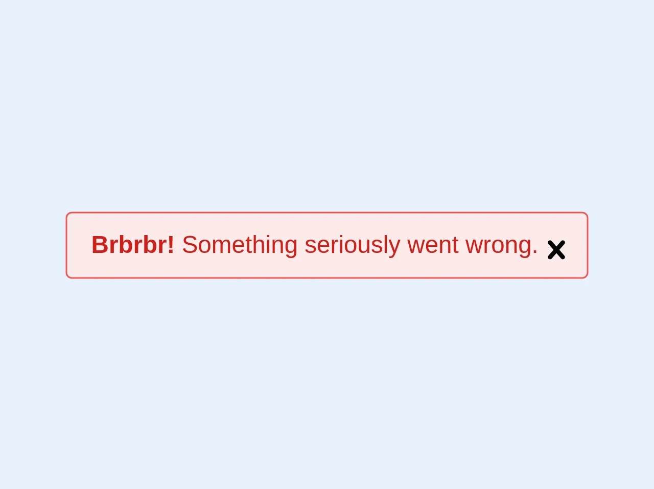
<div class="bg-red-lightest border border-red-light text-red-dark pl-4 pr-8 py-3 rounded relative" role="alert">
  <strong class="font-bold">Brbrbr!</strong>
  <span class="block sm:inline">Something seriously went wrong.</span>
  <span class="absolute pin-t pin-b pin-r pr-2 py-3">
    <svg class="h-6 w-6 text-red" role="button" xmlns="http://www.w3.org/2000/svg" viewBox="0 0 20 20"><title>Close</title><path d="M14.348 14.849a1.2 1.2 0 0 1-1.697 0L10 11.819l-2.651 3.029a1.2 1.2 0 1 1-1.697-1.697l2.758-3.15-2.759-3.152a1.2 1.2 0 1 1 1.697-1.697L10 8.183l2.651-3.031a1.2 1.2 0 1 1 1.697 1.697l-2.758 3.152 2.758 3.15a1.2 1.2 0 0 1 0 1.698z"/></svg>
  </span>
</div>
How to create a Traditional alert with Tailwind CSS?
Now that we have a preview and source code for the traditional alert ui component, let's go through the steps to create it with Tailwind CSS.
- We'll start by creating a new HTML file and adding the following code:
<div class="bg-yellow-100 border-l-4 border-yellow-500 text-yellow-700 p-4" role="alert">
  <p class="font-bold">Warning</p>
  <p>Something not ideal might be happening.</p>
</div>
- Next, we'll add the Tailwind CSS CDN to the head of our HTML file:
<head>
  <link href="https://cdn.jsdelivr.net/npm/tailwindcss@latest/dist/tailwind.min.css" rel="stylesheet">
</head>
- Finally, we'll customize the alert by adding or modifying Tailwind CSS classes. Here are some examples:
<div class="bg-red-100 border-l-4 border-red-500 text-red-700 p-4" role="alert">
  <p class="font-bold">Error</p>
  <p>Something went wrong.</p>
  <button class="mt-2 bg-red-500 hover:bg-red-700 text-white font-bold py-2 px-4 rounded">Dismiss</button>
</div>

<div class="bg-green-100 border-l-4 border-green-500 text-green-700 p-4" role="alert">
  <p class="font-bold">Success</p>
  <p>Everything is working as expected.</p>
  <button class="mt-2 bg-green-500 hover:bg-green-700 text-white font-bold py-2 px-4 rounded">Dismiss</button>
</div>
Conclusion
In this article, we explored how to use Tailwind CSS to create a traditional alert ui component. Tailwind CSS makes it easy to create custom designs without writing any CSS, which is why it's a great choice for creating alerts. By following the steps outlined in this article, you can create your own customized alerts in no time. Happy coding!