- Published on
Advanced Guide: Make A top section With Tailwind CSS
- What is Tailwind CSS?
- The Description of Top Section UI Component
- Why Use Tailwind CSS to Create a Top Section UI Component?
- The Preview of Top Section UI Component
- The Source Code of Top Section UI Component
- How to Create a Top Section with Tailwind CSS?
- Step 1: Set up your HTML
- Step 2: Add Tailwind CSS to your project
- Step 3: Customize your design
- Conclusion
As a FrontEnd technology blogger, you must have heard of Tailwind CSS. It is a utility-first CSS framework that provides a set of pre-defined classes to help you build responsive and customizable user interfaces quickly. In this article, we will guide you through creating a top section UI component with Tailwind CSS.
What is Tailwind CSS?
Tailwind CSS is a utility-first CSS framework that provides a set of pre-defined classes to help you build responsive and customizable user interfaces quickly. It is different from other CSS frameworks because it does not provide pre-designed components. Instead, it provides a set of low-level utility classes that you can use to create your own custom components.
The Description of Top Section UI Component
A top section UI component is a common element in many websites. It usually contains a logo, a navigation menu, and some call-to-action buttons. It is the first thing that users see when they visit a website, so it is essential to make it look good and provide a good user experience.
Why Use Tailwind CSS to Create a Top Section UI Component?
Tailwind CSS provides a set of pre-defined classes that can help you create a top section UI component quickly. It also provides a responsive design system that allows you to create a component that looks good on any screen size. Additionally, Tailwind CSS is highly customizable, which means you can easily change the colors, fonts, and other design elements to match your website's branding.
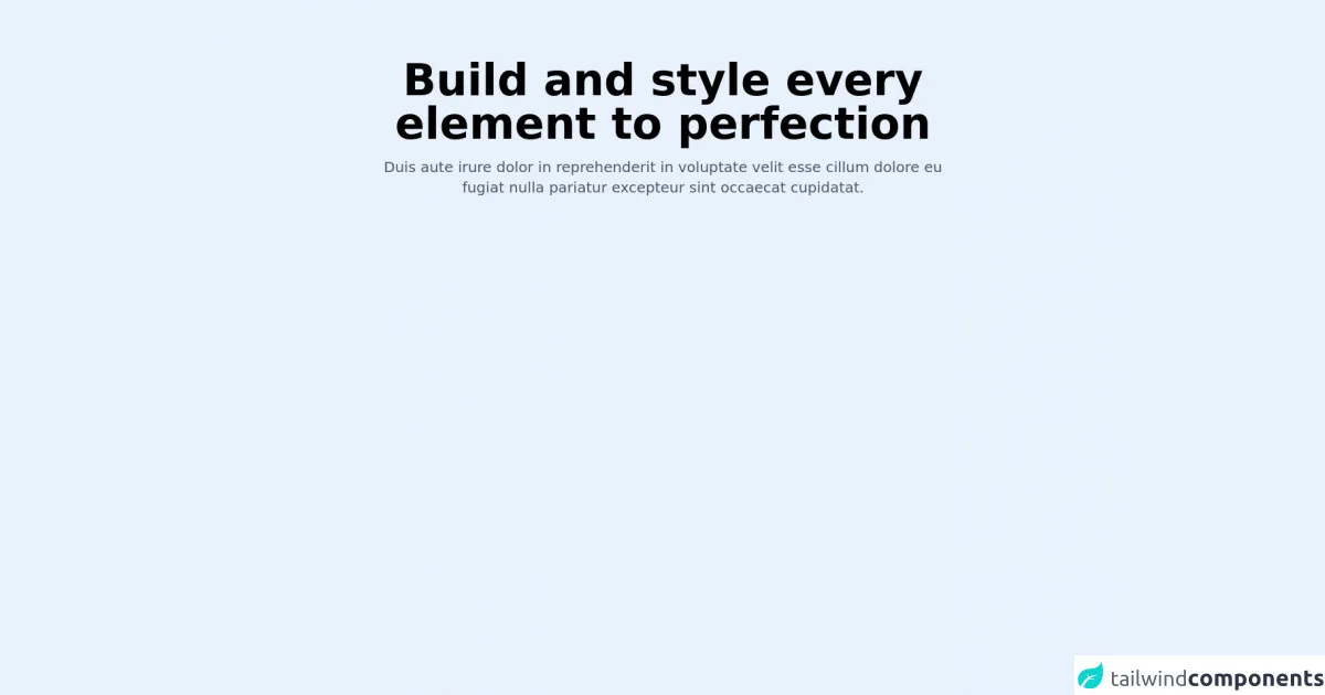
The Preview of Top Section UI Component
Here is a preview of the top section UI component that we will create in this tutorial.
Free download of the top section's source code
The Source Code of Top Section UI Component
Here is the source code of the top section UI component that we will create in this tutorial.
<div class="max-w-6xl mx-auto md:px-6 px-4">
    <div class="md:py-20 py-12">
        <div class="md:pb-20 pb-12 max-w-3xl mx-auto text-center ">
            <h2 class="md:text-6xl text-4xl text-black dark:text-white font-bold mb-4">Build and style every element to perfection</h2>
            <p class="text-xl text-gray-600 dark:text-gray-400">Duis aute irure dolor in reprehenderit in voluptate velit esse cillum dolore eu fugiat nulla pariatur excepteur sint occaecat cupidatat.</p>
        </div>
    </div>
</div>
How to Create a Top Section with Tailwind CSS?
Now that we have covered the basics let's dive into creating a top section UI component with Tailwind CSS.
Step 1: Set up your HTML
The first step is to set up your HTML. We will use a simple HTML structure that contains a header element with a logo, navigation menu, and call-to-action buttons.
<header class="bg-white shadow">
  <div class="container mx-auto px-6 py-3">
    <div class="flex items-center justify-between">
      <div class="flex items-center">
        <a class="text-gray-800 text-xl font-bold hover:text-gray-700" href="#">Logo</a>
      </div>
      <div class="flex items-center">
        <nav class="font-medium">
          <a class="text-gray-600 hover:text-gray-800 px-3 py-2" href="#">Home</a>
          <a class="text-gray-600 hover:text-gray-800 px-3 py-2" href="#">About</a>
          <a class="text-gray-600 hover:text-gray-800 px-3 py-2" href="#">Contact</a>
        </nav>
        <a class="bg-blue-500 hover:bg-blue-700 text-white font-bold py-2 px-4 rounded ml-4" href="#">Sign In</a>
      </div>
    </div>
  </div>
</header>
In this code, we have used the bg-white and shadow classes to give the header a white background color and a shadow effect. We have also used the container, mx-auto, px-6, and py-3 classes to center the header and add some padding.
The flex and items-center classes are used to align the logo and navigation menu to the center of the header. The font-bold class is used to make the logo text bold, and the hover:text-gray-700 class is used to change the text color when the user hovers over it.
The font-medium class is used to set the font weight of the navigation links to medium. The text-gray-600 class is used to set the text color to gray, and the hover:text-gray-800 class is used to change the text color when the user hovers over it.
The bg-blue-500 class is used to set the background color of the sign-in button to blue, and the hover:bg-blue-700 class is used to change the background color when the user hovers over it. The text-white class is used to set the text color to white, and the font-bold class is used to make the text bold. The py-2 and px-4 classes are used to add some padding to the button, and the rounded class is used to round the corners of the button.
Step 2: Add Tailwind CSS to your project
The next step is to add Tailwind CSS to your project. You can do this by either downloading the CSS file from the Tailwind CSS website or by installing it via npm.
<link href="https://cdn.jsdelivr.net/npm/tailwindcss@latest/dist/tailwind.min.css" rel="stylesheet">
Step 3: Customize your design
The final step is to customize your design. Tailwind CSS provides a set of pre-defined classes that you can use to change the colors, fonts, and other design elements of your component.
For example, if you want to change the background color of the header to gray, you can add the bg-gray-100 class to the header element.
<header class="bg-gray-100 shadow">
If you want to change the font size of the logo text, you can add the text-2xl class to the logo link.
<a class="text-gray-800 text-2xl font-bold hover:text-gray-700" href="#">Logo</a>
If you want to change the font size of the navigation links, you can add the text-lg class to the nav element.
<nav class="font-medium text-lg">
Conclusion
In this article, we have shown you how to create a top section UI component with Tailwind CSS. We have covered the basics of Tailwind CSS, why it is a good choice for creating UI components, and how to customize your design using pre-defined classes. With Tailwind CSS, you can create responsive and customizable user interfaces quickly and easily.