- Published on
A Complete Guide To Create A Blurry Alert on Image Card With Tailwind CSS
- What is Tailwind CSS?
- The description of Blurry Alert on Image Card ui component
- Why use Tailwind CSS to create a Blurry Alert on Image Card ui component?
- The preview of Blurry Alert on Image Card ui component
- The source code of Blurry Alert on Image Card ui component
- How to create a Blurry Alert on Image Card with Tailwind CSS?
- Step 1: Set up the HTML structure
- Step 2: Add the Tailwind CSS utility classes
- Step 3: Customize the component
- Conclusion
What is Tailwind CSS?
Tailwind CSS is a utility-first CSS framework that helps developers to create responsive and customizable user interfaces. It provides a set of pre-defined CSS classes that can be used to style HTML elements. Tailwind CSS is gaining popularity among developers due to its simplicity and flexibility.
The description of Blurry Alert on Image Card ui component
A Blurry Alert on Image Card is a user interface component that displays a message on top of an image. The message is displayed in a blurry background, making it stand out from the image. This component is commonly used to display important information or notifications to the user.
Why use Tailwind CSS to create a Blurry Alert on Image Card ui component?
Tailwind CSS provides a set of utility classes that can be used to create a Blurry Alert on Image Card ui component easily. The utility classes provide a quick and easy way to add styles to HTML elements without writing custom CSS.
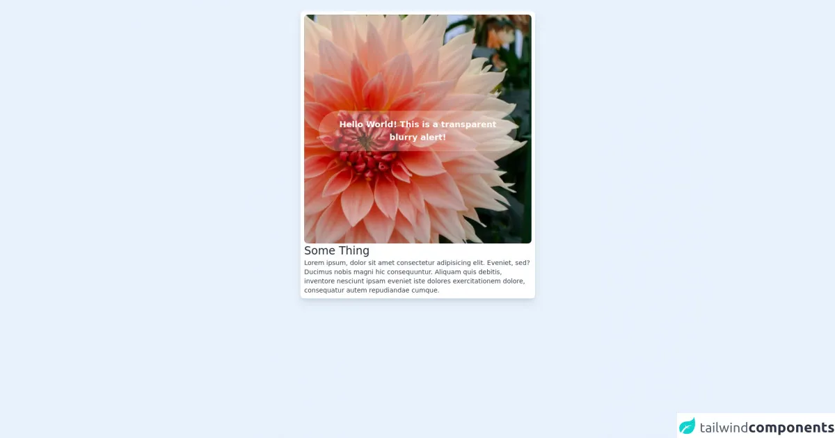
The preview of Blurry Alert on Image Card ui component
To create a Blurry Alert on Image Card ui component, we will use Tailwind CSS utility classes. The component will consist of an image and a message displayed on top of the image in a blurry background. The preview of the component is shown below.
Free download of the Blurry Alert on Image Card's source code
The source code of Blurry Alert on Image Card ui component
To create a Blurry Alert on Image Card ui component, we will use HTML and Tailwind CSS utility classes. The source code of the component is shown below.
<body class="bg-gray-100">
    <div class="flex justify-between m-6">
        <div class="flex flex-col h-full max-w-lg mx-auto bg-white p-2 rounded-lg shadow-lg">
            <div class="rounded-lg flex flex-col justify-center px-8" style="background-image: url(https://source.unsplash.com/6lKf8vmsjQs/400x500); height: 500px; width: auto; background-size: cover">
                <!-- Begin Transparent Alert -->
                <div class="flex justify-center bg-white backdrop-filter backdrop-blur-md bg-opacity-25 rounded-full text-center p-4 mt-2">
                    <span class="text-white text-lg font-semibold">
                        Hello World! This is a transparent blurry alert!
                    </span>
                </div>
                <!-- End Transparent Alert -->
            </div>
            <h2 class="text-2xl font-light text-gray-800">Some Thing</h2>
            <p class="text-sm text-gray-700">
                Lorem ipsum, dolor sit amet consectetur adipisicing elit. Eveniet, sed? Ducimus nobis magni hic consequuntur. Aliquam quis debitis, inventore nesciunt ipsam eveniet iste dolores exercitationem dolore, consequatur autem repudiandae cumque.
            </p>

        </div>
    </div>
</body>
How to create a Blurry Alert on Image Card with Tailwind CSS?
To create a Blurry Alert on Image Card with Tailwind CSS, follow the steps below.
Step 1: Set up the HTML structure
First, we need to set up the HTML structure for the component. The component will consist of an image and a message displayed on top of the image in a blurry background. The HTML structure is shown below.
<div class="relative">
  <img src="image.jpg" alt="Image" class="w-full h-auto">
  <div class="absolute top-0 left-0 w-full h-full bg-gray-900 bg-opacity-50 blur-md flex items-center justify-center">
    <p class="text-white text-2xl font-bold">Important Message</p>
  </div>
</div>
In the above code, we have used the relative and absolute positioning to position the message on top of the image. We have also used the w-full and h-full classes to make the background cover the entire image.
Step 2: Add the Tailwind CSS utility classes
Next, we need to add the Tailwind CSS utility classes to style the component. We will use the following classes:
bg-gray-900: This class sets the background color of the message to dark gray.bg-opacity-50: This class sets the opacity of the background to 50%.blur-md: This class applies a medium blur effect to the background.flex: This class sets the display property of the message container to flex.items-center: This class centers the content vertically.justify-center: This class centers the content horizontally.text-white: This class sets the text color of the message to white.text-2xl: This class sets the font size of the message to 2xl.font-bold: This class sets the font weight of the message to bold.
We will add these classes to the HTML structure as shown below.
<div class="relative">
  <img src="image.jpg" alt="Image" class="w-full h-auto">
  <div class="absolute top-0 left-0 w-full h-full bg-gray-900 bg-opacity-50 blur-md flex items-center justify-center">
    <p class="text-white text-2xl font-bold">Important Message</p>
  </div>
</div>
Step 3: Customize the component
Finally, we can customize the component by changing the values of the Tailwind CSS utility classes. For example, we can change the background color of the message by changing the value of the bg-gray-900 class.
<div class="relative">
  <img src="image.jpg" alt="Image" class="w-full h-auto">
  <div class="absolute top-0 left-0 w-full h-full bg-red-600 bg-opacity-50 blur-md flex items-center justify-center">
    <p class="text-white text-2xl font-bold">Important Message</p>
  </div>
</div>
In the above code, we have changed the background color of the message to red by using the bg-red-600 class.
Conclusion
In this article, we have learned how to create a Blurry Alert on Image Card ui component using Tailwind CSS. We have seen how Tailwind CSS utility classes can be used to style HTML elements quickly and easily. We have also seen how the Blurry Alert on Image Card ui component can be customized by changing the values of the utility classes. With the help of Tailwind CSS, developers can create responsive and customizable user interfaces quickly and easily.