- Published on
How to Create A Top accent alert With Tailwind CSS?
- What is Tailwind CSS?
- The Description of Top Accent Alert UI Component
- Why Use Tailwind CSS to Create a Top Accent Alert UI Component?
- The Preview of Top Accent Alert UI Component
- The Source Code of Top Accent Alert UI Component
- How to Create a Top Accent Alert with Tailwind CSS?
- Conclusion
In this tutorial, we will learn how to create a top accent alert with Tailwind CSS. We will go through the process of creating the UI component from scratch, and explain why Tailwind CSS is a great choice for creating UI components.
What is Tailwind CSS?
Tailwind CSS is a utility-first CSS framework that provides a set of pre-defined classes that can be used to style HTML elements. Unlike other CSS frameworks, Tailwind CSS does not have pre-built components, but instead provides a set of utility classes that can be combined to create custom components. This makes it very flexible and easy to use.
The Description of Top Accent Alert UI Component
A top accent alert is a UI component that is used to display important messages or notifications to the user. It is usually placed at the top of the screen, and has a distinctive accent color to draw attention to it. It can be used for a variety of purposes, such as displaying error messages, success messages, or warnings.
Why Use Tailwind CSS to Create a Top Accent Alert UI Component?
Tailwind CSS is a great choice for creating UI components because it provides a set of pre-defined classes that can be used to style HTML elements. This means that we can create a top accent alert by simply combining the right classes, without having to write any custom CSS. This makes the process much faster and easier.
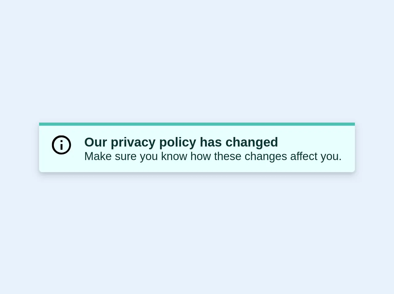
The Preview of Top Accent Alert UI Component
To give you an idea of what the top accent alert UI component looks like, here is a preview:
Free download of the Top accent alert's source code
The Source Code of Top Accent Alert UI Component
To create the top accent alert UI component, we will need to use a few Tailwind CSS classes. Here is the source code:
<div class="bg-teal-lightest border-t-4 border-teal rounded-b text-teal-darkest px-4 py-3 shadow-md my-2" role="alert">
  <div class="flex">
    <svg class="h-6 w-6 text-teal mr-4" xmlns="http://www.w3.org/2000/svg" viewBox="0 0 20 20"><path d="M2.93 17.07A10 10 0 1 1 17.07 2.93 10 10 0 0 1 2.93 17.07zm12.73-1.41A8 8 0 1 0 4.34 4.34a8 8 0 0 0 11.32 11.32zM9 11V9h2v6H9v-4zm0-6h2v2H9V5z"/></svg>
    <div>
      <p class="font-bold">Our privacy policy has changed</p>
      <p class="text-sm">Make sure you know how these changes affect you.</p>
    </div>
  </div>
</div>
How to Create a Top Accent Alert with Tailwind CSS?
To create a top accent alert with Tailwind CSS, we will need to follow these steps:
- Create a container element for the top accent alert. This can be a
divelement with a class ofbg-yellow-500.
<div class="bg-yellow-500">
  <!-- Content goes here -->
</div>
- Add padding to the container element to create some space around the content.
<div class="bg-yellow-500 p-4">
  <!-- Content goes here -->
</div>
- Add a text element to display the message. This can be a
pelement with a class oftext-white.
<div class="bg-yellow-500 p-4">
  <p class="text-white">This is an important message!</p>
</div>
- Add a close button to allow the user to dismiss the alert. This can be a
buttonelement with a class oftext-white.
<div class="bg-yellow-500 p-4">
  <p class="text-white">This is an important message!</p>
  <button class="text-white">x</button>
</div>
- Add some JavaScript to hide the alert when the close button is clicked.
<div class="bg-yellow-500 p-4" id="alert">
  <p class="text-white">This is an important message!</p>
  <button class="text-white" onclick="hideAlert()">x</button>
</div>

<script>
  function hideAlert() {
    document.getElementById("alert").style.display = "none";
  }
</script>
And that's it! We now have a fully functional top accent alert UI component.
Conclusion
In this tutorial, we learned how to create a top accent alert with Tailwind CSS. We explained why Tailwind CSS is a great choice for creating UI components, and provided a step-by-step guide for creating the top accent alert. We hope that you found this tutorial helpful, and that you are now able to create your own custom UI components with Tailwind CSS.