- Published on
The Ninja Guide To How To Make A Top button With Tailwind CSS Better
- What is Tailwind CSS?
- The description of Top button UI component
- Why use Tailwind CSS to create a Top button UI component?
- The preview of Top button UI component
- The source code of Top button UI component
- How to create a Top button with Tailwind CSS?
- Conclusion
As a FrontEnd technology blogger, it's important to stay up-to-date with the latest trends and tools in the industry. One such tool that has gained a lot of popularity in recent years is Tailwind CSS. In this article, we will explore how to create a Top button UI component with Tailwind CSS and make it better.
What is Tailwind CSS?
Tailwind CSS is a utility-first CSS framework that allows developers to quickly build custom user interfaces. It provides a set of pre-defined CSS classes that can be used to style HTML elements. Tailwind CSS is highly customizable and can be easily integrated into any project.
The description of Top button UI component
A Top button UI component is a button that appears on a web page when the user scrolls down. It allows the user to quickly navigate back to the top of the page without having to scroll manually. This component is commonly used on long web pages and can improve the user experience.
Why use Tailwind CSS to create a Top button UI component?
Tailwind CSS provides a set of pre-defined CSS classes that can be used to quickly create a Top button UI component. This saves time and effort, as developers do not have to write custom CSS code from scratch. Additionally, Tailwind CSS is highly customizable, which means that developers can easily modify the appearance of the Top button UI component to match the design of their web page.
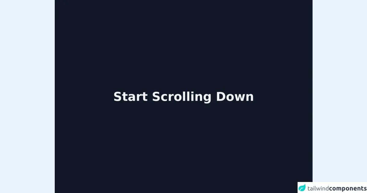
The preview of Top button UI component
To create a Top button UI component with Tailwind CSS, we will use the following classes:
fixed: This class sets the position of the button to fixed, which means that it will stay in the same position on the screen even when the user scrolls.bottom-0: This class sets the position of the button to the bottom of the screen.right-0: This class sets the position of the button to the right of the screen.p-4: This class adds padding to the button to make it more visually appealing.bg-blue-500: This class sets the background color of the button to blue.text-white: This class sets the text color of the button to white.rounded-full: This class rounds the corners of the button to make it more visually appealing.
Free download of the Top button's source code
The source code of Top button UI component
To create a Top button UI component with Tailwind CSS, we will use the following HTML and CSS code:
<button class="fixed bottom-0 right-0 p-4 bg-blue-500 text-white rounded-full">
  Top
</button>
/* No custom CSS code required */
<html class="scroll-smooth">

<head>
    <script defer src="https://unpkg.com/[email protected]/dist/cdn.min.js"></script>
</head>

<body>
    <!-- first page -->
    <section class="flex w-full min-h-screen bg-gray-900 justify-center items-center">
        <p class="text-3xl font-bold text-gray-100 text center md:text-6xl">Start Scrolling Down</p>
    </section>

    <!-- second page -->
    <section class="w-full min-h-screen bg-gray-600"></section>

    <!-- button -->
     <button x-data="topBtn" @click="scrolltoTop" id="topButton"
        class="fixed z-10 hidden p-3 bg-gray-100 rounded-full shadow-md bottom-10 right-10 animate-bounce">
        <svg class="w-8 h-8" fill="none" stroke="currentColor" viewBox="0 0 24 24"
            xmlns="http://www.w3.org/2000/svg">
            <path stroke-linecap="round" stroke-linejoin="round" stroke-width="2.5" d="M5 10l7-7m0 0l7 7m-7-7v18">
            </path>
        </svg>
    </button>

    <script>
        document.addEventListener('alpine:init', () => {
            Alpine.data('topBtn', () => ({
                scrolltoTop() {
                    document.body.scrollTop = 0;
                    document.documentElement.scrollTop = 0;
                }
            }));
        });

        const topBtn = document.getElementById("topButton");
        window.onscroll = () => {
            (document.body.scrollTop > 20 || document.documentElement.scrollTop > 20) ?
            topBtn.classList.remove("hidden"): topBtn.classList.add("hidden");

        }
    </script>
</body>

</html>
How to create a Top button with Tailwind CSS?
To create a Top button UI component with Tailwind CSS, follow these steps:
- Create a new HTML file and add the following code:
<!DOCTYPE html>
<html>
  <head>
    <title>Top button UI component</title>
    <link rel="stylesheet" href="https://cdn.jsdelivr.net/npm/[email protected]/dist/tailwind.min.css">
  </head>
  <body>
    <h1>Top button UI component</h1>
    <p>Lorem ipsum dolor sit amet, consectetur adipiscing elit. Sed euismod enim eu nunc lacinia, vel euismod nisl lobortis. Aliquam erat volutpat. Sed auctor, magna quis efficitur bibendum, dolor nisi facilisis dolor, sit amet aliquam mauris velit vel quam. Donec euismod, odio a blandit lacinia, lorem ex varius velit, a convallis enim erat vel nulla. Nam non enim vel ex blandit interdum. Praesent auctor, orci quis dapibus scelerisque, sapien velit fermentum nunc, a bibendum eros arcu ac velit. Sed iaculis, arcu vel bibendum facilisis, quam velit maximus velit, nec commodo orci risus quis enim. Fusce euismod, odio a blandit lacinia, risus elit lacinia velit, vel tristique odio ex vel mi. Duis commodo malesuada elit, vitae tincidunt sapien tincidunt id.</p>
    <p>Nulla facilisi. Nullam auctor, nulla vel fringilla luctus, velit risus ultrices mi, a bibendum mi nisl non dolor. Sed in velit euismod, euismod quam vel, efficitur enim. Cras feugiat, sapien quis bibendum malesuada, tortor velit varius eros, euismod volutpat ligula enim vel odio. Donec eget risus euismod, cursus lacus vel, sagittis lorem. In hac habitasse platea dictumst. Sed tempus, sapien nec auctor faucibus, sapien elit aliquet mauris, ut consequat justo quam vel nisl. Sed euismod, sapien vel aliquam bibendum, leo libero elementum lorem, vel aliquam dui erat at massa. Nullam eget arcu in metus euismod scelerisque. Vivamus vel tellus eget quam rutrum vestibulum. Pellentesque habitant morbi tristique senectus et netus et malesuada fames ac turpis egestas. Morbi euismod, elit vel viverra scelerisque, massa tortor malesuada arcu, vel ullamcorper sapien felis ac odio.</p>
    <p>Integer bibendum, est eget ullamcorper aliquet, leo quam commodo turpis, in bibendum velit dui vel massa. Pellentesque habitant morbi tristique senectus et netus et malesuada fames ac turpis egestas. Ut sed semper ipsum. Sed euismod, justo vel lacinia sagittis, quam augue commodo massa, nec porta massa mi ac nulla. Sed auctor, lectus in bibendum bibendum, turpis elit bibendum ex, vel bibendum enim enim vel nunc. Fusce vel turpis eget metus bibendum lacinia. Donec ut tortor vel ipsum imperdiet lacinia. Sed sodales, sapien ut varius tempor, neque dolor bibendum mauris, eu aliquam nisl quam eget sem. Sed posuere, nisl eu scelerisque bibendum, sapien nunc lobortis nibh, a ultrices odio velit vel quam. Nulla facilisi. Donec euismod, sapien ut tincidunt blandit, sapien orci consequat nulla, quis imperdiet velit ipsum eu nunc. Sed imperdiet, nunc in bibendum bibendum, augue velit bibendum sapien, vel ultrices magna enim ut elit. Donec bibendum, tortor vel commodo vulputate, sapien nibh blandit sapien, vel pharetra nisi ante ut elit. Donec euismod, odio euismod convallis blandit, nulla augue faucibus sapien, at bibendum mi nibh nec est.</p>
    <button class="fixed bottom-0 right-0 p-4 bg-blue-500 text-white rounded-full">
      Top
    </button>
  </body>
</html>
Save the file as
index.htmland open it in a web browser. You should see a web page with a Top button UI component at the bottom right corner of the screen.To customize the appearance of the Top button UI component, modify the CSS classes used in the button element. For example, you can change the background color to red by replacing
bg-blue-500withbg-red-500.
Conclusion
In this article, we have explored how to create a Top button UI component with Tailwind CSS and make it better. We have learned that Tailwind CSS provides a set of pre-defined CSS classes that can be used to quickly create custom user interfaces. Additionally, we have seen that the Top button UI component can improve the user experience on long web pages. By following the steps outlined in this article, you can easily create a Top button UI component with Tailwind CSS and customize it to match the design of your web page.