- Published on
6 Easy Ways To Create A Tooltip With Tailwind CSS Without Even Thinking About It
- What is Tailwind CSS?
- The description of Tooltip ui component
- Why use Tailwind CSS to create a Tooltip ui component?
- The preview of Tooltip ui component
- The source code of Tooltip ui component
- How to create a Tooltip with Tailwind CSS?
- Step 1: Add the HTML element
- Step 2: Add the tooltip text
- Step 3: Add the Tailwind CSS classes
- Step 4: Add the tooltip arrow
- Step 5: Add the tooltip content
- Step 6: Add the tooltip content to the HTML
- Conclusion
What is Tailwind CSS?
Tailwind CSS is a popular utility-first CSS framework that allows developers to easily create responsive and customizable user interfaces. It provides a set of pre-defined CSS classes that can be used to style HTML elements without the need for custom CSS. With Tailwind CSS, developers can focus on creating functional and visually appealing user interfaces without worrying about the underlying CSS.
The description of Tooltip ui component
A tooltip is a small pop-up box that appears when a user hovers over an element. It is commonly used to provide additional information or context about the element. Tooltips are a popular UI component that can enhance the user experience by providing helpful hints and guidance.
Why use Tailwind CSS to create a Tooltip ui component?
Tailwind CSS provides a set of pre-defined CSS classes that can be used to create a tooltip without the need for custom CSS. This makes it easy to create a tooltip that is both functional and visually appealing. Additionally, Tailwind CSS is highly customizable, which means that developers can easily modify the tooltip to match the design of their application.
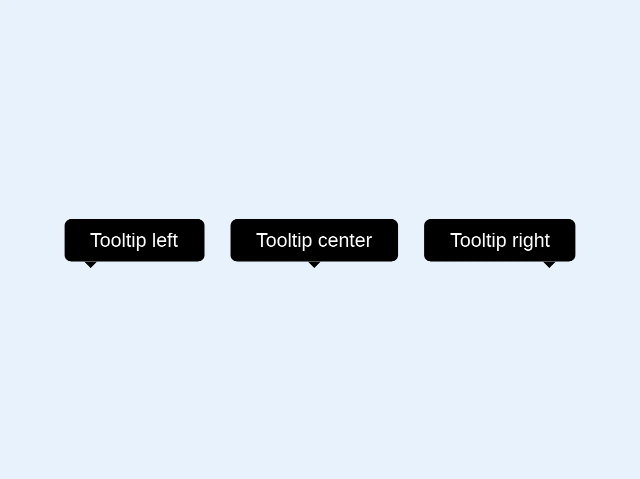
The preview of Tooltip ui component
Tooltips can be used to provide additional information or context about an element. They are commonly used in forms, tables, and other UI components. With Tailwind CSS, you can easily create a tooltip that is both functional and visually appealing.
Free download of the Tooltip's source code
The source code of Tooltip ui component
To create a tooltip with Tailwind CSS, you will need to use a combination of HTML and CSS classes. The HTML code will define the element that the tooltip will be attached to, while the CSS classes will define the appearance and behavior of the tooltip.
<style>
  .bottom-full{bottom: 100%}
  .top-full{top: 100%}
</style>
<div class="flex">
  <div class="relative mx-2">
    <div class="bg-black text-white text-xs rounded py-1 px-4 right-0 bottom-full">
      Tooltip left
      <svg class="absolute text-black h-2 left-0 ml-3 top-full" x="0px" y="0px" viewBox="0 0 255 255" xml:space="preserve"><polygon class="fill-current" points="0,0 127.5,127.5 255,0"/></svg>
    </div>
  </div>
  <div class="relative mx-2">
    <div class="bg-black text-white text-xs rounded py-1 px-4 right-0 bottom-full">
      Tooltip center
      <svg class="absolute text-black h-2 w-full left-0 top-full" x="0px" y="0px" viewBox="0 0 255 255" xml:space="preserve"><polygon class="fill-current" points="0,0 127.5,127.5 255,0"/></svg>
    </div>
  </div>
  <div class="relative mx-2">
    <div class="bg-black text-white text-xs rounded py-1 px-4 right-0 bottom-full">
      Tooltip right
      <svg class="absolute text-black h-2 right-0 mr-3 top-full" x="0px" y="0px" viewBox="0 0 255 255" xml:space="preserve"><polygon class="fill-current" points="0,0 127.5,127.5 255,0"/></svg>
    </div>
  </div>
</div>
How to create a Tooltip with Tailwind CSS?
Creating a tooltip with Tailwind CSS is easy and can be done in six simple steps.
Step 1: Add the HTML element
The first step is to add the HTML element that the tooltip will be attached to. This can be any HTML element, such as a button, link, or image. For example:
<button class="tooltip">Hover me</button>
Step 2: Add the tooltip text
The next step is to add the text that will be displayed in the tooltip. This is done using the data-tooltip attribute. For example:
<button class="tooltip" data-tooltip="Hello, World!">Hover me</button>
Step 3: Add the Tailwind CSS classes
The next step is to add the Tailwind CSS classes that will define the appearance and behavior of the tooltip. This is done using the group and relative classes. For example:
<button class="tooltip group relative" data-tooltip="Hello, World!">Hover me</button>
Step 4: Add the tooltip arrow
The next step is to add the tooltip arrow. This is done using the ::before pseudo-element and the border and border-transparent classes. For example:
.tooltip::before {
  content: "";
  position: absolute;
  top: -10px;
  left: 50%;
  transform: translateX(-50%);
  border-width: 5px;
  border-style: solid;
  border-color: transparent transparent white transparent;
}
Step 5: Add the tooltip content
The next step is to add the tooltip content. This is done using the absolute and invisible classes. For example:
.tooltip .tooltip-content {
  position: absolute;
  top: -30px;
  left: 50%;
  transform: translateX(-50%);
  background-color: white;
  color: black;
  padding: 5px;
  border-radius: 5px;
  box-shadow: 0px 0px 5px rgba(0, 0, 0, 0.1);
  opacity: 0;
  transition: opacity 0.2s ease-in-out;
}

.tooltip:hover .tooltip-content {
  opacity: 1;
}
Step 6: Add the tooltip content to the HTML
The final step is to add the tooltip content to the HTML. This is done using the div element and the tooltip-content class. For example:
<button class="tooltip group relative" data-tooltip="Hello, World!">
  Hover me
  <div class="tooltip-content invisible">Hello, World!</div>
</button>
Conclusion
Creating a tooltip with Tailwind CSS is easy and can be done in six simple steps. By using Tailwind CSS, developers can easily create a tooltip that is both functional and visually appealing. Additionally, Tailwind CSS is highly customizable, which means that developers can easily modify the tooltip to match the design of their application. With these six easy steps, you can create a tooltip with Tailwind CSS without even thinking about it.