- Published on
How To Build A Tooltip With Tailwind CSS In 6 Easy Steps?
- What is Tailwind CSS?
- The description of Tooltip ui component
- Why use Tailwind CSS to create a Tooltip ui component?
- The preview of Tooltip ui component.
- The source code of Tooltip ui component.
- How to create a Tooltip with Tailwind CSS?
- Step 1: Create the HTML structure
- Step 2: Style the tooltip container
- Step 3: Style the tooltip trigger
- Step 4: Style the tooltip content
- Step 5: Hide the tooltip content by default
- Step 6: Show the tooltip content on hover
- Conclusion
What is Tailwind CSS?
Tailwind CSS is a utility-first CSS framework that provides a set of pre-defined CSS classes to help you build responsive and customizable user interfaces quickly. It allows you to create complex designs without writing custom CSS code, making it a popular choice among developers.
The description of Tooltip ui component
A tooltip is a small pop-up box that appears when the user hovers over an element. It provides additional information or context about the element, enhancing the user experience and making the interface more intuitive.
Why use Tailwind CSS to create a Tooltip ui component?
Tailwind CSS provides a set of pre-defined utility classes that make it easy to create a tooltip ui component without writing any custom CSS code. This saves time and effort, allowing you to focus on building the functionality of your application.
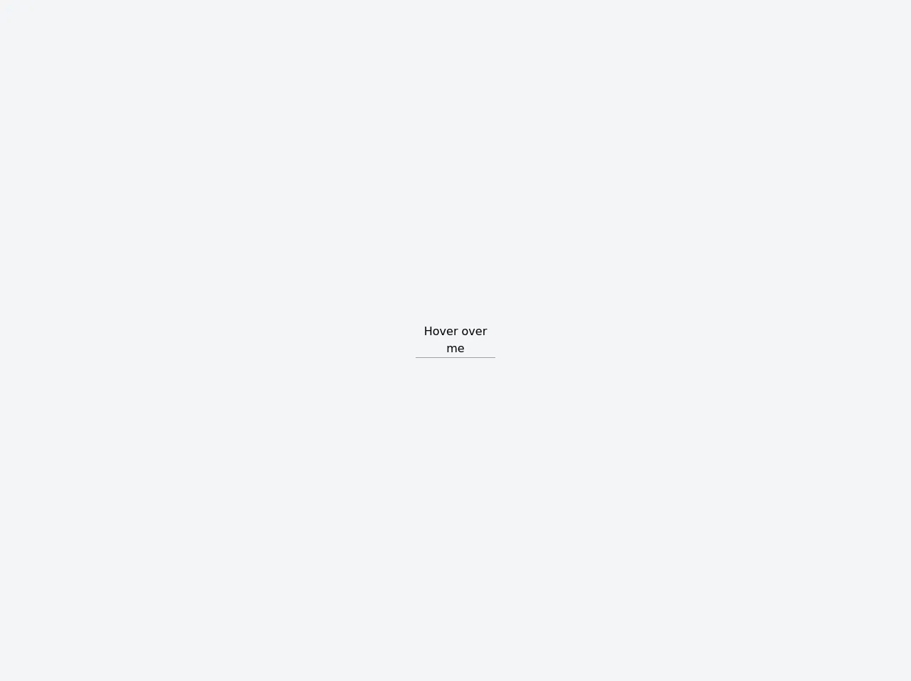
The preview of Tooltip ui component.
Tooltips can be used in a variety of ways, such as providing additional information about a button or link, or displaying a message when the user hovers over an image. Here's an example of what a tooltip ui component might look like:
Free download of the Tooltip's source code
The source code of Tooltip ui component.
To create a tooltip ui component with Tailwind CSS, you'll need to use a combination of HTML and CSS code. Here's an example of what the source code might look like:
<div class="min-h-screen bg-gray-100 py-6 flex flex-col justify-center sm:py-12">
  <div class="relative py-3 sm:max-w-xl sm:mx-auto">
    <div class="group cursor-pointer relative inline-block border-b border-gray-400 w-28 text-center">Hover over me
      <div class="opacity-0 w-28 bg-black text-white text-center text-xs rounded-lg py-2 absolute z-10 group-hover:opacity-100 bottom-full -left-1/2 ml-14 px-3 pointer-events-none">
        Tooltip center
        <svg class="absolute text-black h-2 w-full left-0 top-full" x="0px" y="0px" viewBox="0 0 255 255" xml:space="preserve"><polygon class="fill-current" points="0,0 127.5,127.5 255,0"/></svg>
      </div>
    </div>
  </div>
</div>
How to create a Tooltip with Tailwind CSS?
Now that you have an idea of what a tooltip ui component looks like and what the source code might look like, let's walk through the steps to create one using Tailwind CSS.
Step 1: Create the HTML structure
The first step is to create the HTML structure for the tooltip. This typically involves creating a container element for the tooltip and adding the content that will be displayed when the user hovers over the element.
<div class="tooltip-container">
  <button class="tooltip-trigger">Hover me</button>
  <div class="tooltip-content">
    <p>This is the tooltip content</p>
  </div>
</div>
In this example, we've created a container element with a button as the trigger element and a div as the content element. When the user hovers over the button, the content will be displayed in the tooltip.
Step 2: Style the tooltip container
Next, we'll use Tailwind CSS to style the tooltip container. We'll set the position to relative and the display to inline-block to ensure that the tooltip is positioned correctly and doesn't disrupt the layout of the page.
.tooltip-container {
  position: relative;
  display: inline-block;
}
Step 3: Style the tooltip trigger
Now, we'll style the tooltip trigger element. We'll set the cursor to pointer to indicate that it's clickable, and we'll add some padding and a border to make it more visually appealing.
.tooltip-trigger {
  cursor: pointer;
  padding: 0.5rem;
  border: 1px solid #ccc;
}
Step 4: Style the tooltip content
Next, we'll style the tooltip content element. We'll set the position to absolute and the top and left properties to 100% to position the tooltip next to the trigger element. We'll also add some padding, a background color, and a border radius to make it more visually appealing.
.tooltip-content {
  position: absolute;
  top: 100%;
  left: 0;
  padding: 0.5rem;
  background-color: #333;
  color: #fff;
  border-radius: 0.25rem;
}
Step 5: Hide the tooltip content by default
To ensure that the tooltip content is hidden by default, we'll set the display property to none.
.tooltip-content {
  /* ... */
  display: none;
}
Step 6: Show the tooltip content on hover
Finally, we'll use the hover pseudo-class to show the tooltip content when the user hovers over the trigger element.
.tooltip-container:hover .tooltip-content {
  display: block;
}
And that's it! With just a few lines of HTML and CSS code, you can create a fully functional tooltip ui component using Tailwind CSS.
Conclusion
In this article, we've explored what Tailwind CSS is, why it's a great choice for building user interfaces, and how to create a tooltip ui component using Tailwind CSS in six easy steps. With Tailwind CSS, you can create complex designs quickly and easily, without writing any custom CSS code. So why not give it a try?