- Published on
Most Effective Ways To Build A Toggle With Tailwind CSS
- What is Tailwind CSS?
- The description of Toggle UI component
- Why use Tailwind CSS to create a Toggle UI component?
- The preview of Toggle UI component
- The source code of Toggle UI component
- How to create a Toggle with Tailwind CSS?
- Conclusion
What is Tailwind CSS?
Tailwind CSS is a utility-first CSS framework that provides a set of pre-defined classes to create responsive and customizable UI components. It allows developers to quickly build complex layouts and designs without writing custom CSS code.
The description of Toggle UI component
A toggle is a UI component that allows users to switch between two states, such as on/off, yes/no, or show/hide. It is commonly used in web and mobile applications to enable or disable certain features or settings.
Why use Tailwind CSS to create a Toggle UI component?
Tailwind CSS provides a set of pre-defined classes that can be used to create a toggle UI component quickly and easily. It also allows developers to customize the toggle's appearance and behavior by modifying the classes or adding custom CSS code.
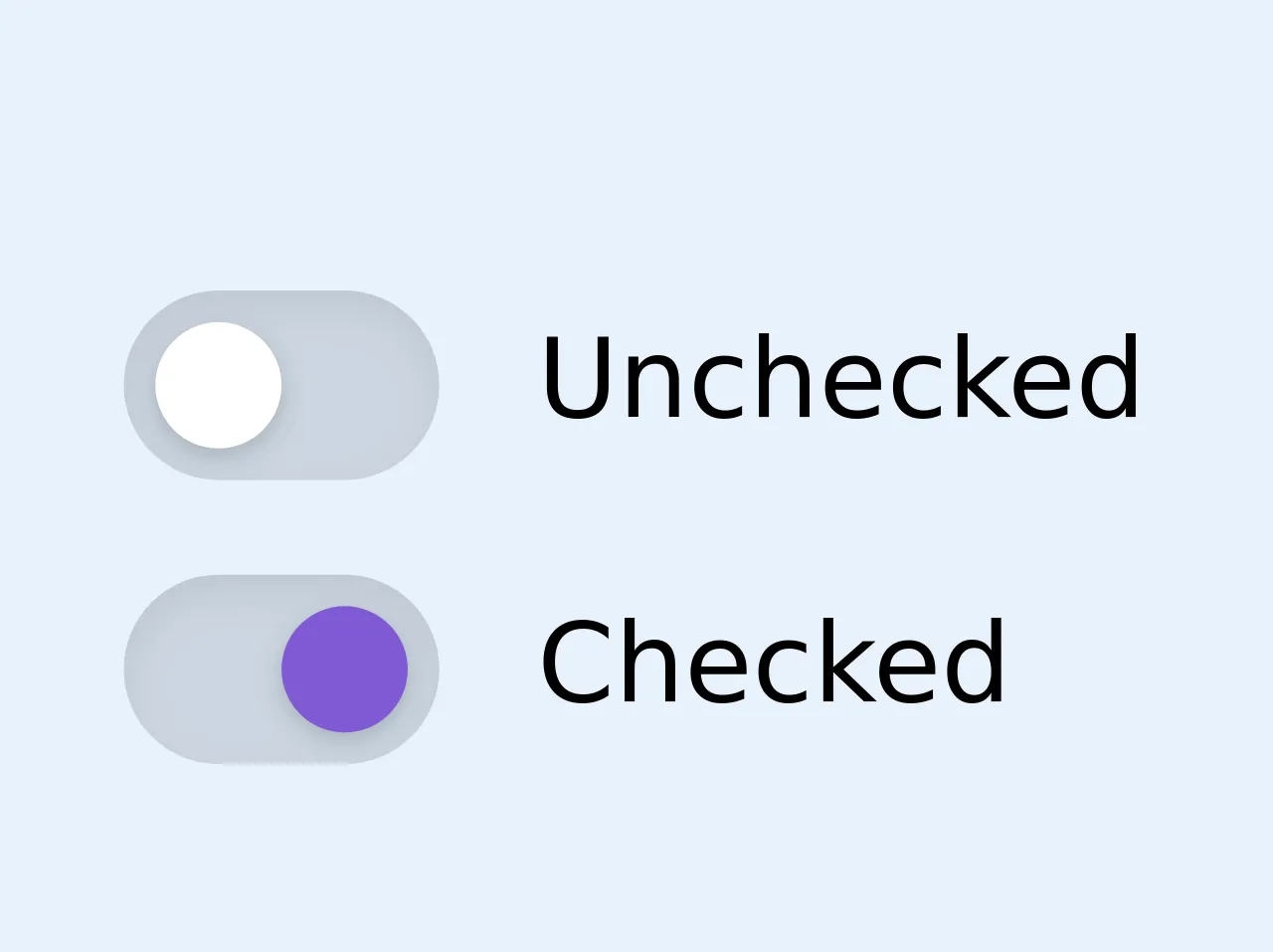
The preview of Toggle UI component
To create a toggle UI component with Tailwind CSS, we need to use the form-checkbox and form-toggle classes. These classes provide the basic styling and functionality for the toggle.
Free download of the Toggle's source code
The source code of Toggle UI component
The source code for a basic toggle UI component using Tailwind CSS is as follows:
<div class="flex flex-col">
  <label for="unchecked" class="mt-3 inline-flex items-center cursor-pointer">
    <span class="relative">
      <span class="block w-10 h-6 bg-gray-400 rounded-full shadow-inner"></span>
      <span class="absolute block w-4 h-4 mt-1 ml-1 bg-white rounded-full shadow inset-y-0 left-0 focus-within:shadow-outline transition-transform duration-300 ease-in-out">
        <input id="unchecked" type="checkbox" class="absolute opacity-0 w-0 h-0" />
      </span>
    </span>
    <span class="ml-3 text-sm">Unchecked</span>
  </label>

  <label for="checked" class="mt-3 inline-flex items-center cursor-pointer">
    <span class="relative">
      <span class="block w-10 h-6 bg-gray-400 rounded-full shadow-inner"></span>
      <span class="absolute block w-4 h-4 mt-1 ml-1 rounded-full shadow inset-y-0 left-0 focus-within:shadow-outline transition-transform duration-300 ease-in-out bg-purple-600 transform translate-x-full">
        <input id="checked" type="checkbox" class="absolute opacity-0 w-0 h-0" />
      </span>
    </span>
    <span class="ml-3 text-sm">Checked</span>
  </label>
</div>

<!-- NB! focus-within must be enabled for boxShadow in variants -->
How to create a Toggle with Tailwind CSS?
To create a toggle UI component with Tailwind CSS, follow these steps:
- Create a checkbox input element with the
form-checkboxclass.
<input type="checkbox" class="form-checkbox">
- Wrap the checkbox input element in a label element with the
form-toggleclass.
<label class="form-toggle">
  <input type="checkbox" class="form-checkbox">
  <span class="form-toggle-label"></span>
</label>
- Add the
form-toggle-labelclass to the label element to create a toggle switch.
<label class="form-toggle">
  <input type="checkbox" class="form-checkbox">
  <span class="form-toggle-label"></span>
</label>
- Customize the toggle's appearance and behavior by modifying the classes or adding custom CSS code.
For example, we can change the color of the toggle switch by adding the text-green-500 class to the form-toggle-label element.
<label class="form-toggle">
  <input type="checkbox" class="form-checkbox">
  <span class="form-toggle-label text-green-500"></span>
</label>
We can also change the size of the toggle switch by adding the w-10 and h-6 classes to the form-toggle-label element.
<label class="form-toggle">
  <input type="checkbox" class="form-checkbox">
  <span class="form-toggle-label text-green-500 w-10 h-6"></span>
</label>
Conclusion
Tailwind CSS provides an easy and efficient way to create toggle UI components for web and mobile applications. By using the pre-defined classes and customizing the styles with CSS, developers can create toggles that are both functional and visually appealing.