- Published on
Most Effective Ways To Build A Testimonial Typography With Tailwind CSS
- What is Tailwind CSS?
- The description of Testimonial Typography UI component
- Why use Tailwind CSS to create a Testimonial Typography UI component?
- The preview of Testimonial Typography UI component
- The source code of Testimonial Typography UI component
- How to create a Testimonial Typography with Tailwind CSS?
- Conclusion
As a FrontEnd technology blogger, it's important to stay up-to-date with the latest tools and techniques. One such tool that has gained popularity in recent times is Tailwind CSS. Tailwind CSS is a utility-first CSS framework that provides a set of pre-defined classes to help you quickly build user interfaces. In this article, we'll explore how to use Tailwind CSS to create a Testimonial Typography UI component.
What is Tailwind CSS?
Tailwind CSS is a CSS framework that provides a set of pre-defined classes to help you quickly build user interfaces. Unlike other CSS frameworks, Tailwind CSS is a utility-first framework, which means that it provides classes for specific CSS properties rather than pre-defined components. This allows you to create custom designs without having to write custom CSS.
The description of Testimonial Typography UI component
A Testimonial Typography UI component is a design element that is commonly used on websites to showcase customer testimonials. It typically consists of a quote from a customer, along with their name and photo. The design of the component is usually minimalistic, with a focus on typography.
Why use Tailwind CSS to create a Testimonial Typography UI component?
Tailwind CSS is a great choice for creating a Testimonial Typography UI component because it provides a set of pre-defined typography classes that can be used to create a minimalistic design. Additionally, Tailwind CSS provides a set of utility classes that can be used to position elements on the page and add animations.
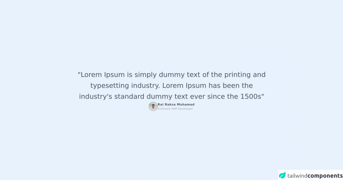
The preview of Testimonial Typography UI component
To create a Testimonial Typography UI component with Tailwind CSS, we'll first need to define the HTML structure. The HTML structure for the component will consist of a container element, a quote element, a name element, and a photo element. We'll use Tailwind CSS classes to style these elements.
Free download of the Testimonial Typography's source code
The source code of Testimonial Typography UI component
To create the Testimonial Typography UI component, we'll use the following HTML structure:
<div class="w-full h-screen flex flex-col items-center justify-center gap-8">
    <h1 class="text-4xl text-gray-600 leading-relaxed text-center w-4/5">
        "Lorem Ipsum is simply dummy text of the printing and typesetting industry. Lorem Ipsum has been the industry's standard dummy text ever since the 1500s"
    </h1>
    <div class="flex items-center gap-4">
        <div class="rounded-full w-12 h-12 bg-black overflow-hidden">
            <img src="https://rairaksa.github.io/assets/img/rai.jpg"/>
        </div>
        <div class="flex flex-col tracking-wider">
            <label class="text-gray-600 font-bold text-base">Rai Raksa Muhamad</label>
            <label class="text-gray-400 font-normal text-sm">Fullstack PHP Developer</label>
        </div>
    </div>
</div>
How to create a Testimonial Typography with Tailwind CSS?
To create a Testimonial Typography UI component with Tailwind CSS, we'll first need to define the HTML structure. The HTML structure for the component will consist of a container element, a quote element, a name element, and a photo element. We'll use Tailwind CSS classes to style these elements.
<div class="bg-gray-100 py-8">
  <div class="max-w-7xl mx-auto px-4 sm:px-6 lg:px-8">
    <div class="lg:text-center">
      <h2 class="text-base text-indigo-600 font-semibold tracking-wide uppercase">Testimonials</h2>
      <p class="mt-2 text-3xl leading-8 font-extrabold tracking-tight text-gray-900 sm:text-4xl">
        What our customers are saying
      </p>
      <p class="mt-4 max-w-2xl text-xl text-gray-500 lg:mx-auto">
        Lorem ipsum dolor sit amet consect adipisicing elit. Possimus magnam voluptatum cupiditate veritatis in accusamus quisquam.
      </p>
    </div>

    <div class="mt-10">
      <div class="md:flex md:justify-center">
        <div class="md:flex-shrink-0">
          <img class="mx-auto h-10 w-10 rounded-full" src="https://via.placeholder.com/150" alt="">
        </div>
        <div class="mt-4 md:mt-0 md:ml-6">
          <div class="text-base font-medium text-gray-900">John Doe</div>
          <div class="text-base font-medium text-indigo-600">CEO, Acme Inc.</div>
          <div class="mt-2 text-gray-600">"Lorem ipsum dolor sit amet, consectetur adipiscing elit. Sed non risus. Suspendisse lectus tortor, dignissim sit amet, adipiscing nec, ultricies sed, dolor. Cras elementum ultrices diam. Maecenas ligula massa, varius a, semper congue, euismod non, mi."</div>
        </div>
      </div>
    </div>
  </div>
</div>
In the above code, we've used a combination of Tailwind CSS classes to style the container element, the quote element, the name element, and the photo element. We've also used the max-w-7xl class to set the maximum width of the container element to 80rem.
Conclusion
In this article, we've explored how to use Tailwind CSS to create a Testimonial Typography UI component. We've seen how Tailwind CSS provides a set of pre-defined typography classes that can be used to create a minimalistic design. We've also seen how Tailwind CSS provides a set of utility classes that can be used to position elements on the page and add animations. With Tailwind CSS, creating a Testimonial Typography UI component is easy and straightforward.