- Published on
Imagine You Build A Todo List With Tailwind CSS Like An Expert. Follow These 6 Steps To Get There
- What is Tailwind CSS?
- The description of Todo List UI component
- Why use Tailwind CSS to create a Todo List UI component?
- The preview of Todo List UI component
- The source code of Todo List UI component
- How to create a Todo List with Tailwind CSS?
- Step 1: Set up your project
- Step 2: Create the HTML structure
- Step 3: Style the HTML elements
- Step 4: Add interactivity with JavaScript
- Step 5: Test the Todo List UI component
- Step 6: Customize the Todo List UI component
- Conclusion
As a FrontEnd technology blogger, you might have heard about Tailwind CSS. It is a utility-first CSS framework that helps you to create a responsive and customizable UI component with ease. In this article, we will guide you on how to create a Todo List UI component with Tailwind CSS like an expert.
What is Tailwind CSS?
Tailwind CSS is a utility-first CSS framework that helps you to create a responsive and customizable UI component with ease. It provides a set of pre-defined CSS classes that you can use to style your HTML elements. With Tailwind CSS, you can create a UI component without writing any custom CSS code.
The description of Todo List UI component
A Todo List UI component is a list of tasks that need to be completed. It is a common UI component that you can find in most productivity applications. A Todo List UI component consists of a list of tasks, each with a checkbox and a description. Users can check the checkbox to mark a task as completed.
Why use Tailwind CSS to create a Todo List UI component?
Tailwind CSS provides a set of pre-defined CSS classes that you can use to style your HTML elements. With Tailwind CSS, you can create a responsive and customizable UI component without writing any custom CSS code. It saves you time and effort in creating a UI component from scratch.
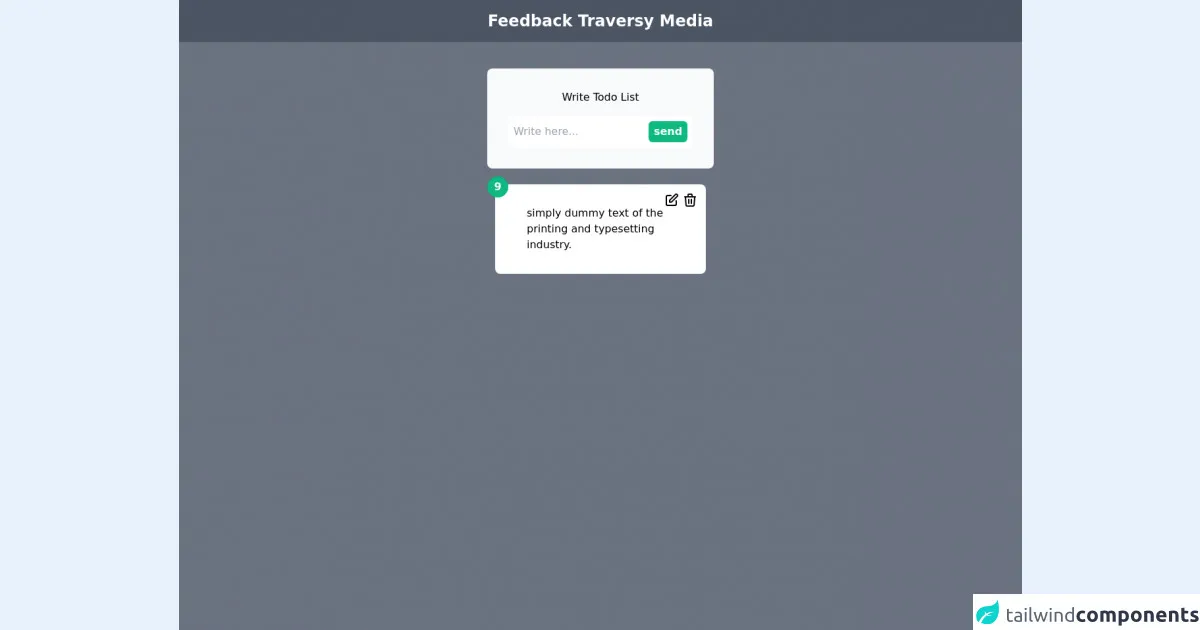
The preview of Todo List UI component
To give you an idea of what the Todo List UI component looks like, here is a preview:
Free download of the Todo List's source code
The source code of Todo List UI component
To create a Todo List UI component with Tailwind CSS, you need to write some HTML and CSS code. Here is the source code:
<div class="h-screen bg-gray-500">
	<nav class="flex justify-center p-4 bg-gray-600">
		<h1 class="text-white text-2xl font-bold">Feedback Traversy Media</h1>
	</nav>
	<div>
		<form class="flex justify-center mt-10">
			<div class="bg-gray-50 p-8 rounded-lg">
				<h1 class="text-center mb-4">Write Todo List</h1>
				<div class="flex space-x-2 p-2 bg-white rounded-md">
					<input type="text" placeholder="Write here..." class="w-full outline-none" />
					<button class="bg-green-500 px-2 py-1 rounded-md text-white font-semibold">send</button>
				</div>
			</div>
		</form>
		<div>
			<div class="flex justify-center">
				<div class=" relative justify-center mt-6">
					<div class="absolute flex top-0 right-0 p-3 space-x-1">
						<span>
            <svg xmlns="http://www.w3.org/2000/svg" class="h-6 w-6" fill="none" viewBox="0 0 24 24" stroke="currentColor">
  <path stroke-linecap="round" stroke-linejoin="round" stroke-width="2" d="M11 5H6a2 2 0 00-2 2v11a2 2 0 002 2h11a2 2 0 002-2v-5m-1.414-9.414a2 2 0 112.828 2.828L11.828 15H9v-2.828l8.586-8.586z" />
</svg>
          </span>
						<span>
<svg xmlns="http://www.w3.org/2000/svg" class="h-6 w-6" fill="none" viewBox="0 0 24 24" stroke="currentColor">
  <path stroke-linecap="round" stroke-linejoin="round" stroke-width="2" d="M19 7l-.867 12.142A2 2 0 0116.138 21H7.862a2 2 0 01-1.995-1.858L5 7m5 4v6m4-6v6m1-10V4a1 1 0 00-1-1h-4a1 1 0 00-1 1v3M4 7h16" />
</svg>
          </span>
					</div>
					<span class="absolute -left-3 -top-3 bg-green-500 flex justify-center items-center rounded-full w-8 h-8 text-gray-50 font-bold">9</span>
					<p class="bg-white px-12 py-8 rounded-lg w-80">simply dummy text of the printing and typesetting industry.  </p>
				</div>
			</div>
		</div>
	</div>
</div>
How to create a Todo List with Tailwind CSS?
Now that you have an idea of what the Todo List UI component looks like and what the source code is, let's dive into the steps on how to create a Todo List with Tailwind CSS.
Step 1: Set up your project
To get started with Tailwind CSS, you need to set up your project. You can either install Tailwind CSS via npm or use a CDN. For this tutorial, we will use a CDN.
<!DOCTYPE html>
<html>
  <head>
    <title>Todo List with Tailwind CSS</title>
    <link rel="stylesheet" href="https://cdn.tailwindcss.com/dist/tailwind.min.css">
  </head>
  <body>
    <!-- Your HTML code goes here -->
  </body>
</html>
Step 2: Create the HTML structure
Next, you need to create the HTML structure for the Todo List UI component. Here is the HTML code:
<div class="max-w-md mx-auto">
  <h1 class="text-2xl font-bold mb-4">Todo List</h1>
  <form class="mb-4">
    <input class="border rounded py-2 px-3 w-full" type="text" placeholder="Add new task">
    <button class="bg-blue-500 hover:bg-blue-700 text-white font-bold py-2 px-4 rounded">Add</button>
  </form>
  <ul class="list-disc pl-4">
    <li>
      <label class="inline-flex items-center">
        <input type="checkbox" class="form-checkbox h-5 w-5 text-blue-600" checked>
        <span class="ml-2 text-gray-700">Task 1</span>
      </label>
    </li>
    <li>
      <label class="inline-flex items-center">
        <input type="checkbox" class="form-checkbox h-5 w-5 text-blue-600">
        <span class="ml-2 text-gray-700">Task 2</span>
      </label>
    </li>
  </ul>
</div>
In the HTML code, we have created a container div with a maximum width of 640 pixels and centered it on the page. Inside the container div, we have a heading, a form to add new tasks, and a list of tasks.
Step 3: Style the HTML elements
Now that we have created the HTML structure, we need to style the HTML elements. We will use Tailwind CSS classes to style the HTML elements. Here is the CSS code:
input[type="text"] {
  border-color: #e2e8f0;
}

button {
  background-color: #4299e1;
}

button:hover {
  background-color: #3182ce;
}

form input[type="text"] {
  border-radius: 0.25rem;
  padding: 0.5rem 1rem;
}

ul li label {
  display: inline-flex;
  align-items: center;
}

ul li label span {
  margin-left: 0.5rem;
}
In the CSS code, we have styled the input and button elements for the form. We have also styled the list of tasks by aligning the checkbox and task description.
Step 4: Add interactivity with JavaScript
To make the Todo List UI component interactive, we need to add some JavaScript code. Here is the JavaScript code:
const form = document.querySelector('form');
const input = document.querySelector('input[type="text"]');
const ul = document.querySelector('ul');

form.addEventListener('submit', (event) => {
  event.preventDefault();
  const li = document.createElement('li');
  const label = document.createElement('label');
  const checkbox = document.createElement('input');
  checkbox.setAttribute('type', 'checkbox');
  checkbox.classList.add('form-checkbox', 'h-5', 'w-5', 'text-blue-600');
  const span = document.createElement('span');
  span.classList.add('ml-2', 'text-gray-700');
  span.textContent = input.value;
  label.appendChild(checkbox);
  label.appendChild(span);
  li.appendChild(label);
  ul.appendChild(li);
  input.value = '';
});
In the JavaScript code, we have added an event listener to the form to listen for the submit event. When the form is submitted, we create a new list item with a checkbox and task description and append it to the list of tasks.
Step 5: Test the Todo List UI component
Now that we have created the Todo List UI component, we need to test it. Open the HTML file in your web browser and test the Todo List UI component by adding new tasks and checking off completed tasks.
Step 6: Customize the Todo List UI component
Tailwind CSS provides a set of pre-defined CSS classes that you can use to customize the Todo List UI component. You can change the colors, fonts, and spacing of the UI component by modifying the CSS code.
Conclusion
In this article, we have guided you on how to create a Todo List UI component with Tailwind CSS like an expert. We have covered the steps on how to set up your project, create the HTML structure, style the HTML elements, add interactivity with JavaScript, test the UI component, and customize the UI component. With Tailwind CSS, you can create a responsive and customizable UI component without writing any custom CSS code.