- Published on
The Ninja Guide To How To Build A ToDo List App - Ui With Tailwind CSS Better
- What is Tailwind CSS?
- The description of ToDo List App - Ui ui component
- Why use Tailwind CSS to create a ToDo List App - Ui ui component?
- The preview of ToDo List App - Ui ui component.
- The source code of ToDo List App - Ui ui component.
- How to create a ToDo List App - Ui with Tailwind CSS?
- Step 1: Set up your development environment
- Step 2: Create the HTML structure
- Step 3: Style the UI with Tailwind CSS
- Step 4: Add interactivity with JavaScript
- Conclusion
Are you looking to build a ToDo List App with a stunning UI? Look no further than Tailwind CSS. In this article, we will discuss what Tailwind CSS is, why it is the perfect tool to use for building a ToDo List App, and how to create a ToDo List App with Tailwind CSS.
What is Tailwind CSS?
Tailwind CSS is a utility-first CSS framework that provides a set of pre-defined CSS classes to use in your HTML. It allows you to quickly and easily create custom designs without writing any CSS code. With Tailwind CSS, you can focus on building your application's functionality rather than spending time writing CSS code.
The description of ToDo List App - Ui ui component
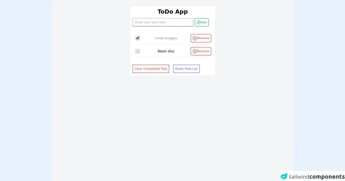
A ToDo List App is a simple application that allows you to create and manage a list of tasks. The UI of a ToDo List App typically consists of a list of tasks, an input field to add new tasks, and buttons to mark tasks as completed or delete them.
Why use Tailwind CSS to create a ToDo List App - Ui ui component?
Tailwind CSS is the perfect tool to use for creating a ToDo List App UI because it allows you to quickly and easily create custom designs without writing any CSS code. With Tailwind CSS, you can create a stunning UI for your ToDo List App in a fraction of the time it would take to write CSS code from scratch.
The preview of ToDo List App - Ui ui component.
Free download of the ToDo List App - Ui's source code
The source code of ToDo List App - Ui ui component.
<html lang="en">
<head>
    <meta charset="UTF-8">
    <meta http-equiv="X-UA-Compatible" content="IE=edge">
    <meta name="viewport" content="width=device-width, initial-scale=1.0">
    <title>ToDo App</title>
    <link href="https://unpkg.com/[email protected]/dist/tailwind.min.css" rel="stylesheet">
</head>
<body>
    <div class="w-full h-screen bg-gray-100 pt-8">
        <div class="bg-white p-3 max-w-md mx-auto">
            <div class="text-center">
                <h1 class="text-3xl font-bold">ToDo App</h1>
                <div class="mt-4 flex">
                    <input
                        class="w-80 border-b-2 border-gray-500 text-black"
                        type="text" placeholder="Enter your task here"
                    />
                    <button
                        class="ml-2 border-2 border-green-500 p-2 text-green-500 hover:text-white hover:bg-green-500 rounded-lg flex"
                    >
                        <svg class="h-6 w-6"  width="24" height="24" viewBox="0 0 24 24" stroke-width="2" stroke="currentColor" fill="none" stroke-linecap="round" stroke-linejoin="round">  <path stroke="none" d="M0 0h24v24H0z"/>  <circle cx="12" cy="12" r="9" />  <line x1="9" y1="12" x2="15" y2="12" />  <line x1="12" y1="9" x2="12" y2="15" /></svg>
                        <span>Add</span>
                    </button>
                </div>
            </div>
            <div class="mt-8">
                <ul>
                        <li class="p-2 rounded-lg" >
                            <div class="flex align-middle flex-row justify-between">
                                <div class="p-2">
                                    <input type="checkbox" class="h-6 w-6 " value="true" checked/>
                                </div>
                                <div class="p-2">
                                    <p class="text-lg line-through text-gray-400">Cook maggie</p>
                                </div>
                                <button
                                    class="flex text-red-500 border-2 border-red-500 p-2 rounded-lg">
                                    <svg class="h-6 w-6 text-red-500"  viewBox="0 0 24 24"  fill="none"  stroke="currentColor"  stroke-width="2"  stroke-linecap="round"  stroke-linejoin="round">  <circle cx="12" cy="12" r="10" />  <line x1="15" y1="9" x2="9" y2="15" />  <line x1="9" y1="9" x2="15" y2="15" /></svg>
                                    <span>Remove</span>
                                </button>
                            </div>
                            <hr class="mt-2"/>
                        </li>
                        <li class="p-2 rounded-lg" >
                            <div class="flex align-middle flex-row justify-between">
                                <div class="p-2">
                                    <input type="checkbox" class="h-6 w-6 " value="true" />
                                </div>
                                <div class="p-2">
                                    <p class="text-lg text-black">Wash disc</p>
                                </div>
                                <button
                                    class="flex text-red-500 border-2 border-red-500 p-2 rounded-lg">
                                    <svg class="h-6 w-6 text-red-500"  viewBox="0 0 24 24"  fill="none"  stroke="currentColor"  stroke-width="2"  stroke-linecap="round"  stroke-linejoin="round">  <circle cx="12" cy="12" r="10" />  <line x1="15" y1="9" x2="9" y2="15" />  <line x1="9" y1="9" x2="15" y2="15" /></svg>
                                    <span>Remove</span>
                                </button>
                            </div>
                            <hr class="mt-2"/>
                        </li>
                </ul>
            </div>
            <div class="mt-8">
                <button
                    class="border-2 border-red-500 p-2 text-red-500"
                >Clear Completed Task</button>
                <button
                    class="border-2 border-indigo-500 p-2 text-indigo-500 ml-4"
                >Reset Todo List</button>
            </div>
        </div>
    </div>
</body>
</html>
How to create a ToDo List App - Ui with Tailwind CSS?
To create a ToDo List App UI with Tailwind CSS, follow these steps:
Step 1: Set up your development environment
Before you can start building your ToDo List App UI, you need to set up your development environment. You will need a code editor, a web browser, and a local web server.
Step 2: Create the HTML structure
The first step in creating your ToDo List App UI is to create the HTML structure. This will include a list of tasks, an input field to add new tasks, and buttons to mark tasks as completed or delete them.
Step 3: Style the UI with Tailwind CSS
Once you have created the HTML structure, you can start styling the UI with Tailwind CSS. Tailwind CSS provides a set of pre-defined CSS classes that you can use to style your UI. You can customize these classes to create a unique design for your ToDo List App.
Step 4: Add interactivity with JavaScript
The final step in creating your ToDo List App UI is to add interactivity with JavaScript. You will need to write JavaScript code to handle user interactions such as adding new tasks, marking tasks as completed, and deleting tasks.
Conclusion
In conclusion, Tailwind CSS is the perfect tool to use for creating a stunning UI for your ToDo List App. With its pre-defined CSS classes and customization options, you can quickly and easily create a custom design without writing any CSS code. By following the steps outlined in this article, you can create a ToDo List App UI with Tailwind CSS in no time.