- Published on
How to Make A Toaster Notification With Tailwind CSS?
- What is Tailwind CSS?
- The description of Toaster Notification UI component
- Why use Tailwind CSS to create a Toaster Notification UI component?
- The preview of Toaster Notification UI component
- The source code of Toaster Notification UI component
- How to create a Toaster Notification with Tailwind CSS?
- Conclusion
As a FrontEnd technology blogger, it is important to stay up-to-date with the latest trends and tools in the industry. One such tool that has gained popularity in recent years is Tailwind CSS. In this article, we will explore how to create a Toaster Notification UI component using Tailwind CSS.
What is Tailwind CSS?
Tailwind CSS is a utility-first CSS framework that provides a set of pre-defined CSS classes that can be used to quickly style HTML elements. It allows developers to focus on writing HTML and JavaScript, while the CSS is taken care of by Tailwind.
The description of Toaster Notification UI component
A Toaster Notification is a UI component that displays a short message to the user, usually at the bottom or top of the screen. It is commonly used to display notifications such as success messages, error messages, or warnings.
Why use Tailwind CSS to create a Toaster Notification UI component?
Tailwind CSS provides a set of pre-defined CSS classes that can be used to quickly style HTML elements. This makes it easy to create a Toaster Notification UI component without having to write custom CSS. Additionally, Tailwind CSS is highly customizable, which allows developers to create unique designs that match their brand.
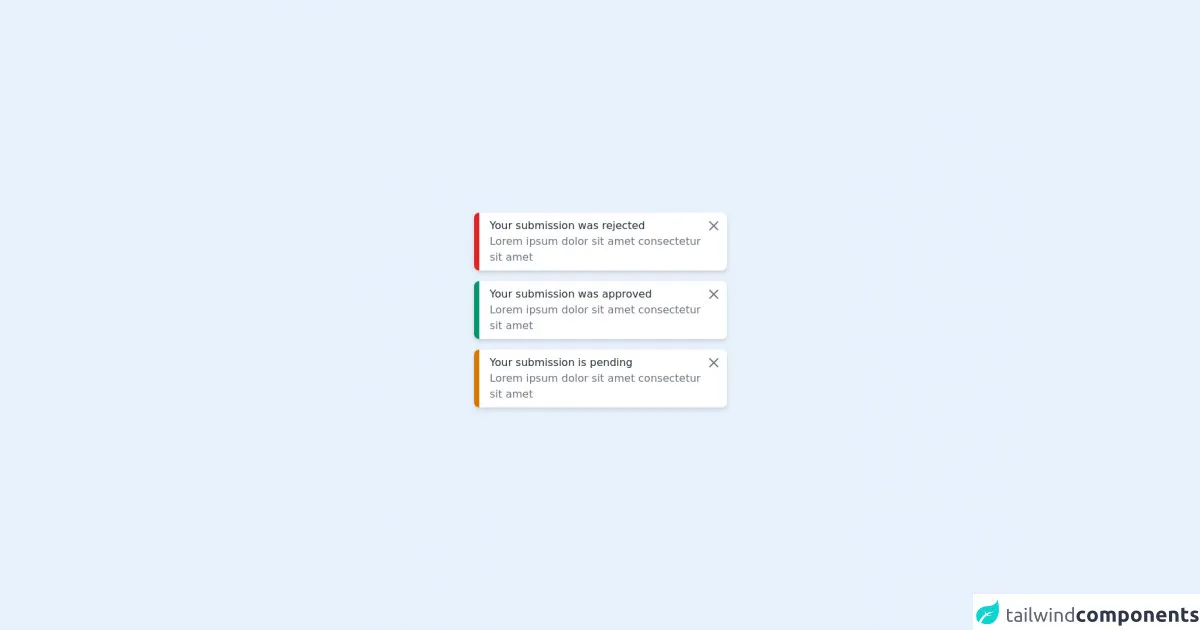
The preview of Toaster Notification UI component
Toaster Notification UI component is a simple and effective way to display notifications to users. It can be customized to match the design of your website or application.
Free download of the Toaster Notification's source code
The source code of Toaster Notification UI component
The source code for a Toaster Notification UI component is relatively simple. It consists of an HTML element and a few CSS classes.
<div class="w-full h-screen flex flex-col items-center justify-center">
    <div class="mb-4">
        <div class="flex max-w-sm w-full bg-white shadow-md rounded-lg overflow-hidden mx-auto">
            <div class="w-2 bg-red-600">
            </div>
            <div class="w-full flex justify-between items-start px-2 py-2">
                <div class="flex flex-col ml-2">
                    <label class="text-gray-800">Your submission was rejected</label>
                    <p class="text-gray-500 ">Lorem ipsum dolor sit amet consectetur sit amet
                </div>
                <a href="#">
                    <svg xmlns="http://www.w3.org/2000/svg" class="h-6 w-6 text-gray-500" fill="none" viewBox="0 0 24 24" stroke="currentColor">
                        <path stroke-linecap="round" stroke-linejoin="round" stroke-width="2" d="M6 18L18 6M6 6l12 12" />
                    </svg>
                </a>
            </div>
        </div>
    </div>
    <div class="mb-4">
        <div class="flex max-w-sm w-full bg-white shadow-md rounded-lg overflow-hidden mx-auto">
            <div class="w-2 bg-green-600">
            </div>
            <div class="w-full flex justify-between items-start px-2 py-2">
                <div class="flex flex-col ml-2">
                    <label class="text-gray-800">Your submission was approved</label>
                    <p class="text-gray-500 ">Lorem ipsum dolor sit amet consectetur sit amet
                </div>
                <a href="#">
                    <svg xmlns="http://www.w3.org/2000/svg" class="h-6 w-6 text-gray-500" fill="none" viewBox="0 0 24 24" stroke="currentColor">
                        <path stroke-linecap="round" stroke-linejoin="round" stroke-width="2" d="M6 18L18 6M6 6l12 12" />
                    </svg>
                </a>
            </div>
        </div>
    </div>
    <div class="mb-4">
        <div class="flex max-w-sm w-full bg-white shadow-md rounded-lg overflow-hidden mx-auto">
            <div class="w-2 bg-yellow-600">
            </div>
            <div class="w-full flex justify-between items-start px-2 py-2">
                <div class="flex flex-col ml-2">
                    <label class="text-gray-800">Your submission is pending</label>
                    <p class="text-gray-500 ">Lorem ipsum dolor sit amet consectetur sit amet
                </div>
                <a href="#">
                    <svg xmlns="http://www.w3.org/2000/svg" class="h-6 w-6 text-gray-500" fill="none" viewBox="0 0 24 24" stroke="currentColor">
                        <path stroke-linecap="round" stroke-linejoin="round" stroke-width="2" d="M6 18L18 6M6 6l12 12" />
                    </svg>
                </a>
            </div>
        </div>
    </div>
</div>
How to create a Toaster Notification with Tailwind CSS?
To create a Toaster Notification with Tailwind CSS, follow these steps:
Create an HTML element for the Toaster Notification. This can be a
divor asectionelement.Add the necessary CSS classes to the HTML element. For example, you can use the
bg-green-500class to set the background color to green.Add the content of the notification inside the HTML element. This can be text or HTML.
Use JavaScript to show and hide the Toaster Notification as needed.
Here is an example of a Toaster Notification created with Tailwind CSS:
<div class="fixed bottom-0 right-0 p-4 bg-green-500 text-white">
  Your changes have been saved successfully.
</div>
In this example, we have used the fixed, bottom-0, right-0, p-4, bg-green-500, and text-white classes to position the Toaster Notification at the bottom right of the screen, set the padding to 4, set the background color to green, and set the text color to white.
Conclusion
In conclusion, Tailwind CSS is a powerful tool that can be used to create beautiful and functional UI components such as Toaster Notifications. By using pre-defined CSS classes, developers can quickly and easily style HTML elements without having to write custom CSS. This saves time and allows developers to focus on writing HTML and JavaScript, which are the core components of any web application.