- Published on
A Complete Guide To Create A Toast Notification With Tailwind CSS
- What is Tailwind CSS?
- The description of Toast Notification UI component
- Why use Tailwind CSS to create a Toast Notification UI component?
- The preview of Toast Notification UI component
- The source code of Toast Notification UI component
- How to create a Toast Notification with Tailwind CSS?
- Conclusion
What is Tailwind CSS?
Tailwind CSS is a utility-first CSS framework that helps you create responsive and customizable UI components quickly and easily. It provides a set of pre-defined classes that you can use to style your HTML elements without writing any custom CSS.
The description of Toast Notification UI component
Toast Notification is a UI component that displays a short message to the user to notify them of an event or action. It is usually displayed at the top or bottom of the screen and disappears automatically after a few seconds.
Why use Tailwind CSS to create a Toast Notification UI component?
Tailwind CSS provides a set of pre-defined classes that you can use to create a Toast Notification UI component quickly and easily. You don't have to write any custom CSS, which saves you a lot of time and effort. Also, Tailwind CSS is highly customizable, so you can easily modify the styles of the Toast Notification UI component to match your design requirements.
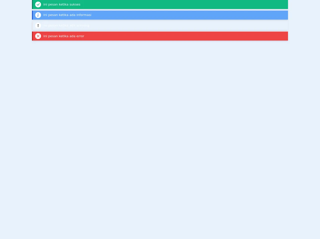
The preview of Toast Notification UI component
To create a Toast Notification UI component with Tailwind CSS, you can use the following classes:
<div class="bg-green-500 text-white font-bold rounded-t px-4 py-2">
  Success
</div>
Free download of the Toast Notification's source code
The source code of Toast Notification UI component
To create a Toast Notification UI component with Tailwind CSS, you can use the following classes:
<div class="bg-green-500 text-white font-bold rounded-t px-4 py-2">
  Success
</div>
<!-- Toast Container -->
  <!-- put taost notification in here , to cope when the toast more than one -->
  <!-- class="absolute right-0 top-0 m-5" For put toast on top right -->
  <div class="flex flex-col jusctify-center">

    <!-- Toast Notification Success-->
    <div class="flex items-center bg-green-500 border-l-4 border-green-700 py-2 px-3 shadow-md mb-2">
       <!-- icons -->
      <div class="text-green-500 rounded-full bg-white mr-3">
        <svg width="1.8em" height="1.8em" viewBox="0 0 16 16" class="bi bi-check" fill="currentColor" xmlns="http://www.w3.org/2000/svg">
          <path fill-rule="evenodd" d="M10.97 4.97a.75.75 0 0 1 1.071 1.05l-3.992 4.99a.75.75 0 0 1-1.08.02L4.324 8.384a.75.75 0 1 1 1.06-1.06l2.094 2.093 3.473-4.425a.236.236 0 0 1 .02-.022z"/>
        </svg>
      </div>
      <!-- message -->
      <div class="text-white max-w-xs ">
        ini pesan ketika sukses
      </div>
    </div>

    <!-- Toast Notification Info -->
    <div class="flex items-center bg-blue-400 border-l-4 border-blue-700 py-2 px-3 shadow-md mb-2">
      <!-- icons -->
     <div class="text-blue-500 rounded-full bg-white mr-3">
      <svg width="1.8em" height="1.8em" viewBox="0 0 16 16" class="bi bi-info" fill="currentColor" xmlns="http://www.w3.org/2000/svg">
        <path d="M8.93 6.588l-2.29.287-.082.38.45.083c.294.07.352.176.288.469l-.738 3.468c-.194.897.105 1.319.808 1.319.545 0 1.178-.252 1.465-.598l.088-.416c-.2.176-.492.246-.686.246-.275 0-.375-.193-.304-.533L8.93 6.588z"/>
        <circle cx="8" cy="4.5" r="1"/>
      </svg>
     </div>
     <!-- message -->
     <div class="text-white max-w-xs ">
       ini pesan ketika ada informasi
     </div>
   </div>

    <!-- Toast Notification Warning -->
    <div class="flex items-center bg-orange-400 border-l-4 border-orange-700 py-2 px-3 shadow-md mb-2">
       <!-- icons -->
      <div class="text-orange-500 rounded-full bg-white mr-3">
        <svg width="1.8em" height="1.8em" viewBox="0 0 16 16" class="bi bi-exclamation" fill="currentColor" xmlns="http://www.w3.org/2000/svg">
          <path d="M7.002 11a1 1 0 1 1 2 0 1 1 0 0 1-2 0zM7.1 4.995a.905.905 0 1 1 1.8 0l-.35 3.507a.552.552 0 0 1-1.1 0L7.1 4.995z"/>
        </svg>
      </div>
      <!-- message -->
      <div class="text-white max-w-xs ">
        ini pesan ketika ada warning
      </div>
    </div>

    <!-- Toast Notification Danger -->
    <div class="flex items-center bg-red-500 border-l-4 border-red-700 py-2 px-3 shadow-md mb-2" >
      <!-- icons -->
     <div class="text-red-500 rounded-full bg-white mr-3">
      <svg width="1.8em" height="1.8em" viewBox="0 0 16 16" class="bi bi-x" fill="currentColor" xmlns="http://www.w3.org/2000/svg">
        <path fill-rule="evenodd" d="M11.854 4.146a.5.5 0 0 1 0 .708l-7 7a.5.5 0 0 1-.708-.708l7-7a.5.5 0 0 1 .708 0z"/>
        <path fill-rule="evenodd" d="M4.146 4.146a.5.5 0 0 0 0 .708l7 7a.5.5 0 0 0 .708-.708l-7-7a.5.5 0 0 0-.708 0z"/>
      </svg>
     </div>
     <!-- message -->
     <div class="text-white max-w-xs ">
       ini pesan ketika ada error
     </div>
   </div>
How to create a Toast Notification with Tailwind CSS?
To create a Toast Notification UI component with Tailwind CSS, follow these steps:
- Create a new HTML file and add the following code:
<div class="fixed bottom-0 right-0 mb-4 mr-4">
  <div class="bg-green-500 text-white font-bold rounded-t px-4 py-2">
    Success
  </div>
</div>
Save the file and open it in your web browser. You should see a green box with the text "Success" at the bottom right corner of the screen.
To make the Toast Notification UI component disappear automatically after a few seconds, you can use JavaScript. Add the following code to your HTML file:
<script>
  setTimeout(function() {
    document.querySelector('.fixed').remove();
  }, 3000);
</script>
This code will remove the entire Toast Notification UI component after 3 seconds.
- To customize the styles of the Toast Notification UI component, you can use Tailwind CSS classes. For example, to change the background color of the Toast Notification UI component to red, you can use the
bg-red-500class:
<div class="fixed bottom-0 right-0 mb-4 mr-4">
  <div class="bg-red-500 text-white font-bold rounded-t px-4 py-2">
    Error
  </div>
</div>
- Save the file and open it in your web browser. You should see a red box with the text "Error" at the bottom right corner of the screen.
Conclusion
In this article, we have learned how to create a Toast Notification UI component with Tailwind CSS. We have seen that Tailwind CSS provides a set of pre-defined classes that you can use to create UI components quickly and easily. Also, we have learned how to customize the styles of the Toast Notification UI component to match our design requirements. With Tailwind CSS, creating UI components has never been easier!