- Published on
What You Need To Create A Toast With Tailwind CSS
- The description of Toast UI component
- Why use Tailwind CSS to create a Toast UI component?
- The preview of Toast UI component
- The source code of Toast UI component
- How to create a Toast with Tailwind CSS?
- Conclusion
Tailwind CSS is a utility-first CSS framework that makes it easy to create custom designs without writing any CSS. It provides a set of pre-defined classes that you can use to style your HTML elements. With Tailwind CSS, you can create responsive and mobile-first designs quickly and easily.
The description of Toast UI component
A toast is a small notification that appears on the screen to inform the user about a specific event or action. It is a simple and effective way to provide feedback to the user without interrupting their workflow. The Toast UI component is a popular UI component that is used to display toasts on web pages. It is easy to use and can be customized to fit the design of your website.
Why use Tailwind CSS to create a Toast UI component?
Tailwind CSS provides a set of pre-defined classes that can be used to create a Toast UI component quickly and easily. It also provides responsive design capabilities, which means that the Toast UI component will look great on any device, whether it is a desktop computer or a mobile device.
Using Tailwind CSS to create a Toast UI component also ensures that the component is consistent with the rest of your website's design. Since Tailwind CSS provides a set of pre-defined classes, you can easily match the styles of the Toast UI component with the styles of other elements on your website.
The preview of Toast UI component
To create a Toast UI component with Tailwind CSS, you can use the following classes:
- bg-green-500: sets the background color to green
- text-white: sets the text color to white
- px-6: adds padding to the left and right of the element
- py-4: adds padding to the top and bottom of the element
- rounded-md: rounds the corners of the element
Free download of the Toast's source code
The source code of Toast UI component
To create a Toast UI component with Tailwind CSS, you can use the following HTML and CSS code:
HTML:
<div class="bg-green-500 text-white px-6 py-4 rounded-md">
  This is a toast message.
</div>
CSS:
/* No CSS required */
<!-- This is an example component -->
<div class="max-w-2xl mx-auto">
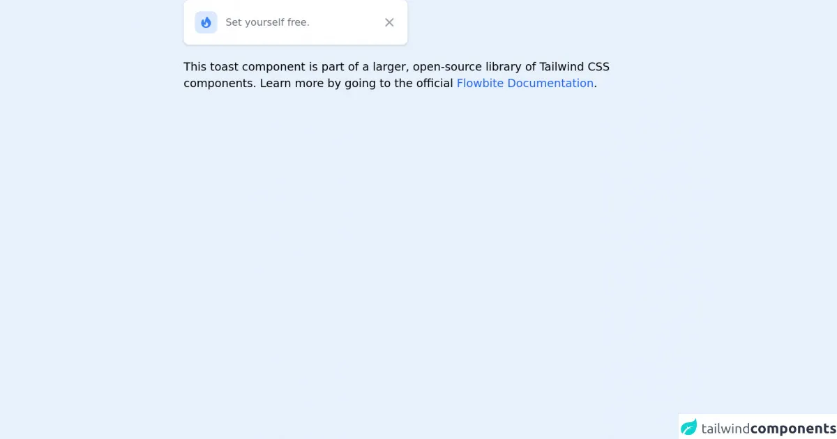
<div id="toast-default"
class="flex items-center w-full max-w-xs p-4 text-gray-500 bg-white rounded-lg shadow dark:text-gray-400 dark:bg-gray-800"
role="alert">
<div
class="inline-flex items-center justify-center flex-shrink-0 w-8 h-8 text-blue-500 bg-blue-100 rounded-lg dark:bg-blue-800 dark:text-blue-200">
<svg class="w-5 h-5" fill="currentColor" viewBox="0 0 20 20" xmlns="http://www.w3.org/2000/svg">
<path fill-rule="evenodd"
d="M12.395 2.553a1 1 0 00-1.45-.385c-.345.23-.614.558-.822.88-.214.33-.403.713-.57 1.116-.334.804-.614 1.768-.84 2.734a31.365 31.365 0 00-.613 3.58 2.64 2.64 0 01-.945-1.067c-.328-.68-.398-1.534-.398-2.654A1 1 0 005.05 6.05 6.981 6.981 0 003 11a7 7 0 1011.95-4.95c-.592-.591-.98-.985-1.348-1.467-.363-.476-.724-1.063-1.207-2.03zM12.12 15.12A3 3 0 017 13s.879.5 2.5.5c0-1 .5-4 1.25-4.5.5 1 .786 1.293 1.371 1.879A2.99 2.99 0 0113 13a2.99 2.99 0 01-.879 2.121z"
clip-rule="evenodd"></path>
</svg>
</div>
<div class="ml-3 text-sm font-normal">Set yourself free.</div>
<button type="button" class="ml-auto -mx-1.5 -my-1.5 bg-white text-gray-400 hover:text-gray-900 rounded-lg focus:ring-2 focus:ring-gray-300 p-1.5 hover:bg-gray-100 inline-flex h-8 w-8 dark:text-gray-500 dark:hover:text-white dark:bg-gray-800 dark:hover:bg-gray-700" data-collapse-toggle="toast-default" aria-label="Close">
<span class="sr-only">Close</span>
<svg class="w-5 h-5" fill="currentColor" viewBox="0 0 20 20" xmlns="http://www.w3.org/2000/svg"><path fill-rule="evenodd" d="M4.293 4.293a1 1 0 011.414 0L10 8.586l4.293-4.293a1 1 0 111.414 1.414L11.414 10l4.293 4.293a1 1 0 01-1.414 1.414L10 11.414l-4.293 4.293a1 1 0 01-1.414-1.414L8.586 10 4.293 5.707a1 1 0 010-1.414z" clip-rule="evenodd"></path></svg>
</button>
</div>
<p class="mt-5">This toast component is part of a larger, open-source library of Tailwind CSS components. Learn more
by going to the official <a class="text-blue-600 hover:underline"
href="https://flowbite.com/docs/getting-started/introduction/" target="_blank">Flowbite Documentation</a>.
</p>
</div>
How to create a Toast with Tailwind CSS?
To create a Toast with Tailwind CSS, you can follow these steps:
- Create a new HTML file and add the following code:
<!DOCTYPE html>
<html>
  <head>
    <title>Toast with Tailwind CSS</title>
    <link rel="stylesheet" href="https://cdn.jsdelivr.net/npm/[email protected]/dist/tailwind.min.css">
  </head>
  <body>
    <div class="bg-green-500 text-white px-6 py-4 rounded-md">
      This is a toast message.
    </div>
  </body>
</html>
Save the file as
index.html.Open the file in your web browser to see the Toast UI component.
Customize the Toast UI component by adding or removing classes from the
divelement. For example, you can change the background color by using a different color class, such asbg-red-500.
Conclusion
Creating a Toast UI component with Tailwind CSS is easy and straightforward. By using pre-defined classes, you can create a Toast UI component that matches the design of your website quickly and easily. Tailwind CSS also provides responsive design capabilities, which means that the Toast UI component will look great on any device. With Tailwind CSS, you can create custom designs without writing any CSS, making it an excellent choice for FrontEnd developers who want to create beautiful and responsive designs quickly and easily.