- Published on
How To Build A Testimonials block With Tailwind CSS From Scratch
- What is Tailwind CSS?
- The Description of Testimonials Block UI Component
- Why Use Tailwind CSS to Create a Testimonials Block UI Component?
- The Preview of Testimonials Block UI Component
- The Source Code of Testimonials Block UI Component
- How to Create a Testimonials Block with Tailwind CSS?
- Conclusion
As a FrontEnd technology blogger, I am always looking for ways to improve my UI components. One of the most important components of any website is the testimonials block. In this article, I will show you how to build a testimonials block with Tailwind CSS from scratch.
What is Tailwind CSS?
Tailwind CSS is a utility-first CSS framework that allows you to quickly build custom designs without writing any custom CSS. It provides a set of pre-defined classes that you can use to style your UI components.
The Description of Testimonials Block UI Component
A testimonials block is a UI component that displays customer reviews or feedback. It is usually placed on the homepage or product page of a website to showcase the positive experiences of customers.
Why Use Tailwind CSS to Create a Testimonials Block UI Component?
Tailwind CSS provides a set of pre-defined classes that can be used to create a testimonials block quickly and easily. It also allows you to customize the design of the block without writing any custom CSS.
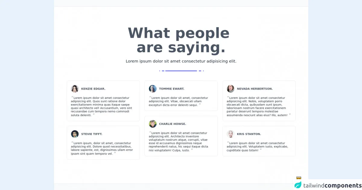
The Preview of Testimonials Block UI Component
To create a testimonials block with Tailwind CSS, we will use a combination of flexbox and grid layout. The block will contain a header, a list of testimonials, and a footer. The header will contain a title and a subtitle, and the footer will contain a link to the full list of testimonials.
Free download of the Testimonials block's source code
The Source Code of Testimonials Block UI Component
To create the testimonials block, we will use the following HTML and CSS code:
<style>@import url('https://cdnjs.cloudflare.com/ajax/libs/MaterialDesign-Webfont/5.3.45/css/materialdesignicons.min.css')</style>

<div class="min-w-screen min-h-screen bg-gray-50 flex items-center justify-center py-5">
    <div class="w-full bg-white border-t border-b border-gray-200 px-5 py-16 md:py-24 text-gray-800">
        <div class="w-full max-w-6xl mx-auto">
            <div class="text-center max-w-xl mx-auto">
                <h1 class="text-6xl md:text-7xl font-bold mb-5 text-gray-600">What people <br>are saying.</h1>
                <h3 class="text-xl mb-5 font-light">Lorem ipsum dolor sit amet consectetur adipisicing elit.</h3>
                <div class="text-center mb-10">
                    <span class="inline-block w-1 h-1 rounded-full bg-indigo-500 ml-1"></span>
                    <span class="inline-block w-3 h-1 rounded-full bg-indigo-500 ml-1"></span>
                    <span class="inline-block w-40 h-1 rounded-full bg-indigo-500"></span>
                    <span class="inline-block w-3 h-1 rounded-full bg-indigo-500 ml-1"></span>
                    <span class="inline-block w-1 h-1 rounded-full bg-indigo-500 ml-1"></span>
                </div>
            </div>
            <div class="-mx-3 md:flex items-start">
                <div class="px-3 md:w-1/3">
                    <div class="w-full mx-auto rounded-lg bg-white border border-gray-200 p-5 text-gray-800 font-light mb-6">
                        <div class="w-full flex mb-4 items-center">
                            <div class="overflow-hidden rounded-full w-10 h-10 bg-gray-50 border border-gray-200">
                                <img src="https://i.pravatar.cc/100?img=1" alt="">
                            </div>
                            <div class="flex-grow pl-3">
                                <h6 class="font-bold text-sm uppercase text-gray-600">Kenzie Edgar.</h6>
                            </div>
                        </div>
                        <div class="w-full">
                            <p class="text-sm leading-tight"><span class="text-lg leading-none italic font-bold text-gray-400 mr-1">"</span>Lorem ipsum dolor sit amet consectetur adipisicing elit. Quos sunt ratione dolor exercitationem minima quas itaque saepe quasi architecto vel! Accusantium, vero sint recusandae cum tempora nemo commodi soluta deleniti.<span class="text-lg leading-none italic font-bold text-gray-400 ml-1">"</span></p>
                        </div>
                    </div>
                    <div class="w-full mx-auto rounded-lg bg-white border border-gray-200 p-5 text-gray-800 font-light mb-6">
                        <div class="w-full flex mb-4 items-center">
                            <div class="overflow-hidden rounded-full w-10 h-10 bg-gray-50 border border-gray-200">
                                <img src="https://i.pravatar.cc/100?img=2" alt="">
                            </div>
                            <div class="flex-grow pl-3">
                                <h6 class="font-bold text-sm uppercase text-gray-600">Stevie Tifft.</h6>
                            </div>
                        </div>
                        <div class="w-full">
                            <p class="text-sm leading-tight"><span class="text-lg leading-none italic font-bold text-gray-400 mr-1">"</span>Lorem ipsum, dolor sit amet, consectetur adipisicing elit. Dolore quod necessitatibus, labore sapiente, est, dignissimos ullam error ipsam sint quam tempora vel.<span class="text-lg leading-none italic font-bold text-gray-400 ml-1">"</span></p>
                        </div>
                    </div>
                </div>
                <div class="px-3 md:w-1/3">
                    <div class="w-full mx-auto rounded-lg bg-white border border-gray-200 p-5 text-gray-800 font-light mb-6">
                        <div class="w-full flex mb-4 items-center">
                            <div class="overflow-hidden rounded-full w-10 h-10 bg-gray-50 border border-gray-200">
                                <img src="https://i.pravatar.cc/100?img=3" alt="">
                            </div>
                            <div class="flex-grow pl-3">
                                <h6 class="font-bold text-sm uppercase text-gray-600">Tommie Ewart.</h6>
                            </div>
                        </div>
                        <div class="w-full">
                            <p class="text-sm leading-tight"><span class="text-lg leading-none italic font-bold text-gray-400 mr-1">"</span>Lorem ipsum dolor sit amet, consectetur adipisicing elit. Vitae, obcaecati ullam excepturi dicta error deleniti sequi.<span class="text-lg leading-none italic font-bold text-gray-400 ml-1">"</span></p>
                        </div>
                    </div>
                    <div class="w-full mx-auto rounded-lg bg-white border border-gray-200 p-5 text-gray-800 font-light mb-6">
                        <div class="w-full flex mb-4 items-center">
                            <div class="overflow-hidden rounded-full w-10 h-10 bg-gray-50 border border-gray-200">
                                <img src="https://i.pravatar.cc/100?img=4" alt="">
                            </div>
                            <div class="flex-grow pl-3">
                                <h6 class="font-bold text-sm uppercase text-gray-600">Charlie Howse.</h6>
                            </div>
                        </div>
                        <div class="w-full">
                            <p class="text-sm leading-tight"><span class="text-lg leading-none italic font-bold text-gray-400 mr-1">"</span>Lorem ipsum dolor sit amet consectetur adipisicing elit. Architecto inventore voluptatum nostrum atque, corrupti, vitae esse id accusamus dignissimos neque reprehenderit natus, hic sequi itaque dicta nisi voluptatem! Culpa, iusto.<span class="text-lg leading-none italic font-bold text-gray-400 ml-1">"</span></p>
                        </div>
                    </div>
                </div>
                <div class="px-3 md:w-1/3">
                    <div class="w-full mx-auto rounded-lg bg-white border border-gray-200 p-5 text-gray-800 font-light mb-6">
                        <div class="w-full flex mb-4 items-center">
                            <div class="overflow-hidden rounded-full w-10 h-10 bg-gray-50 border border-gray-200">
                                <img src="https://i.pravatar.cc/100?img=5" alt="">
                            </div>
                            <div class="flex-grow pl-3">
                                <h6 class="font-bold text-sm uppercase text-gray-600">Nevada Herbertson.</h6>
                            </div>
                        </div>
                        <div class="w-full">
                            <p class="text-sm leading-tight"><span class="text-lg leading-none italic font-bold text-gray-400 mr-1">"</span>Lorem ipsum dolor sit amet consectetur adipisicing elit. Nobis, voluptatem porro obcaecati dicta, quibusdam sunt ipsum, laboriosam nostrum facere exercitationem pariatur deserunt tempora molestiae assumenda nesciunt alias eius? Illo, autem!<span class="text-lg leading-none italic font-bold text-gray-400 ml-1">"</span></p>
                        </div>
                    </div>
                    <div class="w-full mx-auto rounded-lg bg-white border border-gray-200 p-5 text-gray-800 font-light mb-6">
                        <div class="w-full flex mb-4 items-center">
                            <div class="overflow-hidden rounded-full w-10 h-10 bg-gray-50 border border-gray-200">
                                <img src="https://i.pravatar.cc/100?img=6" alt="">
                            </div>
                            <div class="flex-grow pl-3">
                                <h6 class="font-bold text-sm uppercase text-gray-600">Kris Stanton.</h6>
                            </div>
                        </div>
                        <div class="w-full">
                            <p class="text-sm leading-tight"><span class="text-lg leading-none italic font-bold text-gray-400 mr-1">"</span>Lorem ipsum dolor sit amet consectetur adipisicing elit. Voluptatem iusto, explicabo, cupiditate quas totam!<span class="text-lg leading-none italic font-bold text-gray-400 ml-1">"</span></p>
                        </div>
                    </div>
                </div>
            </div>
        </div>
    </div>
</div>

<!-- BUY ME A BEER AND HELP SUPPORT OPEN-SOURCE RESOURCES -->
<div class="flex items-end justify-end fixed bottom-0 right-0 mb-4 mr-4 z-10">
    <div>
        <a title="Buy me a beer" href="https://www.buymeacoffee.com/scottwindon" target="_blank" class="block w-16 h-16 rounded-full transition-all shadow hover:shadow-lg transform hover:scale-110 hover:rotate-12">
            <img class="object-cover object-center w-full h-full rounded-full" src="https://i.pinimg.com/originals/60/fd/e8/60fde811b6be57094e0abc69d9c2622a.jpg"/>
        </a>
    </div>
</div>
How to Create a Testimonials Block with Tailwind CSS?
Step 1: Set up the HTML structure
The first step is to set up the HTML structure of the testimonials block. We will use a combination of flexbox and grid layout to create the block.
<div class="bg-gray-100">
  <div class="container mx-auto px-4 py-16">
    <div class="flex flex-col items-center">
      <h2 class="text-3xl font-bold mb-4">What Our Customers Say</h2>
      <p class="text-gray-600">Lorem ipsum dolor sit amet, consectetur adipiscing elit.</p>
    </div>
    <div class="grid grid-cols-1 md:grid-cols-2 lg:grid-cols-3 gap-8 mt-8">
      <div class="bg-white p-6 rounded-lg shadow-lg">
        <p class="text-gray-600 mb-4">Lorem ipsum dolor sit amet, consectetur adipiscing elit. Sed quis tortor vitae nunc ultricies congue.</p>
        <div class="flex items-center">
          <img src="https://via.placeholder.com/50" alt="avatar" class="rounded-full mr-4">
          <div>
            <h3 class="text-lg font-semibold">John Doe</h3>
            <p class="text-gray-600">CEO, Company Name</p>
          </div>
        </div>
      </div>
      <div class="bg-white p-6 rounded-lg shadow-lg">
        <p class="text-gray-600 mb-4">Lorem ipsum dolor sit amet, consectetur adipiscing elit. Sed quis tortor vitae nunc ultricies congue.</p>
        <div class="flex items-center">
          <img src="https://via.placeholder.com/50" alt="avatar" class="rounded-full mr-4">
          <div>
            <h3 class="text-lg font-semibold">Jane Doe</h3>
            <p class="text-gray-600">Marketing Manager, Company Name</p>
          </div>
        </div>
      </div>
      <div class="bg-white p-6 rounded-lg shadow-lg">
        <p class="text-gray-600 mb-4">Lorem ipsum dolor sit amet, consectetur adipiscing elit. Sed quis tortor vitae nunc ultricies congue.</p>
        <div class="flex items-center">
          <img src="https://via.placeholder.com/50" alt="avatar" class="rounded-full mr-4">
          <div>
            <h3 class="text-lg font-semibold">Bob Smith</h3>
            <p class="text-gray-600">CTO, Company Name</p>
          </div>
        </div>
      </div>
    </div>
    <div class="flex justify-center mt-8">
      <a href="#" class="text-blue-500 font-semibold">View All Testimonials</a>
    </div>
  </div>
</div>
Step 2: Style the testimonials block with Tailwind CSS
Next, we will use Tailwind CSS to style the testimonials block. We will use a combination of pre-defined classes and custom styles to create the design.
/* Set the background color of the block */
.bg-gray-100 {
  background-color: #f7fafc;
}

/* Set the font size and weight of the title */
.text-3xl {
  font-size: 1.875rem;
  font-weight: 700;
}

/* Set the font size and color of the subtitle */
.text-gray-600 {
  font-size: 1.125rem;
  color: #718096;
}

/* Set the background color, padding, and border radius of the testimonial card */
.bg-white {
  background-color: #ffffff;
  padding: 1.5rem;
  border-radius: 0.5rem;
}

/* Set the font size, color, and margin of the testimonial text */
.text-gray-600 {
  font-size: 1rem;
  color: #718096;
  margin-bottom: 1rem;
}

/* Set the font size, weight, and margin of the testimonial author name */
.text-lg {
  font-size: 1.125rem;
  font-weight: 700;
  margin-bottom: 0.25rem;
}

/* Set the font size and color of the testimonial author position */
.text-gray-600 {
  font-size: 1rem;
  color: #718096;
}

/* Set the size and border radius of the testimonial author avatar */
.rounded-full {
  width: 2.5rem;
  height: 2.5rem;
  border-radius: 9999px;
}

/* Set the font size, color, and font weight of the link to view all testimonials */
.text-blue-500 {
  font-size: 1.125rem;
  color: #4299e1;
  font-weight: 700;
}
Step 3: Preview the testimonials block
Finally, we can preview the testimonials block in the browser. The block should look like the following:
Conclusion
In this article, we have learned how to build a testimonials block with Tailwind CSS from scratch. We have used a combination of flexbox and grid layout to create the block, and we have used Tailwind CSS to style the block. With Tailwind CSS, we can quickly and easily create custom designs without writing any custom CSS.