- Published on
3 Things You Must Know To Create A Testimonial UI with TailwindCSS and AlpineJS With Tailwind CSS
- What is Tailwind CSS?
- The description of Testimonial UI with TailwindCSS and AlpineJS ui component
- Why use Tailwind CSS to create a Testimonial UI with TailwindCSS and AlpineJS ui component?
- The preview of Testimonial UI with TailwindCSS and AlpineJS ui component.
- The source code of Testimonial UI with TailwindCSS and AlpineJS ui component.
- How to create a Testimonial UI with TailwindCSS and AlpineJS with Tailwind CSS?
- Step 1: Set up the HTML structure
- Step 2: Add the CSS styles using Tailwind CSS
- Step 3: Add the JavaScript functionality using AlpineJS
- Conclusion
If you are a FrontEnd developer, you must have heard of Tailwind CSS and AlpineJS. Tailwind CSS is a utility-first CSS framework that helps you quickly build custom designs. AlpineJS is a lightweight JavaScript framework that helps you add interactivity to your web applications. In this article, we will discuss how to create a Testimonial UI with TailwindCSS and AlpineJS.
What is Tailwind CSS?
Tailwind CSS is a utility-first CSS framework that provides you with a set of pre-defined CSS classes that you can use to style your HTML elements. Unlike other CSS frameworks, Tailwind CSS does not come with pre-designed components. Instead, it provides you with a set of low-level utility classes that you can use to build your own custom components.
The description of Testimonial UI with TailwindCSS and AlpineJS ui component
A Testimonial UI is a component that is commonly used on websites to showcase customer testimonials. It usually consists of a carousel of testimonials that can be navigated using buttons or arrows. In this article, we will create a Testimonial UI using Tailwind CSS and AlpineJS.
Why use Tailwind CSS to create a Testimonial UI with TailwindCSS and AlpineJS ui component?
Tailwind CSS provides us with a set of pre-defined utility classes that we can use to quickly style our Testimonial UI. This saves us a lot of time and effort compared to writing custom CSS from scratch. Additionally, Tailwind CSS is highly customizable, which means we can easily modify the styles to match our design requirements.
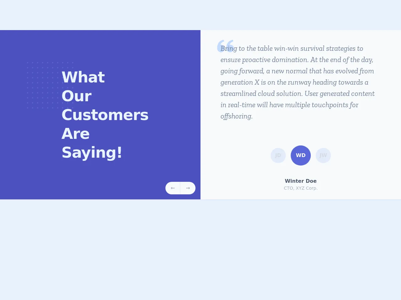
The preview of Testimonial UI with TailwindCSS and AlpineJS ui component.
Free download of the Testimonial UI with TailwindCSS and AlpineJS's source code
The source code of Testimonial UI with TailwindCSS and AlpineJS ui component.
<!-- This is an example component -->
<div>
<!DOCTYPE html>
<html lang="en">
<head>
<meta charset="utf-8" />
<meta name="description" content="" />
<meta name="viewport" content="width=device-width, initial-scale=1" />
<!-- Primary Meta Tags -->
<title>Testimonial with AplineJS and TailwindCSS</title>
<meta name="title" content="Content Title" />
<meta name="description" content="Content Description." />
<link href="https://fonts.googleapis.com/css2?family=Zilla+Slab:ital@1&display=swap" rel="stylesheet">
<link href="https://unpkg.com/tailwindcss@^1.0/dist/tailwind.min.css" rel="stylesheet">
<script src="https://cdn.jsdelivr.net/gh/alpinejs/[email protected]/dist/alpine.min.js" defer></script>
<style>
.serif {
font-family: 'Zilla Slab', serif;
}
[x-cloak] { display: none; }
.grid-indigo {
background-image: radial-gradient(#5a67d8 2px, transparent 2px);
background-size: 16px 16px;
}
</style>
</head>
<body class="antialiased sans-serif bg-gray-200 text-gray-600">
<div class="my-10 md:my-24 container mx-auto flex flex-col md:flex-row shadow-sm overflow-hidden" x-data="{ testimonialActive: 2 }" x-cloak>
<div class="relative w-full py-2 md:py-24 bg-indigo-700 md:w-1/2 flex flex-col item-center justify-center">
<div class="absolute top-0 left-0 z-10 grid-indigo w-16 h-16 md:w-40 md:h-40 md:ml-20 md:mt-24"></div>
<div class="relative text-2xl md:text-5xl py-2 px-6 md:py-6 md:px-1 md:w-64 md:mx-auto text-indigo-100 font-semibold leading-tight tracking-tight mb-0 z-20">
<span class="md:block">What Our</span>
<span class="md-block">Customers</span>
<span class="block">Are Saying!</span>
</div>
<div class="absolute right-0 bottom-0 mr-4 mb-4 hidden md:block">
<button
class="rounded-l-full border-r bg-gray-100 text-gray-500 focus:outline-none hover:text-indigo-500 font-bold w-12 h-10"
x-on:click="testimonialActive = testimonialActive === 1 ? 3 : testimonialActive - 1">
←
</button><button
class="rounded-r-full bg-gray-100 text-gray-500 focus:outline-none hover:text-indigo-500 font-bold w-12 h-10"
x-on:click="testimonialActive = testimonialActive >= 3 ? 1 : testimonialActive + 1">
→
</button>
</div>
</div>
<div class="bg-gray-100 md:w-1/2">
<div class="flex flex-col h-full relative">
<div class="absolute top-0 left-0 mt-3 ml-4 md:mt-5 md:ml-12">
<svg xmlns="http://www.w3.org/2000/svg" class="text-indigo-200 fill-current w-12 h-12 md:w-16 md:h-16" viewBox="0 0 24 24"><path d="M6.5 10c-.223 0-.437.034-.65.065.069-.232.14-.468.254-.68.114-.308.292-.575.469-.844.148-.291.409-.488.601-.737.201-.242.475-.403.692-.604.213-.21.492-.315.714-.463.232-.133.434-.28.65-.35.208-.086.39-.16.539-.222.302-.125.474-.197.474-.197L9.758 4.03c0 0-.218.052-.597.144C8.97 4.222 8.737 4.278 8.472 4.345c-.271.05-.56.187-.882.312C7.272 4.799 6.904 4.895 6.562 5.123c-.344.218-.741.4-1.091.692C5.132 6.116 4.723 6.377 4.421 6.76c-.33.358-.656.734-.909 1.162C3.219 8.33 3.02 8.778 2.81 9.221c-.19.443-.343.896-.468 1.336-.237.882-.343 1.72-.384 2.437-.034.718-.014 1.315.028 1.747.015.204.043.402.063.539.017.109.025.168.025.168l.026-.006C2.535 17.474 4.338 19 6.5 19c2.485 0 4.5-2.015 4.5-4.5S8.985 10 6.5 10zM17.5 10c-.223 0-.437.034-.65.065.069-.232.14-.468.254-.68.114-.308.292-.575.469-.844.148-.291.409-.488.601-.737.201-.242.475-.403.692-.604.213-.21.492-.315.714-.463.232-.133.434-.28.65-.35.208-.086.39-.16.539-.222.302-.125.474-.197.474-.197L20.758 4.03c0 0-.218.052-.597.144-.191.048-.424.104-.689.171-.271.05-.56.187-.882.312-.317.143-.686.238-1.028.467-.344.218-.741.4-1.091.692-.339.301-.748.562-1.05.944-.33.358-.656.734-.909 1.162C14.219 8.33 14.02 8.778 13.81 9.221c-.19.443-.343.896-.468 1.336-.237.882-.343 1.72-.384 2.437-.034.718-.014 1.315.028 1.747.015.204.043.402.063.539.017.109.025.168.025.168l.026-.006C13.535 17.474 15.338 19 17.5 19c2.485 0 4.5-2.015 4.5-4.5S19.985 10 17.5 10z"/></svg>
</div>
<div class="h-full relative z-10">
<div x-show.immediate="testimonialActive === 1">
<p class="text-gray-600 serif font-normal italic px-6 py-6 md:px-16 md:py-10 text-xl md:text-2xl" x-show.transition="testimonialActive == 1">
Leverage agile frameworks to provide a robust synopsis for high level overviews. Iterative approaches to corporate strategy foster collaborative thinking to further the overall value proposition. Organically grow the holistic world view of disruptive innovation via workplace diversity and empowerment.
</p>
</div>
<div x-show.immediate="testimonialActive === 2">
<p class="text-gray-600 serif font-normal italic px-6 py-6 md:px-16 md:py-10 text-xl md:text-2xl" x-show.transition="testimonialActive == 2">
Bring to the table win-win survival strategies to ensure proactive domination. At the end of the day, going forward, a new normal that has evolved from generation X is on the runway heading towards a streamlined cloud solution. User generated content in real-time will have multiple touchpoints for offshoring.
</p>
</div>
<div x-show.immediate="testimonialActive === 3">
<p class="text-gray-600 serif font-normal italic px-6 py-6 md:px-16 md:py-10 text-xl md:text-2xl" x-show.transition="testimonialActive == 3">
Capitalize on low hanging fruit to identify a ballpark value added activity to beta test. Override the digital divide with additional clickthroughs from DevOps. Nanotechnology immersion along the information highway will close the loop on focusing solely on the bottom line.
</p>
</div>
</div>
<div class="flex my-4 justify-center items-center">
<button
@click.prevent="testimonialActive = 1"
class="text-center font-bold shadow-xs focus:outline-none focus:shadow-outline inline-block rounded-full mx-2"
:class="{'h-12 w-12 opacity-25 bg-indigo-300 text-gray-600': testimonialActive != 1, 'h-16 w-16 opacity-100 bg-indigo-600 text-white': testimonialActive == 1 }"
>JD</button>
<button
@click.prevent="testimonialActive = 2"
class="text-center font-bold shadow-xs focus:outline-none focus:shadow-outline h-16 w-16 inline-block bg-indigo-600 rounded-full mx-2"
:class="{'h-12 w-12 opacity-25 bg-indigo-300 text-gray-600': testimonialActive != 2, 'h-16 w-16 opacity-100 bg-indigo-600 text-white': testimonialActive == 2 }"
>WD</button>
<button
@click.prevent="testimonialActive = 3"
class="text-center font-bold shadow-xs focus:outline-none focus:shadow-outline h-12 w-12 inline-block bg-indigo-600 rounded-full mx-2"
:class="{'h-12 w-12 opacity-25 bg-indigo-300 text-gray-600': testimonialActive != 3, 'h-16 w-16 opacity-100 bg-indigo-600 text-white': testimonialActive == 3 }"
>JW</button>
</div>
<div class="flex justify-center px-6 pt-2 pb-6 md:py-6">
<div class="text-center" x-show="testimonialActive == 1">
<h2 class="text-sm md:text-base font-bold text-gray-700 leading-tight">John Doe</h2>
<small class="text-gray-500 text-xs md:text-sm truncate">CEO, ABC Inc.</small>
</div>
<div class="text-center" x-show="testimonialActive == 2">
<h2 class="text-sm md:text-base font-bold text-gray-700 leading-tight">Winter Doe</h2>
<small class="text-gray-500 text-xs md:text-sm truncate">CTO, XYZ Corp.</small>
</div>
<div class="text-center" x-show="testimonialActive == 3">
<h2 class="text-sm md:text-base font-bold text-gray-700 leading-tight">John Wick</h2>
<small class="text-gray-500 text-xs md:text-sm truncate">Product Manager, Fake Corp.</small>
</div>
</div>
</div>
</div>
</div>
</body>
</html>
</div>
How to create a Testimonial UI with TailwindCSS and AlpineJS with Tailwind CSS?
Step 1: Set up the HTML structure
The first step is to set up the HTML structure for our Testimonial UI. We will use a div element with a class of testimonial-container to wrap our testimonials. Inside this container, we will create a div element for each testimonial with a class of testimonial. Each testimonial will consist of a quote and an image.
<div class="testimonial-container">
  <div class="testimonial">
    <blockquote class="text-lg font-medium mb-4">
      "Tailwind CSS is the best CSS framework I have ever used. It's so easy to customize and saves me a lot of time."
    </blockquote>
    <img src="https://via.placeholder.com/150" alt="Customer photo" class="rounded-full w-16 h-16 object-cover">
  </div>
  <div class="testimonial">
    <blockquote class="text-lg font-medium mb-4">
      "AlpineJS is a game-changer for JavaScript development. It's so lightweight and easy to use."
    </blockquote>
    <img src="https://via.placeholder.com/150" alt="Customer photo" class="rounded-full w-16 h-16 object-cover">
  </div>
  <div class="testimonial">
    <blockquote class="text-lg font-medium mb-4">
      "Using Tailwind CSS and AlpineJS together has made my web development workflow so much faster and more efficient."
    </blockquote>
    <img src="https://via.placeholder.com/150" alt="Customer photo" class="rounded-full w-16 h-16 object-cover">
  </div>
</div>
Step 2: Add the CSS styles using Tailwind CSS
Next, we will add the CSS styles using Tailwind CSS. We will use the flex and overflow-x utilities to create a horizontal carousel of testimonials. We will also use the transform and transition utilities to animate the carousel when the user clicks the navigation buttons.
<div class="testimonial-container flex overflow-x-auto">
  <div class="testimonial flex-shrink-0 w-72 mr-4">
    <blockquote class="text-lg font-medium mb-4">
      "Tailwind CSS is the best CSS framework I have ever used. It's so easy to customize and saves me a lot of time."
    </blockquote>
    <img src="https://via.placeholder.com/150" alt="Customer photo" class="rounded-full w-16 h-16 object-cover">
  </div>
  <div class="testimonial flex-shrink-0 w-72 mr-4">
    <blockquote class="text-lg font-medium mb-4">
      "AlpineJS is a game-changer for JavaScript development. It's so lightweight and easy to use."
    </blockquote>
    <img src="https://via.placeholder.com/150" alt="Customer photo" class="rounded-full w-16 h-16 object-cover">
  </div>
  <div class="testimonial flex-shrink-0 w-72 mr-4">
    <blockquote class="text-lg font-medium mb-4">
      "Using Tailwind CSS and AlpineJS together has made my web development workflow so much faster and more efficient."
    </blockquote>
    <img src="https://via.placeholder.com/150" alt="Customer photo" class="rounded-full w-16 h-16 object-cover">
  </div>
</div>

<style>
.testimonial-container {
  transform: translateX(0);
  transition: transform 0.3s ease-in-out;
}
.testimonial {
  flex-shrink: 0;
  width: 18rem;
  margin-right: 1rem;
}
</style>
Step 3: Add the JavaScript functionality using AlpineJS
Finally, we will add the JavaScript functionality using AlpineJS. We will use the x-data directive to create a data object that stores the current position of the carousel. We will also use the x-bind and x-on directives to bind the data object to the HTML elements and handle the click events on the navigation buttons.
<div class="testimonial-container flex overflow-x-auto" x-data="{ position: 0 }">
  <div class="testimonial flex-shrink-0 w-72 mr-4" x-bind:class="{ 'opacity-50': position == 0 }">
    <blockquote class="text-lg font-medium mb-4">
      "Tailwind CSS is the best CSS framework I have ever used. It's so easy to customize and saves me a lot of time."
    </blockquote>
    <img src="https://via.placeholder.com/150" alt="Customer photo" class="rounded-full w-16 h-16 object-cover">
  </div>
  <div class="testimonial flex-shrink-0 w-72 mr-4" x-bind:class="{ 'opacity-50': position == 1 }">
    <blockquote class="text-lg font-medium mb-4">
      "AlpineJS is a game-changer for JavaScript development. It's so lightweight and easy to use."
    </blockquote>
    <img src="https://via.placeholder.com/150" alt="Customer photo" class="rounded-full w-16 h-16 object-cover">
  </div>
  <div class="testimonial flex-shrink-0 w-72 mr-4" x-bind:class="{ 'opacity-50': position == 2 }">
    <blockquote class="text-lg font-medium mb-4">
      "Using Tailwind CSS and AlpineJS together has made my web development workflow so much faster and more efficient."
    </blockquote>
    <img src="https://via.placeholder.com/150" alt="Customer photo" class="rounded-full w-16 h-16 object-cover">
  </div>
  <button class="bg-gray-200 rounded-full w-8 h-8 flex items-center justify-center mr-2" x-on:click="position = Math.max(position - 1, 0)">
    <svg viewBox="0 0 20 20" fill="currentColor" class="chevron-left w-6 h-6">
      <path fill-rule="evenodd" d="M8.707 10l4.147-4.146a.5.5 0 11.708.708l-4.5 4.5a.5.5 0 010 .708l4.5 4.5a.5.5 0 11-.708.708L8.707 10z" clip-rule="evenodd"></path>
    </svg>
  </button>
  <button class="bg-gray-200 rounded-full w-8 h-8 flex items-center justify-center" x-on:click="position = Math.min(position + 1, 2)">
    <svg viewBox="0 0 20 20" fill="currentColor" class="chevron-right w-6 h-6">
      <path fill-rule="evenodd" d="M11.293 10l-4.147 4.146a.5.5 0 00.708.708l4.5-4.5a.5.5 0 000-.708l-4.5-4.5a.5.5 0 10-.708.708L11.293 10z" clip-rule="evenodd"></path>
    </svg>
  </button>
</div>

<script src="https://cdn.jsdelivr.net/npm/[email protected]/dist/alpine.js"></script>
Conclusion
In this article, we discussed how to create a Testimonial UI with TailwindCSS and AlpineJS. We learned how Tailwind CSS provides us with pre-defined utility classes that we can use to quickly style our UI components. We also learned how AlpineJS helps us add interactivity to our web applications. By combining these two frameworks, we can create custom UI components that are both stylish and functional.