- Published on
The 5 Really Obvious Ways To Create A Testimonials With Tailwind CSS Better That You Ever Did
- What is Tailwind CSS?
- The description of Testimonials UI component
- Why use Tailwind CSS to create a Testimonials UI component?
- The preview of Testimonials UI component
- The source code of Testimonials UI component
- How to create a Testimonials with Tailwind CSS?
- 1. Use responsive classes
- 2. Customize the colors
- 3. Use animation
- 4. Add social proof
- 5. Make it accessible
- Conclusion
As a FrontEnd technology blogger, you must have heard about Tailwind CSS. It is a utility-first CSS framework that helps developers to create responsive and customizable user interfaces quickly. In this article, we will discuss how to create a Testimonials UI component with Tailwind CSS and the five really obvious ways to make it better than ever.
What is Tailwind CSS?
Tailwind CSS is a utility-first CSS framework that provides a set of pre-defined CSS classes to create user interfaces quickly. It follows a functional approach where each class represents a single CSS property. Developers can combine these classes to create custom styles and layouts.
The description of Testimonials UI component
Testimonials are a great way to showcase customer feedback and build trust with potential customers. A Testimonials UI component typically consists of a quote from a customer, their name, and a photo. It can also include a rating or a short description of the customer's experience.
Why use Tailwind CSS to create a Testimonials UI component?
Tailwind CSS provides a set of pre-defined classes that make it easy to create a Testimonials UI component quickly. It also provides responsive classes that help to make the component mobile-friendly. Additionally, Tailwind CSS allows developers to customize the styles easily by modifying the configuration file.
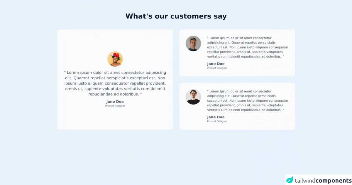
The preview of Testimonials UI component
To create a Testimonials UI component with Tailwind CSS, we will use a card-based layout with a background color and a border. The quote and the customer's name will be centered, and the photo will be aligned to the left.
Free download of the Testimonials's source code
The source code of Testimonials UI component
To create a Testimonials UI component with Tailwind CSS, we will use HTML and CSS. We will use the bg-white, shadow-md, and rounded-lg classes to create a card-based layout. We will also use the text-center class to center the quote and the customer's name.
<div class="py-16 white">
    <div class="container m-auto px-6 text-gray-600 md:px-12 xl:px-6">
        <h2 class="mb-12 text-center text-2xl text-gray-900 font-bold md:text-4xl">What's our customers say</h2>
        <div class="grid gap-8 md:grid-rows-2 lg:grid-cols-2">
          <div class="row-span-2 p-6 border border-gray-100 rounded-xl bg-gray-50 text-center sm:p-8">
            <div class="h-full flex flex-col justify-center space-y-4">
              <img class="w-20 h-20 mx-auto rounded-full" src="https://tailus.io/sources/blocks/grid-cards/preview/images/avatars/second_user.webp" alt="user avatar" height="220" width="220" loading="lazy">
              <p class="text-gray-600 md:text-xl"> <span class="font-serif">"</span> Lorem ipsum dolor sit amet consectetur adipisicing elit. Quaerat repellat perspiciatis excepturi est. Non ipsum iusto aliquam consequatur repellat provident, omnis ut, sapiente voluptates veritatis cum deleniti repudiandae ad doloribus. <span class="font-serif">"</span></p>
              <div>
                  <h6 class="text-lg font-semibold leading-none">Jane Doe</h6>
                  <span class="text-xs text-gray-500">Product Designer</span>
              </div>
            </div>
          </div>

          <div class="p-6 border border-gray-100 rounded-xl bg-gray-50 sm:flex sm:space-x-8 sm:p-8">
            <img class="w-20 h-20 mx-auto rounded-full" src="https://tailus.io/sources/blocks/grid-cards/preview/images/avatars/first_user.webp" alt="user avatar" height="220" width="220" loading="lazy">
            <div class="space-y-4 mt-4 text-center sm:mt-0 sm:text-left">
              <p class="text-gray-600"> <span class="font-serif">"</span> Lorem ipsum dolor sit amet consectetur adipisicing elit. Quaerat repellat perspiciatis excepturi est. Non ipsum iusto aliquam consequatur repellat provident, omnis ut, sapiente voluptates veritatis cum deleniti repudiandae ad doloribus. <span class="font-serif">"</span></p>
              <div>
                  <h6 class="text-lg font-semibold leading-none">Jane Doe</h6>
                  <span class="text-xs text-gray-500">Product Designer</span>
              </div>
            </div>
          </div>
          <div class="p-6 border border-gray-100 rounded-xl bg-gray-50 sm:flex sm:space-x-8 sm:p-8">
            <img class="w-20 h-20 mx-auto rounded-full" src="https://tailus.io/sources/blocks/grid-cards/preview/images/avatars/third_user.webp" alt="user avatar" height="220" width="220" loading="lazy">
            <div class="space-y-4 mt-4 text-center sm:mt-0 sm:text-left">
              <p class="text-gray-600"> <span class="font-serif">"</span> Lorem ipsum dolor sit amet consectetur adipisicing elit. Quaerat repellat perspiciatis excepturi est. Non ipsum iusto aliquam consequatur repellat provident, omnis ut, sapiente voluptates veritatis cum deleniti repudiandae ad doloribus. <span class="font-serif">"</span></p>
              <div>
                  <h6 class="text-lg font-semibold leading-none">Jane Doe</h6>
                  <span class="text-xs text-gray-500">Product Designer</span>
              </div>
            </div>
          </div>
        </div>
    </div>
</div>
How to create a Testimonials with Tailwind CSS?
Now, let's dive into the five really obvious ways to create a Testimonials UI component with Tailwind CSS better than ever.
1. Use responsive classes
Tailwind CSS provides a set of responsive classes that allow developers to create mobile-friendly user interfaces. To make the Testimonials UI component responsive, we can use the sm:flex-row, sm:text-left, and sm:items-center classes. These classes will align the photo to the left on small screens and center it on larger screens.
2. Customize the colors
Tailwind CSS allows developers to customize the colors easily by modifying the configuration file. To make the Testimonials UI component more visually appealing, we can use a custom color palette. We can define the primary color as #3B82F6 and the secondary color as #FCD34D. We can then use these colors for the background and the text.
3. Use animation
Animation can make the Testimonials UI component more engaging and interactive. We can use the transition class to add animation to the component. We can also use the hover class to add animation on hover. For example, we can add a fade-in animation when the user hovers over the component.
4. Add social proof
Social proof can make the Testimonials UI component more persuasive. We can add a rating or a short description of the customer's experience to provide social proof. We can use the flex and justify-between classes to align the rating or the description to the right.
5. Make it accessible
Accessibility is an important aspect of user interface design. To make the Testimonials UI component accessible, we can use the sr-only class to provide alternative text for the photo. We can also use the aria-label attribute to provide a label for the rating or the description.
Conclusion
In this article, we discussed how to create a Testimonials UI component with Tailwind CSS and the five really obvious ways to make it better than ever. We learned that Tailwind CSS provides a set of pre-defined classes that make it easy to create user interfaces quickly. We also learned that Tailwind CSS allows developers to customize the styles easily by modifying the configuration file. By following the five tips discussed in this article, you can create a Testimonials UI component that is responsive, visually appealing, engaging, persuasive, and accessible.