- Published on
Most Effective Ways To Build A Testimonial grid section With Tailwind CSS
- What is Tailwind CSS?
- The Description of Testimonial Grid Section UI Component
- Why Use Tailwind CSS to Create a Testimonial Grid Section UI Component?
- The Preview of Testimonial Grid Section UI Component
- The Source Code of Testimonial Grid Section UI Component
- How to Create a Testimonial Grid Section with Tailwind CSS?
- Step 1: Create the HTML Markup
- Step 2: Style the Testimonial Grid Section
- Step 3: Add Testimonials
- Conclusion
As a FrontEnd technology blogger, you must know that Tailwind CSS is a popular utility-first CSS framework that allows developers to create responsive and customizable user interfaces with ease. In this article, we will discuss the most effective ways to build a Testimonial grid section with Tailwind CSS.
What is Tailwind CSS?
Tailwind CSS is a utility-first CSS framework that provides a set of pre-defined CSS classes that can be used to style HTML elements. It allows developers to create responsive and customizable user interfaces without writing any custom CSS code.
The Description of Testimonial Grid Section UI Component
A Testimonial grid section is a UI component that displays customer testimonials in a grid format. It is a great way to showcase the positive feedback received from customers and build trust with new visitors.
Why Use Tailwind CSS to Create a Testimonial Grid Section UI Component?
Tailwind CSS provides a set of pre-defined CSS classes that can be used to create a Testimonial grid section quickly and easily. It also allows developers to customize the UI component's appearance without writing any custom CSS code.
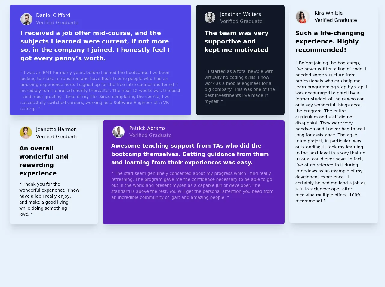
The Preview of Testimonial Grid Section UI Component
To create a Testimonial grid section with Tailwind CSS, we will use a combination of CSS grid and flexbox. The final output will look something like this:
Free download of the Testimonial grid section's source code
The Source Code of Testimonial Grid Section UI Component
To create a Testimonial grid section with Tailwind CSS, we will use a combination of CSS grid and flexbox. The HTML and CSS code for this UI component are as follows:
<!-- component -->
<!DOCTYPE html>
<html lang="en">
  <head>
    <meta charset="UTF-8" />
    <meta name="viewport" content="width=device-width, initial-scale=1.0" />

    <link href="/tailwind.css" rel="stylesheet" />

    <title>Grid section</title>

    <script>
        @import url('https://fonts.googleapis.com/css2?family=Barlow+Semi+Condensed:wght@500;600&display=swap');

        .bg-primary-color-grayish-blue {
            background: hsl(217, 19%, 35%);
        }
        .bg-primary-color-blue {
            background: hsl(217, 90%, 31%);
        }
        .bg-primary-color-white {
            background: hsl(0, 0%, 100%);
        }

        .primary-color-blackish-blue {
            color: rgb(25,33,46);
        }

        .primary-color-blackish-blue-opacity{
            color: rgba(25,33,46,0.5);
        }

        .color-neutral-light-gray{
            color: hsl(0, 0%, 81%);
        }

        .color-neutral-grayish-blue{
            color: hsl(210, 46%, 95%);
        }

        body{
            font-size: 13px;
            font-family: 'Barlow Semi Condensed', sans-serif;
        }

        h1{
      font-weight: 600;
      }

      h2,p{
        font-weight: 500;
      }
    </script>
  </head>
  <body class="bg-indigo-100">
    <div class="w-full h-screen">
      <div class="flex flex-col lg:grid lg:gap-4 2xl:gap-6 lg:grid-cols-4 2xl:row-span-2 2xl:pb-8 ml-2 pt-4 px-6">
        <!-- Beginning of the component about Daniel Clifford -->
        <div class="bg-indigo-600 lg:order-1 lg:row-span-1 2xl:row-span-1 lg:col-span-2 rounded-lg shadow-xl mb-5 lg:mb-0">
          <div class="mx-6 my-8 2xl:mx-10">
            <img class="w-8 md:w-9 lg:w-10 2xl:w-20 h-8 md:h-9 lg:h-10 2xl:h-20 rounded-full border-2 ml-1 lg:ml-3 2xl:ml-0 md:-mt-1 2xl:-mt-4" src="https://images.pexels.com/photos/3775534/pexels-photo-3775534.jpeg?auto=compress&cs=tinysrgb&dpr=1&w=500" />
            <h1 class="text-white text-xs md:text-base 2xl:text-2xl pl-12 lg:pl-16 2xl:pl-20 -mt-8 md:-mt-10 lg:-mt-11 2xl:-mt-20 2xl:mx-8">Daniel Clifford</h1>
            <h2 class="text-white text-opacity-50 text-xs md:text-base 2xl:text-2xl pl-12 lg:pl-16 2xl:pl-20 2xl:my-2 2xl:mx-8">Verified Graduate</h2>
          </div>
          <div class="-mt-6 relative">
            <p class="text-white text-xl 2xl:text-4xl font-bold px-7 lg:px-9 2xl:pt-6 2xl:mx-2">I received a job offer mid-course, and the subjects I learned were current, if not more so, in the company I joined. I honestly feel I got every penny’s worth.</p>
            <br />
            <p class="text-white text-opacity-50 font-medium md:text-sm 2xl:text-3xl px-7 lg:px-9 mb-3 2xl:pb-8 2xl:mx-2">“ I was an EMT for many years before I joined the bootcamp. I’ve been looking to make a transition and have heard some people who had an amazing experience here. I signed up for the free intro course and found it incredibly fun! I enrolled shortly thereafter. The next 12 weeks was the best - and most grueling - time of my life. Since completing the course, I’ve successfully switched careers, working as a Software Engineer at a VR startup. ”</p>
          </div>
        </div>
        <!-- Ending of the component about Daniel Clifford -->

        <!-- Beginning of the component about Jonathan Walters -->
        <div class="bg-gray-900 lg:order-2 lg:row-span-1 2xl:row-span-1 lg:col-span-1 rounded-lg shadow-xl pb-4 mb-5 lg:mb-0">
          <div class="mx-8 2xl:mx-10 my-10">
            <img class="w-8 md:w-9 2xl:w-20 h-8 md:h-9 2xl:h-20 rounded-full border-2 -ml-1 -mt-2 lg:-mt-4" src="https://images.pexels.com/photos/634021/pexels-photo-634021.jpeg?auto=compress&cs=tinysrgb&dpr=1&w=500" />
            <h1 class="text-white text-xs md:text-base 2xl:text-2xl pl-11 md:pl-12 2xl:pl-24 -mt-8 md:-mt-10 2xl:-mt-16">Jonathan Walters</h1>
            <h2 class="text-white text-xs md:text-base 2xl:text-2xl text-opacity-50 pl-11 md:pl-12 2xl:pl-24">Verified Graduate</h2>
          </div>
          <div class="-mt-8 mx-1 lg:mx-2">
            <p class="text-white text-lg lg:text-xl 2xl:text-4xl font-semibold pt-1 px-6 2xl:px-8 lg:pl-5 lg:pr-8">The team was very supportive and kept me motivated</p>
            <br />
            <p class="text-white text-opacity-50 font-medium md:text-sm 2xl:text-3xl pl-6 lg:pl-5 pr-4 -mt-1 lg:mt-6 2xl:mt-2 2xl:px-8">“ I started as a total newbie with virtually no coding skills. I now work as a mobile engineer for a big company. This was one of the best investments I’ve made in myself. ”</p>
          </div>
        </div>
        <!-- Ending of the component about Jonathan Walters -->

        <!-- Beginning of the component about Jeanette Harmon -->
        <div class="bg-primary-color-white lg:order-3 lg:row-span-2 2xl:row-span-1 lg:col-span-1 rounded-lg shadow-xl mb-5 lg:mb-0 2xl:mb-8">
          <div class="mx-8 my-10 lg:my-8">
            <img class="w-8 md:w-9 lg:w-11 2xl:w-20 h-8 md:h-9 lg:h-11 2xl:h-20 rounded-full border-2 -mt-3 -ml-1 lg:-ml-0" src="https://images.pexels.com/photos/415829/pexels-photo-415829.jpeg?auto=compress&cs=tinysrgb&dpr=1&w=500" />
            <h1 class="primary-color-blackish-blue text-xs md:text-base 2xl:text-2xl pl-11 md:pl-12 lg:pl-14 2xl:pl-24 -mt-8 md:-mt-10 lg:-mt-11 2xl:-mt-16">Jeanette Harmon</h1>
            <h2 class="primary-color-blackish-blue-opacity text-xs md:text-base 2xl:text-2xl pl-11 md:pl-12 lg:pl-14 2xl:pl-24">Verified Graduate</h2>
          </div>
          <div class="-mt-4 ml-5 mr-11">
            <p class="primary-color-blackish-blue text-xl 2xl:text-4xl font-bold px-2 lg:px-3 -mt-6 lg:-mt-5 2xl:mt-12 2xl:pb-6">An overall wonderful and rewarding experience</p>
            <br />
            <p class="primary-color-blackish-blue-opacity font-medium md:text-sm 2xl:text-3xl pl-2 lg:pl-3 lg:pr-4 mb-6 2xl:pt-2 -mt-3">“ Thank you for the wonderful experience! I now have a job I really enjoy, and make a good living while doing something I love. ”</p>
          </div>
        </div>
        <!-- Ending of the component about Jeanette Harmon -->

        <!-- Beginning of the component about Patrick Abrams -->
        <div class="bg-purple-800 lg:order-4 lg:row-span-2 2xl:row-span-1 col-span-2 rounded-lg shadow-xl mb-5 lg:mb-0 2xl:mb-8 lg:pb-14 2xl:pb-20">
          <div class="mx-8 my-8">
            <img class="w-8 md:w-9 lg:w-10 2xl:w-20 h-8 md:h-9 lg:h-10 2xl:h-20 rounded-full border-2 lg:-mt-3" src="https://images.pexels.com/photos/3778603/pexels-photo-3778603.jpeg?auto=compress&cs=tinysrgb&dpr=1&w=500" />
            <h1 class="text-white text-xs md:text-base 2xl:text-2xl pl-12 md:pl-14 2xl:pl-24 -mt-8 md:-mt-10 lg:-mt-11 2xl:-mt-16">Patrick Abrams</h1>
            <h2 class="text-white text-xs md:text-base 2xl:text-2xl text-opacity-50 pl-12 md:pl-14 2xl:pl-24">Verified Graduate</h2>
          </div>
          <div class="px-3 -mt-3 mb-5 lg:mb-0">
            <p class="text-white text-lg 2xl:text-4xl font-semibold px-4 -mt-3 lg:-mt-6 2xl:mt-8">Awesome teaching support from TAs who did the bootcamp themselves. Getting guidance from them and learning from their experiences was easy.</p>
            <br />
            <p class="text-white text-opacity-50 font-medium md:text-sm 2xl:text-3xl px-4 mt-1 lg:-mt-3 2xl:mt-6">“ The staff seem genuinely concerned about my progress which I find really refreshing. The program gave me the confidence necessary to be able to go out in the world and present myself as a capable junior developer. The standard is above the rest. You will get the personal attention you need from an incredible community of lgart and amazing people. ”</p>
          </div>
        </div>
        <!-- Ending of the component about Patrick Abrams -->

        <!-- Beginning of the component about Kira Whittle -->
        <div class="bg-primary-color-white lg:order-2 lg:row-span-4 lg:col-span-1 rounded-lg shadow-xl mb-5 lg:pb-4 2xl:h-screen">
          <div class="mx-8 my-8 lg:pl-1">
            <img class="w-8 md:w-9 lg:w-12 2xl:w-20 h-8 md:h-9 lg:h-12 2xl:h-20 rounded-full border-2 lg:-mt-4 -ml-1 lg:-ml-4" src="https://images.pexels.com/photos/3762804/pexels-photo-3762804.jpeg?auto=compress&cs=tinysrgb&dpr=1&w=500" />
            <h1 class="primary-color-blackish-blue text-xs md:text-base 2xl:text-2xl pl-10 md:pl-12 2xl:pl-24 -mt-8 md:-mt-10 lg:-mt-12 2xl:-mt-16">Kira Whittle</h1>
            <h2 class="primary-color-blackish-blue-opacity text-xs md:text-base 2xl:text-2xl pl-10 md:pl-12 2xl:pl-24">Verified Graduate</h2>
          </div>
          <div class="px-3 lg:px-5 lg:-mt-4 mb-5 lg:mb-0">
            <p class="primary-color-blackish-blue text-xl 2xl:text-4xl font-semibold px-4 lg:px-0 -mt-2 lg:-mt-0">Such a life-changing experience. Highly recommended!</p>
            <br />
            <p class="primary-color-blackish-blue-opacity font-medium md:text-sm 2xl:text-3xl px-4 lg:px-0 2xl:px-4 lg:pr-3 mt-2 lg:-mt-1 2xl:mt-2 2xl:pb-64">“ Before joining the bootcamp, I’ve never written a line of code. I needed some structure from professionals who can help me learn programming step by step. I was encouraged to enroll by a former student of theirs who can only say wonderful things about the program. The entire curriculum and staff did not disappoint. They were very hands-on and I never had to wait long for assistance. The agile team project, in particular, was outstanding. It took my learning to the next level in a way that no tutorial could ever have. In fact, I’ve often referred to it during interviews as an example of my developent experience. It certainly helped me land a job as a full-stack developer after receiving multiple offers. 100% recommend! ”</p>
          </div>
        </div>
        <!-- Ending of the component about Kira Whittle -->
      </div>
    </div>
  </body>
</html>
How to Create a Testimonial Grid Section with Tailwind CSS?
To create a Testimonial grid section with Tailwind CSS, follow these steps:
Step 1: Create the HTML Markup
The first step is to create the HTML markup for the Testimonial grid section. We will use a combination of CSS grid and flexbox to create the grid layout.
<div class="grid grid-cols-1 md:grid-cols-2 lg:grid-cols-3 gap-4">
  <div class="bg-white rounded-lg shadow-lg overflow-hidden">
    <div class="p-4">
      <p class="text-gray-600 mb-4">Lorem ipsum dolor sit amet, consectetur adipiscing elit. Fusce vel mauris quis velit ultrices congue. Donec euismod tellus quis enim dictum, quis consequat sapien tristique.</p>
      <p class="font-bold text-lg">John Doe</p>
      <p class="text-gray-600">CEO, ABC Inc.</p>
    </div>
  </div>
  <!-- Repeat for each testimonial -->
</div>
Step 2: Style the Testimonial Grid Section
The next step is to style the Testimonial grid section using Tailwind CSS classes. We will use a combination of CSS grid and flexbox classes to create the grid layout.
/* Grid container */
.grid {
  display: grid;
}

/* Grid columns */
.grid-cols-1 {
  grid-template-columns: repeat(1, minmax(0, 1fr));
}

@media (min-width: 768px) {
  .md\:grid-cols-2 {
    grid-template-columns: repeat(2, minmax(0, 1fr));
  }
}

@media (min-width: 1024px) {
  .lg\:grid-cols-3 {
    grid-template-columns: repeat(3, minmax(0, 1fr));
  }
}

/* Grid gap */
.gap-4 {
  gap: 1rem;
}

/* Testimonial card */
.bg-white {
  background-color: #fff;
}

.rounded-lg {
  border-radius: 0.5rem;
}

.shadow-lg {
  box-shadow: 0 10px 15px -3px rgba(0, 0, 0, 0.1), 0 4px 6px -2px rgba(0, 0, 0, 0.05);
}

.overflow-hidden {
  overflow: hidden;
}

/* Testimonial content */
.p-4 {
  padding: 1rem;
}

.text-gray-600 {
  color: #718096;
}

.mb-4 {
  margin-bottom: 1rem;
}

.font-bold {
  font-weight: 700;
}

.text-lg {
  font-size: 1.125rem;
  line-height: 1.75rem;
}

/* Testimonial author */
.text-gray-600 {
  color: #718096;
}
Step 3: Add Testimonials
The final step is to add the customer testimonials to the Testimonial grid section. You can repeat the HTML markup for each testimonial and replace the content with the actual testimonial text and author details.
<div class="grid grid-cols-1 md:grid-cols-2 lg:grid-cols-3 gap-4">
  <div class="bg-white rounded-lg shadow-lg overflow-hidden">
    <div class="p-4">
      <p class="text-gray-600 mb-4">Lorem ipsum dolor sit amet, consectetur adipiscing elit. Fusce vel mauris quis velit ultrices congue. Donec euismod tellus quis enim dictum, quis consequat sapien tristique.</p>
      <p class="font-bold text-lg">John Doe</p>
      <p class="text-gray-600">CEO, ABC Inc.</p>
    </div>
  </div>
  <div class="bg-white rounded-lg shadow-lg overflow-hidden">
    <div class="p-4">
      <p class="text-gray-600 mb-4">Lorem ipsum dolor sit amet, consectetur adipiscing elit. Fusce vel mauris quis velit ultrices congue. Donec euismod tellus quis enim dictum, quis consequat sapien tristique.</p>
      <p class="font-bold text-lg">Jane Doe</p>
      <p class="text-gray-600">CTO, XYZ Corp.</p>
    </div>
  </div>
  <!-- Repeat for each testimonial -->
</div>
Conclusion
In conclusion, creating a Testimonial grid section with Tailwind CSS is a simple and effective way to showcase customer testimonials on your website. By using a combination of CSS grid and flexbox classes, you can create a responsive and customizable UI component without writing any custom CSS code. With Tailwind CSS, you can focus on building great user experiences without worrying about the underlying CSS code.