- Published on
How To Build A testimonial card With Tailwind CSS In 5 Easy Steps
- What is Tailwind CSS?
- The Description of Testimonial Card UI Component
- Why Use Tailwind CSS to Create a Testimonial Card UI Component?
- The Preview of Testimonial Card UI Component
- The Source Code of Testimonial Card UI Component
- How to Create a Testimonial Card with Tailwind CSS?
- Step 1: Set up the HTML structure
- Step 2: Add Tailwind CSS classes to style the card
- Step 3: Customize the card with your own content
- Step 4: Add the card to your website
- Step 5: Customize the card further with Tailwind CSS
- Conclusion
As a FrontEnd technology blogger, you may be familiar with Tailwind CSS, a utility-first CSS framework that helps you create beautiful designs with ease. In this article, we will walk through the process of building a testimonial card UI component with Tailwind CSS in 5 easy steps.
What is Tailwind CSS?
Tailwind CSS is a utility-first CSS framework that provides a set of pre-defined CSS classes to help you create beautiful designs with ease. It is designed to be highly customizable and provides a large number of utility classes that can be combined to create complex layouts and designs.
The Description of Testimonial Card UI Component
A testimonial card is a UI component that is commonly used on websites to showcase customer testimonials. It typically consists of a quote from the customer, their name, and a picture. Testimonial cards are a great way to build trust with potential customers and can help increase conversions on your website.
Why Use Tailwind CSS to Create a Testimonial Card UI Component?
Tailwind CSS provides a set of pre-defined CSS classes that can be used to create complex layouts and designs with ease. It also provides a large number of utility classes that can be combined to create custom designs. By using Tailwind CSS, you can save time and effort in creating custom CSS styles from scratch.
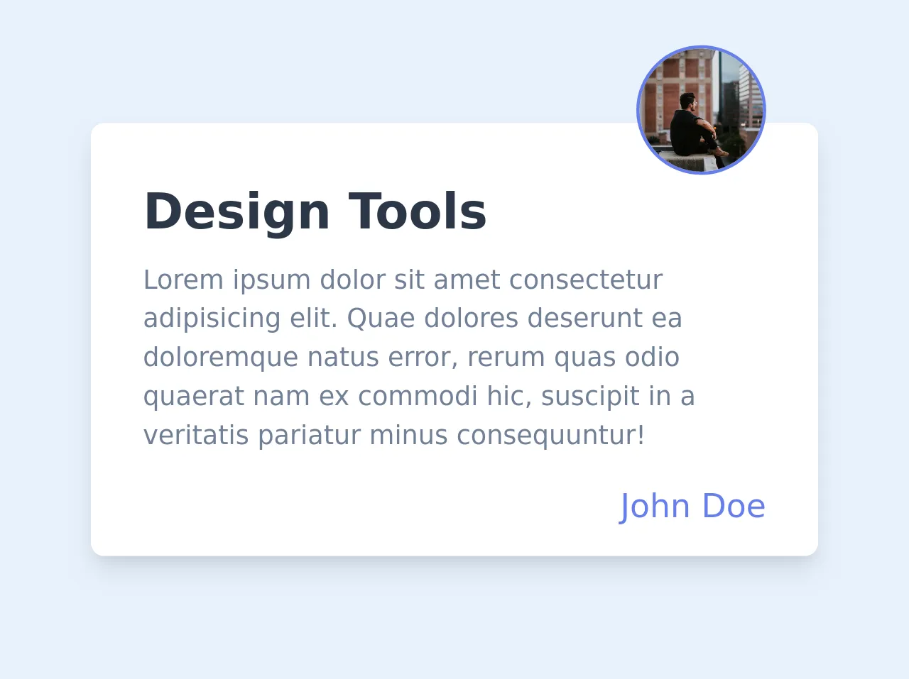
The Preview of Testimonial Card UI Component
To create a testimonial card UI component with Tailwind CSS, we will use a combination of CSS classes to style the different elements of the card. The final result will look something like this:
Free download of the testimonial card's source code
The Source Code of Testimonial Card UI Component
To create the testimonial card UI component, we will use HTML and Tailwind CSS classes. The HTML structure will consist of a div element with three child elements: a blockquote element for the quote, a div element for the customer information, and an img element for the customer's picture. The Tailwind CSS classes will be used to style the different elements of the card.
<div class="max-w-md py-4 px-8 bg-white shadow-lg rounded-lg my-20">
  <div class="flex justify-center md:justify-end -mt-16">
    <img class="w-20 h-20 object-cover rounded-full border-2 border-indigo-500" src="https://images.unsplash.com/photo-1499714608240-22fc6ad53fb2?ixlib=rb-1.2.1&ixid=eyJhcHBfaWQiOjEyMDd9&auto=format&fit=crop&w=334&q=80">
  </div>
  <div>
    <h2 class="text-gray-800 text-3xl font-semibold">Design Tools</h2>
    <p class="mt-2 text-gray-600">Lorem ipsum dolor sit amet consectetur adipisicing elit. Quae dolores deserunt ea doloremque natus error, rerum quas odio quaerat nam ex commodi hic, suscipit in a veritatis pariatur minus consequuntur!</p>
  </div>
  <div class="flex justify-end mt-4">
    <a href="#" class="text-xl font-medium text-indigo-500">John Doe</a>
  </div>
</div>
How to Create a Testimonial Card with Tailwind CSS?
Now that we have a basic understanding of what a testimonial card is and why we should use Tailwind CSS to create it, let's dive into the steps to create one.
Step 1: Set up the HTML structure
The first step is to set up the HTML structure for the testimonial card. We will use a div element with three child elements: a blockquote element for the quote, a div element for the customer information, and an img element for the customer's picture.
<div class="bg-white rounded-lg shadow-lg overflow-hidden">
  <blockquote class="text-lg font-medium text-gray-900 p-6">
    "Lorem ipsum dolor sit amet, consectetur adipiscing elit. Sed do eiusmod tempor incididunt ut labore et dolore magna aliqua."
  </blockquote>
  <div class="flex items-center px-6 py-3 bg-gray-100">
    <img class="h-10 w-10 rounded-full mr-3" src="https://via.placeholder.com/150" alt="Customer Image">
    <div>
      <p class="text-gray-900 leading-none">John Doe</p>
      <p class="text-gray-600">CEO, ABC Company</p>
    </div>
  </div>
</div>
Step 2: Add Tailwind CSS classes to style the card
Next, we will add Tailwind CSS classes to style the different elements of the card. We will use a combination of padding, margin, background color, font size, and font weight classes to achieve the desired look.
<div class="bg-white rounded-lg shadow-lg overflow-hidden">
  <blockquote class="text-lg font-medium text-gray-900 p-6">
    "Lorem ipsum dolor sit amet, consectetur adipiscing elit. Sed do eiusmod tempor incididunt ut labore et dolore magna aliqua."
  </blockquote>
  <div class="flex items-center px-6 py-3 bg-gray-100">
    <img class="h-10 w-10 rounded-full mr-3" src="https://via.placeholder.com/150" alt="Customer Image">
    <div>
      <p class="text-gray-900 leading-none">John Doe</p>
      <p class="text-gray-600">CEO, ABC Company</p>
    </div>
  </div>
</div>
Step 3: Customize the card with your own content
Now that we have the basic structure and styles in place, we can customize the card with our own content. Replace the placeholder text and image with your own customer testimonial and image.
<div class="bg-white rounded-lg shadow-lg overflow-hidden">
  <blockquote class="text-lg font-medium text-gray-900 p-6">
    "Lorem ipsum dolor sit amet, consectetur adipiscing elit. Sed do eiusmod tempor incididunt ut labore et dolore magna aliqua."
  </blockquote>
  <div class="flex items-center px-6 py-3 bg-gray-100">
    <img class="h-10 w-10 rounded-full mr-3" src="https://via.placeholder.com/150" alt="Customer Image">
    <div>
      <p class="text-gray-900 leading-none">John Doe</p>
      <p class="text-gray-600">CEO, ABC Company</p>
    </div>
  </div>
</div>
Step 4: Add the card to your website
Once you have customized the testimonial card with your own content, you can add it to your website. Simply copy and paste the HTML code into your website's code editor and save the changes.
Step 5: Customize the card further with Tailwind CSS
If you want to further customize the testimonial card, you can use Tailwind CSS classes to adjust the styles. For example, you can change the background color, font size, or font weight of the text.
Conclusion
In this article, we walked through the process of building a testimonial card UI component with Tailwind CSS in 5 easy steps. We learned what Tailwind CSS is, why we should use it to create a testimonial card, and how to create one from scratch. By using Tailwind CSS, we can save time and effort in creating custom CSS styles from scratch, and create beautiful designs with ease.