- Published on
6 Tips To Build A testimonial card With Tailwind CSS
- What is Tailwind CSS?
- The description of testimonial card UI component
- Why use Tailwind CSS to create a testimonial card UI component?
- The preview of testimonial card UI component
- The source code of testimonial card UI component
- How to create a testimonial card with Tailwind CSS?
- Step 1: Set up the HTML structure
- Step 2: Add Tailwind CSS classes
- Step 3: Customize the testimonial card
- Conclusion
As a FrontEnd technology blogger, I am always looking for ways to make my UI components more efficient and visually appealing. One of the most popular UI components is the testimonial card, which is commonly used to showcase customer feedback or reviews. In this article, I will share 6 tips to build a testimonial card with Tailwind CSS, a popular utility-first CSS framework.
What is Tailwind CSS?
Tailwind CSS is a utility-first CSS framework that provides a set of pre-defined classes to help developers style their UI components quickly and efficiently. Unlike traditional CSS frameworks, Tailwind CSS does not rely on pre-built components, which allows developers to create custom UI components that meet their specific needs.
The description of testimonial card UI component
A testimonial card is a UI component that is commonly used to showcase customer feedback or reviews. It typically includes a customer's name, photo, and a short quote or review. Testimonial cards are often used on websites to build trust with potential customers and to showcase the quality of a company's products or services.
Why use Tailwind CSS to create a testimonial card UI component?
Tailwind CSS provides a set of pre-defined classes that can be used to create a testimonial card quickly and efficiently. Using Tailwind CSS can save developers time and effort, as they don't need to write custom CSS for each UI component. Additionally, Tailwind CSS provides a consistent and easy-to-use syntax, which makes it easy for developers to create and maintain their UI components.
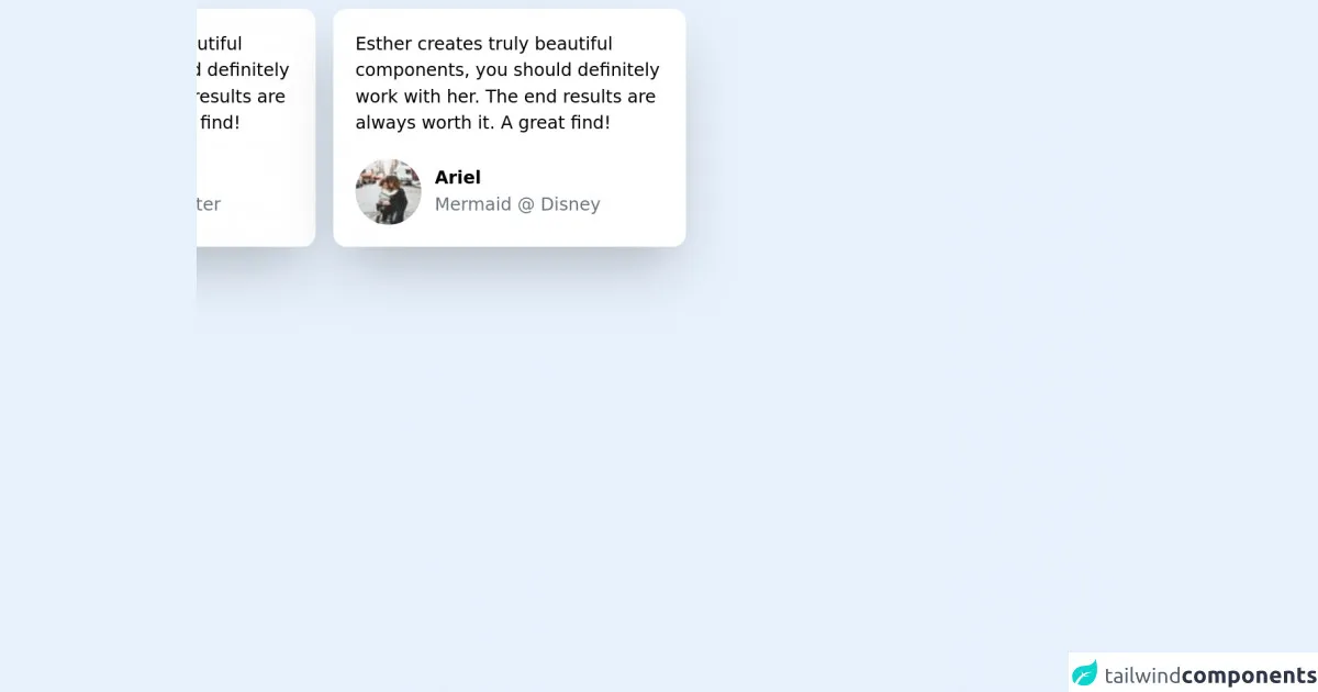
The preview of testimonial card UI component
To create a testimonial card with Tailwind CSS, we will use a combination of pre-defined classes to style the card's content. The final result will look something like this:
Free download of the testimonial card's source code
The source code of testimonial card UI component
To create a testimonial card with Tailwind CSS, we will use a combination of pre-defined classes to style the card's content. The source code for the testimonial card UI component is shown below:
<div class="flex flex-col md:flex-row max-w-2xl">
    <div class="max-w-xs mx-auto bg-white rounded-xl p-5 shadow-2xl m-2">
        <p> Esther creates truly beautiful components,
            you should definitely work with her. The end
            results are always worth it. A great find!
        </p>
        <div class='mt-5 flex items-center'>
            <img src='https://picsum.photos/60/60' class='rounded-full'>
            <div class="ml-3">
                <h3 class="font-semibold"> Lana Del Rey </h2>
                <p class="text-gray-500"> Singer/songwriter </p>
            </div>
        </div>
    </div>
    <div class="max-w-xs mx-auto bg-white rounded-xl p-5 shadow-2xl m-2">
        <p> Esther creates truly beautiful components,
            you should definitely work with her. The end
            results are always worth it. A great find!
        </p>
        <div class='mt-5 flex items-center'>
            <img src='https://picsum.photos/60/60' class='rounded-full'>
            <div class="ml-3">
                <h3 class="font-semibold"> Ariel  </h2>
                <p class="text-gray-500"> Mermaid @ Disney </p>
            </div>
        </div>
    </div>
</div>
How to create a testimonial card with Tailwind CSS?
Now that we have an understanding of what a testimonial card is and why we should use Tailwind CSS to create it, let's dive into the steps to create a testimonial card with Tailwind CSS.
Step 1: Set up the HTML structure
The first step is to set up the HTML structure for the testimonial card. We will use a combination of HTML tags and Tailwind CSS classes to create the card's content. Here is an example HTML structure for a testimonial card:
<div class="max-w-sm rounded overflow-hidden shadow-lg">
  <img class="w-full" src="img/testimonial-1.jpg" alt="Sunset in the mountains">
  <div class="px-6 py-4">
    <div class="font-bold text-xl mb-2">John Doe</div>
    <p class="text-gray-700 text-base">
      Lorem ipsum dolor sit amet, consectetur adipiscing elit. Morbi ac lacinia nibh, nec faucibus enim. Nullam quis lorem posuere, hendrerit tellus eget, tincidunt ipsum. Nam nulla tortor, elementum in elit nec, fermentum dignissim sapien. Sed a mattis nisi, sit amet dignissim elit.
    </p>
  </div>
  <div class="px-6 pt-4 pb-2">
    <span class="inline-block bg-gray-200 rounded-full px-3 py-1 text-sm font-semibold text-gray-700 mr-2">#photography</span>
    <span class="inline-block bg-gray-200 rounded-full px-3 py-1 text-sm font-semibold text-gray-700 mr-2">#travel</span>
    <span class="inline-block bg-gray-200 rounded-full px-3 py-1 text-sm font-semibold text-gray-700">#winter</span>
  </div>
</div>
Step 2: Add Tailwind CSS classes
The next step is to add Tailwind CSS classes to the HTML structure to style the testimonial card. We will use a combination of margin, padding, font, and color classes to style the card's content. Here is an example of the Tailwind CSS classes we can use to style the testimonial card:
<div class="max-w-sm rounded overflow-hidden shadow-lg">
  <img class="w-full" src="img/testimonial-1.jpg" alt="Sunset in the mountains">
  <div class="px-6 py-4">
    <div class="font-bold text-xl mb-2">John Doe</div>
    <p class="text-gray-700 text-base">
      Lorem ipsum dolor sit amet, consectetur adipiscing elit. Morbi ac lacinia nibh, nec faucibus enim. Nullam quis lorem posuere, hendrerit tellus eget, tincidunt ipsum. Nam nulla tortor, elementum in elit nec, fermentum dignissim sapien. Sed a mattis nisi, sit amet dignissim elit.
    </p>
  </div>
  <div class="px-6 pt-4 pb-2">
    <span class="inline-block bg-gray-200 rounded-full px-3 py-1 text-sm font-semibold text-gray-700 mr-2">#photography</span>
    <span class="inline-block bg-gray-200 rounded-full px-3 py-1 text-sm font-semibold text-gray-700 mr-2">#travel</span>
    <span class="inline-block bg-gray-200 rounded-full px-3 py-1 text-sm font-semibold text-gray-700">#winter</span>
  </div>
</div>
Step 3: Customize the testimonial card
The final step is to customize the testimonial card to fit your specific needs. You can change the font, color, and size of the text, as well as the size and shape of the image. Additionally, you can add or remove elements from the card, such as social media icons or a rating system.
Conclusion
In conclusion, Tailwind CSS is a powerful tool for creating UI components quickly and efficiently. By following these 6 tips, you can create a visually appealing testimonial card that showcases your customer feedback and builds trust with potential customers. Remember to experiment with different styles and layouts to find the perfect design for your needs.