- Published on
Learn How To Create A Team section With Tailwind CSS from the Pros
- What is Tailwind CSS?
- The description of Team section ui component
- Why use Tailwind CSS to create a Team section ui component?
- The preview of Team section ui component
- The source code of Team section ui component
- How to create a Team section with Tailwind CSS?
- Conclusion
As a FrontEnd technology blogger, you may have heard of Tailwind CSS, a utility-first CSS framework that allows you to quickly and easily create custom designs. In this article, we will show you how to create a Team section with Tailwind CSS.
What is Tailwind CSS?
Tailwind CSS is a utility-first CSS framework that provides pre-defined classes to help you style your HTML elements. It is designed to be highly customizable and easy to use, allowing you to create custom designs quickly and easily.
The description of Team section ui component
A Team section is a common UI component that is used on many websites to showcase the team members of a company or organization. It typically includes a photo of each team member, their name, and a brief description of their role or responsibilities.
Why use Tailwind CSS to create a Team section ui component?
Tailwind CSS is an excellent choice for creating a Team section UI component because it provides pre-defined classes for styling elements such as images, text, and containers. This makes it easy to create a custom design without having to write a lot of custom CSS.
The preview of Team section ui component
To create a Team section UI component with Tailwind CSS, we will use a combination of flexbox, grid, and utility classes. The result will be a responsive design that looks great on all devices.
Free download of the Team section's source code
The source code of Team section ui component
To create a Team section UI component with Tailwind CSS, we will use HTML and CSS. The HTML will define the structure of the component, while the CSS will style the elements using Tailwind CSS classes.
<div class="py-20 bg-gray-50">
<div class="container mx-auto px-6 md:px-12 xl:px-32">
<div class="mb-16 text-center">
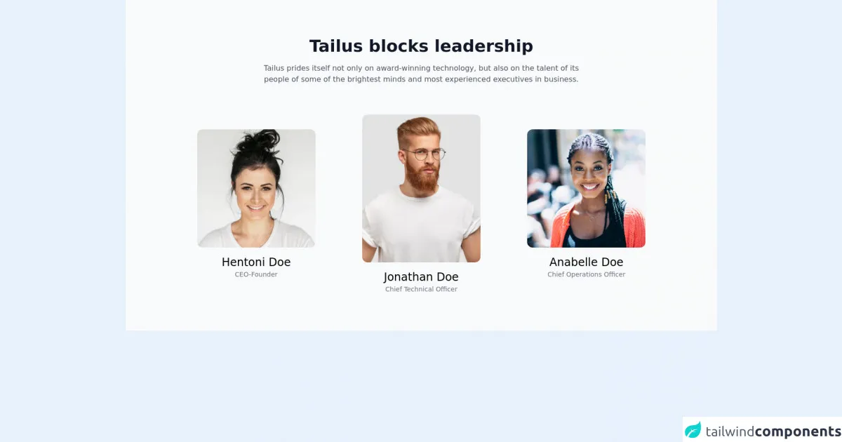
<h2 class="mb-4 text-center text-2xl text-gray-900 font-bold md:text-4xl">Tailus blocks leadership</h2>
<p class="text-gray-600 lg:w-8/12 lg:mx-auto">Tailus prides itself not only on award-winning technology, but also on the talent of its people of some of the brightest minds and most experienced executives in business.</p>
</div>
<div class="grid gap-12 items-center md:grid-cols-3">
<div class="space-y-4 text-center">
<img class="w-64 h-64 mx-auto object-cover rounded-xl md:w-40 md:h-40 lg:w-64 lg:h-64"
src="https://tailus.io/sources/blocks/classic/preview/images/woman1.jpg" alt="woman" loading="lazy" width="640" height="805">
<div>
<h4 class="text-2xl">Hentoni Doe</h4>
<span class="block text-sm text-gray-500">CEO-Founder</span>
</div>
</div>
<div class="space-y-4 text-center">
<img class="w-64 h-64 mx-auto object-cover rounded-xl md:w-48 md:h-64 lg:w-64 lg:h-80"
src="https://tailus.io/sources/blocks/classic/preview/images/man.jpg" alt="man" loading="lazy" width="1000" height="667">
<div>
<h4 class="text-2xl">Jonathan Doe</h4>
<span class="block text-sm text-gray-500">Chief Technical Officer</span>
</div>
</div>
<div class="space-y-4 text-center">
<img class="w-64 h-64 mx-auto object-cover rounded-xl md:w-40 md:h-40 lg:w-64 lg:h-64"
src="https://tailus.io/sources/blocks/classic/preview/images/woman.jpg" alt="woman" loading="lazy" width="1000" height="667">
<div>
<h4 class="text-2xl">Anabelle Doe</h4>
<span class="block text-sm text-gray-500">Chief Operations Officer</span>
</div>
</div>
</div>
</div>
</div>
How to create a Team section with Tailwind CSS?
To create a Team section with Tailwind CSS, follow these steps:
- Create a new HTML file and add the following code:
<section class="team-section bg-gray-100 py-8">
  <div class="max-w-7xl mx-auto px-4 sm:px-6 lg:px-8">
    <h2 class="text-3xl font-extrabold text-gray-900">Meet Our Team</h2>
    <div class="mt-8 grid grid-cols-1 gap-12 sm:grid-cols-2 lg:grid-cols-3">
      <!-- Team member cards -->
    </div>
  </div>
</section>
This code defines a section with a gray background, a title, and a grid container for the team member cards.
- Add the team member cards to the grid container:
<div class="mt-8 grid grid-cols-1 gap-12 sm:grid-cols-2 lg:grid-cols-3">
  <div class="bg-white shadow overflow-hidden sm:rounded-lg">
    <img class="h-48 w-full object-cover" src="https://via.placeholder.com/300x200" alt="">
    <div class="px-4 py-5 sm:p-6">
      <h3 class="text-lg leading-6 font-medium text-gray-900">Jane Cooper</h3>
      <p class="mt-2 max-w-2xl text-sm text-gray-500">Lorem ipsum dolor sit amet, consectetur adipiscing elit. Sed cursus nulla vel orci malesuada, vel ultricies neque hendrerit.</p>
    </div>
  </div>
  <!-- Repeat for each team member -->
</div>
This code defines a card for a team member, including an image, name, and description.
- Add Tailwind CSS classes to style the elements:
<section class="team-section bg-gray-100 py-8">
  <div class="max-w-7xl mx-auto px-4 sm:px-6 lg:px-8">
    <h2 class="text-3xl font-extrabold text-gray-900">Meet Our Team</h2>
    <div class="mt-8 grid grid-cols-1 gap-12 sm:grid-cols-2 lg:grid-cols-3">
      <div class="bg-white shadow overflow-hidden sm:rounded-lg">
        <img class="h-48 w-full object-cover" src="https://via.placeholder.com/300x200" alt="">
        <div class="px-4 py-5 sm:p-6">
          <h3 class="text-lg leading-6 font-medium text-gray-900">Jane Cooper</h3>
          <p class="mt-2 max-w-2xl text-sm text-gray-500">Lorem ipsum dolor sit amet, consectetur adipiscing elit. Sed cursus nulla vel orci malesuada, vel ultricies neque hendrerit.</p>
        </div>
      </div>
      <!-- Repeat for each team member -->
    </div>
  </div>
</section>
This code adds Tailwind CSS classes to style the section, title, grid container, and team member cards.
- Customize the design by modifying the Tailwind CSS classes.
Conclusion
In conclusion, creating a Team section UI component with Tailwind CSS is a quick and easy process that can be done by following a few simple steps. By using pre-defined classes and utility classes, you can create a custom design that looks great on all devices. Give it a try and see for yourself how easy it is to create a Team section with Tailwind CSS!