- Published on
Advanced Guide: Make A Task Widget With Tailwind CSS
- What is Tailwind CSS?
- The description of Task Widget ui component
- Why use Tailwind CSS to create a Task Widget ui component?
- The preview of Task Widget ui component
- The source code of Task Widget ui component
- How to create a Task Widget with Tailwind CSS?
- Step 1: Set up your HTML structure
- Step 2: Add Tailwind CSS classes
- Step 3: Repeat for each task
- Conclusion
What is Tailwind CSS?
Tailwind CSS is a utility-first CSS framework that helps you create custom designs quickly. It provides a set of pre-defined classes that you can use to style your HTML elements. Tailwind CSS is highly customizable, and you can configure it to suit your specific needs.
The description of Task Widget ui component
A task widget is a user interface component that displays a list of tasks that a user needs to complete. It is a common feature in many web applications, especially those that involve project management or task tracking. A task widget usually displays the task name, description, due date, and status.
Why use Tailwind CSS to create a Task Widget ui component?
Tailwind CSS is an excellent choice for creating a task widget UI component because it provides a wide range of pre-defined classes that you can use to style your elements. This saves you a lot of time and effort that you would otherwise spend writing custom CSS. Additionally, Tailwind CSS is highly customizable, which means that you can easily modify the styles to match your project's branding or design requirements.
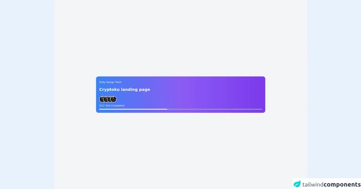
The preview of Task Widget ui component
To give you an idea of what a task widget UI component looks like, here's a preview:
Free download of the Task Widget's source code
The source code of Task Widget ui component
Here's the source code for a basic task widget UI component:
<!-- Created By Eza Alfandy -->
<div class="min-h-screen bg-gray-100 flex justify-center items-center">
    <div class="flex flex-col bg-gradient-to-r from-blue-500 via-purple-500 to-purple-600 p-4 rounded-xl text-white w-8/12 mx-auto my-auto">
        <div>
            <span class="text-xs">Rizky Design Team</span>
        </div>
        <div>
            <p class="text-xl font-bold mt-3 mb-5">Cryptoku landing page</p>
        </div>

        <div class="mb-10 relative">
            <img src="https://source.unsplash.com/ILip77SbmOE/900x900" class="w-8 rounded-full border-2 float-left absolute">
            <img src="https://source.unsplash.com/ILip77SbmOE/900x900" class="w-8 rounded-full border-2 float-left absolute left-5">
            <img src="https://source.unsplash.com/ILip77SbmOE/900x900" class="w-8 rounded-full border-2 float-left absolute left-10">
            <img src="https://source.unsplash.com/ILip77SbmOE/900x900" class="w-8 rounded-full border-2 float-left absolute left-14">
        </div>
        <div class="text-xs mb-2">
            5/12 Task Completed
        </div>
        <div class="w-full bg-gray-400 p-0">
            <div class="w-5/12 bg-white h-1">

            </div>
        </div>
    </div>
</div>
How to create a Task Widget with Tailwind CSS?
Now that you have an idea of what a task widget UI component looks like and what its source code looks like, let's dive into how to create one using Tailwind CSS.
Step 1: Set up your HTML structure
The first step is to set up your HTML structure. Here's an example:
<div class="task-widget">
  <div class="task">
    <div class="task-header">
      <h3 class="task-title">Task 1</h3>
      <span class="task-status">Incomplete</span>
    </div>
    <div class="task-body">
      <p class="task-description">Lorem ipsum dolor sit amet, consectetur adipiscing elit. Sed nec elit euismod, malesuada felis vel, tempor ipsum.</p>
      <span class="task-due-date">Due: 10/10/2021</span>
    </div>
  </div>
</div>
In this example, we've created a div element with a class of task-widget. Inside the task-widget element, we've created another div element with a class of task. Inside the task element, we've created two more div elements: one with a class of task-header and one with a class of task-body. Inside the task-header element, we've added a h3 element with a class of task-title and a span element with a class of task-status. Inside the task-body element, we've added a p element with a class of task-description and a span element with a class of task-due-date.
Step 2: Add Tailwind CSS classes
The next step is to add Tailwind CSS classes to your HTML elements. Here's an example:
<div class="task-widget">
  <div class="task bg-white rounded-lg shadow-md mb-4">
    <div class="task-header bg-gray-200 rounded-t-lg px-4 py-2 flex justify-between items-center">
      <h3 class="task-title text-gray-700 font-bold">Task 1</h3>
      <span class="task-status bg-red-500 text-white py-1 px-2 rounded-full text-sm">Incomplete</span>
    </div>
    <div class="task-body px-4 py-2">
      <p class="task-description text-gray-600">Lorem ipsum dolor sit amet, consectetur adipiscing elit. Sed nec elit euismod, malesuada felis vel, tempor ipsum.</p>
      <span class="task-due-date text-gray-500 text-sm">Due: 10/10/2021</span>
    </div>
  </div>
</div>
In this example, we've added Tailwind CSS classes to our HTML elements. We've added the bg-white, rounded-lg, and shadow-md classes to the task element to give it a white background, rounded corners, and a shadow effect. We've added the bg-gray-200, rounded-t-lg, px-4, and py-2 classes to the task-header element to give it a light gray background, rounded top corners, and some padding. We've added the flex, justify-between, and items-center classes to the task-header element to make its child elements align horizontally and vertically. We've added the text-gray-700 and font-bold classes to the task-title element to make it bold and dark gray. We've added the bg-red-500, text-white, py-1, px-2, rounded-full, and text-sm classes to the task-status element to give it a red background, white text, rounded corners, and some padding. We've added the text-gray-600 class to the task-description element to make its text gray. We've added the text-gray-500 and text-sm classes to the task-due-date element to make its text light gray and small.
Step 3: Repeat for each task
The final step is to repeat steps 1 and 2 for each task that you want to display in your task widget. Here's an example:
<div class="task-widget">
  <div class="task bg-white rounded-lg shadow-md mb-4">
    <div class="task-header bg-gray-200 rounded-t-lg px-4 py-2 flex justify-between items-center">
      <h3 class="task-title text-gray-700 font-bold">Task 1</h3>
      <span class="task-status bg-red-500 text-white py-1 px-2 rounded-full text-sm">Incomplete</span>
    </div>
    <div class="task-body px-4 py-2">
      <p class="task-description text-gray-600">Lorem ipsum dolor sit amet, consectetur adipiscing elit. Sed nec elit euismod, malesuada felis vel, tempor ipsum.</p>
      <span class="task-due-date text-gray-500 text-sm">Due: 10/10/2021</span>
    </div>
  </div>

  <div class="task bg-white rounded-lg shadow-md mb-4">
    <div class="task-header bg-gray-200 rounded-t-lg px-4 py-2 flex justify-between items-center">
      <h3 class="task-title text-gray-700 font-bold">Task 2</h3>
      <span class="task-status bg-green-500 text-white py-1 px-2 rounded-full text-sm">Complete</span>
    </div>
    <div class="task-body px-4 py-2">
      <p class="task-description text-gray-600">Lorem ipsum dolor sit amet, consectetur adipiscing elit. Sed nec elit euismod, malesuada felis vel, tempor ipsum.</p>
      <span class="task-due-date text-gray-500 text-sm">Due: 10/15/2021</span>
    </div>
  </div>
</div>
In this example, we've repeated steps 1 and 2 for two tasks: Task 1 and Task 2.
Conclusion
In this article, we've learned how to create a task widget UI component using Tailwind CSS. We've seen how Tailwind CSS can save us time and effort when styling our elements, and we've learned how to use its pre-defined classes to create a task widget. With this knowledge, you can now create your own task widgets and customize them to suit your project's needs.