- Published on
A Complete Guide To Create A Team cards With Tailwind CSS
- What is Tailwind CSS?
- The Description of Team Cards UI Component
- Why Use Tailwind CSS to Create a Team Cards UI Component?
- The Preview of Team Cards UI Component
- The Source Code of Team Cards UI Component
- How to Create a Team Cards with Tailwind CSS?
- Step 1: Set up your HTML structure
- Step 2: Style your team card with Tailwind CSS
- Step 3: Customize your team card
- Conclusion
What is Tailwind CSS?
Tailwind CSS is a utility-first CSS framework that provides a set of pre-defined CSS classes to help you quickly build custom user interfaces. It is designed to be highly customizable, allowing you to easily create unique designs without having to write custom CSS.
The Description of Team Cards UI Component
Team cards are a common UI component used on websites and applications to showcase team members. They typically include a photo, name, job title, and a brief description of the team member. Team cards are often used on company websites, startup landing pages, and other websites that showcase team members.
Why Use Tailwind CSS to Create a Team Cards UI Component?
Tailwind CSS makes it easy to create custom UI components like team cards. With its pre-defined CSS classes, you can quickly style and layout your team cards without having to write custom CSS. This saves you time and allows you to focus on the design and functionality of your team cards.
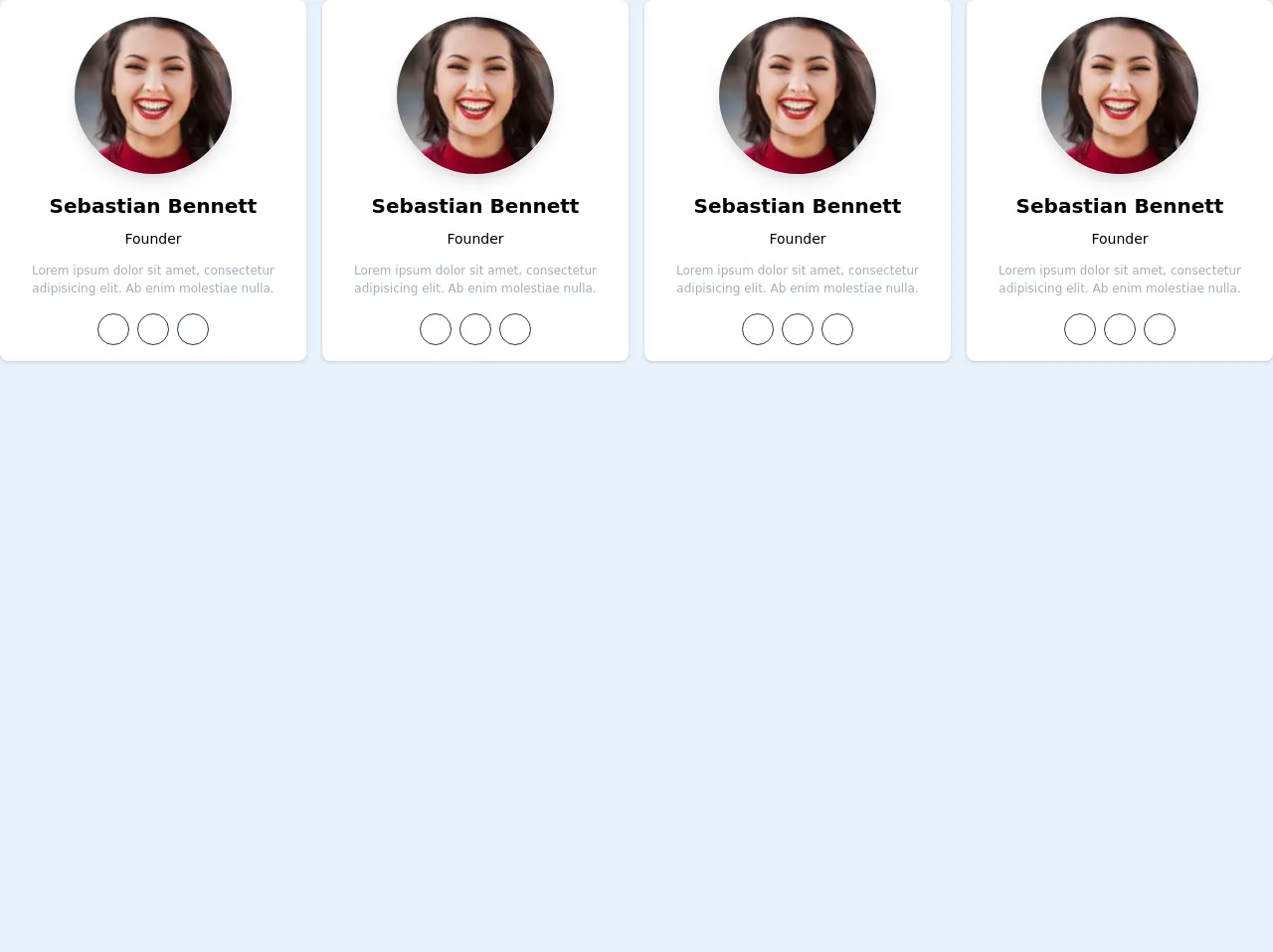
The Preview of Team Cards UI Component
To create a team card with Tailwind CSS, you can use a combination of pre-defined CSS classes and custom CSS. Here's a preview of what a team card might look like:
Free download of the Team cards's source code
The Source Code of Team Cards UI Component
To create a team card with Tailwind CSS, you'll need to use a combination of HTML and CSS. Here's an example of what the HTML and CSS might look like:
<div class="grid grid-cols-1 sm:grid-cols-2 md:grid-cols-3 xl:grid-cols-4 gap-4">

			<div class="flex flex-col items-center justify-center bg-white p-4 shadow rounded-lg">
				<div class="inline-flex shadow-lg border border-gray-200 rounded-full overflow-hidden h-40 w-40">
					<img src="https://images.unsplash.com/photo-1494790108377-be9c29b29330?ixlib=rb-1.2.1&ixid=eyJhcHBfaWQiOjEyMDd9&auto=format&fit=facearea&w=128&h=128&q=60&facepad=2"
						 alt=""
						 class="h-full w-full">
				</div>

				<h2 class="mt-4 font-bold text-xl">Sebastian Bennett</h2>
				<h6 class="mt-2 text-sm font-medium">Founder</h6>

				<p class="text-xs text-gray-500 text-center mt-3">
					Lorem ipsum dolor sit amet, consectetur adipisicing elit. Ab enim molestiae nulla.
				</p>

				<ul class="flex flex-row mt-4 space-x-2">
					<li>
						<a href="" class="flex items-center justify-center h-8 w-8 border rounded-full text-gray-800 border-gray-800">
							<i class="fab fa-facebook"></i>
						</a>
					</li>
					<li>
						<a href="" class="flex items-center justify-center h-8 w-8 border rounded-full text-gray-800 border-gray-800">
							<i class="fab fa-twitter"></i>
						</a>
					</li>
					<li>
						<a href="" class="flex items-center justify-center h-8 w-8 border rounded-full text-gray-800 border-gray-800">
							<i class="fab fa-instagram"></i>
						</a>
					</li>
				</ul>
			</div>

		</div>
How to Create a Team Cards with Tailwind CSS?
To create a team card with Tailwind CSS, follow these steps:
Step 1: Set up your HTML structure
First, you'll need to set up the HTML structure for your team card. Here's an example of what the HTML might look like:
<div class="team-card">
  <img src="team-member-photo.jpg" alt="Team Member Name">
  <h3 class="team-card-name">Team Member Name</h3>
  <p class="team-card-job-title">Job Title</p>
  <p class="team-card-description">Brief description of team member.</p>
</div>
Step 2: Style your team card with Tailwind CSS
Next, you'll need to style your team card using Tailwind CSS. Here's an example of what the CSS might look like:
.team-card {
  border: 1px solid #ccc;
  border-radius: 4px;
  padding: 16px;
  text-align: center;
}

.team-card img {
  width: 100%;
  max-width: 200px;
  border-radius: 50%;
  margin-bottom: 16px;
}

.team-card-name {
  font-size: 24px;
  font-weight: bold;
  margin-bottom: 8px;
}

.team-card-job-title {
  font-size: 18px;
  margin-bottom: 8px;
}

.team-card-description {
  font-size: 16px;
  line-height: 1.5;
}
Step 3: Customize your team card
Finally, you can customize your team card by adding your own colors, fonts, and other design elements. You can also add additional CSS classes to your team card to further customize its appearance.
Conclusion
Creating a team card with Tailwind CSS is a simple and effective way to showcase team members on your website or application. With its pre-defined CSS classes and customizable design, you can quickly create unique team cards that match your brand and style. Give it a try and see how easy it is to create beautiful team cards with Tailwind CSS!