- Published on
6 Steps To Build A Tin Tức With Tailwind CSS Like A Pro In Under An Hour
- What is Tailwind CSS?
- The description of Tin Tức ui component
- Why use Tailwind CSS to create a Tin Tức ui component?
- The preview of Tin Tức ui component.
- The source code of Tin Tức ui component.
- How to create a Tin Tức with Tailwind CSS?
- Step 1: Set up your HTML
- Step 2: Style your container
- Step 3: Style your news article divs
- Step 4: Add your title
- Step 5: Add your image
- Step 6: Add your summary and link
- Conclusion
As a FrontEnd technology blogger, I always look for ways to make my work more efficient and effective. One of the tools that I have found to be incredibly helpful in this regard is Tailwind CSS. Tailwind CSS is a utility-first CSS framework that allows you to quickly and easily create custom user interfaces. In this article, I will show you how to use Tailwind CSS to build a Tin Tức ui component in just six steps.
What is Tailwind CSS?
Tailwind CSS is a utility-first CSS framework that provides you with a set of pre-defined classes that you can use to style your HTML elements. It is designed to be highly customizable and allows you to create custom styles quickly and easily.
The description of Tin Tức ui component
Tin Tức is a Vietnamese word that means "news." In this context, a Tin Tức ui component is a user interface element that displays news articles in a visually appealing way. It typically includes a title, an image, a brief summary of the article, and a link to the full article.
Why use Tailwind CSS to create a Tin Tức ui component?
Tailwind CSS is an excellent choice for creating a Tin Tức ui component because it allows you to quickly and easily create custom styles that are both visually appealing and functional. With Tailwind CSS, you can easily create responsive designs that look great on any device, and you can customize your styles to match your brand's colors and typography.
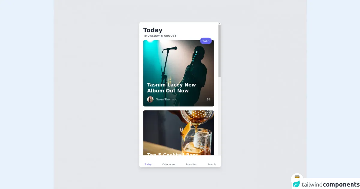
The preview of Tin Tức ui component.
To give you an idea of what a Tin Tức ui component looks like, here is a preview:
Free download of the Tin Tức's source code
The source code of Tin Tức ui component.
Here is the source code for the Tin Tức ui component:
<div class="min-w-screen min-h-screen bg-gray-200 flex items-center justify-center px-5 py-5">
<div class="bg-white text-gray-800 rounded-xl shadow-lg overflow-hidden relative flex" style="width:414px;height:736px">
<div class="bg-white h-full w-full px-5 pt-6 pb-20 overflow-y-auto">
<div class="mb-3">
<h1 class="text-3xl font-bold">Today</h1>
<p class="text-sm text-gray-500 uppercase font-bold">THURSDAY 6 AUGUST</p>
</div>
<div class="mb-5">
<a href="#" class="block rounded-lg relative p-5 transform transition-all duration-300 scale-100 hover:scale-95" style="background: url(https://images.unsplash.com/photo-1484876065684-b683cf17d276?ixlib=rb-1.2.1&ixid=eyJhcHBfaWQiOjEyMDd9&auto=format&fit=crop&w=668&q=80) center; background-size: cover;">
<div class="absolute top-0 right-0 -mt-3 mr-3">
<div class="rounded-full bg-indigo-500 text-white text-xs py-1 pl-2 pr-3 leading-none"><i class="mdi mdi-fire text-base align-middle"></i> <span class="align-middle">FRESH</span></div>
</div>
<div class="h-48"></div>
<h2 class="text-white text-2xl font-bold leading-tight mb-3 pr-5">Tasnim Lacey New Album Out Now</h2>
<div class="flex w-full items-center text-sm text-gray-300 font-medium">
<div class="flex-1 flex items-center">
<div class="rounded-full w-8 h-8 mr-3" style="background: url(https://randomuser.me/api/portraits/women/74.jpg) center; background-size: cover;"></div>
<div>Gwen Thomson</div>
</div>
<div><i class="mdi mdi-thumb-up"></i> 18</div>
</div>
</a>
</div>
<div class="mb-5">
<a href="#" class="block rounded-lg relative p-5 transform transition-all duration-300 scale-100 hover:scale-95" style="background: url(https://images.unsplash.com/photo-1470337458703-46ad1756a187?ixlib=rb-1.2.1&ixid=eyJhcHBfaWQiOjEyMDd9&auto=format&fit=crop&w=1649&q=80) center; background-size: cover;">
<div class="h-48"></div>
<h2 class="text-white text-2xl font-bold leading-tight mb-3 pr-5">Top 5 Cocktail Bars in NYC</h2>
<div class="flex w-full items-center text-sm text-gray-300 font-medium">
<div class="flex-1 flex items-center">
<div class="rounded-full w-8 h-8 mr-3" style="background: url(https://randomuser.me/api/portraits/women/55.jpg) center; background-size: cover;"></div>
<div>Kayden Buckley</div>
</div>
<div><i class="mdi mdi-thumb-up"></i> 7</div>
</div>
</a>
</div>
<div class="mb-3">
<h1 class="text-3xl font-bold">Yesterday</h1>
<p class="text-sm text-gray-500 uppercase font-bold">WEDNESDAY 5 AUGUST</p>
</div>
<div class="flex -mx-1 mb-5">
<div class="w-1/2 px-1">
<a href="#" class="block mb-2 p-5 rounded overflow-hidden transform transition-all duration-300 scale-100 hover:scale-95" style="background: url(https://images.unsplash.com/photo-1470225620780-dba8ba36b745?ixlib=rb-1.2.1&ixid=eyJhcHBfaWQiOjEyMDd9&auto=format&fit=crop&w=800&q=60) center; background-size: cover;">
<div class="h-24"></div>
<h3 class="text-lg font-bold text-white leading-tight">DJ Dan Spins The Wheels</h3>
</a>
<a href="#" class="block mb-2 p-5 rounded overflow-hidden transform transition-all duration-300 scale-100 hover:scale-95" style="background: url(https://images.unsplash.com/photo-1534329539061-64caeb388c42?ixlib=rb-1.2.1&ixid=eyJhcHBfaWQiOjEyMDd9&auto=format&fit=crop&w=800&q=60) center; background-size: cover;">
<div class="h-32"></div>
<h3 class="text-lg font-bold text-white leading-tight">Top Travels Destinations For 2020</h3>
</a>
</div>
<div class="w-1/2 px-1">
<a href="#" class="block mb-2 p-5 rounded overflow-hidden transform transition-all duration-300 scale-100 hover:scale-95" style="background: url(https://images.unsplash.com/photo-1526661934280-676cef25bc9b?ixlib=rb-1.2.1&ixid=eyJhcHBfaWQiOjEyMDd9&auto=format&fit=crop&w=800&q=60) center; background-size: cover;">
<div class="h-32"></div>
<h3 class="text-lg font-bold text-white leading-tight">M&S Launches New Makeup Range!</h3>
</a>
<a href="#" class="block mb-2 p-5 rounded overflow-hidden transform transition-all duration-300 scale-100 hover:scale-95" style="background: url(https://images.unsplash.com/photo-1558365849-6ebd8b0454b2?ixlib=rb-1.2.1&ixid=eyJhcHBfaWQiOjEyMDd9&auto=format&fit=crop&w=800&q=60) center; background-size: cover;">
<div class="h-24"></div>
<h3 class="text-lg font-bold text-white leading-tight">APT Set To Be A Ripper</h3>
</a>
</div>
</div>
<div class="mb-3">
<h1 class="text-3xl font-bold">Previous</h1>
</div>
<div>
<a href="#" class="flex w-full transform transition-all duration-300 scale-100 hover:scale-95">
<div class="block h-24 w-2/5 rounded overflow-hidden" style="background: url(https://images.unsplash.com/photo-1530549387789-4c1017266635?ixlib=rb-1.2.1&ixid=eyJhcHBfaWQiOjEyMDd9&auto=format&fit=crop&w=800&q=60) center; background-size: cover;"></div>
<div class="pl-3 w-3/5">
<p class="text-xs text-gray-500 uppercase font-semibold">SPORTS</p>
<h3 class="text-md font-semibold leading-tight mb-3">Lorem ipsum dolor sit amet consectetur adipisicing elit</h3>
<div class="flex w-full items-center text-xs text-gray-500 font-medium">
<div class="rounded-full w-5 h-5 mr-3" style="background: url(https://randomuser.me/api/portraits/men/41.jpg) center; background-size: cover;"></div>
<div>Jack Ryan</div>
</div>
</div>
</a>
</div>
<hr class="border-gray-200 my-3">
<div>
<a href="#" class="flex w-full transform transition-all duration-300 scale-100 hover:scale-95">
<div class="block h-24 w-2/5 rounded overflow-hidden" style="background: url(https://images.unsplash.com/photo-1499781350541-7783f6c6a0c8?ixlib=rb-1.2.1&ixid=eyJhcHBfaWQiOjEyMDd9&auto=format&fit=crop&w=800&q=60) center; background-size: cover;"></div>
<div class="pl-3 w-3/5">
<p class="text-xs text-gray-500 uppercase font-semibold">ART</p>
<h3 class="text-md font-semibold leading-tight mb-3">Lorem ipsum dolor sit amet consectetur adipisicing elit</h3>
<div class="flex w-full items-center text-xs text-gray-500 font-medium">
<div class="rounded-full w-5 h-5 mr-3" style="background: url(https://randomuser.me/api/portraits/men/63.jpg) center; background-size: cover;"></div>
<div>Kevin Jackson</div>
</div>
</div>
</a>
</div>
<hr class="border-gray-200 my-3">
<div>
<a href="#" class="flex w-full transform transition-all duration-300 scale-100 hover:scale-95">
<div class="block h-24 w-2/5 rounded overflow-hidden" style="background: url(https://images.unsplash.com/photo-1505740420928-5e560c06d30e?ixlib=rb-1.2.1&ixid=eyJhcHBfaWQiOjEyMDd9&auto=format&fit=crop&w=800&q=60) center; background-size: cover;"></div>
<div class="pl-3 w-3/5">
<p class="text-xs text-gray-500 uppercase font-semibold">MUSIC</p>
<h3 class="text-md font-semibold leading-tight mb-3">Lorem ipsum dolor sit amet consectetur adipisicing elit</h3>
<div class="flex w-full items-center text-xs text-gray-500 font-medium">
<div class="rounded-full w-5 h-5 mr-3" style="background: url(https://randomuser.me/api/portraits/women/11.jpg) center; background-size: cover;"></div>
<div>Rowena Wheeler</div>
</div>
</div>
</a>
</div>
<hr class="border-gray-200 my-3">
<div>
<a href="#" class="flex w-full transform transition-all duration-300 scale-100 hover:scale-95">
<div class="block h-24 w-2/5 rounded overflow-hidden" style="background: url(https://images.unsplash.com/photo-1511068797325-6083f0f872b1?ixlib=rb-1.2.1&ixid=eyJhcHBfaWQiOjEyMDd9&auto=format&fit=crop&w=800&q=60) center; background-size: cover;"></div>
<div class="pl-3 w-3/5">
<p class="text-xs text-gray-500 uppercase font-semibold">WORLD</p>
<h3 class="text-md font-semibold leading-tight mb-3">Lorem ipsum dolor sit amet consectetur adipisicing elit</h3>
<div class="flex w-full items-center text-xs text-gray-500 font-medium">
<div class="rounded-full w-5 h-5 mr-3" style="background: url(https://randomuser.me/api/portraits/women/74.jpg) center; background-size: cover;"></div>
<div>Gwen Thomson</div>
</div>
</div>
</a>
</div>
</div>
<div class="bg-white absolute bottom-0 w-full border-t border-gray-200 flex">
<a href="#" class="flex flex-grow items-center justify-center p-2 text-indigo-500 hover:text-indigo-500">
<div class="text-center">
<span class="block h-8 text-3xl leading-8">
<i class="mdi mdi-newspaper-variant-outline"></i>
</span>
<span class="block text-xs leading-none">Today</span>
</div>
</a>
<a href="#" class="flex flex-grow items-center justify-center p-2 text-gray-500 hover:text-indigo-500">
<div class="text-center">
<span class="block h-8 text-3xl leading-8">
<i class="mdi mdi-apps"></i>
</span>
<span class="block text-xs leading-none">Categories</span>
</div>
</a>
<a href="#" class="flex flex-grow items-center justify-center p-2 text-gray-500 hover:text-indigo-500">
<div class="text-center">
<span class="block h-8 text-3xl leading-8">
<i class="mdi mdi-star-outline"></i>
</span>
<span class="block text-xs leading-none">Favorites</span>
</div>
</a>
<a href="#" class="flex flex-grow items-center justify-center p-2 text-gray-500 hover:text-indigo-500">
<div class="text-center">
<span class="block h-8 text-3xl leading-8">
<i class="mdi mdi-magnify"></i>
</span>
<span class="block text-xs leading-none">Search</span>
</div>
</a>
</div>
</div>
</div>
<!-- BUY ME A BEER AND HELP SUPPORT OPEN-SOURCE RESOURCES -->
<div class="flex items-end justify-end fixed bottom-0 right-0 mb-4 mr-4 z-10">
<div>
<a title="Buy me a beer" href="https://www.buymeacoffee.com/scottwindon" target="_blank" class="block w-16 h-16 rounded-full transition-all shadow hover:shadow-lg transform hover:scale-110 hover:rotate-12">
<img class="object-cover object-center w-full h-full rounded-full" src="https://i.pinimg.com/originals/60/fd/e8/60fde811b6be57094e0abc69d9c2622a.jpg"/>
</a>
</div>
</div>
How to create a Tin Tức with Tailwind CSS?
Now that you have an idea of what a Tin Tức ui component looks like and what the source code looks like, let's get started with creating one using Tailwind CSS.
Step 1: Set up your HTML
The first step is to set up your HTML. Start by creating a container element for your Tin Tức ui component. Inside the container, create a series of div elements to hold each news article. Here is an example of what your HTML might look like:
<div class="container mx-auto">
  <div class="flex flex-wrap -mx-4">
    <div class="w-full md:w-1/2 lg:w-1/3 px-4 mb-8">
      <!-- News article 1 -->
    </div>
    <div class="w-full md:w-1/2 lg:w-1/3 px-4 mb-8">
      <!-- News article 2 -->
    </div>
    <div class="w-full md:w-1/2 lg:w-1/3 px-4 mb-8">
      <!-- News article 3 -->
    </div>
  </div>
</div>
Step 2: Style your container
Next, you will want to style your container element to give it a background color and some padding. Here is an example of what your CSS might look like:
.container {
  background-color: #f7fafc;
  padding: 2rem;
}
Step 3: Style your news article divs
Now it's time to style your news article divs. You will want to give each div a border, some padding, and a margin to separate them from each other. Here is an example of what your CSS might look like:
.news-article {
  border: 1px solid #e2e8f0;
  padding: 1rem;
  margin-bottom: 2rem;
}
Step 4: Add your title
Inside each news article div, you will want to add a title element. You can use an h2 element for this. Here is an example of what your HTML might look like:
<div class="news-article">
  <h2 class="text-xl font-bold mb-4">Title of news article</h2>
  <!-- Rest of news article -->
</div>
Step 5: Add your image
Next, you will want to add an image to each news article. You can use an img element for this. Here is an example of what your HTML might look like:
<div class="news-article">
  <h2 class="text-xl font-bold mb-4">Title of news article</h2>
  <img src="path/to/image.jpg" alt="Image for news article" class="w-full mb-4">
  <!-- Rest of news article -->
</div>
Step 6: Add your summary and link
Finally, you will want to add a brief summary of each news article and a link to the full article. You can use a p element for the summary and an a element for the link. Here is an example of what your HTML might look like:
<div class="news-article">
  <h2 class="text-xl font-bold mb-4">Title of news article</h2>
  <img src="path/to/image.jpg" alt="Image for news article" class="w-full mb-4">
  <p class="mb-4">Brief summary of news article</p>
  <a href="#" class="text-blue-500 hover:text-blue-700">Read more</a>
</div>
Conclusion
In this article, we have learned how to use Tailwind CSS to create a Tin Tức ui component in just six steps. By following these steps, you can quickly and easily create a visually appealing and functional user interface element that displays news articles in a way that is easy to read and navigate. With Tailwind CSS, you can customize your styles to match your brand's colors and typography, and you can create responsive designs that look great on any device.