- Published on
How to Build A Tailwind Card component With Tailwind CSS?
- What is Tailwind CSS?
- The description of Tailwind Card component ui component
- Why use Tailwind CSS to create a Tailwind Card component ui component?
- The preview of Tailwind Card component ui component
- The source code of Tailwind Card component ui component
- How to create a Tailwind Card component with Tailwind CSS?
- Step 1: Set up the HTML structure
- Step 2: Style the card component
- Conclusion
What is Tailwind CSS?
Tailwind CSS is a utility-first CSS framework that allows developers to quickly create custom designs without writing any CSS. It provides a set of pre-defined CSS classes that can be used to style HTML elements. Tailwind CSS is highly customizable and can be configured to match the design requirements of any project.
The description of Tailwind Card component ui component
A card is a UI component that is commonly used to display content in a structured manner. It is a container that can hold text, images, and other UI elements. A card typically has a title, a body, and some optional buttons or links.
Why use Tailwind CSS to create a Tailwind Card component ui component?
Tailwind CSS provides a set of pre-defined CSS classes that can be used to create a card component quickly and easily. The classes can be customized to match the design requirements of the project, and the resulting code is clean and easy to maintain.
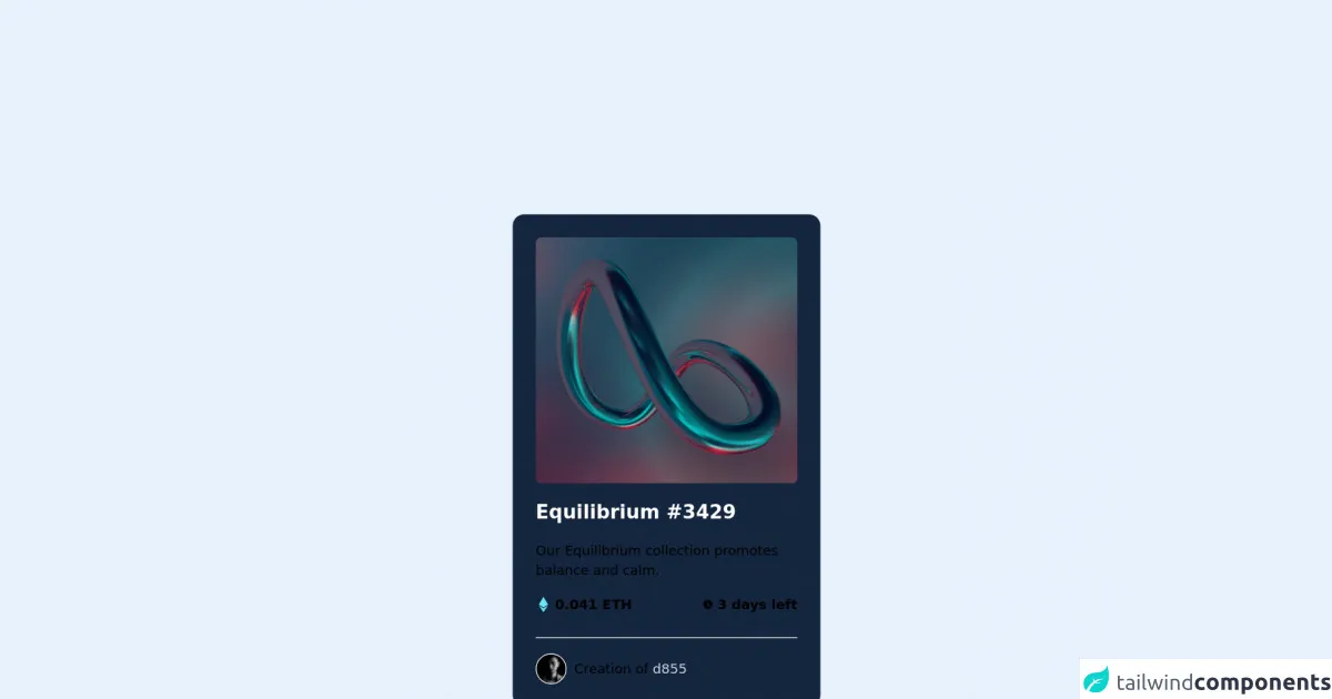
The preview of Tailwind Card component ui component
To create a Tailwind Card component, we will use a combination of CSS classes provided by Tailwind CSS. The resulting card will have a title, an image, and a body section.
Free download of the Tailwind Card component's source code
The source code of Tailwind Card component ui component
To create a Tailwind Card component, we will use a combination of CSS classes provided by Tailwind CSS. The resulting code is clean and easy to maintain.
<div class="card bg-[#15263F] w-80 h-[32rem] rounded-xl p-6 space-y-4">
            <a href="#">
                <img class="w-full h-64 rounded-md transition hover:bg-cyan-300"
                    src="https://images.unsplash.com/photo-1635002962487-2c1d4d2f63c2?ixlib=rb-1.2.1&ixid=MnwxMjA3fDB8MHxzZWFyY2h8M3x8ZGlnaXRhbCUyMGFydHxlbnwwfDJ8MHx8&auto=format&fit=crop&w=800&q=60"
                    alt="">
            </a>
            <div id="description" class="space-y-4">
                <a href="#">
                    <h2 class="text-white font-semibold text-xl transition hover:text-cyan-300">
                        Equilibrium #3429
                    </h2>
                </a>
                <p class="text-slate-500 text-sm select-none">Our Equilibrium collection promotes balance and calm.</p>
                <div class="flex items-center justify-between font-semibold text-sm border-b border-slate-500 pb-6">
                    <span id="price" class="text-cyan-300 flex justify-between items-center">
                        <svg xmlns="http://www.w3.org/2000/svg" class="h-4 w-4 mr-1" viewBox="0 0 320 512" fill="#67E7F9">
                            <!--! Font Awesome Pro 6.0.0 by @fontawesome - https://fontawesome.com License - https://fontawesome.com/license (Commercial License) Copyright 2022 Fonticons, Inc. -->
                            <path d="M311.9 260.8L160 353.6 8 260.8 160 0l151.9 260.8zM160 383.4L8 290.6 160 512l152-221.4-152 92.8z" />
                        </svg>
                        0.041 ETH
                    </span>
                    <span class="text-slate-500 flex justify-between items-center select-none">
                        <svg xmlns="http://www.w3.org/2000/svg" class="h-3 w-3 mr-1" viewBox="0 0 20 20" fill="currentColor">
                            <path fill-rule="evenodd"
                                d="M10 18a8 8 0 100-16 8 8 0 000 16zm1-12a1 1 0 10-2 0v4a1 1 0 00.293.707l2.828 2.829a1 1 0 101.415-1.415L11 9.586V6z"
                                clip-rule="evenodd" />
                        </svg>
                        3 days left
                    </span>
                </div>
                <div class="flex text-sm items-center">
                    <img src="https://i.pravatar.cc/30?img=56" alt="avatar" class="rounded-full border border-white">
                    <span class="ml-2 text-slate-500">
                        Creation of
                        <a href="#" class="text-gray-300 transition hover:text-cyan-300">
                            d855
                        </a>
                    </span>
                </div>
        </div>
How to create a Tailwind Card component with Tailwind CSS?
To create a Tailwind Card component, follow these steps:
Step 1: Set up the HTML structure
The first step is to set up the HTML structure for the card component. We will use a div element with a class of card to create the card container. Inside the card container, we will create a div element with a class of card-header to hold the card title, an img element with a class of card-img to display the card image, and a div element with a class of card-body to hold the card content.
<div class="card">
  <div class="card-header">
    <h2 class="card-title">Card Title</h2>
  </div>
  <img class="card-img" src="https://via.placeholder.com/150" alt="Card image">
  <div class="card-body">
    <p class="card-text">Lorem ipsum dolor sit amet, consectetur adipiscing elit. Sed euismod, sapien eget bibendum aliquam, lorem ipsum.</p>
  </div>
</div>
Step 2: Style the card component
Next, we will use Tailwind CSS classes to style the card component. We will use the bg-white, shadow-md, and rounded-lg classes to give the card a white background, a shadow effect, and rounded corners. We will use the p-4 class to add padding to the card container.
<div class="card bg-white shadow-md rounded-lg p-4">
  <div class="card-header">
    <h2 class="card-title">Card Title</h2>
  </div>
  <img class="card-img" src="https://via.placeholder.com/150" alt="Card image">
  <div class="card-body">
    <p class="card-text">Lorem ipsum dolor sit amet, consectetur adipiscing elit. Sed euismod, sapien eget bibendum aliquam, lorem ipsum.</p>
  </div>
</div>
We will use the text-lg class to increase the font size of the card title, and the mb-4 class to add margin to the bottom of the card title.
<div class="card bg-white shadow-md rounded-lg p-4">
  <div class="card-header">
    <h2 class="card-title text-lg mb-4">Card Title</h2>
  </div>
  <img class="card-img" src="https://via.placeholder.com/150" alt="Card image">
  <div class="card-body">
    <p class="card-text">Lorem ipsum dolor sit amet, consectetur adipiscing elit. Sed euismod, sapien eget bibendum aliquam, lorem ipsum.</p>
  </div>
</div>
We will use the object-cover class to ensure that the card image covers the entire container, and the h-48 class to set the height of the card image to 48 pixels.
<div class="card bg-white shadow-md rounded-lg p-4">
  <div class="card-header">
    <h2 class="card-title text-lg mb-4">Card Title</h2>
  </div>
  <img class="card-img object-cover h-48" src="https://via.placeholder.com/150" alt="Card image">
  <div class="card-body">
    <p class="card-text">Lorem ipsum dolor sit amet, consectetur adipiscing elit. Sed euismod, sapien eget bibendum aliquam, lorem ipsum.</p>
  </div>
</div>
Finally, we will use the text-gray-700 class to set the color of the card text to gray.
<div class="card bg-white shadow-md rounded-lg p-4">
  <div class="card-header">
    <h2 class="card-title text-lg mb-4">Card Title</h2>
  </div>
  <img class="card-img object-cover h-48" src="https://via.placeholder.com/150" alt="Card image">
  <div class="card-body">
    <p class="card-text text-gray-700">Lorem ipsum dolor sit amet, consectetur adipiscing elit. Sed euismod, sapien eget bibendum aliquam, lorem ipsum.</p>
  </div>
</div>
Conclusion
In this article, we learned how to create a Tailwind Card component using Tailwind CSS. We used a combination of HTML and CSS classes provided by Tailwind CSS to create a card component with a title, an image, and a body section. The resulting code is clean, easy to maintain, and highly customizable. With Tailwind CSS, developers can quickly create custom UI components without writing any CSS.