- Published on
The Ultimate Guide To Help You Build A Table with actions inside With Tailwind CSS
- What is Tailwind CSS?
- The description of Table with actions inside ui component
- Why use Tailwind CSS to create a Table with actions inside ui component?
- The preview of Table with actions inside ui component.
- The source code of Table with actions inside ui component.
- How to create a Table with actions inside with Tailwind CSS?
- Step 1: Create the HTML structure
- Step 2: Create the table rows
- Step 3: Style the table with Tailwind CSS
- Conclusion
In this article, we will discuss how to create a Table with actions inside ui component using Tailwind CSS. We will go through the step-by-step process of creating this component and why Tailwind CSS is the perfect tool for the job.
What is Tailwind CSS?
Tailwind CSS is a utility-first CSS framework that allows you to rapidly build custom user interfaces. It provides a set of pre-defined classes that you can use to style your HTML elements. With Tailwind CSS, you can create complex UI components without writing custom CSS.
The description of Table with actions inside ui component
A Table with actions inside is a UI component that displays data in a tabular format and allows users to perform actions on each row. This component is commonly used in web applications to display data in a structured manner. The actions inside the table can be anything from editing, deleting, or viewing more details about a row.
Why use Tailwind CSS to create a Table with actions inside ui component?
Tailwind CSS is the perfect tool for creating a Table with actions inside UI component because it provides a set of pre-defined classes that you can use to style your HTML elements. This means that you can create complex UI components without writing custom CSS. Additionally, Tailwind CSS is highly customizable, which means that you can easily modify the styles of your components to match your design requirements.
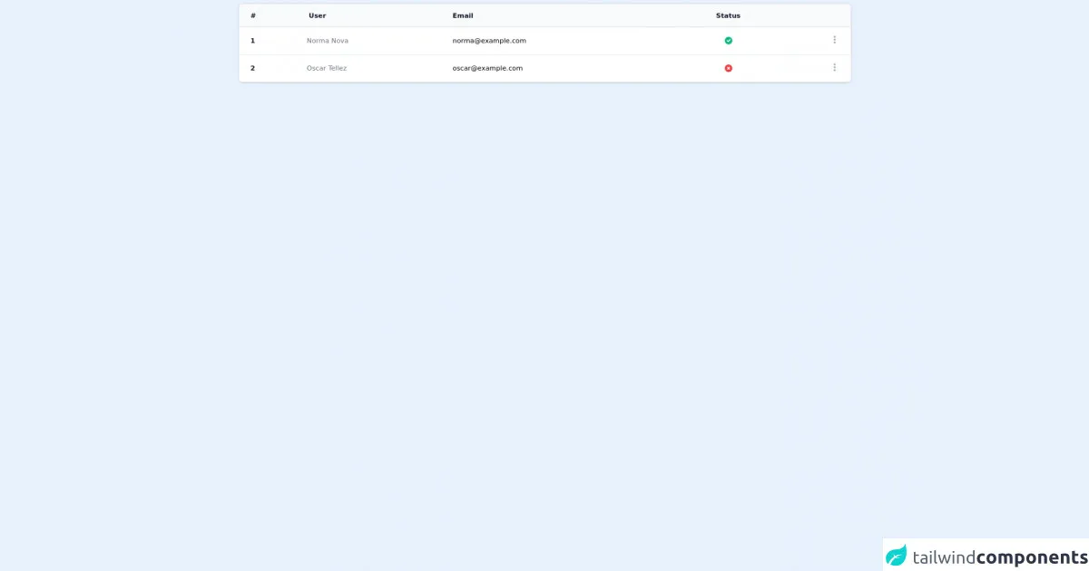
The preview of Table with actions inside ui component.
To create a Table with actions inside UI component, we will use Tailwind CSS to style our HTML elements. The final result will be a table that displays data in a structured manner and allows users to perform actions on each row.
Free download of the Table with actions inside's source code
The source code of Table with actions inside ui component.
To create a Table with actions inside UI component, we will use HTML and Tailwind CSS. The HTML code will define the structure of the table, and the Tailwind CSS classes will be used to style the table.
<div class="max-w-7xl mx-auto">
    <div class="inline-block min-w-full py-2 align-middle">
        <div class="overflow-hidden shadow ring-1 ring-black ring-opacity-5 md:rounded-lg">
            <table class="min-w-full divide-y divide-gray-300">
                <thead class="bg-gray-50">
                    <tr>
                        <th scope="col" class="py-3.5 pl-4 pr-3 text-left text-sm font-semibold text-gray-900 sm:pl-6">#</th>
                        <th scope="col" class="py-3.5 pl-4 pr-3 text-left text-sm font-semibold text-gray-900">User</th>
                        <th scope="col" class="px-3 py-3.5 text-left text-sm font-semibold text-gray-900">Email</th>
                        <th scope="col" class="px-3 py-3.5 text-center text-sm font-semibold text-gray-900">Status</th>
                        <th scope="col" class="relative py-3.5 pl-3 pr-4 sm:pr-6">
                            <span class="sr-only">Actions</span>
                        </th>
                    </tr>
                </thead>
                <tbody class="divide-y divide-gray-200 bg-white">
                    <tr>
                        <td class="whitespace-nowrap py-4 pl-4 pr-3 text-sm font-semibold text-gray-900 sm:pl-6">1</td>
                        <td class="whitespace-nowrap px-3 py-4 text-sm text-gray-500">Norma Nova</td>
                        <td class="whitespace-nowrap px-3 py-4 text-sm">
                            [email protected]
                        </td>
                        <td class="whitespace-nowrap px-3 py-4 text-sm">
                            <span class="flex justify-center">
                                <svg xmlns="http://www.w3.org/2000/svg" class="h-5 w-5 text-green-500" viewBox="0 0 20 20" fill="currentColor">
                                    <path fill-rule="evenodd" d="M10 18a8 8 0 100-16 8 8 0 000 16zm3.707-9.293a1 1 0 00-1.414-1.414L9 10.586 7.707 9.293a1 1 0 00-1.414 1.414l2 2a1 1 0 001.414 0l4-4z" clip-rule="evenodd" />
                                </svg>
                            </span>
                        </td>
                        <td class="py-4 pl-3 pr-4 text-right text-sm font-medium sm:pr-6">
                            <div class="inline-block text-left" x-data="{ menu: false }">
                                <button x-on:click="menu = ! menu" type="button" class="flex items-center text-gray-400 hover:text-gray-600 focus:outline-none" id="menu-button" aria-expanded="true" aria-haspopup="true">
                                    <span class="sr-only"></span>
                                    <svg class="h-5 w-5" xmlns="http://www.w3.org/2000/svg" viewBox="0 0 20 20" fill="currentColor" aria-hidden="true">
                                    <path d="M10 6a2 2 0 110-4 2 2 0 010 4zM10 12a2 2 0 110-4 2 2 0 010 4zM10 18a2 2 0 110-4 2 2 0 010 4z" />
                                    </svg>
                                </button>
                                <div x-show="menu" x-on:click.away="menu = false" class="origin-top-right absolute right-32 mt-2 w-56 rounded-md shadow-lg bg-white ring-1 ring-black ring-opacity-5 divide-y divide-gray-100 focus:outline-none" role="menu" aria-orientation="vertical" aria-labelledby="menu-button" tabindex="-1">
                                    <div class="" role="none">
                                        <a href="#" class="text-gray-500 font-medium hover:text-gray-900 hover:bg-gray-50 block px-4 py-2 text-sm" role="menuitem" tabindex="-1" id="menu-item-0">
                                            Detalle
                                        </a>
                                    </div>
                                    <div class="" role="none">
                                        <a href="#" class="text-gray-500 font-medium hover:text-gray-900 hover:bg-gray-50 block px-4 py-2 text-sm" role="menuitem" tabindex="-1" id="menu-item-0">
                                            Editar
                                        </a>
                                    </div>
                                </div>
                            </div>
                        </td>
                    </tr>

                    <tr>
                        <td class="whitespace-nowrap py-4 pl-4 pr-3 text-sm font-semibold text-gray-900 sm:pl-6">2</td>
                        <td class="whitespace-nowrap px-3 py-4 text-sm text-gray-500">Oscar Tellez</td>
                        <td class="whitespace-nowrap px-3 py-4 text-sm">
                            [email protected]
                        </td>
                        <td class="whitespace-nowrap px-3 py-4 text-sm">
                            <span class="flex justify-center">
                                <svg xmlns="http://www.w3.org/2000/svg" class="h-5 w-5 text-red-500" viewBox="0 0 20 20" fill="currentColor">
                                    <path fill-rule="evenodd" d="M10 18a8 8 0 100-16 8 8 0 000 16zM8.707 7.293a1 1 0 00-1.414 1.414L8.586 10l-1.293 1.293a1 1 0 101.414 1.414L10 11.414l1.293 1.293a1 1 0 001.414-1.414L11.414 10l1.293-1.293a1 1 0 00-1.414-1.414L10 8.586 8.707 7.293z" clip-rule="evenodd" />
                                </svg>
                            </span>
                        </td>
                        <td class="py-4 pl-3 pr-4 text-right text-sm font-medium sm:pr-6">
                            <div class="inline-block text-left" x-data="{ menu: false }">
                                <button x-on:click="menu = ! menu" type="button" class="flex items-center text-gray-400 hover:text-gray-600 focus:outline-none" id="menu-button" aria-expanded="true" aria-haspopup="true">
                                    <span class="sr-only"></span>
                                    <svg class="h-5 w-5" xmlns="http://www.w3.org/2000/svg" viewBox="0 0 20 20" fill="currentColor" aria-hidden="true">
                                    <path d="M10 6a2 2 0 110-4 2 2 0 010 4zM10 12a2 2 0 110-4 2 2 0 010 4zM10 18a2 2 0 110-4 2 2 0 010 4z" />
                                    </svg>
                                </button>
                                <div x-show="menu" x-on:click.away="menu = false" class="origin-top-right absolute right-32 mt-2 w-56 rounded-md shadow-lg bg-white ring-1 ring-black ring-opacity-5 divide-y divide-gray-100 focus:outline-none" role="menu" aria-orientation="vertical" aria-labelledby="menu-button" tabindex="-1">
                                    <div class="" role="none">
                                        <a href="#" class="text-gray-500 font-medium hover:text-gray-900 hover:bg-gray-50 block px-4 py-2 text-sm" role="menuitem" tabindex="-1" id="menu-item-0">
                                            Detalle
                                        </a>
                                    </div>
                                    <div class="" role="none">
                                        <a href="#" class="text-gray-500 font-medium hover:text-gray-900 hover:bg-gray-50 block px-4 py-2 text-sm" role="menuitem" tabindex="-1" id="menu-item-0">
                                            Editar
                                        </a>
                                    </div>
                                </div>
                            </div>
                        </td>
                    </tr>
                </tbody>
            </table>
        </div>
    </div>
</div>
<script src="https://cdn.jsdelivr.net/gh/alpinejs/[email protected]/dist/alpine.min.js" defer></script>
How to create a Table with actions inside with Tailwind CSS?
To create a Table with actions inside UI component, we will follow these steps:
Step 1: Create the HTML structure
The first step is to create the HTML structure of the table. We will use the table and tr tags to create the table rows and columns. We will also add a thead tag to define the table header.
<table class="min-w-full divide-y divide-gray-200">
  <thead>
    <tr>
      <th class="px-6 py-3 bg-gray-50 text-left text-xs font-medium text-gray-500 uppercase tracking-wider">
        Name
      </th>
      <th class="px-6 py-3 bg-gray-50 text-left text-xs font-medium text-gray-500 uppercase tracking-wider">
        Title
      </th>
      <th class="px-6 py-3 bg-gray-50 text-left text-xs font-medium text-gray-500 uppercase tracking-wider">
        Status
      </th>
      <th class="px-6 py-3 bg-gray-50 text-left text-xs font-medium text-gray-500 uppercase tracking-wider">
        Actions
      </th>
    </tr>
  </thead>
  <tbody class="bg-white divide-y divide-gray-200">
    <!-- Table rows will go here -->
  </tbody>
</table>
Step 2: Create the table rows
The next step is to create the table rows. We will use the tr tag to create each row and the td tag to create each column. We will also add a button to each row to allow users to perform actions on that row.
<tbody class="bg-white divide-y divide-gray-200">
  <tr>
    <td class="px-6 py-4 whitespace-nowrap">
      <div class="flex items-center">
        <div class="ml-4">
          <div class="text-sm font-medium text-gray-900">
            Jane Cooper
          </div>
          <div class="text-sm text-gray-500">
            [email protected]
          </div>
        </div>
      </div>
    </td>
    <td class="px-6 py-4 whitespace-nowrap">
      <div class="text-sm text-gray-900">Regional Paradigm Technician</div>
      <div class="text-sm text-gray-500">Optimization</div>
    </td>
    <td class="px-6 py-4 whitespace-nowrap">
      <span
        class="px-2 inline-flex text-xs leading-5 font-semibold rounded-full bg-green-100 text-green-800"
      >
        Active
      </span>
    </td>
    <td class="px-6 py-4 whitespace-nowrap text-right text-sm font-medium">
      <a href="#" class="text-indigo-600 hover:text-indigo-900"
        >Edit</a
      >
      <a href="#" class="text-red-600 hover:text-red-900 ml-4"
        >Delete</a
      >
    </td>
  </tr>
</tbody>
Step 3: Style the table with Tailwind CSS
The final step is to style the table with Tailwind CSS. We will use the pre-defined classes provided by Tailwind CSS to style the table. Here is an example of how we can style the table header:
.bg-gray-50 {
  background-color: #f9fafb;
}

.text-gray-500 {
  color: #6b7280;
}

.tracking-wider {
  letter-spacing: 0.05em;
}

.uppercase {
  text-transform: uppercase;
}
Conclusion
In this article, we have discussed how to create a Table with actions inside UI component using Tailwind CSS. We have gone through the step-by-step process of creating this component and why Tailwind CSS is the perfect tool for the job. With Tailwind CSS, you can easily create complex UI components without writing custom CSS.