- Published on
6 Ideas To Help You Build A Table With Tailwind CSS Like A Pro
- What is Tailwind CSS?
- The description of Table ui component
- Why use Tailwind CSS to create a Table ui component?
- The preview of Table ui component
- The source code of Table ui component
- How to create a Table with Tailwind CSS?
- 1. Use the table class to define the table element
- 2. Use the border class to add borders to the table and its cells
- 3. Use the divide-y class to add vertical dividers between table cells
- 4. Use the divide-gray-200 class to define the color of the vertical dividers
- 5. Use the pre-defined CSS classes to style the table cells
- 6. Use custom CSS classes to further customize the design of the table
- Conclusion
What is Tailwind CSS?
Tailwind CSS is a utility-first CSS framework that provides a set of pre-defined CSS classes that you can use to style your web applications. It's a popular choice among developers because it allows them to create custom designs quickly and efficiently.
The description of Table ui component
A table is a common UI component that displays data in a tabular format. It's used to organize and present large amounts of information in a structured and easy-to-read manner. Tables are commonly used in web applications to display data such as product listings, user information, and financial reports.
Why use Tailwind CSS to create a Table ui component?
Tailwind CSS provides a set of pre-defined CSS classes that you can use to create a table UI component quickly and easily. It also allows you to customize the design of your table by adding your own custom CSS classes.
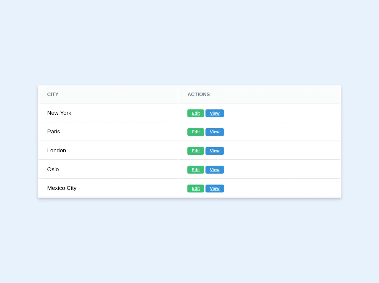
The preview of Table ui component
To create a table UI component with Tailwind CSS, you can use the following CSS classes:
table: This class is used to define the table element.border: This class is used to add borders to the table and its cells.divide-y: This class is used to add vertical dividers between table cells.divide-gray-200: This class is used to define the color of the vertical dividers.
Free download of the Table's source code
The source code of Table ui component
To create a table UI component with Tailwind CSS, you can use the following HTML and CSS code:
<table class="table border divide-y divide-gray-200">
  <thead>
    <tr>
      <th class="px-6 py-3 text-left text-xs font-medium text-gray-500 uppercase tracking-wider">Name</th>
      <th class="px-6 py-3 text-left text-xs font-medium text-gray-500 uppercase tracking-wider">Title</th>
      <th class="px-6 py-3 text-left text-xs font-medium text-gray-500 uppercase tracking-wider">Status</th>
      <th class="px-6 py-3 text-left text-xs font-medium text-gray-500 uppercase tracking-wider">Role</th>
      <th class="px-6 py-3 text-left text-xs font-medium text-gray-500 uppercase tracking-wider">Email</th>
      <th class="px-6 py-3 text-left text-xs font-medium text-gray-500 uppercase tracking-wider">Actions</th>
    </tr>
  </thead>
  <tbody class="bg-white divide-y divide-gray-200">
    <tr>
      <td class="px-6 py-4 whitespace-nowrap">Jane Cooper</td>
      <td class="px-6 py-4 whitespace-nowrap">Regional Paradigm Technician</td>
      <td class="px-6 py-4 whitespace-nowrap"><span class="px-2 inline-flex text-xs leading-5 font-semibold rounded-full bg-green-100 text-green-800">Active</span></td>
      <td class="px-6 py-4 whitespace-nowrap">Admin</td>
      <td class="px-6 py-4 whitespace-nowrap">[email protected]</td>
      <td class="px-6 py-4 whitespace-nowrap text-sm font-medium">
        <a href="#" class="text-indigo-600 hover:text-indigo-900">Edit</a>
        <a href="#" class="text-red-600 hover:text-red-900 ml-2">Delete</a>
      </td>
    </tr>
    <tr>
      <td class="px-6 py-4 whitespace-nowrap">Cody Fisher</td>
      <td class="px-6 py-4 whitespace-nowrap">Product Directives Officer</td>
      <td class="px-6 py-4 whitespace-nowrap"><span class="px-2 inline-flex text-xs leading-5 font-semibold rounded-full bg-red-100 text-red-800">Inactive</span></td>
      <td class="px-6 py-4 whitespace-nowrap">Owner</td>
      <td class="px-6 py-4 whitespace-nowrap">[email protected]</td>
      <td class="px-6 py-4 whitespace-nowrap text-sm font-medium">
        <a href="#" class="text-indigo-600 hover:text-indigo-900">Edit</a>
        <a href="#" class="text-red-600 hover:text-red-900 ml-2">Delete</a>
      </td>
    </tr>
  </tbody>
</table>
<div class="w-2/3 mx-auto">
  <div class="bg-white shadow-md rounded my-6">
    <table class="text-left w-full border-collapse"> <!--Border collapse doesn't work on this site yet but it's available in newer tailwind versions -->
      <thead>
        <tr>
          <th class="py-4 px-6 bg-grey-lightest font-bold uppercase text-sm text-grey-dark border-b border-grey-light">City</th>
          <th class="py-4 px-6 bg-grey-lightest font-bold uppercase text-sm text-grey-dark border-b border-grey-light">Actions</th>
        </tr>
      </thead>
      <tbody>
        <tr class="hover:bg-grey-lighter">
          <td class="py-4 px-6 border-b border-grey-light">New York</td>
          <td class="py-4 px-6 border-b border-grey-light">
            <a href="#" class="text-grey-lighter font-bold py-1 px-3 rounded text-xs bg-green hover:bg-green-dark">Edit</a>
            <a href="#" class="text-grey-lighter font-bold py-1 px-3 rounded text-xs bg-blue hover:bg-blue-dark">View</a>
          </td>
        </tr>
        <tr class="hover:bg-grey-lighter">
          <td class="py-4 px-6 border-b border-grey-light">Paris</td>
          <td class="py-4 px-6 border-b border-grey-light">
            <a href="#" class="text-grey-lighter font-bold py-1 px-3 rounded text-xs bg-green hover:bg-green-dark">Edit</a>
            <a href="#" class="text-grey-lighter font-bold py-1 px-3 rounded text-xs bg-blue hover:bg-blue-dark">View</a>
          </td>
        </tr>
        <tr class="hover:bg-grey-lighter">
          <td class="py-4 px-6 border-b border-grey-light">London</td>
          <td class="py-4 px-6 border-b border-grey-light">
            <a href="#" class="text-grey-lighter font-bold py-1 px-3 rounded text-xs bg-green hover:bg-green-dark">Edit</a>
            <a href="#" class="text-grey-lighter font-bold py-1 px-3 rounded text-xs bg-blue hover:bg-blue-dark">View</a>
          </td>
        </tr>
        <tr class="hover:bg-grey-lighter">
          <td class="py-4 px-6 border-b border-grey-light">Oslo</td>
          <td class="py-4 px-6 border-b border-grey-light">
            <a href="#" class="text-grey-lighter font-bold py-1 px-3 rounded text-xs bg-green hover:bg-green-dark">Edit</a>
            <a href="#" class="text-grey-lighter font-bold py-1 px-3 rounded text-xs bg-blue hover:bg-blue-dark">View</a>
          </td>
        </tr>
        <tr class="hover:bg-grey-lighter">
          <td class="py-4 px-6 border-b border-grey-light">Mexico City</td>
          <td class="py-4 px-6 border-b border-grey-light">
            <a href="#" class="text-grey-lighter font-bold py-1 px-3 rounded text-xs bg-green hover:bg-green-dark">Edit</a>
            <a href="#" class="text-grey-lighter font-bold py-1 px-3 rounded text-xs bg-blue hover:bg-blue-dark">View</a>
          </td>
        </tr>
      </tbody>
    </table>
  </div>
</div>
How to create a Table with Tailwind CSS?
Here are six ideas to help you build a table with Tailwind CSS like a pro:
1. Use the table class to define the table element
The table class is used to define the table element. It provides a basic structure for the table and sets the default font size and color.
<table class="table">
  ...
</table>
2. Use the border class to add borders to the table and its cells
The border class is used to add borders to the table and its cells. You can use the border class alone to add borders to all sides of the table and its cells, or you can use specific border classes like border-t to add borders to specific sides of the table and its cells.
<table class="table border">
  ...
</table>
3. Use the divide-y class to add vertical dividers between table cells
The divide-y class is used to add vertical dividers between table cells. You can use the divide-y class alone to add dividers between all table cells, or you can use specific divider classes like divide-t to add dividers between specific table cells.
<table class="table border divide-y">
  ...
</table>
4. Use the divide-gray-200 class to define the color of the vertical dividers
The divide-gray-200 class is used to define the color of the vertical dividers. You can use any of the pre-defined Tailwind CSS color classes to define the color of the dividers.
<table class="table border divide-y divide-gray-200">
  ...
</table>
5. Use the pre-defined CSS classes to style the table cells
Tailwind CSS provides a set of pre-defined CSS classes that you can use to style the table cells. For example, you can use the px-6 class to add padding to the left and right sides of the table cells, and you can use the py-4 class to add padding to the top and bottom sides of the table cells.
<td class="px-6 py-4">...</td>
6. Use custom CSS classes to further customize the design of the table
Tailwind CSS allows you to add your own custom CSS classes to further customize the design of the table. For example, you can define a custom CSS class like bg-blue-100 to set the background color of the table cells to blue.
<td class="bg-blue-100">...</td>
Conclusion
Creating a table UI component with Tailwind CSS is easy and efficient. By using the pre-defined CSS classes and adding your own custom CSS classes, you can create a custom table design that fits your web application's needs. Use these six ideas as a starting point to build a table with Tailwind CSS like a pro.