- Published on
A Complete Guide To Make A Slack Clone With Tailwind CSS
- What is Tailwind CSS?
- The description of Slack Clone ui component
- Why use Tailwind CSS to create a Slack Clone ui component?
- The preview of Slack Clone ui component
- The source code of Slack Clone ui component
- How to create a Slack Clone with Tailwind CSS?
- Step 1: Set up the project
- Step 2: Create the sidebar
- Step 3: Create the main area
- Step 4: Create the user profile
- Step 5: Style the Slack Clone UI component
- Conclusion
Slack is a popular communication platform used by millions of people around the world. It offers a wide range of features and functionalities that make it easy for teams to collaborate and communicate effectively. In this tutorial, we will show you how to create a Slack clone using Tailwind CSS.
What is Tailwind CSS?
Tailwind CSS is a utility-first CSS framework that makes it easy to create custom designs without writing any CSS code. It provides a set of pre-defined classes that you can use to style your HTML elements. Tailwind CSS is highly customizable and allows you to create a unique design for your website or application.
The description of Slack Clone ui component
The Slack Clone UI component is a replica of the Slack user interface. It includes all the essential features and functionalities of Slack, such as channels, messages, notifications, and user profiles. The Slack Clone UI component is built using HTML, CSS, and JavaScript.
Why use Tailwind CSS to create a Slack Clone ui component?
Tailwind CSS provides a set of pre-defined classes that you can use to style your HTML elements. This makes it easy to create a custom design without writing any CSS code. Tailwind CSS is highly customizable and allows you to create a unique design for your website or application.
Using Tailwind CSS to create a Slack Clone UI component will save you a lot of time and effort. You can easily customize the design of the Slack Clone UI component by modifying the pre-defined classes provided by Tailwind CSS.
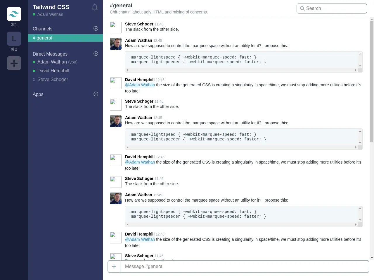
The preview of Slack Clone ui component
The Slack Clone UI component includes a sidebar that displays all the channels and a main area that displays the messages. The user profile is displayed in the top right corner of the screen.
Free download of the Slack Clone's source code
The source code of Slack Clone ui component
The source code of the Slack Clone UI component is available on GitHub. You can download the code and modify it to suit your needs.
<div class="font-sans antialiased h-screen flex">
<!-- Sidebar / channel list -->
<div class="bg-indigo-darkest text-purple-lighter flex-none w-24 p-6 hidden md:block">
<div class="cursor-pointer mb-4">
<div class="bg-white h-12 w-12 flex items-center justify-center text-black text-2xl font-semibold rounded-lg mb-1 overflow-hidden">
<img src="https://pbs.twimg.com/profile_images/895274026783866881/E1G1nNb0_400x400.jpg" alt="">
</div>
<div class="text-center text-white opacity-50 text-sm">⌘1</div>
</div>
<div class="cursor-pointer mb-4">
<div class="bg-indigo-lighter opacity-25 h-12 w-12 flex items-center justify-center text-black text-2xl font-semibold rounded-lg mb-1 overflow-hidden">
L
</div>
<div class="text-center text-white opacity-50 text-sm">⌘2</div>
</div>
<div class="cursor-pointer">
<div class="bg-white opacity-25 h-12 w-12 flex items-center justify-center text-black text-2xl font-semibold rounded-lg mb-1 overflow-hidden">
<svg class="fill-current h-10 w-10 block" xmlns="http://www.w3.org/2000/svg" viewBox="0 0 20 20"><path d="M16 10c0 .553-.048 1-.601 1H11v4.399c0 .552-.447.601-1 .601-.553 0-1-.049-1-.601V11H4.601C4.049 11 4 10.553 4 10c0-.553.049-1 .601-1H9V4.601C9 4.048 9.447 4 10 4c.553 0 1 .048 1 .601V9h4.399c.553 0 .601.447.601 1z"/></svg>
</div>
</div>
</div>
<div class="bg-indigo-darker text-purple-lighter flex-none w-64 pb-6 hidden md:block">
<div class="text-white mb-2 mt-3 px-4 flex justify-between">
<div class="flex-auto">
<h1 class="font-semibold text-xl leading-tight mb-1 truncate">Tailwind CSS</h1>
<div class="flex items-center mb-6">
<span class="bg-green rounded-full block w-2 h-2 mr-2"></span>
<span class="text-white opacity-50 text-sm">Adam Wathan</span>
</div>
</div>
<div>
<svg class="h-6 w-6 fill-current text-white opacity-25" viewBox="0 0 20 20">
<path d="M14 8a4 4 0 1 0-8 0v7h8V8zM8.027 2.332A6.003 6.003 0 0 0 4 8v6l-3 2v1h18v-1l-3-2V8a6.003 6.003 0 0 0-4.027-5.668 2 2 0 1 0-3.945 0zM12 18a2 2 0 1 1-4 0h4z" fill-rule="evenodd" />
</svg>
</div>
</div>
<div class="mb-8">
<div class="px-4 mb-2 text-white flex justify-between items-center">
<div class="opacity-75">Channels</div>
<div>
<svg class="fill-current h-4 w-4 opacity-50" xmlns="http://www.w3.org/2000/svg" viewBox="0 0 20 20">
<path d="M11 9h4v2h-4v4H9v-4H5V9h4V5h2v4zm-1 11a10 10 0 1 1 0-20 10 10 0 0 1 0 20zm0-2a8 8 0 1 0 0-16 8 8 0 0 0 0 16z" />
</svg>
</div>
</div>
<div class="bg-teal-dark py-1 px-4 text-white"># general</div>
</div>
<div class="mb-8">
<div class="px-4 mb-2 text-white flex justify-between items-center">
<div class="opacity-75">Direct Messages</div>
<div>
<svg class="fill-current h-4 w-4 opacity-50" xmlns="http://www.w3.org/2000/svg" viewBox="0 0 20 20">
<path d="M11 9h4v2h-4v4H9v-4H5V9h4V5h2v4zm-1 11a10 10 0 1 1 0-20 10 10 0 0 1 0 20zm0-2a8 8 0 1 0 0-16 8 8 0 0 0 0 16z" />
</svg>
</div>
</div>
<div class="flex items-center mb-3 px-4">
<span class="bg-green rounded-full block w-2 h-2 mr-2"></span>
<span class="text-white opacity-75">Adam Wathan <span class="text-grey text-sm">(you)</span></span>
</div>
<div class="flex items-center mb-3 px-4">
<span class="bg-green rounded-full block w-2 h-2 mr-2"></span>
<span class="text-white opacity-75">David Hemphill</span>
</div>
<div class="flex items-center px-4 mb-6 opacity-50">
<span class="border border-white rounded-full w-2 h-2 mr-2"></span>
<span class="text-white">Steve Schoger</span>
</div>
</div>
<div>
<div class="px-4 mb-2 text-white flex justify-between items-center">
<div class="opacity-75">Apps</div>
<div>
<svg class="fill-current h-4 w-4 opacity-50" xmlns="http://www.w3.org/2000/svg" viewBox="0 0 20 20">
<path d="M11 9h4v2h-4v4H9v-4H5V9h4V5h2v4zm-1 11a10 10 0 1 1 0-20 10 10 0 0 1 0 20zm0-2a8 8 0 1 0 0-16 8 8 0 0 0 0 16z" />
</svg>
</div>
</div>
</div>
</div>
<!-- Chat content -->
<div class="flex-1 flex flex-col bg-white overflow-hidden">
<!-- Top bar -->
<div class="border-b flex px-6 py-2 items-center flex-none">
<div class="flex flex-col">
<h3 class="text-grey-darkest mb-1 font-extrabold">#general</h3>
<div class="text-grey-dark text-sm truncate">
Chit-chattin' about ugly HTML and mixing of concerns.
</div>
</div>
<div class="ml-auto hidden md:block">
<div class="relative">
<input type="search" placeholder="Search" class="appearance-none border border-grey rounded-lg pl-8 pr-4 py-2">
<div class="absolute pin-y pin-l pl-3 flex items-center justify-center">
<svg class="fill-current text-grey h-4 w-4" xmlns="http://www.w3.org/2000/svg" viewBox="0 0 20 20">
<path d="M12.9 14.32a8 8 0 1 1 1.41-1.41l5.35 5.33-1.42 1.42-5.33-5.34zM8 14A6 6 0 1 0 8 2a6 6 0 0 0 0 12z" />
</svg>
</div>
</div>
</div>
</div>
<!-- Chat messages -->
<div class="px-6 py-4 flex-1 overflow-y-scroll">
<!-- A message -->
<div class="flex items-start mb-4 text-sm">
<img src="https://pbs.twimg.com/profile_images/875010472105222144/Pkt9zqPY_400x400.jpg" class="w-10 h-10 rounded mr-3">
<div class="flex-1 overflow-hidden">
<div>
<span class="font-bold">Steve Schoger</span>
<span class="text-grey text-xs">11:46</span>
</div>
<p class="text-black leading-normal">The slack from the other side.</p>
</div>
</div>
<!-- A message -->
<div class="flex items-start mb-4 text-sm">
<img src="https://pbs.twimg.com/profile_images/887661330832003072/Zp6rA_e2_400x400.jpg" class="w-10 h-10 rounded mr-3" />
<div class="flex-1 overflow-hidden">
<div>
<span class="font-bold">Adam Wathan</span>
<span class="text-grey text-xs">12:45</span>
</div>
<p class="text-black leading-normal">How are we supposed to control the marquee space without an utility for it? I propose this:</p>
<div class="bg-grey-lighter border border-grey-light text-grey-darkest text-sm font-mono rounded p-3 mt-2 whitespace-pre overflow-scroll">.marquee-lightspeed { -webkit-marquee-speed: fast; }
.marquee-lightspeeder { -webkit-marquee-speed: faster; }</div>
</div>
</div>
<!-- A message -->
<div class="flex items-start mb-4 text-sm">
<img src="https://pbs.twimg.com/profile_images/929910740156215296/yDEC9GW9_400x400.jpg" class="w-10 h-10 rounded mr-3" />
<div class="flex-1 overflow-hidden">
<div>
<span class="font-bold">David Hemphill</span>
<span class="text-grey text-xs">12:46</span>
</div>
<p class="text-black leading-normal"><a href="#" class="inline-block bg-blue-lightest text-blue no-underline">@Adam Wathan</a> the size of the generated CSS is creating a singularity in space/time, we must stop adding more utilities before it's too late!</p>
</div>
</div>
<!-- A message -->
<div class="flex items-start mb-4 text-sm">
<img src="https://pbs.twimg.com/profile_images/875010472105222144/Pkt9zqPY_400x400.jpg" class="w-10 h-10 rounded mr-3">
<div class="flex-1 overflow-hidden">
<div>
<span class="font-bold">Steve Schoger</span>
<span class="text-grey text-xs">11:46</span>
</div>
<p class="text-black leading-normal">The slack from the other side.</p>
</div>
</div>
<!-- A message -->
<div class="flex items-start mb-4 text-sm">
<img src="https://pbs.twimg.com/profile_images/887661330832003072/Zp6rA_e2_400x400.jpg" class="w-10 h-10 rounded mr-3" />
<div class="flex-1 overflow-hidden">
<div>
<span class="font-bold">Adam Wathan</span>
<span class="text-grey text-xs">12:45</span>
</div>
<p class="text-black leading-normal">How are we supposed to control the marquee space without an utility for it? I propose this:</p>
<div class="bg-grey-lighter border border-grey-light text-grey-darkest text-sm font-mono rounded p-3 mt-2 whitespace-pre overflow-scroll">.marquee-lightspeed { -webkit-marquee-speed: fast; }
.marquee-lightspeeder { -webkit-marquee-speed: faster; }</div>
</div>
</div>
<!-- A message -->
<div class="flex items-start mb-4 text-sm">
<img src="https://pbs.twimg.com/profile_images/929910740156215296/yDEC9GW9_400x400.jpg" class="w-10 h-10 rounded mr-3" />
<div class="flex-1 overflow-hidden">
<div>
<span class="font-bold">David Hemphill</span>
<span class="text-grey text-xs">12:46</span>
</div>
<p class="text-black leading-normal"><a href="#" class="inline-block bg-blue-lightest text-blue no-underline">@Adam Wathan</a> the size of the generated CSS is creating a singularity in space/time, we must stop adding more utilities before it's too late!</p>
</div>
</div>
</div>
<div class="pb-6 px-4 flex-none">
<div class="flex rounded-lg border-2 border-grey overflow-hidden">
<span class="text-3xl text-grey border-r-2 border-grey p-2">
<svg class="fill-current h-6 w-6 block" xmlns="http://www.w3.org/2000/svg" viewBox="0 0 20 20"><path d="M16 10c0 .553-.048 1-.601 1H11v4.399c0 .552-.447.601-1 .601-.553 0-1-.049-1-.601V11H4.601C4.049 11 4 10.553 4 10c0-.553.049-1 .601-1H9V4.601C9 4.048 9.447 4 10 4c.553 0 1 .048 1 .601V9h4.399c.553 0 .601.447.601 1z"/></svg>
</span>
<input type="text" class="w-full px-4" placeholder="Message #general" />
</div>
</div>
</div>
</div>
How to create a Slack Clone with Tailwind CSS?
To create a Slack Clone with Tailwind CSS, you need to follow these steps:
Step 1: Set up the project
Create a new HTML file and add the necessary HTML tags. Add a CSS file and link it to the HTML file. Add the Tailwind CSS CDN link to the head section of the HTML file.
Step 2: Create the sidebar
Create a div element with the class name "sidebar". Add a ul element inside the div element. Add li elements inside the ul element to display the channels.
Step 3: Create the main area
Create a div element with the class name "main". Add a div element inside the main element to display the messages.
Step 4: Create the user profile
Create a div element with the class name "user-profile". Add an img element inside the div element to display the user's profile picture. Add a span element inside the div element to display the user's name.
Step 5: Style the Slack Clone UI component
Use the pre-defined classes provided by Tailwind CSS to style the Slack Clone UI component. You can modify the colors, fonts, and sizes to create a unique design.
Conclusion
In this tutorial, we showed you how to create a Slack Clone UI component using Tailwind CSS. Tailwind CSS provides a set of pre-defined classes that you can use to style your HTML elements. This makes it easy to create a custom design without writing any CSS code. Using Tailwind CSS to create a Slack Clone UI component will save you a lot of time and effort. You can easily customize the design of the Slack Clone UI component by modifying the pre-defined classes provided by Tailwind CSS.