- Published on
Here Are 6 Ways To Build A Skip Link With Tailwind CSS
- What is Tailwind CSS?
- The description of Skip Link ui component
- Why use Tailwind CSS to create a Skip Link ui component?
- The preview of Skip Link ui component
- The source code of Skip Link ui component
- How to create a Skip Link with Tailwind CSS?
- Conclusion
Skip links are a useful UI component that allows users to skip over repetitive content and jump straight to the main content of a page. In this article, we will explore how to build a skip link using Tailwind CSS, a popular utility-first CSS framework.
What is Tailwind CSS?
Tailwind CSS is a utility-first CSS framework that allows developers to quickly build custom user interfaces. It provides a set of pre-defined CSS classes that can be used to style HTML elements without writing any CSS code. Tailwind CSS is highly customizable and can be easily integrated with other front-end frameworks like React, Vue, and Angular.
The description of Skip Link ui component
A skip link is a hidden link that appears at the top of a page and allows users to jump directly to the main content of a page. Skip links are particularly useful for users who navigate the web using a keyboard or assistive technologies like screen readers. Skip links are usually hidden from sight until they receive focus, at which point they become visible and clickable.
Why use Tailwind CSS to create a Skip Link ui component?
Tailwind CSS provides a set of pre-defined CSS classes that can be used to create a skip link without writing any custom CSS code. This makes it easy to create a skip link that is both functional and visually appealing. Additionally, Tailwind CSS is highly customizable, which means that you can easily modify the appearance of your skip link to match the design of your website.
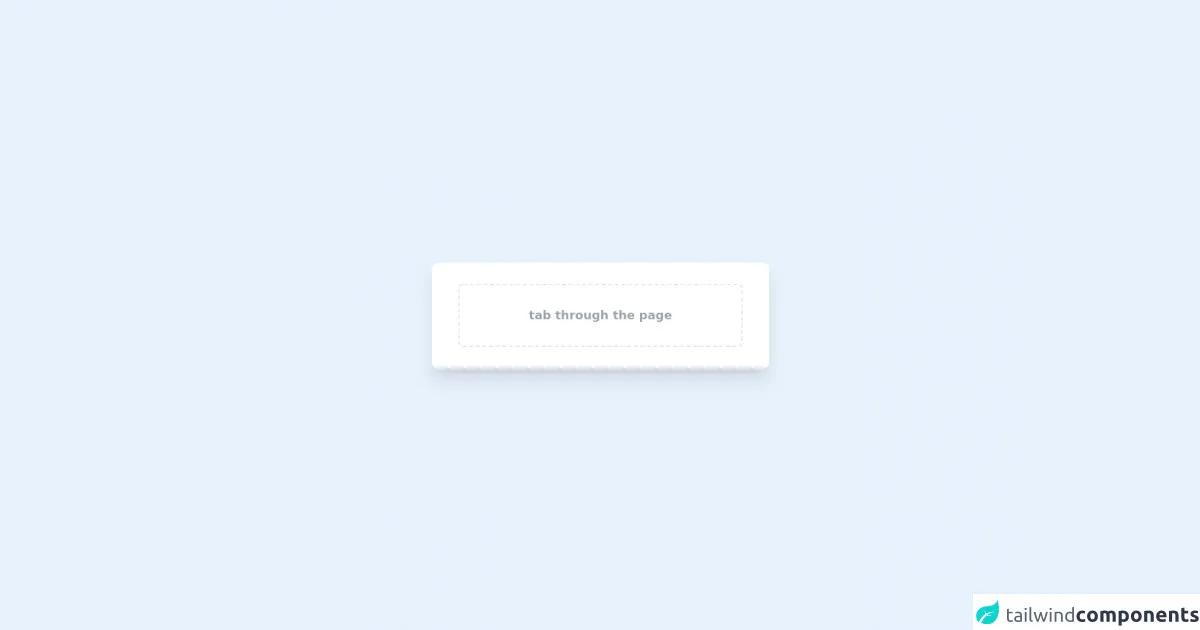
The preview of Skip Link ui component
To create a skip link using Tailwind CSS, we will use the following HTML code:
<a href="#main-content" class="sr-only focus:not-sr-only">Skip to main content</a>
<main id="main-content">
  <!-- Main content of the page goes here -->
</main>
In this code, we use the sr-only class to hide the skip link from sight until it receives focus. We also use the focus:not-sr-only class to make the skip link visible when it receives focus. Finally, we use the href attribute to specify the ID of the main content section of the page.
Free download of the Skip Link's source code
The source code of Skip Link ui component
To create a skip link using Tailwind CSS, we will use the following HTML code:
<a href="#main-content" class="sr-only focus:not-sr-only">Skip to main content</a>
<main id="main-content">
  <!-- Main content of the page goes here -->
</main>
In this code, we use the sr-only class to hide the skip link from sight until it receives focus. We also use the focus:not-sr-only class to make the skip link visible when it receives focus. Finally, we use the href attribute to specify the ID of the main content section of the page.
<a href='#main-content' class="absolute px-3 py-2 transition-all -translate-y-full focus:translate-y-0 bg-indigo-800 text-gray-100 text-base font-medium rounded-b-lg mx-4 focus:outline-none focus:ring-4 focus:ring-indigo-500  hover:no-underline hover:bg-indigo-900 hover:text-white z-10">    skip to main content</a>
<div class='flex items-center justify-center min-h-screen from-teal-100 via-teal-300 to-teal-500 bg-gradient-to-br'>

    <!-- This is placeholder content and has nothing to do with the component -->
    <div class='w-full max-w-lg px-10 py-8 mx-auto bg-white rounded-lg shadow-xl' id='main-content'>
        <div class="border border-dashed border-2 h-24 flex justify-center items-center text-gray-400 text-lg rounded-lg font-bold focus:ring-2 focus:ring-indigo-500">tab through the page</div>
    </div>
</div>
How to create a Skip Link with Tailwind CSS?
Here are six ways to create a skip link using Tailwind CSS:
Use the
sr-onlyclass to hide the skip link from sight until it receives focus.Use the
focus:not-sr-onlyclass to make the skip link visible when it receives focus.Use the
text-whiteclass to make the skip link text white.Use the
bg-blue-500class to make the skip link background blue.Use the
p-2class to add padding to the skip link.Use the
rounded-lgclass to add rounded corners to the skip link.
Here is the final code for our skip link:
<a href="#main-content" class="sr-only focus:not-sr-only text-white bg-blue-500 p-2 rounded-lg">Skip to main content</a>
<main id="main-content">
  <!-- Main content of the page goes here -->
</main>
Conclusion
In this article, we explored how to build a skip link using Tailwind CSS. We discussed the benefits of using Tailwind CSS to create a skip link, and we provided six different ways to customize the appearance of the skip link. By using Tailwind CSS, you can quickly and easily create a skip link that is both functional and visually appealing.