- Published on
3 Things You Must Know To Make A Slack clone With Tailwind CSS
- What is Tailwind CSS?
- The description of Slack clone ui component
- Why use Tailwind CSS to create a Slack clone ui component?
- The preview of Slack clone ui component
- The source code of Slack clone ui component
- How to create a Slack clone with Tailwind CSS?
- Step 1: Set up your project
- Step 2: Create the HTML structure
- Step 3: Style your HTML elements with Tailwind CSS
- Step 4: Add interactivity with JavaScript
- Conclusion
Slack is a popular communication tool used by businesses and teams worldwide. Its user interface is simple yet effective, making it easy for users to communicate and collaborate with each other. If you're interested in creating a Slack clone, you're in luck! In this article, we'll discuss three things you must know to make a Slack clone with Tailwind CSS.
What is Tailwind CSS?
Tailwind CSS is a utility-first CSS framework that allows you to quickly design and customize your website's appearance. It provides a set of pre-defined classes that you can use to style your HTML elements. Tailwind CSS is gaining popularity among developers because it allows them to create responsive and modern designs without writing custom CSS code.
The description of Slack clone ui component
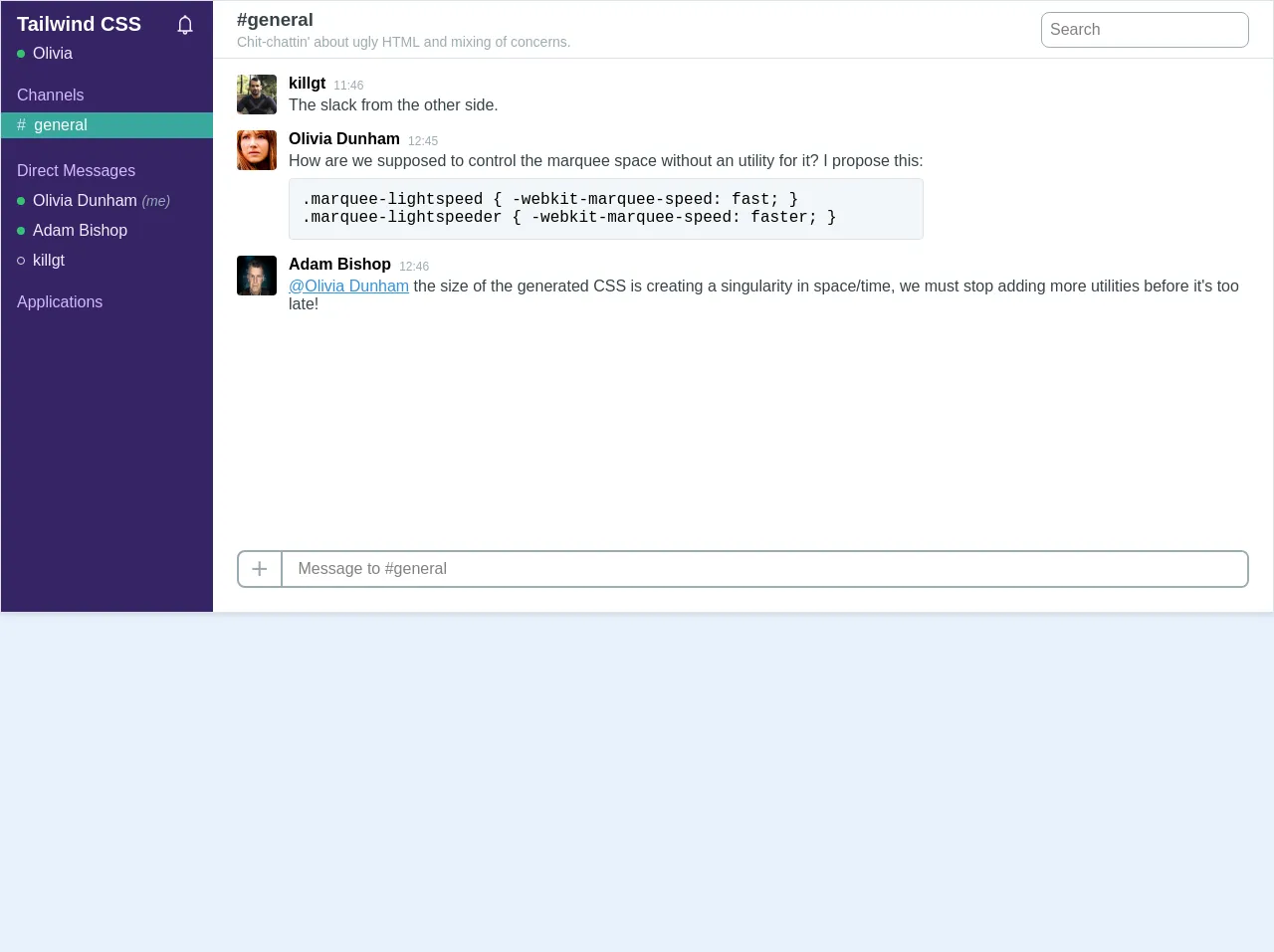
Before we dive into the details of creating a Slack clone with Tailwind CSS, let's take a quick look at the Slack clone UI component. The Slack clone UI component consists of a navigation bar, a chat window, and a message input box. The navigation bar contains a list of channels, direct messages, and notifications. The chat window displays the conversation between users, and the message input box allows users to send messages.
Why use Tailwind CSS to create a Slack clone ui component?
Tailwind CSS is an excellent choice for creating a Slack clone UI component because it provides a set of pre-defined classes that you can use to style your HTML elements. This makes it easy to create a responsive and modern design without writing custom CSS code. Additionally, Tailwind CSS allows you to customize your design by modifying its configuration file, making it easy to create a unique look for your Slack clone.
The preview of Slack clone ui component
Creating a Slack clone UI component with Tailwind CSS is easy. You can use the pre-defined classes to style your HTML elements and create a modern and responsive design. Here's a preview of what the Slack clone UI component looks like:
Free download of the Slack clone's source code
The source code of Slack clone ui component
To create a Slack clone UI component with Tailwind CSS, you'll need to write HTML and CSS code. Here's a sample code snippet that demonstrates how to create the navigation bar of the Slack clone UI component:
<div class="w-full border shadow bg-white">
	<div class="flex">
      	<!-- Sidebar / channel list -->
        <div class="bg-purple-darker text-purple-lighter w-1/5 pb-6 hidden md:block">
            <h1 class="text-white text-xl mb-2 mt-3 px-4 font-sans flex justify-between">
              	<span>Tailwind CSS</span>
              	<svg class="h-6 w-6 text-purple-lightest fill-current" viewBox="0 0 32 32" >
                    <g id="surface1">
                        <path style=" " d="M 16 3 C 14.894531 3 14 3.894531 14 5 C 14 5.085938 14.019531 5.167969 14.03125 5.25 C 10.574219 6.132813 8 9.273438 8 13 L 8 22 C 8 22.566406 7.566406 23 7 23 L 6 23 L 6 25 L 13.1875 25 C 13.074219 25.316406 13 25.648438 13 26 C 13 27.644531 14.355469 29 16 29 C 17.644531 29 19 27.644531 19 26 C 19 25.648438 18.925781 25.316406 18.8125 25 L 26 25 L 26 23 L 25 23 C 24.433594 23 24 22.566406 24 22 L 24 13.28125 C 24 9.523438 21.488281 6.171875 17.96875 5.25 C 17.980469 5.167969 18 5.085938 18 5 C 18 3.894531 17.105469 3 16 3 Z M 15.5625 7 C 15.707031 6.988281 15.851563 7 16 7 C 16.0625 7 16.125 7 16.1875 7 C 19.453125 7.097656 22 9.960938 22 13.28125 L 22 22 C 22 22.351563 22.074219 22.683594 22.1875 23 L 9.8125 23 C 9.925781 22.683594 10 22.351563 10 22 L 10 13 C 10 9.824219 12.445313 7.226563 15.5625 7 Z M 16 25 C 16.5625 25 17 25.4375 17 26 C 17 26.5625 16.5625 27 16 27 C 15.4375 27 15 26.5625 15 26 C 15 25.4375 15.4375 25 16 25 Z "></path>
                    </g>
				</svg>
          	</h1>
          	<div class="flex items-center mb-6 px-4">
          		<span class="bg-green rounded-full block w-2 h-2 mr-2"></span>
              	<span class="text-purple-lightest">Olivia</span>
        	</div>

          	<div class="px-4 mb-2 font-sans">Channels</div>
          	<div class="bg-teal-dark mb-6 py-1 px-4 text-white font-semi-bold "><span class="pr-1 text-grey-light">#</span> general</div>

          	<div class="px-4 mb-3 font-sans">Direct Messages</div>

            <div class="flex items-center mb-3 px-4">
                 <span class="bg-green rounded-full block w-2 h-2 mr-2"></span>
                 <span class="text-purple-lightest">Olivia Dunham <i class="text-grey text-sm">(me)</i></span>
          	</div>


            <div class="flex items-center mb-3 px-4">
                 <span class="bg-green rounded-full block w-2 h-2 mr-2"></span>
                 <span class="text-purple-lightest">Adam Bishop</span>
          	</div>

            <div class="flex items-center px-4 mb-6">
                 <span class="border rounded-full block w-2 h-2 mr-2"></span>
                 <span class="text-purple-lightest">killgt</span>
          	</div>


          	<div class="px-4 mb-3 font-sans">Applications</div>

        </div>

      	<!-- Chat content -->
      	<div class="w-full flex flex-col">
          	<!-- Top bar -->
          	<div class="border-b flex px-6 py-2 items-center">
              	<div class="flex flex-col">
                  	<h3 class="text-grey-darkest text-md mb-1 font-extrabold">#general</h3>
                  	<div class="text-grey font-thin text-sm">
                  		Chit-chattin' about ugly HTML and mixing of concerns.
                  	</div>
              	</div>
              	<div class="ml-auto hidden md:block">
                  	<input type="search" placeholder="Search" class="border border-grey rounded-lg p-2"/>
              	</div>
          	</div>

			<!-- Chat messages -->
          	<div class="px-6 py-4 flex-1 overflow-scroll-x">
              <!-- A message -->
              	<div class="flex items-start mb-4">
                  	<img src="https://avatars2.githubusercontent.com/u/343407?s=460&v=4" class="w-10 h-10 rounded mr-3" />
                  	<div class="flex flex-col">
                      	<div class="flex items-end">
                      		<span class="font-bold text-md mr-2 font-sans">killgt</span>
                      		<span class="text-grey text-xs font-light">11:46</span>
                      	</div>
                    	<p class="font-light text-md text-grey-darkest pt-1">The slack from the other side.</p>
                  	</div>
              	</div>

                <!-- A message -->
              	<div class="flex items-start mb-4">
                  	<img src="https://i.imgur.com/8Km9tLL.jpg" class="w-10 h-10 rounded mr-3" />
                  	<div class="flex flex-col">
                      	<div class="flex items-end">
                      		<span class="font-bold text-md mr-2 font-sans">Olivia Dunham</span>
                      		<span class="text-grey text-xs font-light">12:45</span>
                      	</div>
                    	<p class="font-light text-md text-grey-darkest pt-1">How are we supposed to control the marquee space without an utility for it? I propose this:</p>
                      	<div class="bg-grey-lighter border border-grey-light font-mono rounded p-3 mt-2 whitespace-pre">.marquee-lightspeed { -webkit-marquee-speed: fast; }
.marquee-lightspeeder { -webkit-marquee-speed: faster; }</div>
                  	</div>
              	</div>

                <!-- A message -->
              	<div class="flex items-start">
                  	<img src="https://i.imgur.com/qACoKgY.jpg" class="w-10 h-10 rounded mr-3" />
                  	<div class="flex flex-col">
                      	<div class="flex items-end">
                      		<span class="font-bold text-md mr-2 font-sans">Adam Bishop</span>
                      		<span class="text-grey text-xs font-light">12:46</span>
                      	</div>
                      <p class="font-light text-md text-grey-darkest pt-1"><a href="#" class="text-blue">@Olivia Dunham</a> the size of the generated CSS is creating a singularity in space/time, we must stop adding more utilities before it's too late!</p>
                  	</div>
              	</div>

              	<!-- Ignore -->
              	<br><br><br><br><br><br><br><br><br><br><br>

            </div>

          	<div class="flex m-6 rounded-lg border-2 border-grey overflow-hidden">
              <span class="text-3xl text-grey px-3 border-r-2 border-grey">+</span>
              <input type="text" class="w-full px-4" placeholder="Message to #general"/>
          	</div>
		</div>
  	</div>
</div>
How to create a Slack clone with Tailwind CSS?
Now that you know why Tailwind CSS is an excellent choice for creating a Slack clone UI component let's dive into the details of how to create a Slack clone with Tailwind CSS.
Step 1: Set up your project
To get started, you'll need to create a new project and install Tailwind CSS. You can do this by following the instructions on the Tailwind CSS website.
Step 2: Create the HTML structure
Next, you'll need to create the HTML structure for your Slack clone. This will include the navigation bar, chat window, and message input box. You can use the sample code snippet provided in the previous section as a starting point.
Step 3: Style your HTML elements with Tailwind CSS
Once you've created the HTML structure, you can start styling your HTML elements with Tailwind CSS. You can use the pre-defined classes to style your elements or create custom classes in your configuration file.
Step 4: Add interactivity with JavaScript
Finally, you'll need to add interactivity to your Slack clone using JavaScript. This will include features like sending and receiving messages, displaying notifications, and updating the chat window.
Conclusion
In conclusion, Tailwind CSS is an excellent choice for creating a Slack clone UI component. Its pre-defined classes make it easy to create a modern and responsive design without writing custom CSS code. By following the steps outlined in this article, you can create a Slack clone with Tailwind CSS that looks and functions just like the real thing.