- Published on
Ways To Build A skills card With Tailwind CSS In 60 Minutes
- What is Tailwind CSS?
- The Description of Skills Card UI Component
- Why Use Tailwind CSS to Create a Skills Card UI Component?
- The Preview of Skills Card UI Component
- The Source Code of Skills Card UI Component
- How to Create a Skills Card with Tailwind CSS?
- Step 1: Set up your project
- Step 2: Add the HTML structure
- Step 3: Style the HTML elements
- Step 4: Add some visual effects
- Step 5: Customize your design
- Conclusion
As a FrontEnd technology blogger, you are always looking for ways to improve your skills and create beautiful UI components. In this article, we will explore how to build a skills card UI component using Tailwind CSS in just 60 minutes.
What is Tailwind CSS?
Tailwind CSS is a utility-first CSS framework that allows you to quickly build custom designs without having to write any CSS. It provides a set of pre-defined classes that you can use to style your HTML elements. Tailwind CSS is highly customizable and can be used in any project, regardless of its size.
The Description of Skills Card UI Component
A skills card is a UI component that displays a user's skills in a visually appealing way. It typically includes an image, a title, and a list of skills. Skills cards are commonly used on personal websites, portfolios, and resumes.
Why Use Tailwind CSS to Create a Skills Card UI Component?
Tailwind CSS provides a wide range of pre-defined classes that make it easy to create custom designs quickly. It also allows you to customize your design by adding your own classes and modifying the existing ones. Using Tailwind CSS can save you a lot of time and effort, and it is an excellent choice for building a skills card UI component.
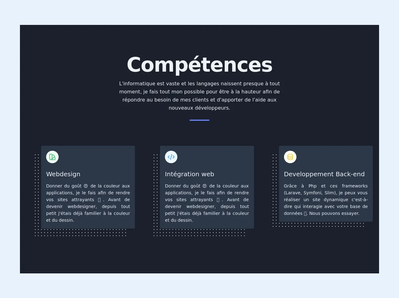
The Preview of Skills Card UI Component
To create a skills card UI component with Tailwind CSS, we will use a combination of HTML and CSS. The HTML structure will consist of a div container that will contain an image, a title, and a list of skills. The CSS will be used to style the HTML elements and add some visual effects.
Free download of the skills card's source code
The Source Code of Skills Card UI Component
To create a skills card UI component with Tailwind CSS, we will use the following HTML and CSS code:
<!-- This is an example component -->
<link href="https://unpkg.com/pattern.css" rel="stylesheet">

<div>
    <section class="text-gray-200 bg-gray-900">
        <div class="max-w-6xl mx-auto px-5 py-24 ">
          <div class="text-center mb-20">
            <h1 class=" title-font  mb-4 text-4xl font-extrabold leading-10 tracking-tight sm:text-5xl sm:leading-none md:text-6xl">Compétences</h1>
            <p class="text-base leading-relaxed xl:w-2/4 lg:w-3/4 mx-auto">L'informatique est vaste et les langages naissent presque à tout moment, je fais tout mon possible pour être à la hauteur afin de répondre au besoin de mes clients et d'apporter de l'aide aux nouveaux développeurs.</p>
            <div class="flex mt-6 justify-center">
              <div class="w-16 h-1 rounded-full bg-indigo-500 inline-flex"></div>
            </div>
          </div>
          <div class="flex flex-wrap sm:-m-4 -mx-4 -mb-10 -mt-4 ">
            <div class="p-10 md:w-1/3 md:mb-0 mb-6 flex flex-col ">
              <div class="pattern-dots-md gray-light">
                <div class="rounded bg-gray-800 p-4 transform translate-x-6 -translate-y-6  "  >
                  <div class="w-10 h-10 inline-flex items-center justify-center rounded-full bg-green-100 text-green-500 mb-5 flex-shrink-0 p-2">
                    <svg class="w-6 h-6" fill="none" stroke="currentColor" viewBox="0 0 24 24" xmlns="http://www.w3.org/2000/svg"><path stroke-linecap="round" stroke-linejoin="round" stroke-width="2" d="M7 21a4 4 0 01-4-4V5a2 2 0 012-2h4a2 2 0 012 2v12a4 4 0 01-4 4zm0 0h12a2 2 0 002-2v-4a2 2 0 00-2-2h-2.343M11 7.343l1.657-1.657a2 2 0 012.828 0l2.829 2.829a2 2 0 010 2.828l-8.486 8.485M7 17h.01"></path></svg>                </div>
                  <div class="flex-grow ">
                    <h2 class=" text-xl title-font font-medium mb-3">Webdesign</h2>
                    <p class="leading-relaxed text-sm text-justify">Donner du goût 😍 de la couleur aux applications, je le fais afin de rendre vos sites attrayants 🎨. Avant de devenir webdesigner, depuis tout petit j'étais déjà familier à la couleur et du dessin.</p>
                  </div>
                </div>
              </div>
            </div>
            <div class="p-10 md:w-1/3 md:mb-0 mb-6 flex flex-col ">
              <div class="pattern-dots-md gray-light">
                <div class="rounded bg-gray-800 p-4 transform translate-x-6 -translate-y-6 ">
                  <div class="w-10 h-10 inline-flex items-center justify-center rounded-full bg-blue-100 text-blue-500 mb-5 flex-shrink-0">
                    <svg class="w-6 h-6" fill="none" stroke="currentColor" viewBox="0 0 24 24" xmlns="http://www.w3.org/2000/svg"><path stroke-linecap="round" stroke-linejoin="round" stroke-width="2" d="M10 20l4-16m4 4l4 4-4 4M6 16l-4-4 4-4"></path></svg>
                  </div>
                  <div class="flex-grow">
                    <h2 class=" text-xl title-font font-medium mb-3">Intégration web</h2>
                    <p class="leading-relaxed text-sm text-justify">
                    Donner du goût 😍 de la couleur aux applications, je le fais afin de rendre vos sites attrayants 🎨. Avant de devenir webdesigner, depuis tout petit j'étais déjà familier à la couleur et du dessin.
                    </p>
                  </div>
                </div>
              </div>
            </div>
            <div class="p-10 md:w-1/3 md:mb-0 mb-6 flex flex-col ">
              <div class="pattern-dots-md gray-light">
                <div class="rounded bg-gray-800 p-4 transform translate-x-6 -translate-y-6 ">
                  <div class="w-10 h-10 inline-flex items-center justify-center rounded-full bg-yellow-100 text-yellow-500 mb-5 flex-shrink-0">
                    <svg class="w-6 h-6" fill="none" stroke="currentColor" viewBox="0 0 24 24" xmlns="http://www.w3.org/2000/svg"><path stroke-linecap="round" stroke-linejoin="round" stroke-width="2" d="M4 7v10c0 2.21 3.582 4 8 4s8-1.79 8-4V7M4 7c0 2.21 3.582 4 8 4s8-1.79 8-4M4 7c0-2.21 3.582-4 8-4s8 1.79 8 4m0 5c0 2.21-3.582 4-8 4s-8-1.79-8-4"></path></svg>
                  </div>
                  <div class="flex-grow">
                    <h2 class=" text-xl title-font font-medium mb-3">Developpement Back-end</h2>
                    <p class="leading-relaxed text-sm text-justify">
                     Grâce à Php et ces frameworks (Larave, Symfoni, Slim), je peux vous réaliser un site dynamique c'est-à-dire qui interagie avec votre base de données 💪. Nous pouvons essayer.
                    </p>
                  </div>
                </div>
        </div>
    </section>
</div>
How to Create a Skills Card with Tailwind CSS?
To create a skills card UI component with Tailwind CSS, follow these steps:
Step 1: Set up your project
Create a new HTML file and add the necessary HTML boilerplate code. Then, include the Tailwind CSS stylesheet in the head section of your HTML file.
<!DOCTYPE html>
<html>
  <head>
    <title>Skills Card</title>
    <link rel="stylesheet" href="https://cdn.jsdelivr.net/npm/[email protected]/dist/tailwind.min.css">
  </head>
  <body>
    <!-- Your HTML code goes here -->
  </body>
</html>
Step 2: Add the HTML structure
Add a div container to your HTML file that will contain the image, title, and list of skills.
<div class="max-w-sm rounded overflow-hidden shadow-lg">
  <img class="w-full" src="img/avatar.png" alt="Avatar">
  <div class="px-6 py-4">
    <div class="font-bold text-xl mb-2">John Doe</div>
    <ul>
      <li class="text-gray-700 text-base mb-2">HTML</li>
      <li class="text-gray-700 text-base mb-2">CSS</li>
      <li class="text-gray-700 text-base mb-2">JavaScript</li>
    </ul>
  </div>
</div>
Step 3: Style the HTML elements
Use Tailwind CSS classes to style the HTML elements. You can customize the colors, fonts, and sizes to match your design.
<div class="max-w-sm rounded overflow-hidden shadow-lg">
  <img class="w-full" src="img/avatar.png" alt="Avatar">
  <div class="px-6 py-4">
    <div class="font-bold text-xl mb-2">John Doe</div>
    <ul>
      <li class="text-gray-700 text-base mb-2"><i class="fab fa-html5 mr-2"></i>HTML</li>
      <li class="text-gray-700 text-base mb-2"><i class="fab fa-css3-alt mr-2"></i>CSS</li>
      <li class="text-gray-700 text-base mb-2"><i class="fab fa-js mr-2"></i>JavaScript</li>
    </ul>
  </div>
</div>
Step 4: Add some visual effects
Use Tailwind CSS classes to add some visual effects to the HTML elements. You can add hover effects, shadows, and rounded corners to make your design more appealing.
<div class="max-w-sm rounded overflow-hidden shadow-lg hover:shadow-xl">
  <img class="w-full" src="img/avatar.png" alt="Avatar">
  <div class="px-6 py-4">
    <div class="font-bold text-xl mb-2">John Doe</div>
    <ul>
      <li class="text-gray-700 text-base mb-2"><i class="fab fa-html5 mr-2"></i>HTML</li>
      <li class="text-gray-700 text-base mb-2"><i class="fab fa-css3-alt mr-2"></i>CSS</li>
      <li class="text-gray-700 text-base mb-2"><i class="fab fa-js mr-2"></i>JavaScript</li>
    </ul>
  </div>
</div>
Step 5: Customize your design
Use your own classes to customize your design further. You can add your own fonts, colors, and sizes to create a unique design.
<div class="max-w-sm rounded overflow-hidden shadow-lg hover:shadow-xl">
  <img class="w-full" src="img/avatar.png" alt="Avatar">
  <div class="px-6 py-4">
    <div class="font-bold text-2xl mb-2 text-blue-500">John Doe</div>
    <ul>
      <li class="text-gray-700 text-lg mb-2"><i class="fab fa-html5 mr-2"></i>HTML</li>
      <li class="text-gray-700 text-lg mb-2"><i class="fab fa-css3-alt mr-2"></i>CSS</li>
      <li class="text-gray-700 text-lg mb-2"><i class="fab fa-js mr-2"></i>JavaScript</li>
    </ul>
  </div>
</div>
Conclusion
In this article, we have explored how to build a skills card UI component using Tailwind CSS. We have discussed the benefits of using Tailwind CSS, and we have provided step-by-step instructions on how to create a skills card in just 60 minutes. With Tailwind CSS, you can create beautiful UI components quickly and easily, and you can customize your designs to match your style. We hope that this article has been helpful, and we encourage you to continue exploring the world of FrontEnd technology.