- Published on
Imagine You Create A Skills sections With Tailwind CSS Like An Expert. Follow These 6 Steps To Get There
- What is Tailwind CSS?
- The description of Skills sections ui component
- Why use Tailwind CSS to create a Skills sections ui component?
- The preview of Skills sections ui component.
- The source code of Skills sections ui component.
- How to create a Skills sections with Tailwind CSS?
- Step 1: Set up your project
- Step 2: Create the HTML structure
- Step 3: Style the list
- Step 4: Style the list items
- Step 5: Style the skill name and proficiency level
- Step 6: Style the progress bar
- Conclusion
What is Tailwind CSS?
Tailwind CSS is a utility-first CSS framework that helps you create custom designs quickly. It provides a set of pre-defined classes that you can use to style your HTML elements. Tailwind CSS is easy to use and highly customizable, making it a popular choice among developers.
The description of Skills sections ui component
A Skills section is a common UI component used on websites to showcase the skills of a person or a team. It usually consists of a list of skills with a progress bar or a rating system to indicate the level of proficiency in each skill.
Why use Tailwind CSS to create a Skills sections ui component?
Tailwind CSS is an excellent choice for creating a Skills section UI component because it provides a wide range of utility classes that can be used to style the different elements of the component. With Tailwind CSS, you can easily create a responsive and customizable Skills section that looks great on any device.
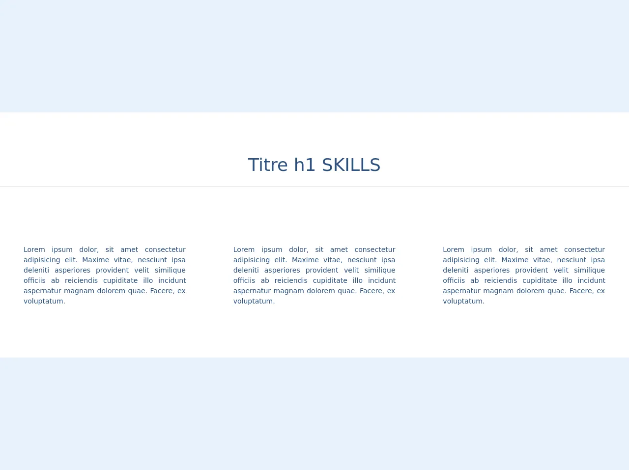
The preview of Skills sections ui component.
To create a Skills section UI component with Tailwind CSS, we will use a combination of HTML and CSS. The HTML structure will consist of an unordered list with each skill represented as a list item. We will use a progress bar to indicate the level of proficiency in each skill.
Free download of the Skills sections's source code
The source code of Skills sections ui component.
To create the Skills section UI component, we will use Tailwind CSS classes to style the different elements of the component. We will use the bg-gray-200 class to set the background color of the progress bar and the text-gray-600 class to set the text color. We will also use the w-full class to set the width of the progress bar to 100%.
<head>
    <link href="https://unpkg.com/tailwindcss@^1.0/dist/tailwind.min.css" rel="stylesheet">
    <script src="https://kit.fontawesome.com/479346cc73.js" crossorigin="anonymous"></script>

</head>

<div class=" w-full text-blue-800 bg-white h-auto py-20">


    <div class=" text-center  ">

        <h1 class=" md:text-4xl sm:text-2xl text-xl mb-4"> Titre h1 SKILLS </h1>

        <hr class="W-1/4 mx-auto mb-10 shadow-4xl">
    </div>

    <div class="sm:flex content-center justify-center">


        <div class=" sm:w-2/4 w-3/4 mx-auto h-auto my-6 lg:mx-8 md:mx-4">
            <h3 class="text-center text-xl my-2"> <i class=" fas fa-user-astronaut text-4xl"></i> </h3>
            <p class=" text-sm text-justify mx-4">Lorem ipsum dolor, sit amet consectetur adipisicing elit. Maxime
                vitae,
                nesciunt
                ipsa
                deleniti asperiores
                provident velit similique officiis ab reiciendis cupiditate illo incidunt aspernatur magnam dolorem
                quae. Facere, ex voluptatum.</p>
        </div>

        <div class=" sm:w-2/4 w-3/4 mx-auto h-auto my-6 lg:mx-8 md:mx-4">
            <h3 class="text-center text-xl my-2"> <i class=" fas fa-user-astronaut text-4xl"></i><br> </h3>
            <p class=" text-sm text-justify mx-4">Lorem ipsum dolor, sit amet consectetur adipisicing elit. Maxime
                vitae,
                nesciunt
                ipsa
                deleniti asperiores
                provident velit similique officiis ab reiciendis cupiditate illo incidunt aspernatur magnam dolorem
                quae. Facere, ex voluptatum.</p>
        </div>
    </div>

</div>
How to create a Skills sections with Tailwind CSS?
Follow these 6 steps to create a Skills section UI component with Tailwind CSS:
Step 1: Set up your project
To use Tailwind CSS, you need to install it in your project. You can either install it via npm or use a CDN. For this tutorial, we will use the CDN method.
Add the following code to the head section of your HTML file:
<link rel="stylesheet" href="https://unpkg.com/tailwindcss@latest/dist/tailwind.min.css">
Step 2: Create the HTML structure
Create an unordered list with each skill represented as a list item. Add a progress bar to indicate the level of proficiency in each skill. Here's an example:
<ul class="list-none">
  <li>
    <div class="flex items-center justify-between">
      <span class="font-medium text-gray-800">HTML</span>
      <span class="text-gray-600 text-sm">90%</span>
    </div>
    <div class="w-full h-2 bg-gray-200 rounded-full mt-1">
      <div class="h-full bg-blue-500 rounded-full" style="width:90%"></div>
    </div>
  </li>
  <li>
    <div class="flex items-center justify-between">
      <span class="font-medium text-gray-800">CSS</span>
      <span class="text-gray-600 text-sm">80%</span>
    </div>
    <div class="w-full h-2 bg-gray-200 rounded-full mt-1">
      <div class="h-full bg-blue-500 rounded-full" style="width:80%"></div>
    </div>
  </li>
  <li>
    <div class="flex items-center justify-between">
      <span class="font-medium text-gray-800">JavaScript</span>
      <span class="text-gray-600 text-sm">70%</span>
    </div>
    <div class="w-full h-2 bg-gray-200 rounded-full mt-1">
      <div class="h-full bg-blue-500 rounded-full" style="width:70%"></div>
    </div>
  </li>
</ul>
Step 3: Style the list
Add the following classes to the unordered list to remove the default list styles and add some margin:
<ul class="list-none mt-8">
Step 4: Style the list items
Add the following classes to the list items to add some padding and margin:
<li class="py-2">
Step 5: Style the skill name and proficiency level
Add the following classes to the skill name and proficiency level to set the font size and color:
<span class="font-medium text-gray-800 text-lg">HTML</span>
<span class="text-gray-600 text-sm">90%</span>
Step 6: Style the progress bar
Add the following classes to the progress bar to set the background color and width:
<div class="w-full h-2 bg-gray-200 rounded-full mt-1">
Add the following classes to the progress bar fill to set the color and width:
<div class="h-full bg-blue-500 rounded-full" style="width:90%"></div>
Conclusion
Creating a Skills section UI component with Tailwind CSS is easy and straightforward. With just a few lines of code, you can create a responsive and customizable Skills section that looks great on any device. By following these 6 steps, you can create a Skills section UI component like an expert.