- Published on
Best Ways To Make A skeleton card With Tailwind CSS

- What is Tailwind CSS?
- The Description of Skeleton Card UI Component
- Why Use Tailwind CSS to Create a Skeleton Card UI Component?
- The Preview of Skeleton Card UI Component
- The Source Code of Skeleton Card UI Component
- How to Create a Skeleton Card with Tailwind CSS?
- Conclusion
What is Tailwind CSS?
Tailwind CSS is a popular utility-first CSS framework that helps developers quickly build custom user interfaces. It provides a set of pre-defined CSS classes that can be used to style HTML elements without writing any custom CSS. This makes it easy to create responsive and visually appealing web pages.
The Description of Skeleton Card UI Component
A skeleton card is a UI component that is used to display a placeholder for content that is being loaded. It is a common design pattern used in modern web applications to improve the user experience by providing visual feedback while the content is being loaded.
A skeleton card typically consists of a rectangular container with a border and a set of lines or shapes that represent the content that will be loaded. The lines or shapes are usually animated to create a sense of movement and indicate that the content is being loaded.
Why Use Tailwind CSS to Create a Skeleton Card UI Component?
Tailwind CSS provides a set of pre-defined CSS classes that can be used to create a skeleton card UI component quickly and easily. These classes can be combined to create custom styles that match the design of your application.
Using Tailwind CSS to create a skeleton card UI component also ensures that the component is responsive and works well on different screen sizes. Tailwind CSS provides a set of responsive utility classes that can be used to adjust the size and position of the skeleton card based on the screen size.
The Preview of Skeleton Card UI Component
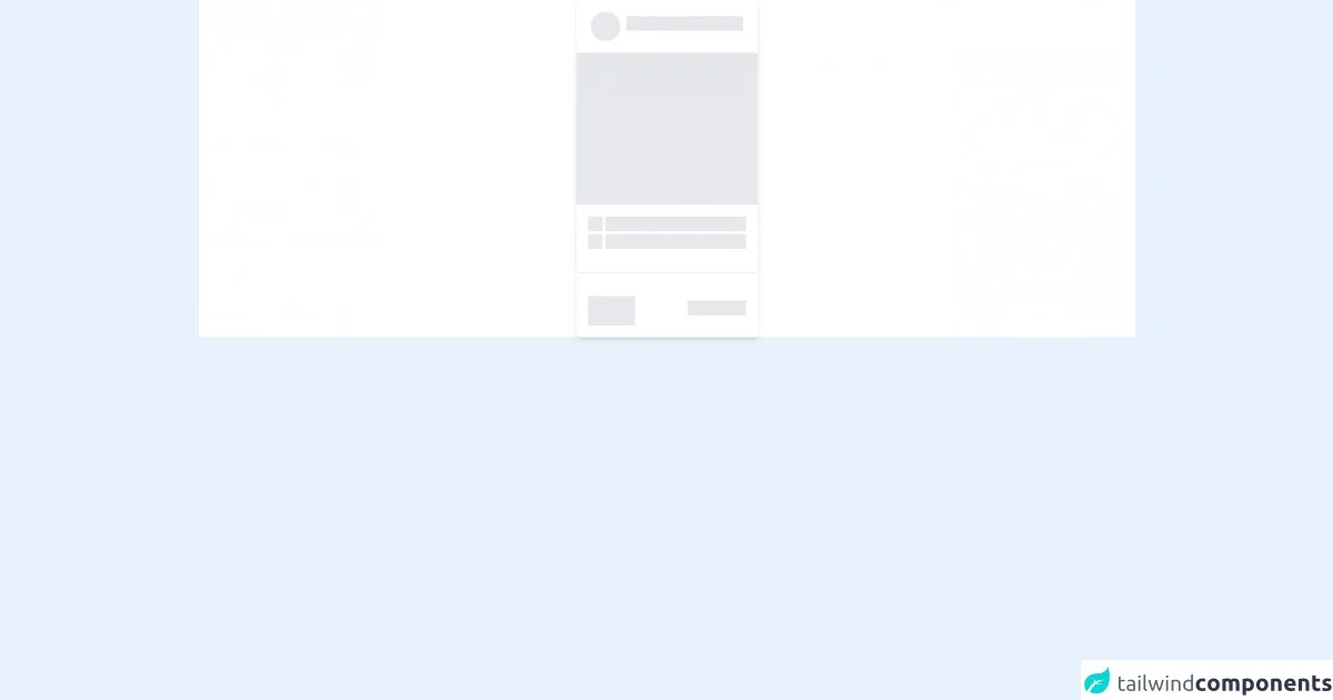
To create a skeleton card UI component with Tailwind CSS, we can use a combination of CSS classes to style the container and the lines or shapes that represent the content. Here's a preview of what the skeleton card UI component might look like:
Free download of the skeleton card's source code
The Source Code of Skeleton Card UI Component
To create a skeleton card UI component with Tailwind CSS, we can use a combination of CSS classes to style the container and the lines or shapes that represent the content. Here's the source code for the skeleton card UI component:
<!-- This is an example component -->


<div class="w-full flex items-center flex-col  bg-white">
     <div class="flex flex-col bg-white shadow-md  rounded-md items-center">

        <div class="flex items-center p-4">
            <div data-placeholder class="mr-2 h-10 w-10  rounded-full overflow-hidden relative bg-gray-200">

                </div>
            <div class="flex flex-col justify-between items-center">
            <div data-placeholder class="mb-2 h-5 w-40 overflow-hidden relative bg-gray-200">

            </div>
            </div>

        </div>
        <div data-placeholder class="h-52 w-full overflow-hidden relative bg-gray-200"></div>

        <div class="flex flex-col p-4">
            <div class="flex">
            <div data-placeholder  class=" flex h-5 w-5 overflow-hidden relative bg-gray-200 mr-1"></div>
            <div data-placeholder  class="flex h-5 w-48 overflow-hidden relative bg-gray-200"></div>
            </div>
            <div class="flex mt-1">
            <div data-placeholder  class="flex h-5 w-5 overflow-hidden relative bg-gray-200 mr-1"></div>
            <div data-placeholder  class="flex h-5 w-48 overflow-hidden relative bg-gray-200"></div>
            </div>
        </div>
        <div class="w-full h-px  overflow-hidden relative bg-gray-200 m-4"></div>
        <div class="flex justify-between items-center p-4 w-full">
            <div data-placeholder class="mr-2 h-10 w-16  overflow-hidden relative bg-gray-200">

                </div>

            <div data-placeholder class="mb-2 h-5 w-20 overflow-hidden relative bg-gray-200">

            </div>

        </div>
    </div>
</div>

<style>
    [data-placeholder]::after {
        content: " ";
        box-shadow: 0 0 50px 9px rgba(254,254,254);
        position: absolute;
        top: 0;
        left: -100%;
        height: 100%;
        animation: load 1s infinite;
    }
    @keyframes load {
        0%{ left: -100%}
        100%{ left: 150%}
    }
</style>
How to Create a Skeleton Card with Tailwind CSS?
To create a skeleton card UI component with Tailwind CSS, follow these steps:
- Create a container element for the skeleton card using the
bg-whiteandborderutility classes.
<div class="bg-white border rounded-lg p-4">
  <!-- content goes here -->
</div>
- Add lines or shapes to represent the content that will be loaded using the
h-4,w-1/2, andmy-2utility classes.
<div class="bg-white border rounded-lg p-4">
  <div class="h-4 bg-gray-200 rounded w-1/2 my-2"></div>
  <div class="h-4 bg-gray-200 rounded w-3/4 my-2"></div>
  <div class="h-4 bg-gray-200 rounded w-full my-2"></div>
</div>
- Add animation to the lines or shapes using the
animate-pulseutility class.
<div class="bg-white border rounded-lg p-4">
  <div class="h-4 bg-gray-200 rounded w-1/2 my-2 animate-pulse"></div>
  <div class="h-4 bg-gray-200 rounded w-3/4 my-2 animate-pulse"></div>
  <div class="h-4 bg-gray-200 rounded w-full my-2 animate-pulse"></div>
</div>
- Adjust the size and position of the skeleton card based on the screen size using the responsive utility classes.
<div class="bg-white border rounded-lg p-4 md:w-1/2 lg:w-1/3 xl:w-1/4">
  <div class="h-4 bg-gray-200 rounded w-1/2 my-2 animate-pulse"></div>
  <div class="h-4 bg-gray-200 rounded w-3/4 my-2 animate-pulse"></div>
  <div class="h-4 bg-gray-200 rounded w-full my-2 animate-pulse"></div>
</div>
Conclusion
Creating a skeleton card UI component with Tailwind CSS is a simple and effective way to improve the user experience of your web application. By using pre-defined CSS classes and responsive utility classes, you can create a visually appealing and responsive skeleton card that works well on different screen sizes. With the steps outlined in this article, you can easily create a skeleton card UI component for your next web project.