- Published on
6 Easy Ways To Make A Site Header With Tailwind CSS Without Even Thinking About It
- What is Tailwind CSS?
- The description of Site Header ui component
- Why use Tailwind CSS to create a Site Header ui component?
- The preview of Site Header ui component
- The source code of Site Header ui component
- How to create a Site Header with Tailwind CSS?
- Step 1: Create the HTML structure
- Step 2: Style the Site Header with Tailwind CSS
- Step 3: Add responsiveness to the Site Header
- Conclusion
As a FrontEnd technology blogger, you might have heard of Tailwind CSS. It is a utility-first CSS framework that makes it easy to create custom designs without writing any CSS code. In this article, we will explore how to create a Site Header with Tailwind CSS without even thinking about it.
What is Tailwind CSS?
Tailwind CSS is a utility-first CSS framework that provides a set of pre-defined classes that can be used to create custom designs without writing any CSS code. It is designed to be highly customizable, and it allows you to create complex designs quickly and easily.
The description of Site Header ui component
A Site Header is a UI component that is used to display the title of a website and its navigation menu. It is usually located at the top of the page and is one of the first things that a user sees when they visit a website.
Why use Tailwind CSS to create a Site Header ui component?
Tailwind CSS provides a set of pre-defined classes that can be used to create a Site Header quickly and easily. It also allows you to customize the design of the Site Header without writing any CSS code.
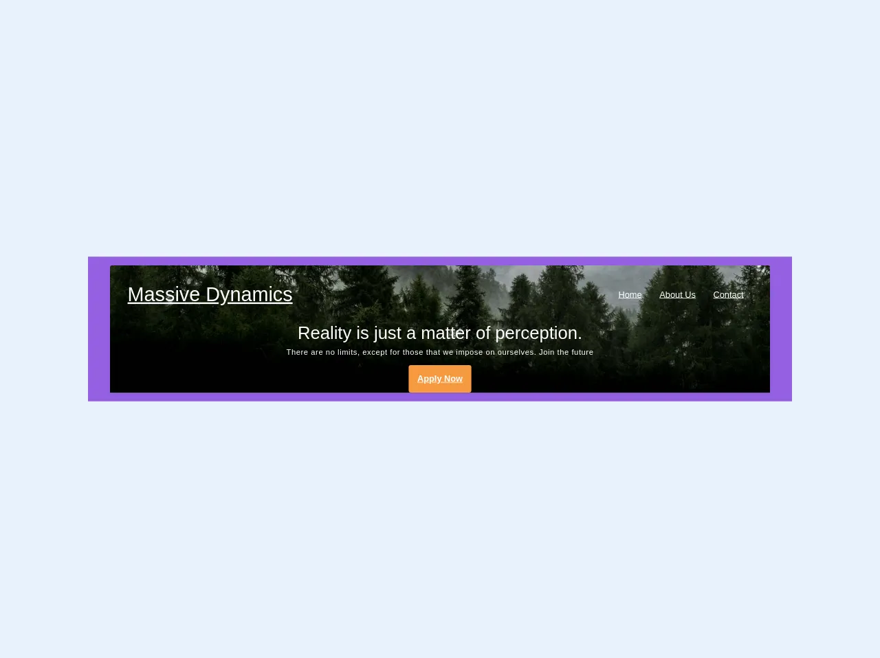
The preview of Site Header ui component
To create a Site Header with Tailwind CSS, we will use a combination of utility classes to style the different elements of the Site Header. Here is a preview of what the Site Header will look like:
Free download of the Site Header's source code
The source code of Site Header ui component
To create a Site Header with Tailwind CSS, we will use a combination of HTML and utility classes. Here is the source code for the Site Header:
<div class="bg-purple w-full px-2">
  <div class="container mx-auto rounded-t shadow bg-cover bg-bottom m-4" style="background-image: url(https://i.imgur.com/R68RNUK.jpg)">
 	<!-- Text shadow utilities will be cool -->
    <nav class="flex justify-between p-8 items-center mb-16">
      <a href="#" class="font-sans text-black md:text-white text-sm md:text-4xl font-thin">Massive Dynamics</a>
      <ul class="list-reset flex">
        <li><a href="#" class="text-black md:text-white p-2 md:p-4">Home</a></li>
        <li><a href="#" class="text-black md:text-white p-2 md:p-4 whitespace-no-wrap">About Us</a></li>
        <li><a href="#" class="text-black md:text-white p-2 md:p-4">Contact</a></li>
      </ul>
    </nav>

    <div class="text-center text-white pb-16">
      <h1 class="font-sans font-thin">Reality is just a matter of perception.</h1>
      <h2 class="font-thin text-sm tracking-wide mt-2 mb-4">There are no limits, except for those that we impose on ourselves. Join the future</h2>

      	<a href="#" class="rounded bg-orange text-white p-4 font-bold inline-block mb-16">
      		Apply Now
      	</a>


    </div>
  </div>

</div>
How to create a Site Header with Tailwind CSS?
Now that we have a preview and the source code for the Site Header, let's take a look at how to create it step by step.
Step 1: Create the HTML structure
The first step is to create the HTML structure for the Site Header. We will use a combination of HTML tags and Tailwind CSS classes to create the Site Header.
<header class="bg-gray-800 text-white flex items-center justify-between px-4 py-3">
  <div class="flex items-center">
    <img src="logo.png" alt="Logo" class="h-8">
    <h1 class="ml-2 font-bold text-lg">Site Name</h1>
  </div>
  <nav>
    <ul class="flex items-center">
      <li class="ml-4">
        <a href="#" class="hover:text-gray-300">Home</a>
      </li>
      <li class="ml-4">
        <a href="#" class="hover:text-gray-300">About</a>
      </li>
      <li class="ml-4">
        <a href="#" class="hover:text-gray-300">Contact</a>
      </li>
    </ul>
  </nav>
</header>
In this HTML code, we have used the header tag to create the Site Header. Inside the header tag, we have used the flex class to make the Site Header a flex container. We have also used the bg-gray-800 and text-white classes to set the background color and text color of the Site Header.
Inside the header tag, we have used the div tag to create a container for the logo and site name. We have used the img tag to display the logo and the h1 tag to display the site name. We have also used the nav tag to create a container for the navigation menu.
Inside the nav tag, we have used the ul tag to create an unordered list of navigation links. We have used the li tag to create list items for each navigation link. We have also used the a tag to create links for each navigation item.
Step 2: Style the Site Header with Tailwind CSS
Now that we have created the HTML structure for the Site Header, we can use Tailwind CSS classes to style it. Here is the CSS code for the Site Header:
/* Set the height of the Site Header */
header {
  height: 60px;
}

/* Style the logo */
header img {
  width: 40px;
}

/* Style the site name */
header h1 {
  font-size: 1.5rem;
}

/* Style the navigation menu */
header nav ul {
  list-style: none;
}

header nav ul li {
  display: inline-block;
}

header nav ul li a {
  color: #fff;
  text-decoration: none;
}

header nav ul li a:hover {
  color: #ccc;
}
In this CSS code, we have used the height property to set the height of the Site Header. We have also used the width property to set the width of the logo. We have used the font-size property to set the font size of the site name.
We have used the list-style property to remove the bullet points from the navigation menu. We have used the display property to make the navigation links display inline. We have also used the color property to set the color of the navigation links.
Step 3: Add responsiveness to the Site Header
Finally, we can add responsiveness to the Site Header by using Tailwind CSS classes. Here is the updated HTML code:
<header class="bg-gray-800 text-white flex flex-wrap items-center justify-between px-4 py-3">
  <div class="flex items-center flex-shrink-0">
    <img src="logo.png" alt="Logo" class="h-8">
    <h1 class="ml-2 font-bold text-lg">Site Name</h1>
  </div>
  <div class="block lg:hidden">
    <button class="flex items-center px-3 py-2 border rounded text-gray-200 border-gray-400 hover:text-white hover:border-white">
      <svg class="h-3 w-3 fill-current" viewBox="0 0 20 20" xmlns="http://www.w3.org/2000/svg"><title>Menu</title><path d="M0 3h20v2H0V3zm0 6h20v2H0V9zm0 6h20v2H0v-2z"/></svg>
    </button>
  </div>
  <nav class="w-full block flex-grow lg:flex lg:items-center lg:w-auto">
    <ul class="flex flex-col lg:flex-row list-none lg:ml-auto">
      <li class="nav-item">
        <a href="#" class="px-3 py-2 flex items-center text-xs uppercase font-bold leading-snug text-white hover:opacity-75">Home</a>
      </li>
      <li class="nav-item">
        <a href="#" class="px-3 py-2 flex items-center text-xs uppercase font-bold leading-snug text-white hover:opacity-75">About</a>
      </li>
      <li class="nav-item">
        <a href="#" class="px-3 py-2 flex items-center text-xs uppercase font-bold leading-snug text-white hover:opacity-75">Contact</a>
      </li>
    </ul>
  </nav>
</header>
In this updated HTML code, we have used the flex-wrap class to wrap the Site Header items when the screen size is small. We have also used the flex-shrink-0 class to prevent the logo and site name from shrinking.
We have added a button for the mobile menu using the block and hidden classes. We have used the flex-grow class to make the navigation menu grow to fill the available space. We have also used the list-none class to remove the bullet points from the navigation menu.
We have used the text-xs class to set the font size of the navigation links. We have used the uppercase class to make the navigation links uppercase. We have also used the leading-snug class to set the line height of the navigation links.
Conclusion
Creating a Site Header with Tailwind CSS is easy and straightforward. By using a combination of HTML and Tailwind CSS classes, you can create a custom Site Header without writing any CSS code. With Tailwind CSS, you can create complex designs quickly and easily, making it a great choice for FrontEnd developers.