- Published on
The 5 Really Obvious Ways To Create A Single User Page With Tailwind CSS Better That You Ever Did
- What is Tailwind CSS?
- The description of Single User Page UI component
- Why use Tailwind CSS to create a Single User Page UI component?
- The preview of Single User Page UI component
- The source code of Single User Page UI component
- How to create a Single User Page with Tailwind CSS?
- Step 1: Set up your HTML structure
- Step 2: Style your UI component with Tailwind CSS
- Step 3: Customize your UI component
- Conclusion
As a FrontEnd technology blogger, I have come across many CSS frameworks, but none of them have impressed me like Tailwind CSS. Tailwind CSS is a utility-first CSS framework that helps you create responsive and customizable UI components with ease. In this article, I will show you how to create a Single User Page UI component with Tailwind CSS.
What is Tailwind CSS?
Tailwind CSS is a utility-first CSS framework that provides you with a set of pre-defined classes that you can use to style your HTML elements. It is different from other CSS frameworks like Bootstrap and Foundation, which provide you with pre-built UI components. With Tailwind CSS, you have the freedom to create your own UI components by combining the pre-defined classes.
The description of Single User Page UI component
A Single User Page UI component is a page that displays the details of a single user. It usually contains the user's profile picture, name, bio, and other details like their social media links, contact information, etc.
Why use Tailwind CSS to create a Single User Page UI component?
Tailwind CSS provides you with a set of pre-defined classes that you can use to style your UI components. This means that you don't have to write custom CSS for every UI component you create. With Tailwind CSS, you can create a Single User Page UI component with just a few lines of code.
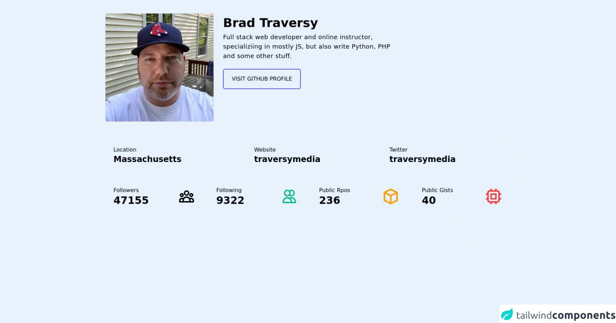
The preview of Single User Page UI component
To give you an idea of what a Single User Page UI component looks like, here is a preview:
Free download of the Single User Page's source code
The source code of Single User Page UI component
To create a Single User Page UI component with Tailwind CSS, you need to write HTML and CSS code. Here is the source code:
<div class="bg-slate-700 w-full py-10 px-10">
  <div>
    <div class="sm:flex space-x-7 md:items-start items-center">
      <div class="mb-4">
        <img class="rounded-md md:w-80" src="https://avatars.githubusercontent.com/u/5550850?v=4" alt="brad" />
      </div>
      <div>
        <h1 class="text-slate-100 text-4xl font-bold my-2">Brad Traversy</h1>
        <p class="text-slate-100 text-lg tracking-wide mb-6 md:max-w-lg">Full stack web developer and online instructor, specializiing in mostly JS, but also write Python, PHP and some other stuff.</p>
        <button class="border-2 px-6 py-4 rounded-md border-indigo-600 text-slate-100 hover:bg-indigo-600 hover:text-indigo-100 transition duration-75">VISIT GITHUB PROFILE</button>
      </div>
    </div>
  </div>
  <div class="mt-8 sm:grid grid-cols-3 sm:space-x-4">
    <div class="bg-slate-600 p-6 rounded-md mb-4">
      <span class="text-slate-400 text-md">Location</span>
      <h2 class="text-slate-100 text-2xl font-semibold">Massachusetts</h2>
    </div>
    <div class="bg-slate-600 p-6 rounded-md mb-4">
      <span class="text-slate-400 text-md">Website</span>
      <h2 class="text-slate-100 text-2xl font-semibold">traversymedia</h2>
    </div>
    <div class="bg-slate-600 p-6 rounded-md mb-4">
      <span class="text-slate-400 text-md">Twitter</span>
      <h2 class="text-slate-100 text-2xl font-semibold">traversymedia</h2>
    </div>
  </div>
  <div class="sm:grid lg:grid-cols-4 grid-cols-2 sm:gap-x-4">
    <div class="flex justify-between items-center bg-slate-600 p-6 rounded-md mb-4">
      <div>
        <span class="text-md text-slate-400">Followers</span>
        <h1 class="text-3xl font-bold text-slate-100">47155</h1>
      </div>
      <div>
        <svg xmlns="http://www.w3.org/2000/svg" class="h-12 w-12 text-cyan-500" fill="none" viewBox="0 0 24 24" stroke="currentColor">
          <path stroke-linecap="round" stroke-linejoin="round" stroke-width="2" d="M17 20h5v-2a3 3 0 00-5.356-1.857M17 20H7m10 0v-2c0-.656-.126-1.283-.356-1.857M7 20H2v-2a3 3 0 015.356-1.857M7 20v-2c0-.656.126-1.283.356-1.857m0 0a5.002 5.002 0 019.288 0M15 7a3 3 0 11-6 0 3 3 0 016 0zm6 3a2 2 0 11-4 0 2 2 0 014 0zM7 10a2 2 0 11-4 0 2 2 0 014 0z" />
        </svg>
      </div>
    </div>
    <div class="flex justify-between items-center bg-slate-600 p-6 rounded-md mb-4">
      <div>
        <span class="text-md text-slate-400">Following</span>
        <h1 class="text-3xl font-bold text-slate-100">9322</h1>
      </div>
      <div>
        <svg xmlns="http://www.w3.org/2000/svg" class="h-12 w-12 text-green-500" fill="none" viewBox="0 0 24 24" stroke="currentColor">
          <path stroke-linecap="round" stroke-linejoin="round" stroke-width="2" d="M12 4.354a4 4 0 110 5.292M15 21H3v-1a6 6 0 0112 0v1zm0 0h6v-1a6 6 0 00-9-5.197M13 7a4 4 0 11-8 0 4 4 0 018 0z" />
        </svg>
      </div>
    </div>
    <div class="flex justify-between items-center bg-slate-600 p-6 rounded-md mb-4">
      <div>
        <span class="text-md text-slate-400">Public Rpos</span>
        <h1 class="text-3xl font-bold text-slate-100">236</h1>
      </div>
      <div>
        <svg xmlns="http://www.w3.org/2000/svg" class="h-14 w-14 text-yellow-500" fill="none" viewBox="0 0 24 24" stroke="currentColor">
          <path stroke-linecap="round" stroke-linejoin="round" stroke-width="2" d="M20 7l-8-4-8 4m16 0l-8 4m8-4v10l-8 4m0-10L4 7m8 4v10M4 7v10l8 4" />
        </svg>
      </div>
    </div>
    <div class="flex justify-between items-center bg-slate-600 p-6 rounded-md mb-4">
      <div>
        <span class="text-md text-slate-400">Public Gists</span>
        <h1 class="text-3xl font-bold text-slate-100">40</h1>
      </div>
      <div>
        <svg xmlns="http://www.w3.org/2000/svg" class="h-14 w-14 text-red-500" fill="none" viewBox="0 0 24 24" stroke="currentColor">
          <path stroke-linecap="round" stroke-linejoin="round" stroke-width="2" d="M9 3v2m6-2v2M9 19v2m6-2v2M5 9H3m2 6H3m18-6h-2m2 6h-2M7 19h10a2 2 0 002-2V7a2 2 0 00-2-2H7a2 2 0 00-2 2v10a2 2 0 002 2zM9 9h6v6H9V9z" />
        </svg>
      </div>
    </div>
  </div>
</div>
How to create a Single User Page with Tailwind CSS?
Now that you have seen the preview and source code of a Single User Page UI component, let's dive into how to create one with Tailwind CSS.
Step 1: Set up your HTML structure
The first step is to set up your HTML structure. Here is an example:
<div class="flex flex-col items-center justify-center min-h-screen bg-gray-100">
  <div class="w-full max-w-md p-4 bg-white rounded-lg shadow-lg">
    <div class="flex flex-col items-center">
      <img src="profile.jpg" alt="Profile Picture" class="w-32 h-32 rounded-full object-cover">
      <h1 class="mt-4 text-2xl font-bold">John Doe</h1>
      <p class="mt-2 text-gray-600">Web Developer</p>
    </div>
    <div class="mt-8">
      <h2 class="text-lg font-bold">Bio</h2>
      <p class="mt-2 text-gray-600">Lorem ipsum dolor sit amet, consectetur adipiscing elit. Sed non risus. Suspendisse lectus tortor, dignissim sit amet, adipiscing nec, ultricies sed, dolor.</p>
    </div>
    <div class="mt-8">
      <h2 class="text-lg font-bold">Contact Information</h2>
      <ul class="mt-2 text-gray-600">
        <li>Email: [email protected]</li>
        <li>Phone: +1 (555) 555-5555</li>
        <li>Website: www.johndoe.com</li>
      </ul>
    </div>
    <div class="mt-8">
      <h2 class="text-lg font-bold">Social Media</h2>
      <ul class="mt-2 text-gray-600">
        <li><a href="#">Twitter</a></li>
        <li><a href="#">Facebook</a></li>
        <li><a href="#">Instagram</a></li>
      </ul>
    </div>
  </div>
</div>
In this example, we have used the flex and flex-col classes to create a column layout. We have also used the items-center and justify-center classes to center the content vertically and horizontally. The min-h-screen class sets the minimum height of the container to the height of the screen. We have also used the bg-gray-100 class to set the background color of the container.
Step 2: Style your UI component with Tailwind CSS
The next step is to style your UI component with Tailwind CSS. Here is an example:
/* Set the font family */
body {
  font-family: 'Open Sans', sans-serif;
}

/* Style the profile picture */
img {
  border: 4px solid #fff;
}

/* Style the headings */
h1, h2 {
  color: #333;
}

/* Style the links */
a {
  color: #3182ce;
  text-decoration: none;
}

a:hover {
  text-decoration: underline;
}
In this example, we have set the font family to 'Open Sans' using the font-family property. We have also styled the profile picture by adding a white border using the border property. We have used the color property to set the color of the headings and links. We have also used the text-decoration property to remove the underline from links and add it on hover.
Step 3: Customize your UI component
The final step is to customize your UI component. With Tailwind CSS, you can customize your UI component by adding or removing classes. Here are some examples:
<!-- Add a button -->
<button class="px-4 py-2 mt-8 text-white bg-blue-500 rounded hover:bg-blue-600">Follow</button>

<!-- Remove the social media links -->
<div class="mt-8">
  <h2 class="text-lg font-bold">Social Media</h2>
  <p class="mt-2 text-gray-600">No social media links available.</p>
</div>

<!-- Change the background color -->
<div class="w-full max-w-md p-4 bg-gray-900 rounded-lg shadow-lg">
In these examples, we have added a button using the px-4, py-2, text-white, bg-blue-500, rounded, and hover:bg-blue-600 classes. We have also removed the social media links and added a message using the text-gray-600 class. We have also changed the background color using the bg-gray-900 class.
Conclusion
In this article, we have learned how to create a Single User Page UI component with Tailwind CSS. We have seen the preview and source code of the UI component, and we have also learned how to create one step-by-step. With Tailwind CSS, you can create responsive and customizable UI components with ease. So, go ahead and give it a try!