- Published on
What You Need To Create A Simple Toast Notification With Tailwind CSS
- What is Tailwind CSS?
- The description of Simple Toast Notification ui component
- Why use Tailwind CSS to create a Simple Toast Notification ui component?
- The preview of Simple Toast Notification ui component.
- The source code of Simple Toast Notification ui component.
- How to create a Simple Toast Notification with Tailwind CSS?
- Conclusion
As a FrontEnd technology blogger, it's important to keep up with the latest trends and tools in the industry. One such tool that has gained popularity in recent years is Tailwind CSS. In this article, we will explore how to create a simple toast notification using Tailwind CSS.
What is Tailwind CSS?
Tailwind CSS is a utility-first CSS framework that allows you to design your website by applying pre-defined classes to HTML elements. It provides a wide range of pre-defined classes that can be used to style your website without writing any custom CSS. Tailwind CSS is designed to be highly customizable and easy to use.
The description of Simple Toast Notification ui component
A toast notification is a small message that appears on the screen to inform the user about a specific action or event. It is a non-intrusive way of providing feedback to the user. A simple toast notification usually consists of a message and a close button.
Why use Tailwind CSS to create a Simple Toast Notification ui component?
Tailwind CSS provides a wide range of pre-defined classes that can be used to style your website. It allows you to create complex layouts and designs without writing any custom CSS. Tailwind CSS also provides a responsive design system that makes it easy to create websites that look great on all devices.
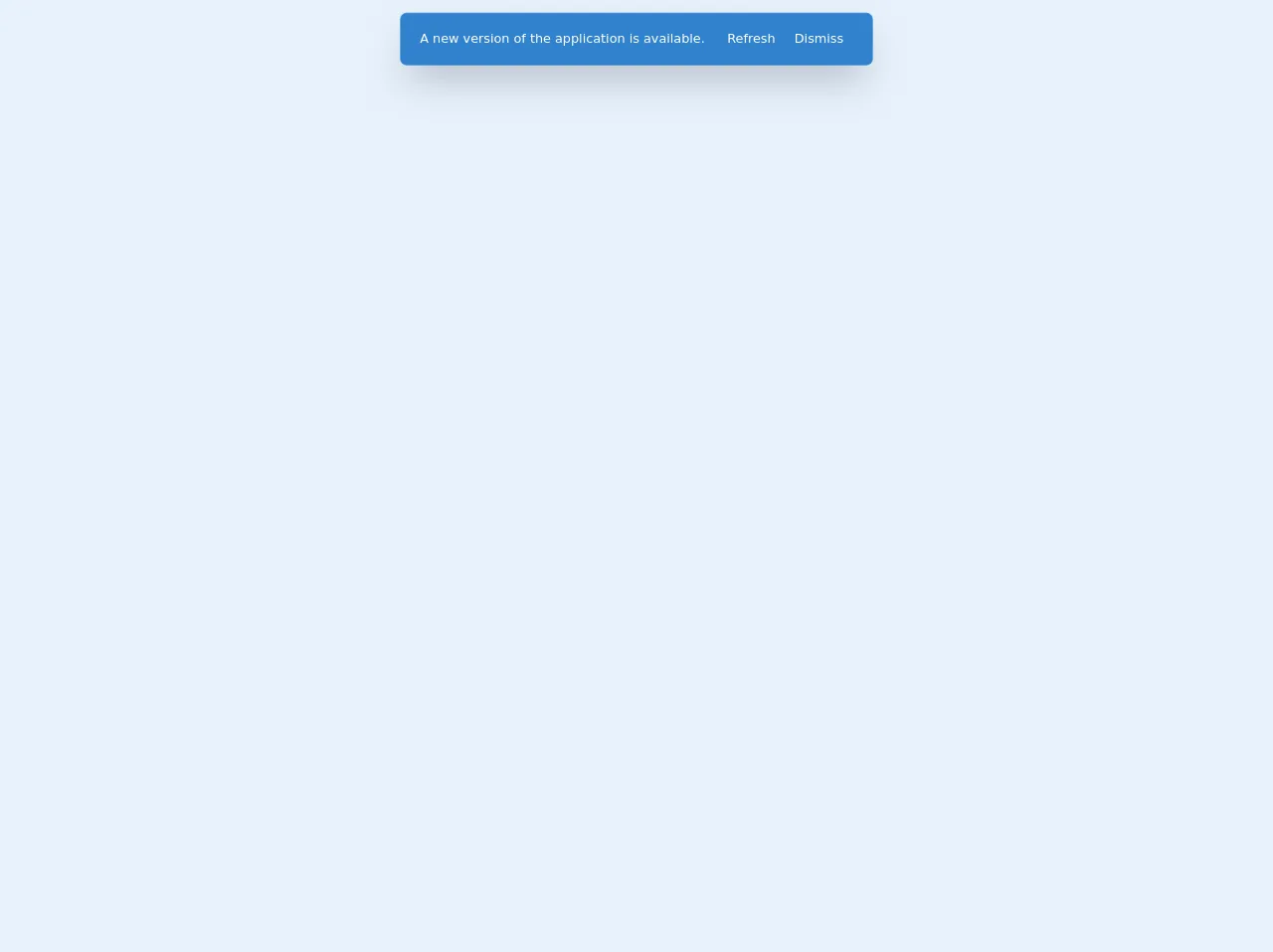
The preview of Simple Toast Notification ui component.
To create a simple toast notification using Tailwind CSS, we will use the following classes:
- bg-green-500: sets the background color to green
- text-white: sets the text color to white
- px-6: adds padding to the left and right of the element
- py-4: adds padding to the top and bottom of the element
- rounded: rounds the corners of the element
- flex: sets the display property to flex
- justify-between: aligns the content to the left and right of the element
- items-center: centers the content vertically
Free download of the Simple Toast Notification's source code
The source code of Simple Toast Notification ui component.
To create a simple toast notification using Tailwind CSS, we will use the following HTML and CSS code:
<div class="bg-green-500 text-white px-6 py-4 rounded flex justify-between items-center">
  <div>
    Success! Your action was successful.
  </div>
  <div>
    <button>
      <svg fill="currentColor" viewBox="0 0 20 20" class="w-6 h-6">
        <path fill-rule="evenodd" d="M10.707 10l4.147-4.146a.5.5 0 10-.708-.708L10 9.293 5.854 5.146a.5.5 0 10-.708.708L9.293 10l-4.147 4.146a.5.5 0 00.708.708L10 10.707l4.146 4.147a.5.5 0 00.708-.708L10.707 10z" clip-rule="evenodd"></path>
      </svg>
    </button>
  </div>
</div>
<div class="flex justify-center">
  <div class="w-full px-6 py-3 shadow-2xl flex flex-col items-center border-t
        sm:w-auto sm:m-4 sm:rounded-lg sm:flex-row sm:border bg-blue-600 border-blue-600 text-white">
   	<div> A new version of the application is available. </div>
    <div class="flex mt-2 sm:mt-0 sm:ml-4">
      <button class="px-3 py-2 hover:bg-blue-700 transition ease-in-out duration-300"> Refresh </button>
      <button class="px-3 py-2 hover:bg-blue-700 transition ease-in-out duration-300"> Dismiss </button></div></div>
</div>
How to create a Simple Toast Notification with Tailwind CSS?
To create a simple toast notification using Tailwind CSS, follow these steps:
- Create a new HTML file and add the following code:
<div class="bg-green-500 text-white px-6 py-4 rounded flex justify-between items-center">
  <div>
    Success! Your action was successful.
  </div>
  <div>
    <button>
      <svg fill="currentColor" viewBox="0 0 20 20" class="w-6 h-6">
        <path fill-rule="evenodd" d="M10.707 10l4.147-4.146a.5.5 0 10-.708-.708L10 9.293 5.854 5.146a.5.5 0 10-.708.708L9.293 10l-4.147 4.146a.5.5 0 00.708.708L10 10.707l4.146 4.147a.5.5 0 00.708-.708L10.707 10z" clip-rule="evenodd"></path>
      </svg>
    </button>
  </div>
</div>
Save the file and open it in your web browser. You should see a green box with a message and a close button.
Customize the message and the colors by changing the classes. For example, to change the background color to red, replace "bg-green-500" with "bg-red-500".
Add JavaScript code to show and hide the toast notification. For example, you can use the following code to show the toast notification:
document.querySelector('.toast').classList.add('show');
And the following code to hide it:
document.querySelector('.toast').classList.remove('show');
Conclusion
In this article, we have explored how to create a simple toast notification using Tailwind CSS. We have seen how Tailwind CSS provides a wide range of pre-defined classes that can be used to style your website without writing any custom CSS. We have also seen how easy it is to create complex layouts and designs using Tailwind CSS. With the help of this article, you should now be able to create your own toast notifications using Tailwind CSS.