- Published on
The Ninja Guide To How To Make A Simple Time Picker With Tailwind CSS Better
- What is Tailwind CSS?
- The description of Simple Time Picker ui component
- Why use Tailwind CSS to create a Simple Time Picker ui component?
- The preview of Simple Time Picker ui component
- The source code of Simple Time Picker ui component
- How to create a Simple Time Picker with Tailwind CSS?
- Conclusion
What is Tailwind CSS?
Tailwind CSS is a utility-first CSS framework that allows you to quickly design and customize your website's appearance. It provides a set of pre-defined classes that you can use to style your HTML elements. Tailwind CSS is easy to use and can help you create beautiful designs in no time.
The description of Simple Time Picker ui component
A time picker is a user interface component that allows users to select a time from a list of available options. A simple time picker is a basic version of a time picker that only allows users to select hours and minutes. It is a useful component for websites that require users to input a specific time, such as scheduling appointments or setting reminders.
Why use Tailwind CSS to create a Simple Time Picker ui component?
Tailwind CSS is an excellent choice for creating a simple time picker UI component because it provides a wide range of utility classes that can help you style your component quickly and efficiently. Tailwind CSS also allows you to customize your design by adding your own classes or modifying existing ones.
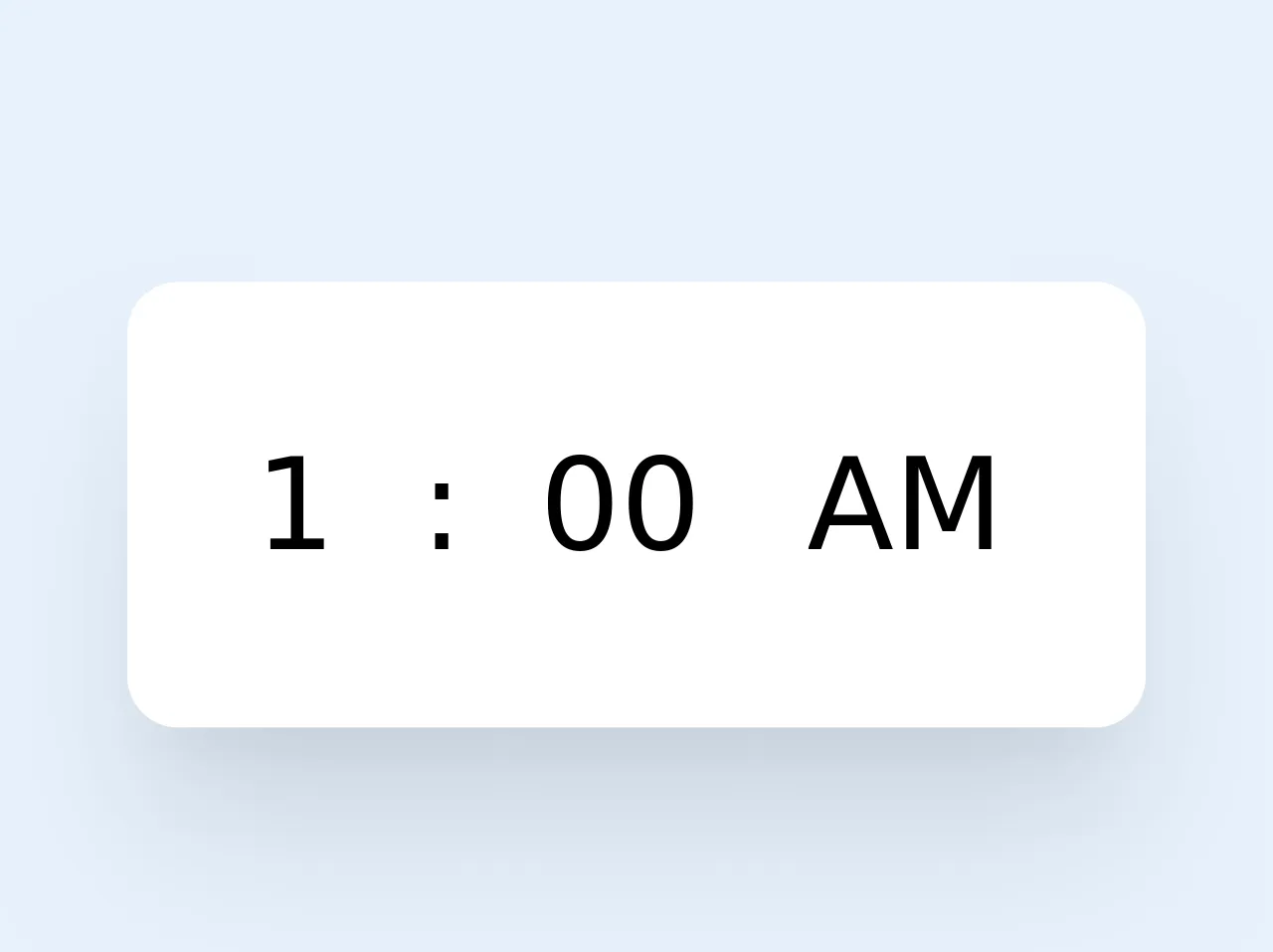
The preview of Simple Time Picker ui component
To create a simple time picker UI component with Tailwind CSS, we will use a combination of HTML and CSS. The final result will be a clean and minimalistic design that is easy to use and understand.
Free download of the Simple Time Picker's source code
The source code of Simple Time Picker ui component
To create a simple time picker UI component with Tailwind CSS, we will use a combination of HTML and CSS. The HTML code will define the structure of the component, while the CSS code will style it. The final result will be a clean and minimalistic design that is easy to use and understand.
<div class="mt-2 p-5 w-40 bg-white rounded-lg shadow-xl">
  <div class="flex">
    <select name="hours" class="bg-transparent text-xl appearance-none outline-none">
      <option value="1">1</option>
      <option value="2">2</option>
      <option value="3">3</option>
      <option value="4">4</option>
      <option value="5">5</option>
      <option value="6">6</option>
      <option value="7">7</option>
      <option value="8">8</option>
      <option value="9">9</option>
      <option value="10">10</option>
      <option value="11">10</option>
      <option value="12">12</option>
    </select>
    <span class="text-xl mr-3">:</span>
    <select name="minutes" class="bg-transparent text-xl appearance-none outline-none mr-4">
      <option value="0">00</option>
      <option value="30">30</option>
    </select>
    <select name="ampm" class="bg-transparent text-xl appearance-none outline-none">
      <option value="am">AM</option>
      <option value="pm">PM</option>
    </select>
  </div>
</div>
How to create a Simple Time Picker with Tailwind CSS?
To create a simple time picker UI component with Tailwind CSS, follow these steps:
- Create the HTML structure for the time picker.
<div class="flex items-center space-x-2">
  <select class="border border-gray-300 rounded-md px-2 py-1">
    <option value="00">00</option>
    <option value="01">01</option>
    <option value="02">02</option>
    <option value="03">03</option>
    <option value="04">04</option>
    <option value="05">05</option>
    <option value="06">06</option>
    <option value="07">07</option>
    <option value="08">08</option>
    <option value="09">09</option>
    <option value="10">10</option>
    <option value="11">11</option>
    <option value="12">12</option>
    <option value="13">13</option>
    <option value="14">14</option>
    <option value="15">15</option>
    <option value="16">16</option>
    <option value="17">17</option>
    <option value="18">18</option>
    <option value="19">19</option>
    <option value="20">20</option>
    <option value="21">21</option>
    <option value="22">22</option>
    <option value="23">23</option>
  </select>
  <span>:</span>
  <select class="border border-gray-300 rounded-md px-2 py-1">
    <option value="00">00</option>
    <option value="05">05</option>
    <option value="10">10</option>
    <option value="15">15</option>
    <option value="20">20</option>
    <option value="25">25</option>
    <option value="30">30</option>
    <option value="35">35</option>
    <option value="40">40</option>
    <option value="45">45</option>
    <option value="50">50</option>
    <option value="55">55</option>
  </select>
  <select class="border border-gray-300 rounded-md px-2 py-1">
    <option value="AM">AM</option>
    <option value="PM">PM</option>
  </select>
</div>
- Style the time picker using Tailwind CSS classes.
select {
  appearance: none;
}

select::-ms-expand {
  display: none;
}

select:focus {
  outline: none;
}

select option {
  font-weight: normal;
}

select option:checked {
  font-weight: bold;
}

select:hover {
  cursor: pointer;
}

select:focus {
  border-color: #60a5fa;
  box-shadow: 0 0 0 2px rgba(96, 165, 250, 0.5);
}

select::-webkit-scrollbar {
  width: 0.25rem;
}

select::-webkit-scrollbar-track {
  background-color: #f1f1f1;
}

select::-webkit-scrollbar-thumb {
  background-color: #60a5fa;
}
- Add the time picker to your website.
<div class="my-4">
  <label class="block text-gray-700 font-bold mb-2" for="time">
    Select a time:
  </label>
  <div class="flex items-center space-x-2">
    <select class="border border-gray-300 rounded-md px-2 py-1">
      <option value="00">00</option>
      <option value="01">01</option>
      <option value="02">02</option>
      <option value="03">03</option>
      <option value="04">04</option>
      <option value="05">05</option>
      <option value="06">06</option>
      <option value="07">07</option>
      <option value="08">08</option>
      <option value="09">09</option>
      <option value="10">10</option>
      <option value="11">11</option>
      <option value="12">12</option>
      <option value="13">13</option>
      <option value="14">14</option>
      <option value="15">15</option>
      <option value="16">16</option>
      <option value="17">17</option>
      <option value="18">18</option>
      <option value="19">19</option>
      <option value="20">20</option>
      <option value="21">21</option>
      <option value="22">22</option>
      <option value="23">23</option>
    </select>
    <span>:</span>
    <select class="border border-gray-300 rounded-md px-2 py-1">
      <option value="00">00</option>
      <option value="05">05</option>
      <option value="10">10</option>
      <option value="15">15</option>
      <option value="20">20</option>
      <option value="25">25</option>
      <option value="30">30</option>
      <option value="35">35</option>
      <option value="40">40</option>
      <option value="45">45</option>
      <option value="50">50</option>
      <option value="55">55</option>
    </select>
    <select class="border border-gray-300 rounded-md px-2 py-1">
      <option value="AM">AM</option>
      <option value="PM">PM</option>
    </select>
  </div>
</div>
Conclusion
In conclusion, Tailwind CSS is an excellent choice for creating a simple time picker UI component. It provides a wide range of utility classes that can help you style your component quickly and efficiently. With just a few lines of code, you can create a clean and minimalistic design that is easy to use and understand. So, why not give it a try and see how it can improve your website's user experience?