- Published on
How To Make A Simple toast With Tailwind CSS In 6 Easy Steps?
- What is Tailwind CSS?
- The description of Simple toast ui component
- Why use Tailwind CSS to create a Simple toast ui component?
- The preview of Simple toast ui component
- The source code of Simple toast ui component
- How to create a Simple toast with Tailwind CSS?
- Step 1: Create the HTML markup
- Step 2: Add Tailwind CSS to your project
- Step 3: Style the toast container
- Step 4: Add padding and margin to the toast container
- Step 5: Add animation to the toast container
- Step 6: Show and hide the toast
- Conclusion
What is Tailwind CSS?
Tailwind CSS is a utility-first CSS framework that helps developers to quickly design and build responsive and modern user interfaces. It provides a set of pre-defined CSS classes that can be easily used to style HTML elements without writing custom CSS code.
The description of Simple toast ui component
A toast is a small notification that appears on the screen to inform the user about a specific event or action. It is a common UI component used in web and mobile applications to provide feedback to the user.
Why use Tailwind CSS to create a Simple toast ui component?
Tailwind CSS provides a set of pre-defined CSS classes that can be used to create a Simple toast UI component quickly and easily. It also provides responsive design utilities that make it easy to create a toast that looks good on any device.
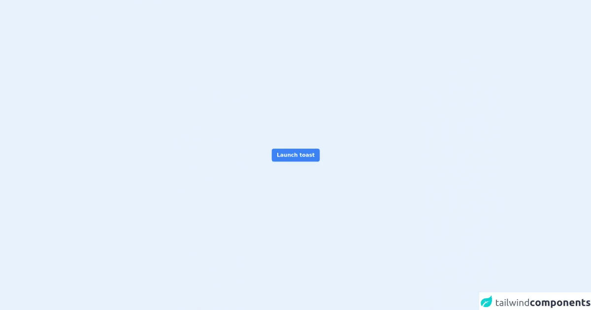
The preview of Simple toast ui component
To create a Simple toast UI component with Tailwind CSS, we will use the following HTML and CSS code:
Free download of the Simple toast's source code
The source code of Simple toast ui component
To create a Simple toast UI component with Tailwind CSS, we will use the following HTML and CSS code:
<link rel="stylesheet" href="https://unpkg.com/[email protected]/css/boxicons.min.css" />
<script defer src="https://unpkg.com/[email protected]/dist/cdn.min.js"></script>

<!-- page -->
<main x-data="app" class="min-w-screen flex min-h-screen items-center justify-center">
  <!-- toast -->
  <button type="button" @click="closeToast()" x-show="open" x-transition.duration.300ms class="fixed top-4 right-4 z-50 rounded-md bg-green-500 px-4 py-2 text-white transition hover:bg-green-600">
    <div class="flex items-center space-x-2">
      <span class="text-3xl"><i class="bx bx-check"></i></span>
      <p class="font-bold">Item Created Successfully!</p>
    </div>
  </button>

  <!-- trigger button -->
  <button type="button" @click="openToast()" class="rounded-md bg-blue-500 px-4 py-2 font-bold text-white transition hover:bg-blue-600">Launch toast</button>
</main>

<script>
  let timer;

  document.addEventListener("alpine:init", () => {
      Alpine.data("app", () => ({
          open: false,

          openToast() {
              if (this.open) return;
              this.open = true;

              // reset time to 0 second
              clearTimeout(timer);

              // auto close toast after 5 seconds
              timer = setTimeout(() => {
                  this.open = false;
              }, 5000);
          },

          closeToast() {
              this.open = false;
          },
      }));
  });
</script>
How to create a Simple toast with Tailwind CSS?
Follow these 6 easy steps to create a Simple toast UI component with Tailwind CSS:
Step 1: Create the HTML markup
The first step is to create the HTML markup for the toast. We will use a div element with a class of toast to create the container for the toast. Inside the div, we will add a p element to display the message.
<div class="toast">
  <p>Hello, world!</p>
</div>
Step 2: Add Tailwind CSS to your project
To use Tailwind CSS, you need to add it to your project. You can either download the CSS file from the official website or install it using a package manager like npm.
<link rel="stylesheet" href="https://cdn.jsdelivr.net/npm/tailwindcss@latest/dist/tailwind.min.css">
Step 3: Style the toast container
To style the toast container, we will use the bg-gray-800 class to set the background color to gray and the text-white class to set the text color to white.
<div class="toast bg-gray-800 text-white">
  <p>Hello, world!</p>
</div>
Step 4: Add padding and margin to the toast container
To add some space around the toast container, we will use the p-4 class to add padding and the m-4 class to add margin.
<div class="toast bg-gray-800 text-white p-4 m-4">
  <p>Hello, world!</p>
</div>
Step 5: Add animation to the toast container
To add animation to the toast container, we will use the animate__bounceInRight class from the animate.css library. You can either download the CSS file from the official website or install it using a package manager like npm.
<div class="toast bg-gray-800 text-white p-4 m-4 animate__animated animate__bounceInRight">
  <p>Hello, world!</p>
</div>
Step 6: Show and hide the toast
To show and hide the toast, we will use JavaScript. We will add an event listener to a button that will show the toast when clicked. We will also add a timeout function to hide the toast after a few seconds.
<button onclick="showToast()">Show Toast</button>

<div id="toast" class="toast bg-gray-800 text-white p-4 m-4 animate__animated animate__bounceInRight">
  <p>Hello, world!</p>
</div>

<script>
  function showToast() {
    var toast = document.getElementById("toast");
    toast.classList.remove("hidden");
    setTimeout(function() {
      toast.classList.add("hidden");
    }, 3000);
  }
</script>
Conclusion
In this article, we have learned how to create a Simple toast UI component with Tailwind CSS in 6 easy steps. We have also seen how Tailwind CSS can help developers to quickly design and build responsive and modern user interfaces. With Tailwind CSS, you can create beautiful and functional UI components without writing custom CSS code.