- Published on
The Ultimate Guide To Help You Build A Simple template With Tailwind CSS
- What is Tailwind CSS?
- The description of Simple template ui component
- Why use Tailwind CSS to create a Simple template ui component?
- The preview of Simple template ui component.
- The source code of Simple template ui component.
- How to create a Simple template with Tailwind CSS?
- Conclusion
Are you tired of spending hours designing and coding a simple template for your website? Look no further than Tailwind CSS. Tailwind CSS is a utility-first CSS framework that can help you build beautiful and responsive designs quickly and easily. In this article, we will guide you through the process of creating a simple template with Tailwind CSS.
What is Tailwind CSS?
Tailwind CSS is a CSS framework that provides pre-defined classes to help you style your HTML elements. It is a utility-first framework, meaning that it focuses on providing classes that can be used to create custom styles quickly and easily. Tailwind CSS is highly customizable, allowing you to create your own classes or modify existing ones to fit your needs.
The description of Simple template ui component
A simple template is a basic layout that can be used for a variety of purposes. It typically consists of a header, a navigation menu, a content area, and a footer. The header and footer sections may include logos, branding, or other information, while the navigation menu and content area can be customized to fit your specific needs.
Why use Tailwind CSS to create a Simple template ui component?
Tailwind CSS provides a number of benefits when it comes to creating a simple template. Here are just a few reasons why you should consider using Tailwind CSS for your next project:
- Speed: Tailwind CSS allows you to create custom styles quickly and easily, without the need to write custom CSS from scratch.
- Consistency: Tailwind CSS provides a consistent set of classes that can be used throughout your project, ensuring that your styles are cohesive and easy to maintain.
- Flexibility: Tailwind CSS is highly customizable, allowing you to create your own classes or modify existing ones to fit your needs.
- Responsive: Tailwind CSS provides classes that make it easy to create responsive designs that look great on any device.
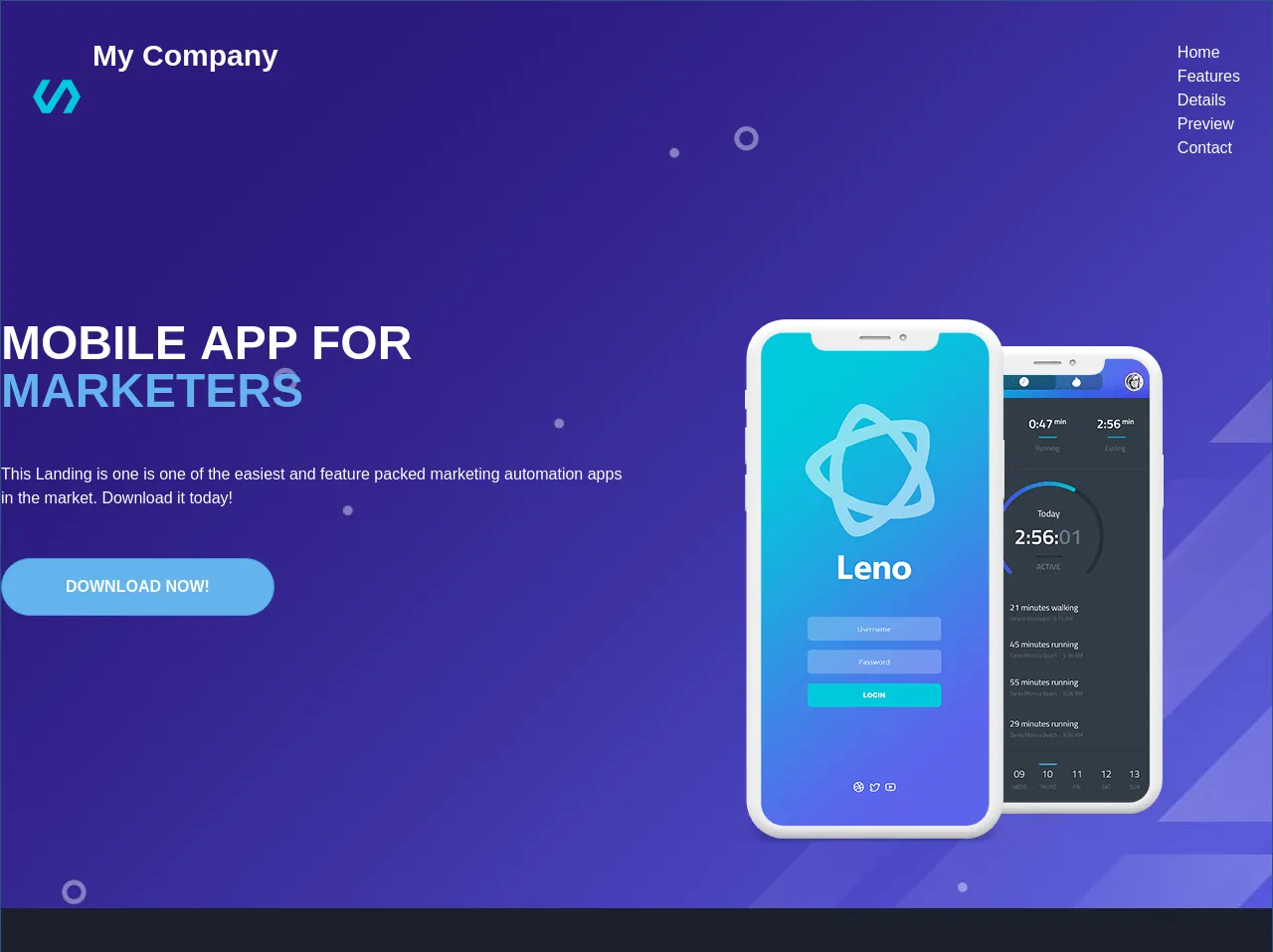
The preview of Simple template ui component.
To give you an idea of what a simple template created with Tailwind CSS might look like, here is a preview of the basic layout:
<header class="bg-gray-800 text-white p-4">
<div class="container mx-auto flex justify-between items-center">
<a href="#" class="text-xl font-bold">My Website</a>
<nav>
<a href="#" class="text-gray-400 hover:text-white px-3 py-2">Home</a>
<a href="#" class="text-gray-400 hover:text-white px-3 py-2">About</a>
<a href="#" class="text-gray-400 hover:text-white px-3 py-2">Contact</a>
</nav>
</div>
</header>
<main class="container mx-auto my-4">
<h1 class="text-3xl font-bold mb-4">Welcome to my website</h1>
<p class="mb-4">Lorem ipsum dolor sit amet, consectetur adipiscing elit. Duis auctor, est vel dapibus bibendum, enim turpis sodales libero, vel tristique elit augue vel justo. Sed euismod, justo eu tincidunt lacinia, risus justo efficitur nulla, vel ultricies mauris enim sit amet quam. Sed euismod, justo eu tincidunt lacinia, risus justo efficitur nulla, vel ultricies mauris enim sit amet quam.</p>
<p class="mb-4">Sed euismod, justo eu tincidunt lacinia, risus justo efficitur nulla, vel ultricies mauris enim sit amet quam. Sed euismod, justo eu tincidunt lacinia, risus justo efficitur nulla, vel ultricies mauris enim sit amet quam.</p>
<p class="mb-4">Sed euismod, justo eu tincidunt lacinia, risus justo efficitur nulla, vel ultricies mauris enim sit amet quam. Sed euismod, justo eu tincidunt lacinia, risus justo efficitur nulla, vel ultricies mauris enim sit amet quam.</p>
</main>
<footer class="bg-gray-800 text-white p-4">
<div class="container mx-auto">
<p>© 2021 My Website. All rights reserved.</p>
</div>
</footer>
Free download of the Simple template's source code
The source code of Simple template ui component.
If you're interested in seeing the source code for the simple template created with Tailwind CSS, here is a sample HTML file:
<!DOCTYPE html>
<html lang="en">
<head>
<meta charset="UTF-8">
<meta name="viewport" content="width=device-width, initial-scale=1.0">
<title>My Website</title>
<link rel="stylesheet" href="https://cdn.jsdelivr.net/npm/[email protected]/dist/tailwind.min.css">
</head>
<body>
<header class="bg-gray-800 text-white p-4">
<div class="container mx-auto flex justify-between items-center">
<a href="#" class="text-xl font-bold">My Website</a>
<nav>
<a href="#" class="text-gray-400 hover:text-white px-3 py-2">Home</a>
<a href="#" class="text-gray-400 hover:text-white px-3 py-2">About</a>
<a href="#" class="text-gray-400 hover:text-white px-3 py-2">Contact</a>
</nav>
</div>
</header>
<main class="container mx-auto my-4">
<h1 class="text-3xl font-bold mb-4">Welcome to my website</h1>
<p class="mb-4">Lorem ipsum dolor sit amet, consectetur adipiscing elit. Duis auctor, est vel dapibus bibendum, enim turpis sodales libero, vel tristique elit augue vel justo. Sed euismod, justo eu tincidunt lacinia, risus justo efficitur nulla, vel ultricies mauris enim sit amet quam. Sed euismod, justo eu tincidunt lacinia, risus justo efficitur nulla, vel ultricies mauris enim sit amet quam.</p>
<p class="mb-4">Sed euismod, justo eu tincidunt lacinia, risus justo efficitur nulla, vel ultricies mauris enim sit amet quam. Sed euismod, justo eu tincidunt lacinia, risus justo efficitur nulla, vel ultricies mauris enim sit amet quam.</p>
<p class="mb-4">Sed euismod, justo eu tincidunt lacinia, risus justo efficitur nulla, vel ultricies mauris enim sit amet quam. Sed euismod, justo eu tincidunt lacinia, risus justo efficitur nulla, vel ultricies mauris enim sit amet quam.</p>
</main>
<footer class="bg-gray-800 text-white p-4">
<div class="container mx-auto">
<p>© 2021 My Website. All rights reserved.</p>
</div>
</footer>
</body>
</html>
<div class="text-white mt-0 border border-blue-800 py-0 w-full h-full" style="background-image:url('https://demos.onepagelove.com/html/leno/images/header-background.jpg')">
    <header class="flex md:justify-between p-8">
        <div class="flex align-items-center">
            <svg class="sm:w-12 w-10 inline mr-3" fill="#00c9db" version="1.1" xmlns="http://www.w3.org/2000/svg" xmlns:xlink="http://www.w3.org/1999/xlink" x="0px" y="0px" viewBox="0 0 586.5 586.5"  xml:space="preserve"><polygon points="471.75,89.25 369.75,89.25 168.3,410.55 102,293.25 216.75,89.25 114.75,89.25 0,293.25 114.75,497.25 216.75,497.25 418.2,175.95 484.5,293.25 369.75,497.25 471.75,497.25 586.5,293.25"/></svg>
            <h1 class="inline text-white sm:text-3xl text-2xl font-bold"><a href="/">My Company</a></h1>
        </div>
        <div class="lg:flex md:text-white hidden">
            <ul class="align-items-center pt-2">
                <li class="ml-4 p4"><a href="">Home</a></li>
                <li class="ml-4 p4"><a href="">Features</a></li>
                <li class="ml-4 p4"><a href="">Details</a></li>
                <li class="ml-4 p4"><a href="">Preview</a></li>
                <li class="ml-4 p4"><a href="">Contact</a></li>
            </ul>
        </div>
    </header>
    <section class="px-2 lg:px-0 mt-16 sm:mt-32 flex w-full container mx-auto pb-16">
        <div class="w-full text-white flex justify-center md:justify-start text-center md:text-left">
            <div class="md:w-1/2 w-full">
                <h2 class="leading-none font-bold text-2xl xs:text-2x1 md:text-5xl lg:6x1 uppercase">Mobile app for <span class="text-blue-400">Marketers</span></h2>
                <p class="mt-12 mb-12">This Landing is one is one of the easiest and feature packed marketing automation apps in the market. Download it today!</p>
                <button class="px-16 rounded-full bg-blue-400 text-white font-bold p-4 uppercase border-blue-500 border">Download Now!</button>
            </div>
            <div class="md:w-1/2 md:justify-center md:flex hidden">
                <img src="https://demos.onepagelove.com/html/leno/images/header-iphone.png" alt="Mobile Phone" />
            </div>
        </div>
    </section>
    <section class="bg-gray-900 sm:py-32 py-16">
        <div class="container mx-auto sm:flex-row flex-col flex ">
            <div class="sm:w-1/3 w-full sm:mb-0 mb-16">
                <img src="https://demos.onepagelove.com/html/leno/images/testimonial-1.jpg" class="rounded-full w-24 h-24 mx-auto mb-2">
                <p class="italic text-gray-500 text-center my-3">I just finished my trial period and was so amazed with the support and results that I purchased this template.</p>
                <p class="font-bold  text-gray-400 text-center text-xl">Sandy Grain - Designer</p>
            </div>
            <div class="sm:w-1/3 w-full sm:mb-0 mb-16">
                <img src="https://demos.onepagelove.com/html/leno/images/testimonial-2.jpg" class="rounded-full w-24 h-24 mx-auto mb-2">
                <p class="italic text-gray-500 text-center my-3">Searching for a great marketing automation app was difficult but thankfully I found this template.</p>
                <p class="font-bold  text-gray-400 text-center text-xl">Bruce Cashman - Developer</p>
            </div>
            <div class="sm:w-1/3 w-full sm:mb-0 mb-16">
                <img src="https://demos.onepagelove.com/html/leno/images/testimonial-3.jpg" class="rounded-full w-24 h-24 mx-auto mb-2">
                <p class="italic text-gray-500 text-center my-3">Who would have thought that this template can provide such amazing results in just a few weeks of use.</p>
                <p class="font-bold  text-gray-400 text-center text-xl">Amanda Savage - Administrator</p>
            </div>
        </div>
    </section>
    <section class="bg-gray-800 py-32">
        <div class="container mx-auto">
            <h1 class="text-5xl font-bold uppercase text-center text-gray-300">Features</h1>
            <div class="flex justify-center">
                <p class="w-1/2 text-center text-gray-300">This template was designed based on input from personal development coaches and popular trainers so it offers all</p>
            </div>
        </div>
    </section>
</div>
How to create a Simple template with Tailwind CSS?
Now that you've seen what a simple template created with Tailwind CSS looks like, let's walk through the steps to create your own.
- Start by creating a new HTML file and adding the basic structure.
<!DOCTYPE html>
<html lang="en">
<head>
  <meta charset="UTF-8">
  <meta name="viewport" content="width=device-width, initial-scale=1.0">
  <title>My Website</title>
  <link rel="stylesheet" href="https://cdn.jsdelivr.net/npm/[email protected]/dist/tailwind.min.css">
</head>
<body>

</body>
</html>
- Add the header section.
<header class="bg-gray-800 text-white p-4">
  <div class="container mx-auto flex justify-between items-center">
    <a href="#" class="text-xl font-bold">My Website</a>
    <nav>
      <a href="#" class="text-gray-400 hover:text-white px-3 py-2">Home</a>
      <a href="#" class="text-gray-400 hover:text-white px-3 py-2">About</a>
      <a href="#" class="text-gray-400 hover:text-white px-3 py-2">Contact</a>
    </nav>
  </div>
</header>
- Add the main content section.
<main class="container mx-auto my-4">
  <h1 class="text-3xl font-bold mb-4">Welcome to my website</h1>
  <p class="mb-4">Lorem ipsum dolor sit amet, consectetur adipiscing elit. Duis auctor, est vel dapibus bibendum, enim turpis sodales libero, vel tristique elit augue vel justo. Sed euismod, justo eu tincidunt lacinia, risus justo efficitur nulla, vel ultricies mauris enim sit amet quam. Sed euismod, justo eu tincidunt lacinia, risus justo efficitur nulla, vel ultricies mauris enim sit amet quam.</p>
  <p class="mb-4">Sed euismod, justo eu tincidunt lacinia, risus justo efficitur nulla, vel ultricies mauris enim sit amet quam. Sed euismod, justo eu tincidunt lacinia, risus justo efficitur nulla, vel ultricies mauris enim sit amet quam.</p>
  <p class="mb-4">Sed euismod, justo eu tincidunt lacinia, risus justo efficitur nulla, vel ultricies mauris enim sit amet quam. Sed euismod, justo eu tincidunt lacinia, risus justo efficitur nulla, vel ultricies mauris enim sit amet quam.</p>
</main>
- Add the footer section.
<footer class="bg-gray-800 text-white p-4">
<div class="container mx-auto">
<p>© 2021 My Website. All rights reserved.</p>
</div>
</footer>
- Save the file and open it in your web browser to see your new simple template.
Conclusion
Creating a simple template with Tailwind CSS is a quick and easy way to get started with the framework. By using pre-defined classes, you can create custom styles that look great on any device. With Tailwind CSS, you can create responsive designs quickly and easily, without the need for custom CSS. We hope this guide has been helpful in getting you started with Tailwind CSS. Happy coding!