- Published on
The 5 Really Obvious Ways To Create A Simple Testimonial Component With Tailwind CSS Better That You Ever Did
- What is Tailwind CSS?
- The description of Simple Testimonial Component ui component
- Why use Tailwind CSS to create a Simple Testimonial Component ui component?
- The preview of Simple Testimonial Component ui component.
- The source code of Simple Testimonial Component ui component.
- How to create a Simple Testimonial Component with Tailwind CSS?
- Conclusion.
Are you looking for a simple way to create a testimonial component for your website? Look no further than Tailwind CSS. In this article, we will explore the benefits of using Tailwind CSS to create a simple testimonial component and provide a step-by-step guide on how to do so.
What is Tailwind CSS?
Tailwind CSS is a utility-first CSS framework that allows you to quickly build custom designs without writing any CSS. It provides a set of pre-defined classes that you can use to style your HTML elements. Tailwind CSS is highly customizable, and you can easily change the default styles to match your brand.
The description of Simple Testimonial Component ui component
A simple testimonial component is a UI element that displays customer reviews or feedback. It typically consists of a quote from the customer, their name, and a photo. The component is designed to be visually appealing and easy to read.
Why use Tailwind CSS to create a Simple Testimonial Component ui component?
Tailwind CSS is an excellent choice for creating a simple testimonial component for several reasons:
Tailwind CSS provides a set of pre-defined classes that you can use to style your HTML elements. This makes it easy to create a consistent design across your website.
Tailwind CSS is highly customizable. You can easily change the default styles to match your brand.
Tailwind CSS is lightweight and fast. It only includes the styles that you need, which helps to improve the performance of your website.
Tailwind CSS is easy to learn. The framework provides clear documentation and examples that make it easy to get started.
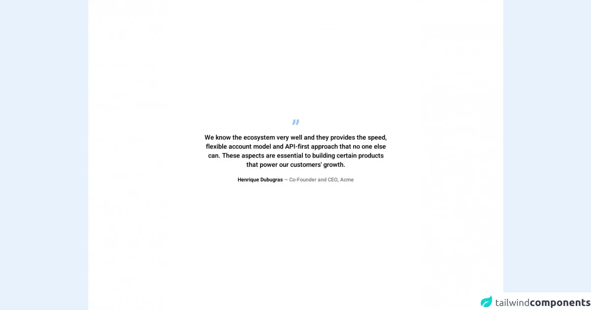
The preview of Simple Testimonial Component ui component.
To create a simple testimonial component with Tailwind CSS, you can use the following HTML structure:
<div class="bg-white rounded-lg shadow-lg overflow-hidden">
  <div class="p-4">
    <p class="text-gray-600 mb-4">{{__placeholder1__}}</p>
    <div class="flex items-center">
      <img src="https://via.placeholder.com/150" alt="testimonial" class="w-12 h-12 rounded-full mr-4">
      <div>
        <p class="font-bold text-gray-800">John Doe</p>
        <p class="text-gray-600">CEO, Company Name</p>
      </div>
    </div>
  </div>
</div>
Free download of the Simple Testimonial Component's source code
The source code of Simple Testimonial Component ui component.
To create a simple testimonial component with Tailwind CSS, you can use the following HTML structure:
<div class="bg-white rounded-lg shadow-lg overflow-hidden">
  <div class="p-4">
    <p class="text-gray-600 mb-4">"Lorem ipsum dolor sit amet, consectetur adipiscing elit. Sed euismod, nibh eu fringilla ullamcorper, quam nunc suscipit urna, vel lacinia velit ante ac dui."</p>
    <div class="flex items-center">
      <img src="https://via.placeholder.com/150" alt="testimonial" class="w-12 h-12 rounded-full mr-4">
      <div>
        <p class="font-bold text-gray-800">John Doe</p>
        <p class="text-gray-600">CEO, Company Name</p>
      </div>
    </div>
  </div>
</div>
<!--
    =======================================================================
    Name    :   Simple Testimonial
    Author  :   Surjith S M
    Twitter :   @surjithctly

    Get more components here 👉 https://web3templates.com/components
	Tailwind Play Link: https://play.tailwindcss.com/9172qJmyVi

    Copyright © 2022
    =======================================================================
 -->

<div class="bg-white h-screen flex items-center justify-center">
	<div class=" text-center">
		<div class="text-7xl text-blue-300 leading-5">”</div>
		<div class="font-medium max-w-xl text-xl">
			We know the ecosystem very well and they provides the speed, flexible account model and API-first approach
			that no one else can. These aspects are essential to building certain products that power our customers'
			growth.
		</div>
		<div class="mt-5">
			<span class="font-bold">Henrique Dubugras</span><span class="text-gray-500 font-medium"> — Co-Founder and CEO, Acme</span>
		</div>
	</div>
</div>

<link rel="preconnect" href="https://fonts.googleapis.com">
<link rel="preconnect" href="https://fonts.gstatic.com" crossorigin>
<link href="https://fonts.googleapis.com/css2?family=Heebo:wght@300;400;500;600&display=swap" rel="stylesheet">

<style>
	body {
		font-family: 'Heebo', sans-serif;
	}
</style>
How to create a Simple Testimonial Component with Tailwind CSS?
Start by creating a new HTML file and linking to the Tailwind CSS stylesheet.
Add the HTML structure for the testimonial component. You can use the code provided above as a starting point.
Customize the component by adding your own content and styles. You can use the Tailwind CSS classes to style the component as desired.
Repeat the process for each testimonial that you want to display on your website.
Conclusion.
In conclusion, Tailwind CSS is an excellent choice for creating a simple testimonial component for your website. It provides a set of pre-defined classes that you can use to style your HTML elements and is highly customizable. With Tailwind CSS, you can create a visually appealing and easy-to-read testimonial component in just a few steps. So why not give it a try?