- Published on
Practical Guide: Create A Simple Search Bar With Tailwind CSS
- What is Tailwind CSS?
- The description of Simple Search Bar ui component
- Why use Tailwind CSS to create a Simple Search Bar ui component?
- The preview of Simple Search Bar ui component
- The source code of Simple Search Bar ui component
- How to create a Simple Search Bar with Tailwind CSS?
- Step 1: Create the HTML structure
- Step 2: Style the input field
- Step 3: Style the search button
- Step 4: Add the search icon
- Step 5: Combine the HTML and CSS
- Conclusion
As a front-end developer, creating UI components is one of the most important tasks. A search bar is a common component that can be found on almost every website. In this article, we will guide you through the process of creating a simple search bar with Tailwind CSS.
What is Tailwind CSS?
Tailwind CSS is a utility-first CSS framework that provides a set of pre-defined classes for styling HTML elements. It allows you to quickly create custom designs without writing any CSS code. Tailwind CSS is gaining popularity among front-end developers due to its simplicity and flexibility.
The description of Simple Search Bar ui component
A search bar is a UI component that allows users to search for specific content on a website. It typically consists of an input field and a search button. In this tutorial, we will create a simple search bar with a rounded input field and a search icon.
Why use Tailwind CSS to create a Simple Search Bar ui component?
Tailwind CSS provides a set of pre-defined classes that can be used to style HTML elements. It allows you to quickly create custom designs without writing any CSS code. Tailwind CSS is also highly customizable, which means you can easily modify the styles to match your design requirements.
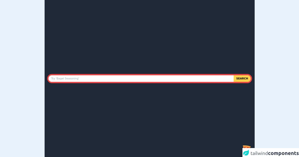
The preview of Simple Search Bar ui component
To give you an idea of what the Simple Search Bar UI component will look like, here is a preview:
Free download of the Simple Search Bar's source code
The source code of Simple Search Bar ui component
To create the Simple Search Bar UI component, we will use HTML and Tailwind CSS. Here is the source code:
<div class="flex items-center justify-center w-screen h-screen bg-gray-800">
    <div class="container px-4 mx-auto flex flex-wrap items-center justify-between">
        <div class="border-8 border-red-500 rounded-full bg-white shadow flex w-full">
            <input
                type="text"
                placeholder="Try 'Bagel Seasoning'"
                class="w-full rounded-tl-full rounded-bl-full py-2 px-4" />
            <button class="bg-yellow-300 rounded-tr-full rounded-br-full hover:bg-red-300 py-2 px-4">
                <p class="font-semibold text-base uppercase">Search</p>
            </button>
        </div>
    </div>
</div>

<!-- BUY ME A PIZZA AND HELP SUPPORT OPEN-SOURCE RESOURCES -->
<div class="flex items-end justify-end fixed bottom-0 right-0 mb-4 mr-4 z-10">
  <div>
    <a title="Buy me a pizza" href="https://www.buymeacoffee.com/Dekartmc" target="_blank" class="block w-16 h-16 rounded-full transition-all shadow hover:shadow-lg transform hover:scale-110 hover:rotate-12">
      <img class="object-cover object-center w-full h-full rounded-full" src="https://img.icons8.com/emoji/48/000000/pizza-emoji.png"/>
    </a>
  </div>
</div>
How to create a Simple Search Bar with Tailwind CSS?
Now, let's go through the steps to create the Simple Search Bar UI component.
Step 1: Create the HTML structure
The first step is to create the HTML structure for the search bar. We will use a div element with the flex and items-center classes to create a horizontal layout. Inside the div element, we will add an input element and a button element.
<div class="flex items-center">
  <input type="text" placeholder="Search">
  <button>Search</button>
</div>
Step 2: Style the input field
Next, we will style the input field. We will use the rounded-l-full class to round the left side of the input field. We will also use the w-full class to make the input field take up the full width of the container. We will add some padding to the input field using the py-4 and px-6 classes. Finally, we will set the text color to gray using the text-gray-700 class.
<input class="rounded-l-full w-full py-4 px-6 text-gray-700" type="text" placeholder="Search">
Step 3: Style the search button
Next, we will style the search button. We will use the bg-blue-500 class to set the background color to blue. We will also use the text-white class to set the text color to white. We will add some padding to the button using the p-2 class. We will use the rounded-full class to make the button round. We will also add a hover effect using the hover:bg-blue-400 class. Finally, we will use the focus:outline-none class to remove the focus outline when the button is clicked.
<button class="bg-blue-500 text-white p-2 rounded-full hover:bg-blue-400 focus:outline-none">Search</button>
Step 4: Add the search icon
Finally, we will add a search icon to the search button. We will use the Font Awesome library to add the icon. We will use the p-4 class to add some padding to the button container. We will use the w-12 and h-12 classes to set the width and height of the button container. We will use the flex and items-center classes to center the icon vertically and horizontally. We will use the justify-center class to center the icon horizontally.
<div class="p-4">
  <button class="bg-blue-500 text-white rounded-full p-2 hover:bg-blue-400 focus:outline-none w-12 h-12 flex items-center justify-center">
    <i class="fas fa-search"></i>
  </button>
</div>
Step 5: Combine the HTML and CSS
Now that we have created the HTML and CSS for the Simple Search Bar UI component, let's combine them.
<div class="flex items-center bg-white rounded-full shadow-xl">
  <input class="rounded-l-full w-full py-4 px-6 text-gray-700 leading-tight focus:outline-none" id="search" type="text" placeholder="Search">
  <div class="p-4">
    <button class="bg-blue-500 text-white rounded-full p-2 hover:bg-blue-400 focus:outline-none w-12 h-12 flex items-center justify-center">
      <i class="fas fa-search"></i>
    </button>
  </div>
</div>
@import url('https://cdnjs.cloudflare.com/ajax/libs/font-awesome/5.15.3/css/all.min.css');
Conclusion
In this tutorial, we have shown you how to create a Simple Search Bar UI component with Tailwind CSS. Tailwind CSS provides a set of pre-defined classes that can be used to style HTML elements. It allows you to quickly create custom designs without writing any CSS code. We hope this tutorial has been helpful and that you can use this knowledge to create your own UI components.