- Published on
The Ninja Guide To How To Make A Simple Navbar With Tailwind CSS Better
- What is Tailwind CSS?
- The description of Simple Navbar ui component
- Why use Tailwind CSS to create a Simple Navbar ui component?
- The preview of Simple Navbar ui component.
- The source code of Simple Navbar ui component.
- How to create a Simple Navbar with Tailwind CSS?
- Step 1: Set up your HTML
- Step 2: Style your navbar with Tailwind CSS
- Step 3: Add interactivity
- Conclusion
As a frontend developer, you know that creating a navbar is one of the most important tasks when building a website. A navbar is the first thing a user sees when they visit your website, so it's important to make it look good and function well. In this article, we'll show you how to create a simple navbar with Tailwind CSS and make it even better.
What is Tailwind CSS?
Tailwind CSS is a utility-first CSS framework that helps you quickly build custom designs. It provides a set of pre-defined classes that you can use to style your HTML elements. With Tailwind CSS, you can create complex designs without writing a single line of CSS.
The description of Simple Navbar ui component
A simple navbar is a basic navigation bar that typically includes a logo, links to different pages, and a search bar. It's a common UI component that you'll find on most websites.
Why use Tailwind CSS to create a Simple Navbar ui component?
Tailwind CSS provides a set of pre-defined classes that make it easy to create a simple navbar. You don't need to write any CSS code, which saves you time and effort. Additionally, Tailwind CSS is highly customizable, so you can easily tweak the design to match your website's branding.
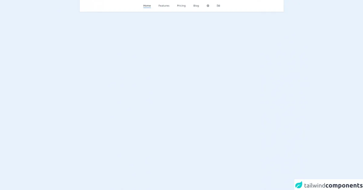
The preview of Simple Navbar ui component.
To create a simple navbar with Tailwind CSS, you'll need to use a combination of HTML and CSS. Here's a preview of what the final product will look like:
Free download of the Simple Navbar's source code
The source code of Simple Navbar ui component.
Here's the source code for the simple navbar:
<nav class="bg-white shadow dark:bg-gray-800">
    <div class="container flex items-center justify-center p-6 mx-auto text-gray-600 capitalize dark:text-gray-300">
        <a href="#" class="text-gray-800 dark:text-gray-200 border-b-2 border-blue-500 mx-1.5 sm:mx-6">home</a>

        <a href="#" class="border-b-2 border-transparent hover:text-gray-800 dark:hover:text-gray-200 hover:border-blue-500 mx-1.5 sm:mx-6">features</a>

        <a href="#" class="border-b-2 border-transparent hover:text-gray-800 dark:hover:text-gray-200 hover:border-blue-500 mx-1.5 sm:mx-6">pricing</a>

        <a href="#" class="border-b-2 border-transparent hover:text-gray-800 dark:hover:text-gray-200 hover:border-blue-500 mx-1.5 sm:mx-6">blog</a>

        <a href="#" class="border-b-2 border-transparent hover:text-gray-800 dark:hover:text-gray-200 hover:border-blue-500 mx-1.5 sm:mx-6">
            <svg class="w-4 h-4 fill-current" viewBox="0 0 24 24" fill="none" xmlns="http://www.w3.org/2000/svg"><path fill-rule="evenodd" clip-rule="evenodd" d="M1 11.9554V12.0446C1.01066 14.7301 1.98363 17.1885 3.59196 19.0931C4.05715 19.6439 4.57549 20.1485 5.13908 20.5987C5.70631 21.0519 6.31937 21.4501 6.97019 21.7853C7.90271 22.2656 8.91275 22.6165 9.97659 22.8143C10.5914 22.9286 11.2243 22.9918 11.8705 22.9993C11.9136 22.9998 11.9567 23 11.9999 23C15.6894 23 18.9547 21.1836 20.9502 18.3962C21.3681 17.8125 21.7303 17.1861 22.0291 16.525C22.6528 15.1448 22.9999 13.613 22.9999 12C22.9999 8.73978 21.5816 5.81084 19.3283 3.79653C18.8064 3.32998 18.2397 2.91249 17.6355 2.55132C15.9873 1.56615 14.0597 1 11.9999 1C11.888 1 11.7764 1.00167 11.6653 1.00499C9.99846 1.05479 8.42477 1.47541 7.0239 2.18719C6.07085 2.67144 5.19779 3.29045 4.42982 4.01914C3.7166 4.69587 3.09401 5.4672 2.58216 6.31302C2.22108 6.90969 1.91511 7.54343 1.6713 8.20718C1.24184 9.37631 1.00523 10.6386 1 11.9554ZM20.4812 15.0186C20.8171 14.075 20.9999 13.0588 20.9999 12C20.9999 9.54265 20.0151 7.31533 18.4186 5.6912C17.5975 7.05399 16.5148 8.18424 15.2668 9.0469C15.7351 10.2626 15.9886 11.5603 16.0045 12.8778C16.7692 13.0484 17.5274 13.304 18.2669 13.6488C19.0741 14.0252 19.8141 14.487 20.4812 15.0186ZM15.8413 14.8954C16.3752 15.0321 16.904 15.22 17.4217 15.4614C18.222 15.8346 18.9417 16.3105 19.5723 16.8661C18.0688 19.2008 15.5151 20.7953 12.5788 20.9817C13.5517 20.0585 14.3709 18.9405 14.972 17.6514C15.3909 16.7531 15.678 15.8272 15.8413 14.8954ZM13.9964 12.6219C13.9583 11.7382 13.7898 10.8684 13.5013 10.0408C10.6887 11.2998 7.36584 11.3765 4.35382 9.97197C4.01251 9.81281 3.68319 9.63837 3.36632 9.44983C3.12787 10.2584 2.99991 11.1142 2.99991 12C2.99991 13.9462 3.61763 15.748 4.6677 17.2203C6.83038 14.1875 10.3685 12.4987 13.9964 12.6219ZM6.047 18.7502C7.77258 16.059 10.7714 14.5382 13.8585 14.6191C13.723 15.3586 13.4919 16.093 13.1594 16.8062C12.3777 18.4825 11.1453 19.805 9.67385 20.6965C8.31043 20.3328 7.07441 19.6569 6.047 18.7502ZM11.9999 3C13.7846 3 15.4479 3.51946 16.847 4.41543C16.2113 5.54838 15.3593 6.4961 14.368 7.23057C13.3472 5.57072 11.8752 4.16433 10.027 3.21692C10.6619 3.07492 11.3222 3 11.9999 3ZM8.80619 4.84582C10.4462 5.61056 11.7474 6.80659 12.6379 8.23588C10.3464 9.24654 7.64722 9.30095 5.19906 8.15936C4.83384 7.98905 4.48541 7.79735 4.15458 7.58645C4.91365 6.24006 6.00929 5.10867 7.32734 4.30645C7.82672 4.44058 8.32138 4.61975 8.80619 4.84582Z" fill="currentColor" /></svg>
        </a>

        <a href="#" class="border-b-2 border-transparent hover:text-gray-800 dark:hover:text-gray-200 hover:border-blue-500 mx-1.5 sm:mx-6">
            <svg class="w-5 h-5 fill-current" viewBox="0 0 24 24" xmlns="http://www.w3.org/2000/svg"><path d="m.75 19h7.092c4.552 0 6.131-6.037 2.107-8.203 2.701-2.354 1.029-6.797-2.595-6.797h-6.604c-.414 0-.75.336-.75.75v13.5c0 .414.336.75.75.75zm.75-13.5h5.854c3.211 0 3.215 4.768 0 4.768h-5.854zm0 6.268h6.342c3.861 0 3.861 5.732 0 5.732h-6.342z"/><path d="m18.374 7.857c-3.259 0-5.755 2.888-5.635 5.159-.247 3.28 2.397 5.984 5.635 5.984 2.012 0 3.888-1.065 4.895-2.781.503-.857-.791-1.613-1.293-.76-.739 1.259-2.12 2.041-3.602 2.041-2.187 0-3.965-1.668-4.125-3.771 1.443.017 4.136-.188 8.987-.033.016 0 .027-.008.042-.008 2-.09-.189-5.831-4.904-5.831zm-3.928 4.298c1.286-3.789 6.718-3.676 7.89.064-4.064.097-6.496-.066-7.89-.064z"/><path d="m21.308 6.464c.993 0 .992-1.5 0-1.5h-5.87c-.993 0-.992 1.5 0 1.5z"/></svg>
        </a>
    </div>
</nav>
How to create a Simple Navbar with Tailwind CSS?
Now that you know why Tailwind CSS is the best choice for creating a simple navbar, let's dive into the steps for creating one.
Step 1: Set up your HTML
The first step is to set up your HTML. Here's an example of what your HTML should look like:
<nav class="bg-white shadow">
  <div class="max-w-7xl mx-auto px-4 sm:px-6 lg:px-8">
    <div class="flex justify-between h-16">
      <div class="flex-shrink-0 flex items-center">
        <a href="#">
          <img class="h-8 w-auto" src="https://tailwindui.com/img/logos/workflow-mark-indigo-600.svg" alt="Workflow">
        </a>
      </div>
      <div class="hidden md:block">
        <div class="ml-10 flex items-baseline space-x-4">
          <a href="#" class="px-3 py-2 rounded-md text-sm font-medium text-gray-900 hover:text-gray-700 focus:outline-none focus:text-gray-700 transition duration-150 ease-in-out">Home</a>
          <a href="#" class="px-3 py-2 rounded-md text-sm font-medium text-gray-900 hover:text-gray-700 focus:outline-none focus:text-gray-700 transition duration-150 ease-in-out">About</a>
          <a href="#" class="px-3 py-2 rounded-md text-sm font-medium text-gray-900 hover:text-gray-700 focus:outline-none focus:text-gray-700 transition duration-150 ease-in-out">Contact</a>
        </div>
      </div>
    </div>
  </div>
</nav>
In this example, we've used the nav tag to define the navbar. We've also used a combination of Tailwind CSS classes to style the navbar.
Step 2: Style your navbar with Tailwind CSS
The next step is to style your navbar with Tailwind CSS. Here are some of the classes you can use to style your navbar:
bg-white: sets the background color of the navbar to white.shadow: adds a shadow effect to the navbar.max-w-7xl: sets the maximum width of the navbar to 7xl.mx-auto: centers the navbar on the page.px-4 sm:px-6 lg:px-8: sets the padding of the navbar to 4px on small screens, 6px on medium screens, and 8px on large screens.flex justify-between h-16: aligns the elements in the navbar to the left and right, and sets the height of the navbar to 16px.flex-shrink-0 flex items-center: centers the logo in the navbar.hidden md:block: hides the links on small screens and displays them on medium and large screens.ml-10 flex items-baseline space-x-4: aligns the links in the navbar and adds space between them.
Step 3: Add interactivity
Finally, you can add interactivity to your navbar with JavaScript. For example, you can add a dropdown menu or a search bar.
Conclusion
In this article, we've shown you how to create a simple navbar with Tailwind CSS. We've also explained why Tailwind CSS is the best choice for creating a navbar. With Tailwind CSS, you can create a beautiful and functional navbar in no time.