- Published on
6 Critical Skills To Build A Simple Navbar With Tailwind CSS Remarkably Well
- What is Tailwind CSS?
- The description of Simple Navbar ui component
- Why use Tailwind CSS to create a Simple Navbar ui component?
- The preview of Simple Navbar ui component
- The source code of Simple Navbar ui component
- How to create a Simple Navbar with Tailwind CSS?
- Step 1: Set up your HTML
- Step 2: Add Tailwind CSS classes
- Step 3: Customize the styles
- Conclusion
What is Tailwind CSS?
Tailwind CSS is a utility-first CSS framework that provides a set of pre-defined classes to help you build custom user interfaces quickly. It offers a low-level approach to building UI components that allows developers to create designs that are both responsive and visually appealing.
The description of Simple Navbar ui component
A navbar is a common UI component used in web development. It typically contains links to various pages of a website and may also include other elements such as a logo or search bar. A simple navbar is a stripped-down version of a navbar that contains only the essential elements.
Why use Tailwind CSS to create a Simple Navbar ui component?
Tailwind CSS provides a wide range of pre-defined classes that can be used to create a simple navbar. This makes it easy to build a navbar quickly without having to write custom CSS. Additionally, Tailwind CSS is highly customizable, which means you can easily modify the styles to match your design requirements.
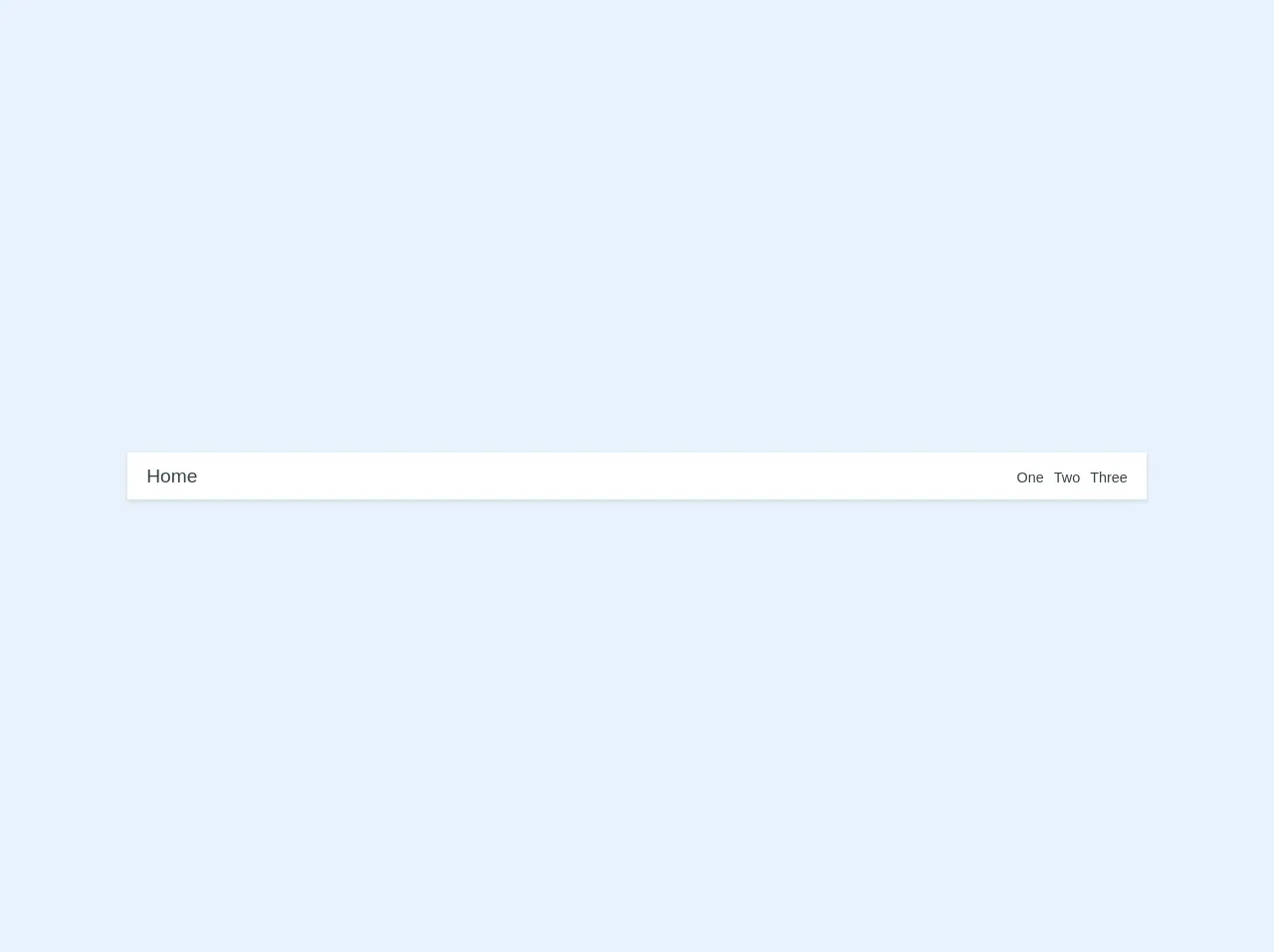
The preview of Simple Navbar ui component
To create a simple navbar with Tailwind CSS, you will need to use a combination of classes such as flex, justify-between, and items-center. These classes help to align the elements within the navbar and ensure that they are responsive across different screen sizes.
Free download of the Simple Navbar's source code
The source code of Simple Navbar ui component
To create a simple navbar with Tailwind CSS, you can use the following HTML and Tailwind CSS classes:
<nav class="font-sans flex flex-col text-center sm:flex-row sm:text-left sm:justify-between py-4 px-6 bg-white shadow sm:items-baseline w-full">
  <div class="mb-2 sm:mb-0">
    <a href="/home" class="text-2xl no-underline text-grey-darkest hover:text-blue-dark">Home</a>
  </div>
  <div>
    <a href="/one" class="text-lg no-underline text-grey-darkest hover:text-blue-dark ml-2">One</a>
    <a href="/two" class="text-lg no-underline text-grey-darkest hover:text-blue-dark ml-2">Two</a>
    <a href="/three" class="text-lg no-underline text-grey-darkest hover:text-blue-dark ml-2">Three</a>
  </div>
</nav>
How to create a Simple Navbar with Tailwind CSS?
To create a simple navbar with Tailwind CSS, you will need to follow these steps:
Step 1: Set up your HTML
The first step is to set up your HTML. You will need to create a nav element and add the necessary elements such as links and a logo.
<nav class="flex items-center justify-between flex-wrap bg-gray-800 p-6">
  <div class="flex items-center flex-shrink-0 text-white mr-6">
    <svg class="fill-current h-8 w-8 mr-2" width="54" height="54" viewBox="0 0 54 54" xmlns="http://www.w3.org/2000/svg"><path d="M27 0C12.1 0 0 12.1 0 27s12.1 27 27 27 27-12.1 27-27S41.9 0 27 0zm0 51c-12.1 0-22-9.9-22-22s9.9-22 22-22 22 9.9 22 22-9.9 22-22 22z"/></svg>
    <span class="font-semibold text-xl tracking-tight">Tailwind CSS</span>
  </div>
  <div class="block lg:hidden">
    <button class="flex items-center px-3 py-2 border rounded text-gray-500 border-gray-600 hover:text-white hover:border-white">
      <svg class="fill-current h-3 w-3" viewBox="0 0 20 20" xmlns="http://www.w3.org/2000/svg"><title>Menu</title><path d="M0 3h20v2H0V3zm0 6h20v2H0V9zm0 6h20v2H0v-2z"/></svg>
    </button>
  </div>
  <div class="w-full block flex-grow lg:flex lg:items-center lg:w-auto">
    <div class="text-sm lg:flex-grow">
      <a href="#responsive-header" class="block mt-4 lg:inline-block lg:mt-0 text-gray-500 hover:text-white mr-4">
        Docs
      </a>
      <a href="#responsive-header" class="block mt-4 lg:inline-block lg:mt-0 text-gray-500 hover:text-white mr-4">
        Examples
      </a>
      <a href="#responsive-header" class="block mt-4 lg:inline-block lg:mt-0 text-gray-500 hover:text-white">
        Blog
      </a>
    </div>
    <div>
      <a href="#" class="inline-block text-sm px-4 py-2 leading-none border rounded text-white border-white hover:border-transparent hover:text-gray-500 hover:bg-white mt-4 lg:mt-0">Download</a>
    </div>
  </div>
</nav>
Step 2: Add Tailwind CSS classes
Next, you will need to add the necessary Tailwind CSS classes to your HTML. These classes help to style the navbar and ensure that it is responsive.
<nav class="flex items-center justify-between flex-wrap bg-gray-800 p-6">
  <div class="flex items-center flex-shrink-0 text-white mr-6">
    <svg class="fill-current h-8 w-8 mr-2" width="54" height="54" viewBox="0 0 54 54" xmlns="http://www.w3.org/2000/svg"><path d="M27 0C12.1 0 0 12.1 0 27s12.1 27 27 27 27-12.1 27-27S41.9 0 27 0zm0 51c-12.1 0-22-9.9-22-22s9.9-22 22-22 22 9.9 22 22-9.9 22-22 22z"/></svg>
    <span class="font-semibold text-xl tracking-tight">Tailwind CSS</span>
  </div>
  <div class="block lg:hidden">
    <button class="flex items-center px-3 py-2 border rounded text-gray-500 border-gray-600 hover:text-white hover:border-white">
      <svg class="fill-current h-3 w-3" viewBox="0 0 20 20" xmlns="http://www.w3.org/2000/svg"><title>Menu</title><path d="M0 3h20v2H0V3zm0 6h20v2H0V9zm0 6h20v2H0v-2z"/></svg>
    </button>
  </div>
  <div class="w-full block flex-grow lg:flex lg:items-center lg:w-auto">
    <div class="text-sm lg:flex-grow">
      <a href="#responsive-header" class="block mt-4 lg:inline-block lg:mt-0 text-gray-500 hover:text-white mr-4">
        Docs
      </a>
      <a href="#responsive-header" class="block mt-4 lg:inline-block lg:mt-0 text-gray-500 hover:text-white mr-4">
        Examples
      </a>
      <a href="#responsive-header" class="block mt-4 lg:inline-block lg:mt-0 text-gray-500 hover:text-white">
        Blog
      </a>
    </div>
    <div>
      <a href="#" class="inline-block text-sm px-4 py-2 leading-none border rounded text-white border-white hover:border-transparent hover:text-gray-500 hover:bg-white mt-4 lg:mt-0">Download</a>
    </div>
  </div>
</nav>
Step 3: Customize the styles
Finally, you can customize the styles of your navbar by modifying the Tailwind CSS classes. For example, you can change the background color, font size, and padding of the navbar to match your design requirements.
<nav class="flex items-center justify-between flex-wrap bg-gray-800 p-6">
  <div class="flex items-center flex-shrink-0 text-white mr-6">
    <svg class="fill-current h-8 w-8 mr-2" width="54" height="54" viewBox="0 0 54 54" xmlns="http://www.w3.org/2000/svg"><path d="M27 0C12.1 0 0 12.1 0 27s12.1 27 27 27 27-12.1 27-27S41.9 0 27 0zm0 51c-12.1 0-22-9.9-22-22s9.9-22 22-22 22 9.9 22 22-9.9 22-22 22z"/></svg>
    <span class="font-semibold text-xl tracking-tight">Tailwind CSS</span>
  </div>
  <div class="block lg:hidden">
    <button class="flex items-center px-3 py-2 border rounded text-gray-500 border-gray-600 hover:text-white hover:border-white">
      <svg class="fill-current h-3 w-3" viewBox="0 0 20 20" xmlns="http://www.w3.org/2000/svg"><title>Menu</title><path d="M0 3h20v2H0V3zm0 6h20v2H0V9zm0 6h20v2H0v-2z"/></svg>
    </button>
  </div>
  <div class="w-full block flex-grow lg:flex lg:items-center lg:w-auto">
    <div class="text-sm lg:flex-grow">
      <a href="#responsive-header" class="block mt-4 lg:inline-block lg:mt-0 text-gray-500 hover:text-white mr-4">
        Docs
      </a>
      <a href="#responsive-header" class="block mt-4 lg:inline-block lg:mt-0 text-gray-500 hover:text-white mr-4">
        Examples
      </a>
      <a href="#responsive-header" class="block mt-4 lg:inline-block lg:mt-0 text-gray-500 hover:text-white">
        Blog
      </a>
    </div>
    <div>
      <a href="#" class="inline-block text-sm px-4 py-2 leading-none border rounded text-white border-white hover:border-transparent hover:text-gray-500 hover:bg-white mt-4 lg:mt-0">Download</a>
    </div>
  </div>
</nav>
Conclusion
In conclusion, building a simple navbar with Tailwind CSS is a straightforward process that requires a few critical skills. By following the steps outlined in this article, you can create a responsive and visually appealing navbar that meets your design requirements. With Tailwind CSS, you can build custom user interfaces quickly and efficiently, making it an excellent choice for web developers looking to streamline their workflow.