- Published on
How To Create A simple nav & sidebar With Tailwind CSS In 5 Easy Steps
- What is Tailwind CSS?
- The Description of Simple Nav & Sidebar UI Component
- Why Use Tailwind CSS to Create a Simple Nav & Sidebar UI Component?
- The Preview of Simple Nav & Sidebar UI Component
- The Source Code of Simple Nav & Sidebar UI Component
- How to Create a Simple Nav & Sidebar with Tailwind CSS?
- Step 1: Set Up Your HTML
- Step 2: Add Tailwind CSS
- Step 3: Style the Navigation Bar
- Step 4: Style the Sidebar
- Step 5: Style the Main Content Area
- Conclusion
What is Tailwind CSS?
Tailwind CSS is a utility-first CSS framework that allows developers to easily create responsive and customizable user interfaces. It provides a set of pre-defined classes that can be used to style HTML elements, making it easy to create complex layouts without writing custom CSS.
The Description of Simple Nav & Sidebar UI Component
A simple nav & sidebar UI component is a common user interface element that is used to display navigation links and other important information on a website or web application. It typically consists of a horizontal navigation bar at the top of the page and a vertical sidebar on the left-hand side that can be used to display additional information or links.
Why Use Tailwind CSS to Create a Simple Nav & Sidebar UI Component?
Tailwind CSS makes it easy to create a simple nav & sidebar UI component by providing a set of pre-defined classes that can be used to style HTML elements. This means that developers can create complex layouts without having to write custom CSS, which can save time and reduce the risk of errors.
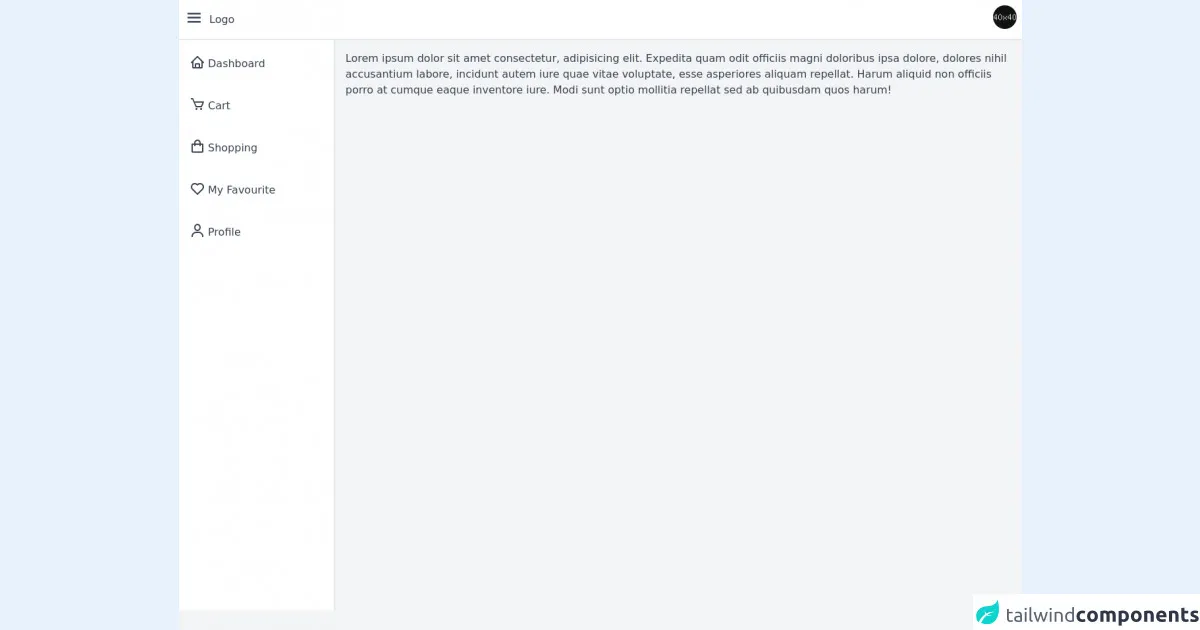
The Preview of Simple Nav & Sidebar UI Component
To create a simple nav & sidebar UI component with Tailwind CSS, we will use a combination of HTML and CSS. Here is what the final result will look like:
Free download of the simple nav & sidebar's source code
The Source Code of Simple Nav & Sidebar UI Component
To create the simple nav & sidebar UI component, we will use the following HTML and CSS code:
<script defer src="https://unpkg.com/[email protected]/dist/cdn.min.js"></script>
<link rel="stylesheet" href="https://unpkg.com/[email protected]/css/boxicons.min.css" />

<!-- page -->
<main class="min-h-screen w-full bg-gray-100 text-gray-700" x-data="layout">
    <!-- header page -->
    <header class="flex w-full items-center justify-between border-b-2 border-gray-200 bg-white p-2">
        <!-- logo -->
        <div class="flex items-center space-x-2">
            <button type="button" class="text-3xl" @click="asideOpen = !asideOpen"><i class="bx bx-menu"></i></button>
            <div>Logo</div>
        </div>

        <!-- button profile -->
        <div>
            <button type="button" @click="profileOpen = !profileOpen" @click.outside="profileOpen = false"
                class="h-9 w-9 overflow-hidden rounded-full">
                <img src="https://plchldr.co/i/40x40?bg=111111" alt="plchldr.co" />
            </button>

            <!-- dropdown profile -->
            <div class="absolute right-2 mt-1 w-48 divide-y divide-gray-200 rounded-md border border-gray-200 bg-white shadow-md"
                x-show="profileOpen" x-transition>
                <div class="flex items-center space-x-2 p-2">
                    <img src="https://plchldr.co/i/40x40?bg=111111" alt="plchldr.co" class="h-9 w-9 rounded-full" />
                    <div class="font-medium">Hafiz Haziq</div>
                </div>

                <div class="flex flex-col space-y-3 p-2">
                    <a href="#" class="transition hover:text-blue-600">My Profile</a>
                    <a href="#" class="transition hover:text-blue-600">Edit Profile</a>
                    <a href="#" class="transition hover:text-blue-600">Settings</a>
                </div>

                <div class="p-2">
                    <button class="flex items-center space-x-2 transition hover:text-blue-600">
                        <svg class="h-4 w-4" fill="none" stroke="currentColor" viewBox="0 0 24 24"
                            xmlns="http://www.w3.org/2000/svg">
                            <path stroke-linecap="round" stroke-linejoin="round" stroke-width="2"
                                d="M17 16l4-4m0 0l-4-4m4 4H7m6 4v1a3 3 0 01-3 3H6a3 3 0 01-3-3V7a3 3 0 013-3h4a3 3 0 013 3v1">
                            </path>
                        </svg>
                        <div>Log Out</div>
                    </button>
                </div>
            </div>
        </div>
    </header>

    <div class="flex">
        <!-- aside -->
        <aside class="flex w-72 flex-col space-y-2 border-r-2 border-gray-200 bg-white p-2" style="height: 90.5vh"
            x-show="asideOpen">
            <a href="#" class="flex items-center space-x-1 rounded-md px-2 py-3 hover:bg-gray-100 hover:text-blue-600">
                <span class="text-2xl"><i class="bx bx-home"></i></span>
                <span>Dashboard</span>
            </a>

            <a href="#" class="flex items-center space-x-1 rounded-md px-2 py-3 hover:bg-gray-100 hover:text-blue-600">
                <span class="text-2xl"><i class="bx bx-cart"></i></span>
                <span>Cart</span>
            </a>

            <a href="#" class="flex items-center space-x-1 rounded-md px-2 py-3 hover:bg-gray-100 hover:text-blue-600">
                <span class="text-2xl"><i class="bx bx-shopping-bag"></i></span>
                <span>Shopping</span>
            </a>

            <a href="#" class="flex items-center space-x-1 rounded-md px-2 py-3 hover:bg-gray-100 hover:text-blue-600">
                <span class="text-2xl"><i class="bx bx-heart"></i></span>
                <span>My Favourite</span>
            </a>

            <a href="#" class="flex items-center space-x-1 rounded-md px-2 py-3 hover:bg-gray-100 hover:text-blue-600">
                <span class="text-2xl"><i class="bx bx-user"></i></span>
                <span>Profile</span>
            </a>
        </aside>

        <!-- main content page -->
        <div class="w-full p-4">Lorem ipsum dolor sit amet consectetur, adipisicing elit. Expedita quam odit officiis
            magni doloribus ipsa dolore, dolores nihil accusantium labore, incidunt autem iure quae vitae voluptate,
            esse asperiores aliquam repellat. Harum aliquid non officiis porro at cumque eaque inventore iure. Modi sunt
            optio mollitia repellat sed ab quibusdam quos harum!</div>
    </div>
</main>

<script>
    document.addEventListener("alpine:init", () => {
        Alpine.data("layout", () => ({
            profileOpen: false,
            asideOpen: true,
        }));
    });
</script>
How to Create a Simple Nav & Sidebar with Tailwind CSS?
Now that we have an idea of what the final result will look like, let's dive into the steps required to create a simple nav & sidebar UI component with Tailwind CSS.
Step 1: Set Up Your HTML
The first step is to set up the HTML for our simple nav & sidebar UI component. We will start by creating a basic HTML structure with a header, main content area, and sidebar. Here is the HTML code:
<!DOCTYPE html>
<html lang="en">
<head>
  <meta charset="UTF-8">
  <title>Simple Nav & Sidebar</title>
</head>
<body>
  <header class="bg-gray-800 py-4">
    <div class="container mx-auto flex justify-between items-center px-4">
      <div>
        <h1 class="text-white font-bold text-2xl">Logo</h1>
      </div>
      <div>
        <button class="text-white focus:outline-none focus:text-white">
          <svg class="h-6 w-6 fill-current" viewBox="0 0 24 24">
            <path d="M4 6h16M4 12h16M4 18h16"></path>
          </svg>
        </button>
      </div>
    </div>
  </header>
  <div class="container mx-auto flex flex-wrap py-6">
    <nav class="w-full md:w-1/4">
      <div class="px-4 mb-6">
        <h2 class="text-gray-900 font-bold mb-2">Navigation</h2>
        <ul>
          <li class="mb-2"><a href="#" class="text-gray-700 hover:text-gray-900">Home</a></li>
          <li class="mb-2"><a href="#" class="text-gray-700 hover:text-gray-900">About</a></li>
          <li class="mb-2"><a href="#" class="text-gray-700 hover:text-gray-900">Contact</a></li>
        </ul>
      </div>
    </nav>
    <div class="w-full md:w-3/4 px-4">
      <h2 class="text-gray-900 font-bold mb-2">Main Content</h2>
      <p class="mb-4">Lorem ipsum dolor sit amet, consectetur adipiscing elit. Sed euismod, erat vel aliquet dictum, lorem nunc bibendum erat, vel efficitur nisl metus nec tellus. Nulla facilisi. Fusce eget ultrices eros. Donec vel ipsum ut mauris condimentum sodales. Donec euismod, nunc vel imperdiet vestibulum, justo tortor eleifend ante, at lacinia lectus massa vel enim. Sed non neque vitae nisl rhoncus pulvinar. Sed vel leo vel quam varius feugiat. Donec euismod, nunc vel imperdiet vestibulum, justo tortor eleifend ante, at lacinia lectus massa vel enim. Sed non neque vitae nisl rhoncus pulvinar. Sed vel leo vel quam varius feugiat.</p>
      <p>Lorem ipsum dolor sit amet, consectetur adipiscing elit. Sed euismod, erat vel aliquet dictum, lorem nunc bibendum erat, vel efficitur nisl metus nec tellus. Nulla facilisi. Fusce eget ultrices eros. Donec vel ipsum ut mauris condimentum sodales. Donec euismod, nunc vel imperdiet vestibulum, justo tortor eleifend ante, at lacinia lectus massa vel enim. Sed non neque vitae nisl rhoncus pulvinar. Sed vel leo vel quam varius feugiat. Donec euismod, nunc vel imperdiet vestibulum, justo tortor eleifend ante, at lacinia lectus massa vel enim. Sed non neque vitae nisl rhoncus pulvinar. Sed vel leo vel quam varius feugiat.</p>
    </div>
  </div>
</body>
</html>
Step 2: Add Tailwind CSS
The next step is to add Tailwind CSS to our HTML file. We can do this by including the Tailwind CSS CDN in the head of our HTML file:
<head>
  <meta charset="UTF-8">
  <title>Simple Nav & Sidebar</title>
  <link rel="stylesheet" href="https://cdn.jsdelivr.net/npm/[email protected]/dist/tailwind.min.css">
</head>
Step 3: Style the Navigation Bar
Now that we have our HTML and Tailwind CSS set up, we can start styling our navigation bar. We will use the bg-gray-800 class to set the background color of the header to gray, and the py-4 class to add some padding to the top and bottom of the header:
<header class="bg-gray-800 py-4">
We will also use the container class to center the content of the header and add some padding to the sides:
<div class="container mx-auto flex justify-between items-center px-4">
Inside the header, we will use the text-white, font-bold, and text-2xl classes to style the logo:
<h1 class="text-white font-bold text-2xl">Logo</h1>
Finally, we will use the text-white, focus:outline-none, and focus:text-white classes to style the hamburger menu button:
<button class="text-white focus:outline-none focus:text-white">
  <svg class="h-6 w-6 fill-current" viewBox="0 0 24 24">
    <path d="M4 6h16M4 12h16M4 18h16"></path>
  </svg>
</button>
Step 4: Style the Sidebar
Next, we will style the sidebar. We will use the w-full and md:w-1/4 classes to set the width of the sidebar to 100% on small screens and 25% on medium screens:
<nav class="w-full md:w-1/4">
We will also use the px-4 class to add some padding to the sides of the sidebar:
<div class="px-4 mb-6">
Inside the sidebar, we will use the text-gray-900, font-bold, and mb-2 classes to style the navigation title:
<h2 class="text-gray-900 font-bold mb-2">Navigation</h2>
We will also use the text-gray-700 and hover:text-gray-900 classes to style the navigation links:
<li class="mb-2"><a href="#" class="text-gray-700 hover:text-gray-900">Home</a></li>
<li class="mb-2"><a href="#" class="text-gray-700 hover:text-gray-900">About</a></li>
<li class="mb-2"><a href="#" class="text-gray-700 hover:text-gray-900">Contact</a></li>
Step 5: Style the Main Content Area
Finally, we will style the main content area. We will use the w-full and md:w-3/4 classes to set the width of the main content area to 100% on small screens and 75% on medium screens:
<div class="w-full md:w-3/4 px-4">
We will also use the text-gray-900, font-bold, and mb-2 classes to style the main content title:
<h2 class="text-gray-900 font-bold mb-2">Main Content</h2>
And we will use the mb-4 class to add some margin to the bottom of the first paragraph:
<p class="mb-4">Lorem ipsum dolor sit amet, consectetur adipiscing elit. Sed euismod, erat vel aliquet dictum, lorem nunc bibendum erat, vel efficitur nisl metus nec tellus. Nulla facilisi. Fusce eget ultrices eros. Donec vel ipsum ut mauris condimentum sodales. Donec euismod, nunc vel imperdiet vestibulum, justo tortor eleifend ante, at lacinia lectus massa vel enim. Sed non neque vitae nisl rhoncus pulvinar. Sed vel leo vel quam varius feugiat. Donec euismod, nunc vel imperdiet vestibulum, justo tortor eleifend ante, at lacinia lectus massa vel enim. Sed non neque vitae nisl rhoncus pulvinar. Sed vel leo vel quam varius feugiat.</p>
Conclusion
In this article, we have learned how to create a simple nav & sidebar UI component with Tailwind CSS in 5 easy steps. By using Tailwind CSS, we were able to create a complex layout without having to write custom CSS, which can save time and reduce the risk of errors. With the knowledge gained from this article, you can now create your own custom UI components using Tailwind CSS.