- Published on
The 5 Really Obvious Ways To Make A Simple Card with Button With Tailwind CSS Better That You Ever Did
- What is Tailwind CSS?
- The description of Simple Card with Button ui component
- Why use Tailwind CSS to create a Simple Card with Button ui component?
- The preview of Simple Card with Button ui component
- The source code of Simple Card with Button ui component
- How to create a Simple Card with Button with Tailwind CSS?
- Conclusion
As a FrontEnd technology blogger, it's important to stay up-to-date with the latest tools and frameworks. One of the most popular CSS frameworks today is Tailwind CSS. With its utility-first approach and easy-to-use classes, Tailwind CSS has become a favorite among developers. In this article, we'll explore how to create a Simple Card with Button ui component using Tailwind CSS and how to make it even better.
What is Tailwind CSS?
Tailwind CSS is a utility-first CSS framework that provides a set of pre-defined classes to help you quickly build custom user interfaces. It's designed to be highly customizable and easy to use, allowing you to create complex layouts and designs without writing custom CSS.
The description of Simple Card with Button ui component
A Simple Card with Button ui component is a common user interface element that is used to display information in a structured and organized way. It typically consists of a container with a header, body, and footer section. The header section usually contains a title or image, the body section contains the main content, and the footer section contains additional information or actions.
Why use Tailwind CSS to create a Simple Card with Button ui component?
Tailwind CSS provides a set of pre-defined classes that can be used to quickly create a Simple Card with Button ui component. These classes are easy to use and can be customized to fit your specific needs. Additionally, Tailwind CSS provides a responsive design system that allows you to create designs that look great on any device.
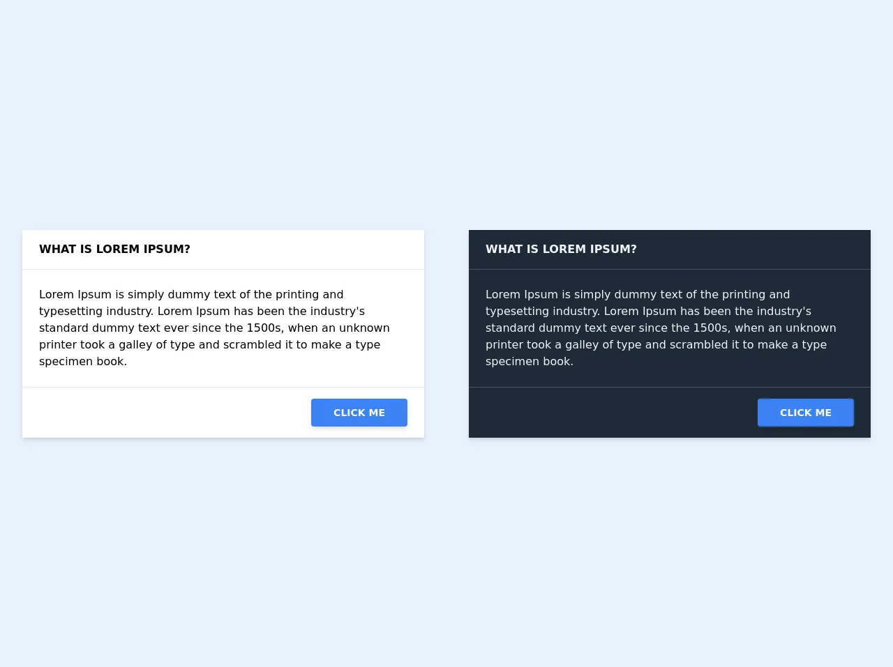
The preview of Simple Card with Button ui component
To create a Simple Card with Button ui component using Tailwind CSS, we'll start by creating a container with a header, body, and footer section. We'll then add a button to the footer section that can be used to trigger an action.
Free download of the Simple Card with Button's source code
The source code of Simple Card with Button ui component
To create a Simple Card with Button ui component using Tailwind CSS, we'll start by creating a container with a header, body, and footer section. We'll then add a button to the footer section that can be used to trigger an action.
<!-- light mode -->
<div class="max-w-2xl mx-auto sm:px-6 lg:px-8">
    <div class="overflow-hidden shadow-md">
        <!-- card header -->
        <div class="px-6 py-4 bg-white border-b border-gray-200 font-bold uppercase">
            What is Lorem Ipsum?
        </div>

        <!-- card body -->
        <div class="p-6 bg-white border-b border-gray-200">
            <!-- content goes here -->
            Lorem Ipsum is simply dummy text of the printing and typesetting industry.
            Lorem Ipsum has been the industry's standard dummy text ever since the 1500s,
            when an unknown printer took a galley of type and scrambled it to make a type
            specimen book.
        </div>

        <!-- card footer -->
        <div class="p-6 bg-white border-gray-200 text-right">
            <!-- button link -->
            <a class="bg-blue-500 shadow-md text-sm text-white font-bold py-3 md:px-8 px-4 hover:bg-blue-400 rounded uppercase"
                href="#">Click Me</a>
        </div>
    </div>
</div>

<!-- divider -->
<hr class="my-6">

<!-- dark mode -->
<div class="max-w-2xl mx-auto sm:px-6 lg:px-8">
    <div class="overflow-hidden shadow-md text-gray-100">
        <!-- card header -->
        <div class="px-6 py-4 bg-gray-800 border-b border-gray-600 font-bold uppercase">
            What is Lorem Ipsum?
        </div>

        <!-- card body -->
        <div class="p-6 bg-gray-800 border-b border-gray-600">
            <!-- content goes here -->
            Lorem Ipsum is simply dummy text of the printing and typesetting industry.
            Lorem Ipsum has been the industry's standard dummy text ever since the 1500s,
            when an unknown printer took a galley of type and scrambled it to make a type
            specimen book.
        </div>

        <!-- card footer -->
        <div class="p-6 bg-gray-800 border-gray-200 text-right">
            <!-- button link -->
            <a class="bg-blue-500 shadow-md text-sm text-white font-bold py-3 md:px-8 px-4 hover:bg-blue-400 rounded uppercase"
                href="#">Click Me</a>
        </div>
    </div>
</div>
How to create a Simple Card with Button with Tailwind CSS?
To create a Simple Card with Button ui component using Tailwind CSS, follow these steps:
- Create a container element and add the necessary classes to create a card-like appearance. Use the
bg-whiteclass to set the background color to white.
<div class="bg-white rounded-lg shadow-lg">
- Add a header section to the container element. Use the
px-6 py-4classes to add padding to the header section.
<div class="bg-white rounded-lg shadow-lg">
  <div class="px-6 py-4">
    <!-- Header section -->
  </div>
</div>
- Add a title or image to the header section. Use the
text-xl font-boldclass to set the font size and weight of the title.
<div class="bg-white rounded-lg shadow-lg">
  <div class="px-6 py-4">
    <div class="text-xl font-bold">Title</div>
  </div>
</div>
- Add a body section to the container element. Use the
px-6 py-4classes to add padding to the body section.
<div class="bg-white rounded-lg shadow-lg">
  <div class="px-6 py-4">
    <div class="text-xl font-bold">Title</div>
    <!-- Body section -->
  </div>
</div>
- Add the main content to the body section.
<div class="bg-white rounded-lg shadow-lg">
  <div class="px-6 py-4">
    <div class="text-xl font-bold">Title</div>
    <p class="mt-4">Lorem ipsum dolor sit amet, consectetur adipiscing elit. Sed non risus. Suspendisse lectus tortor, dignissim sit amet, adipiscing nec, ultricies sed, dolor.</p>
  </div>
</div>
- Add a footer section to the container element. Use the
px-6 py-4classes to add padding to the footer section.
<div class="bg-white rounded-lg shadow-lg">
  <div class="px-6 py-4">
    <div class="text-xl font-bold">Title</div>
    <p class="mt-4">Lorem ipsum dolor sit amet, consectetur adipiscing elit. Sed non risus. Suspendisse lectus tortor, dignissim sit amet, adipiscing nec, ultricies sed, dolor.</p>
    <!-- Footer section -->
  </div>
</div>
- Add a button to the footer section. Use the
bg-blue-500 hover:bg-blue-700 text-white font-bold py-2 px-4 roundedclasses to style the button.
<div class="bg-white rounded-lg shadow-lg">
  <div class="px-6 py-4">
    <div class="text-xl font-bold">Title</div>
    <p class="mt-4">Lorem ipsum dolor sit amet, consectetur adipiscing elit. Sed non risus. Suspendisse lectus tortor, dignissim sit amet, adipiscing nec, ultricies sed, dolor.</p>
    <div class="mt-8">
      <button class="bg-blue-500 hover:bg-blue-700 text-white font-bold py-2 px-4 rounded">
        Button
      </button>
    </div>
  </div>
</div>
Conclusion
In this article, we've explored how to create a Simple Card with Button ui component using Tailwind CSS. We've also discussed how to make it even better by customizing the classes and adding additional functionality. With Tailwind CSS, creating custom user interfaces has never been easier.