- Published on
Beginners Guide: Build A Simple Comment Box Component With Tailwind CSS
- What is Tailwind CSS?
- The description of Simple Comment Box Component UI component
- Why use Tailwind CSS to create a Simple Comment Box Component UI component?
- The preview of Simple Comment Box Component UI component
- The source code of Simple Comment Box Component UI component
- How to create a Simple Comment Box Component with Tailwind CSS?
- Step 1: Set up your HTML file
- Step 2: Add Tailwind CSS classes
- Step 3: Preview your Simple Comment Box Component
- Conclusion
As a beginner in FrontEnd technology, building a Simple Comment Box Component with Tailwind CSS can be a great way to get started. In this article, we will guide you through the process of building a Simple Comment Box Component with Tailwind CSS.
What is Tailwind CSS?
Tailwind CSS is a utility-first CSS framework that allows you to create custom designs without writing any CSS code. It provides a set of pre-defined classes that you can use to style your UI components. Tailwind CSS is easy to use and allows you to create responsive designs quickly.
The description of Simple Comment Box Component UI component
A Simple Comment Box Component is a UI component that allows users to leave comments on a website or application. It usually consists of a text input field and a submit button. The Simple Comment Box Component can be used in various scenarios, such as blog posts, product reviews, and social media platforms.
Why use Tailwind CSS to create a Simple Comment Box Component UI component?
Tailwind CSS provides a set of pre-defined classes that you can use to style your UI components. This makes it easy to create custom designs without writing any CSS code. Tailwind CSS also provides responsive design utilities that allow you to create designs that adapt to different screen sizes.
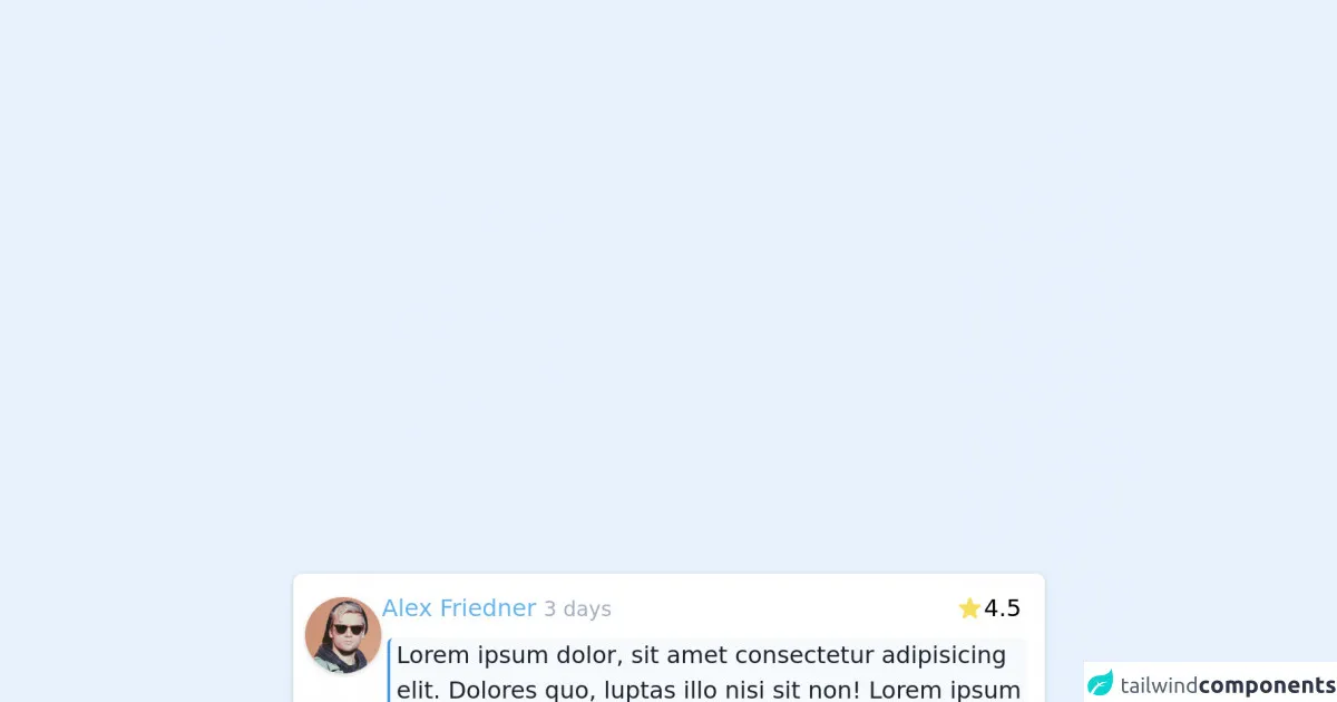
The preview of Simple Comment Box Component UI component
To create a Simple Comment Box Component with Tailwind CSS, we will use a text input field and a submit button. The text input field will have a placeholder that says "Leave a comment".
Free download of the Simple Comment Box Component's source code
The source code of Simple Comment Box Component UI component
To create a Simple Comment Box Component with Tailwind CSS, we will use HTML and Tailwind CSS classes.
<div class="my-2 mx-1 max-w-lg flex gap-3 rounded-md bg-white p-2 text-black shadow">
              <!-- Photo -->
              <div class="mt-2">
                <img class="w-56 rounded-full shadow" src="https://flowbite.com/docs/images/people/profile-picture-5.jpg" alt="" srcset="" />
              </div>
              <!-- Content -->
              <div>
                <!-- Header -->
                <div class="flex items-center justify-between py-1 pr-2">
                  <!-- Author -->
                  <div>
                    <a href="#" class="text-blue-400 hover:underline">Alex Friedner</a>
                    <span class="text-sm font-thin text-gray-500"> 3 days</span>
                  </div>
                  <!-- Rate -->
                  <div>
                    <div class="flex items-center gap-1">
                      <svg class="inline-block h-5 w-5 text-yellow-400" fill="currentColor" viewBox="0 0 20 20" xmlns="http://www.w3.org/2000/svg"><path d="M9.049 2.927c.3-.921 1.603-.921 1.902 0l1.07 3.292a1 1 0 00.95.69h3.462c.969 0 1.371 1.24.588 1.81l-2.8 2.034a1 1 0 00-.364 1.118l1.07 3.292c.3.921-.755 1.688-1.54 1.118l-2.8-2.034a1 1 0 00-1.175 0l-2.8 2.034c-.784.57-1.838-.197-1.539-1.118l1.07-3.292a1 1 0 00-.364-1.118L2.98 8.72c-.783-.57-.38-1.81.588-1.81h3.461a1 1 0 00.951-.69l1.07-3.292z"></path></svg> 4.5
                    </div>
                  </div>
                </div>
                <!-- Context -->
                <div class="p-1">
                  <p class="text-gray-900 border-l-2 px-1 border-blue-500 bg-gray-100 rounded">Lorem ipsum dolor, sit amet consectetur adipisicing elit. Dolores quo, luptas illo nisi sit non! Lorem ipsum dolor, sit amet consectetur adipisicing elit. Minus qui at eum praesentium quod perspiciatis vitae nihil velit quaerat repellendus?</p>
                </div>
              </div>
            </div>
How to create a Simple Comment Box Component with Tailwind CSS?
To create a Simple Comment Box Component with Tailwind CSS, follow these steps:
Step 1: Set up your HTML file
Create a new HTML file and add the following code:
<!DOCTYPE html>
<html>
  <head>
    <title>Simple Comment Box Component</title>
    <link rel="stylesheet" href="https://cdn.jsdelivr.net/npm/[email protected]/dist/tailwind.min.css">
  </head>
  <body>
    <div class="container mx-auto my-8">
      <form class="bg-white p-6 rounded-lg shadow-md">
        <div class="mb-4">
          <label class="block text-gray-700 font-bold mb-2" for="comment">Leave a comment</label>
          <input class="shadow appearance-none border rounded w-full py-2 px-3 text-gray-700 leading-tight focus:outline-none focus:shadow-outline" id="comment" type="text" placeholder="Leave a comment">
        </div>
        <div class="flex items-center justify-between">
          <button class="bg-blue-500 hover:bg-blue-700 text-white font-bold py-2 px-4 rounded focus:outline-none focus:shadow-outline" type="button">
            Submit
          </button>
        </div>
      </form>
    </div>
  </body>
</html>
Step 2: Add Tailwind CSS classes
In the HTML code above, we have used Tailwind CSS classes to style our Simple Comment Box Component. The container class centers the component on the page, while the bg-white, p-6, rounded-lg, and shadow-md classes give it a clean and modern look.
The mb-4 class adds margin-bottom to the label and input fields, while the block, text-gray-700, font-bold, and leading-tight classes style the label.
The shadow, appearance-none, border, rounded, w-full, py-2, px-3, text-gray-700, focus:outline-none, and focus:shadow-outline classes style the input field.
The flex, items-center, and justify-between classes align the submit button to the right of the component, while the bg-blue-500, hover:bg-blue-700, text-white, font-bold, py-2, px-4, rounded, focus:outline-none, and focus:shadow-outline classes style the submit button.
Step 3: Preview your Simple Comment Box Component
Save your HTML file and open it in a web browser to preview your Simple Comment Box Component.
Conclusion
In this article, we have shown you how to build a Simple Comment Box Component with Tailwind CSS. We hope this tutorial has helped you get started with Tailwind CSS and inspired you to create more UI components. Remember to experiment with different Tailwind CSS classes to create custom designs that suit your needs. Happy coding!