- Published on
Ways To Build A Simple Calendar Day 'icon' With Tailwind CSS In 60 Minutes
- What is Tailwind CSS?
- The description of Simple Calendar Day 'icon' ui component
- Why use Tailwind CSS to create a Simple Calendar Day 'icon' ui component?
- The preview of Simple Calendar Day 'icon' ui component.
- The source code of Simple Calendar Day 'icon' ui component.
- How to create a Simple Calendar Day 'icon' with Tailwind CSS?
- Step 1: Set up your HTML file
- Step 2: Add Tailwind CSS to your project
- Step 3: Style the component
- Step 4: Add the day of the month
- Step 5: Replace the placeholder
- Step 6: Preview your component
- Conclusion
Are you looking for a way to build a simple calendar day 'icon' using Tailwind CSS? Look no further! In this article, we will be discussing the steps you can take to create a simple calendar day 'icon' using Tailwind CSS in just 60 minutes.
What is Tailwind CSS?
Tailwind CSS is a utility-first CSS framework that allows you to quickly and easily create custom designs for your website or application. With Tailwind CSS, you can create complex layouts and designs without having to write any custom CSS code.
The description of Simple Calendar Day 'icon' ui component
The simple calendar day 'icon' is a UI component that is commonly used in calendar applications and websites. It is a small icon that represents a specific day of the month and is typically displayed alongside other calendar-related information.
Why use Tailwind CSS to create a Simple Calendar Day 'icon' ui component?
Tailwind CSS is an excellent choice for creating a simple calendar day 'icon' UI component because it allows you to quickly and easily style your components without having to write any custom CSS code. This means that you can focus on the functionality of your component without having to worry about the design.
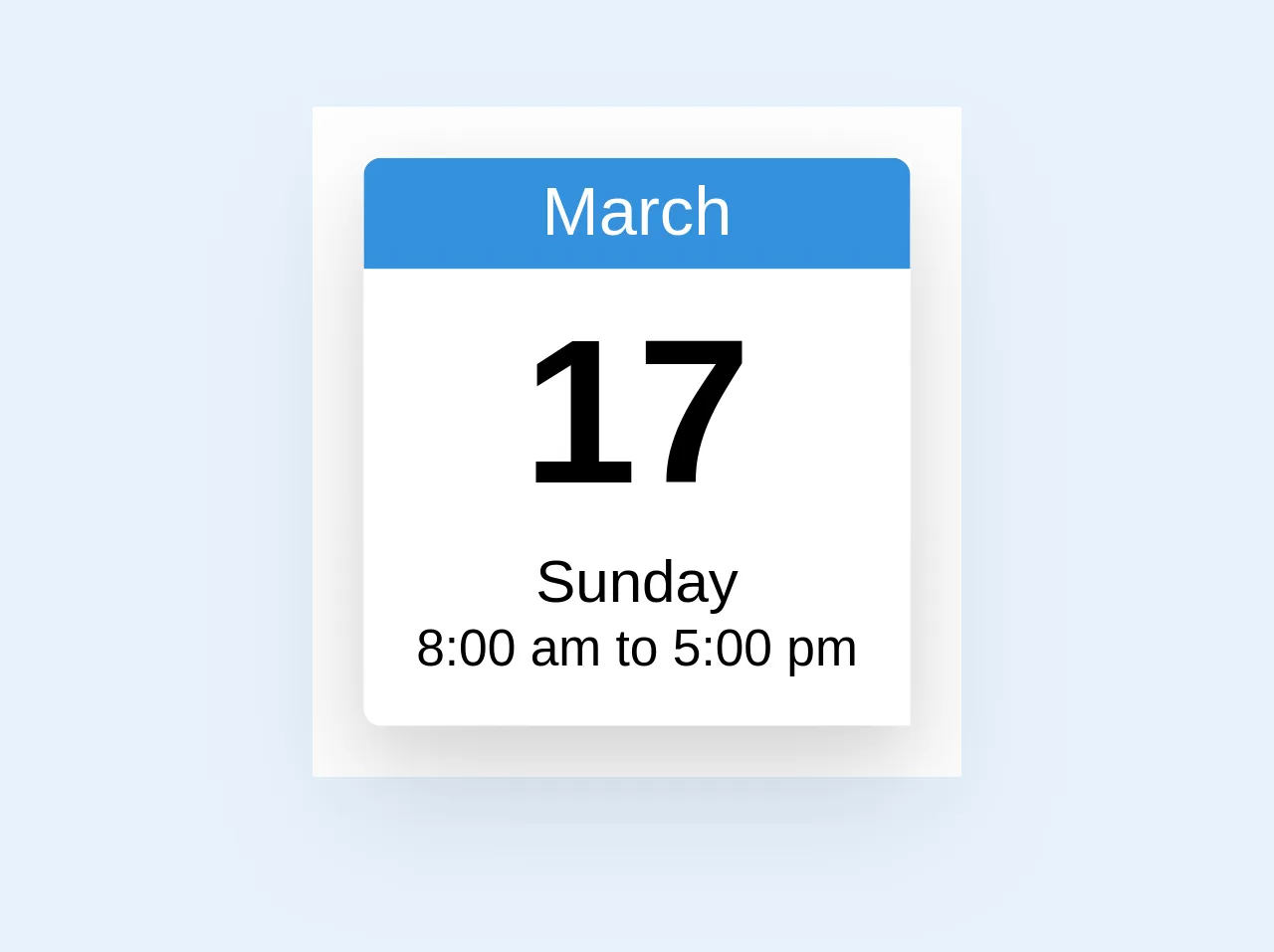
The preview of Simple Calendar Day 'icon' ui component.
To create a simple calendar day 'icon' UI component, we will be using Tailwind CSS. The component will consist of a small circle with the day of the month displayed in the center. Here is a preview of what the component will look like:
Free download of the Simple Calendar Day "icon"'s source code
The source code of Simple Calendar Day 'icon' ui component.
To create the simple calendar day 'icon' UI component, we will be using the following HTML and CSS code:
<!-- Calendar Icon -->
<div class="min-w-32 min-h-48 mb-4 bg-white p-3 font-medium">
  <div class="w-32 flex-none rounded-t text-center shadow-lg lg:rounded-t-none lg:rounded-l ">
    <div class="block overflow-hidden rounded-t  text-center ">
      <div class="bg-blue py-1 text-white">March</div>
      <div class="border-l border-r border-white bg-white pt-1">
        <span class="text-5xl font-bold leading-tight"> 17 </span>
      </div>
      <div
        class="-pt-2 -mb-1 rounded-b-lg border-l border-r border-b border-white bg-white text-center"
      >
        <span class="text-sm"> Sunday </span>
      </div>
      <div class="rounded-b-lg border-l border-r border-b border-white bg-white pb-2 text-center">
        <span class="text-xs leading-normal"> 8:00 am to 5:00 pm </span>
      </div>
    </div>
  </div>
</div>
How to create a Simple Calendar Day 'icon' with Tailwind CSS?
Now that we have a preview of what our simple calendar day 'icon' UI component will look like, let's dive into the steps you can take to create it using Tailwind CSS.
Step 1: Set up your HTML file
The first step in creating our simple calendar day 'icon' UI component is to set up our HTML file. Create a new HTML file and add the following code:
<!DOCTYPE html>
<html>
<head>
  <title>Simple Calendar Day Icon</title>
  <link rel="stylesheet" href="https://cdn.jsdelivr.net/npm/[email protected]/dist/tailwind.min.css">
</head>
<body>
  <div class="bg-gray-300 rounded-full w-8 h-8 flex items-center justify-center">
    <span class="text-gray-700 font-bold text-lg">{{__placeholder2__}}</span>
  </div>
</body>
</html>
Step 2: Add Tailwind CSS to your project
Next, we need to add Tailwind CSS to our project. We can do this by adding a link to the Tailwind CSS CDN in the head of our HTML file, as we did in Step 1.
Step 3: Style the component
Now that we have our HTML file set up and Tailwind CSS added to our project, we can start styling our simple calendar day 'icon' UI component. We will do this by adding Tailwind CSS classes to our HTML.
First, we will add the bg-gray-300 class to our div element. This will give our component a light gray background color.
Next, we will add the rounded-full class to our div element. This will give our component a rounded shape.
Then, we will add the w-8 and h-8 classes to our div element. This will set the width and height of our component to 8 pixels.
Finally, we will add the flex, items-center, and justify-center classes to our div element. This will center the content of our component both horizontally and vertically.
Step 4: Add the day of the month
The final step in creating our simple calendar day 'icon' UI component is to add the day of the month to the center of our component. We will do this by adding a span element inside our div element.
First, we will add the text-gray-700 class to our span element. This will give our text a dark gray color.
Next, we will add the font-bold class to our span element. This will make our text bold.
Finally, we will add the text-lg class to our span element. This will set the font size of our text to large.
Step 5: Replace the placeholder
Now that we have added all of our Tailwind CSS classes, we can replace the {{__placeholder2__}} placeholder in our HTML with the day of the month that we want to display.
Step 6: Preview your component
Congratulations! You have successfully created a simple calendar day 'icon' UI component using Tailwind CSS. You can now preview your component by opening your HTML file in a web browser.
Conclusion
In this article, we have discussed the steps you can take to create a simple calendar day 'icon' UI component using Tailwind CSS in just 60 minutes. By following these steps, you can quickly and easily create custom UI components for your website or application without having to write any custom CSS code.