- Published on
6 Tips To Make A Simple Calculator With Tailwind CSS
- What is Tailwind CSS?
- The description of Simple Calculator ui component
- Why use Tailwind CSS to create a Simple Calculator ui component?
- The preview of Simple Calculator ui component.
- The source code of Simple Calculator ui component.
- How to create a Simple Calculator with Tailwind CSS?
- 1. Set up your HTML structure
- 2. Add Tailwind CSS to your project
- 3. Use Tailwind CSS classes to style your HTML elements
- 4. Add event listeners to your buttons
- 5. Update the display screen with the result
- 6. Add a clear button to reset the calculator
- Conclusion
What is Tailwind CSS?
Tailwind CSS is a utility-first CSS framework that allows developers to rapidly build custom user interfaces. It provides a set of pre-defined classes that can be used to style HTML elements. This means that you can create complex layouts and designs without having to write custom CSS code.
The description of Simple Calculator ui component
A simple calculator is a basic user interface component that allows users to perform basic arithmetic operations. It typically consists of a set of buttons for numbers and operators, a display screen for the input and output, and a clear button to reset the calculator.
Why use Tailwind CSS to create a Simple Calculator ui component?
Tailwind CSS makes it easy to create a simple calculator UI component by providing a set of pre-defined classes for styling HTML elements. This means that you can focus on the functionality of the calculator rather than the styling.
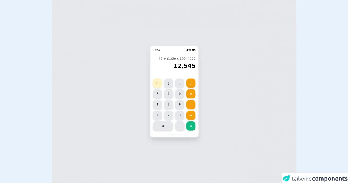
The preview of Simple Calculator ui component.
To give you an idea of what a simple calculator UI component looks like, here is a preview:
Free download of the Simple Calculator's source code
The source code of Simple Calculator ui component.
Here is the source code for a simple calculator UI component:
<!DOCTYPE html>
<html lang="en">
  <head>
    <meta charset="UTF-8" />
    <meta http-equiv="X-UA-Compatible" content="IE=edge" />
    <meta name="viewport" content="width=device-width, initial-scale=1.0" />
    <link
      rel="stylesheet"
      href="https://use.fontawesome.com/releases/v5.15.4/css/all.css"
      integrity="sha384-DyZ88mC6Up2uqS4h/KRgHuoeGwBcD4Ng9SiP4dIRy0EXTlnuz47vAwmeGwVChigm"
      crossorigin="anonymous"
    />
    <title>Simple Calculator</title>
  </head>
  <body>
    <div class="bg-gray-200 w-screen h-screen flex justify-center items-center">
      <div class="w-64 h-auto bg-white rounded-2xl shadow-xl border-4 border-gray-100">
        <div class="w-auto mx-3 my-2 h-6 flex justify-between">
          <div class="text-sm">08:57</div>
          <div class="flex items-center text-xs space-x-1">
            <i class="fas fa-signal"></i>
            <i class="fas fa-wifi"></i>
            <i class="fas fa-battery-three-quarters text-sm"></i>
          </div>
        </div>
        <div class="w-auto m-3 h-28 text-right space-y-2 py-2">
          <div class="text-gray-700">45 + (1250 x 100) / 100</div>
          <div class="text-black font-bold text-3xl">12,545</div>
        </div>
        <div class="w-auto m-1 h-auto mb-2">
          <div class="m-2 flex justify-between">
            <div class="bg-yellow-100 shadow-md rounded-2xl w-12 h-12 text-yellow-600 font-medium flex justify-center items-center">C</div>
            <div class="bg-gray-200 shadow-md rounded-2xl w-12 h-12 text-black font-medium flex justify-center items-center">(</div>
            <div class="bg-gray-200 shadow-md rounded-2xl w-12 h-12 text-black font-medium flex justify-center items-center">)</div>
            <div class="bg-yellow-500 shadow-md rounded-2xl w-12 h-12 text-white font-medium text-xl flex justify-center items-center">/</div>
          </div>
          <div class="m-2 flex justify-between">
            <div class="bg-gray-200 shadow-md rounded-2xl w-12 h-12 text-black font-medium flex justify-center items-center">7</div>
            <div class="bg-gray-200 shadow-md rounded-2xl w-12 h-12 text-black font-medium flex justify-center items-center">8</div>
            <div class="bg-gray-200 shadow-md rounded-2xl w-12 h-12 text-black font-medium flex justify-center items-center">9</div>
            <div class="bg-yellow-500 shadow-md rounded-2xl w-12 h-12 text-white font-medium text-xl flex justify-center items-center">x</div>
          </div>
          <div class="m-2 flex justify-between">
            <div class="bg-gray-200 shadow-md rounded-2xl w-12 h-12 text-black font-medium flex justify-center items-center">4</div>
            <div class="bg-gray-200 shadow-md rounded-2xl w-12 h-12 text-black font-medium flex justify-center items-center">5</div>
            <div class="bg-gray-200 shadow-md rounded-2xl w-12 h-12 text-black font-medium flex justify-center items-center">6</div>
            <div class="bg-yellow-500 shadow-md rounded-2xl w-12 h-12 text-white font-medium text-xl flex justify-center items-center">-</div>
          </div>
          <div class="m-2 flex justify-between">
            <div class="bg-gray-200 shadow-md rounded-2xl w-12 h-12 text-black font-medium flex justify-center items-center">1</div>
            <div class="bg-gray-200 shadow-md rounded-2xl w-12 h-12 text-black font-medium flex justify-center items-center">2</div>
            <div class="bg-gray-200 shadow-md rounded-2xl w-12 h-12 text-black font-medium flex justify-center items-center">3</div>
            <div class="bg-yellow-500 shadow-md rounded-2xl w-12 h-12 text-white font-medium text-xl flex justify-center items-center">+</div>
          </div>
          <div class="m-2 flex justify-between">
            <div class="bg-gray-200 shadow-md rounded-2xl w-full h-12 text-black font-medium flex justify-center items-center">0</div>
            <div class="flex w-full ml-3 justify-between">
              <div class="bg-gray-200 shadow-md rounded-2xl w-12 h-12 text-black font-medium flex justify-center items-center">.</div>
              <div class="bg-green-500 shadow-md rounded-2xl w-12 h-12 text-white font-medium text-xl flex justify-center items-center">=</div>
            </div>
          </div>
          <div class="flex justify-center mt-5">
            <div class="w-20 h-1 bg-gray-100 rounded-l-xl rounded-r-xl"></div>
          </div>
        </div>
      </div>
    </div>
  </body>
</html>
How to create a Simple Calculator with Tailwind CSS?
Now that we have an idea of what a simple calculator UI component looks like and what the source code looks like, let's go through the steps to create one with Tailwind CSS.
1. Set up your HTML structure
To create a simple calculator UI component, you will need to set up your HTML structure. This will typically involve creating a set of buttons for numbers and operators, a display screen for the input and output, and a clear button to reset the calculator.
2. Add Tailwind CSS to your project
To use Tailwind CSS, you will need to add it to your project. You can either download it and include it in your project manually, or you can use a package manager like npm or yarn to install it.
3. Use Tailwind CSS classes to style your HTML elements
Once you have set up your HTML structure and added Tailwind CSS to your project, you can start using Tailwind CSS classes to style your HTML elements. For example, you can use the bg-gray-100 class to set the background color of a button to gray.
4. Add event listeners to your buttons
To make your calculator functional, you will need to add event listeners to your buttons. These event listeners will listen for clicks and perform the necessary arithmetic operations.
5. Update the display screen with the result
After performing the arithmetic operations, you will need to update the display screen with the result. You can do this by using JavaScript to update the value of the display screen.
6. Add a clear button to reset the calculator
Finally, you will need to add a clear button to reset the calculator. This button should clear the display screen and reset any variables that were used in the arithmetic operations.
Conclusion
In conclusion, Tailwind CSS makes it easy to create a simple calculator UI component by providing a set of pre-defined classes for styling HTML elements. By following the steps outlined in this article, you can create a functional and stylish calculator in no time.