- Published on
Create A Sidebar & Navbar With Tailwind CSS Like A Pro With The Help Of These 6 Tips
- What is Tailwind CSS?
- The description of Sidebar & Navbar ui component
- Why use Tailwind CSS to create a Sidebar & Navbar ui component?
- The preview of Sidebar & Navbar ui component
- The source code of Sidebar & Navbar ui component
- How to create a Sidebar & Navbar with Tailwind CSS?
- 1. Create a flexible container for the sidebar and navbar
- 2. Create a vertical layout for the sidebar
- 3. Set the width of the sidebar
- 4. Set the background color and text color of the sidebar
- 5. Add padding to the sidebar
- 6. Create the navbar
- Conclusion
What is Tailwind CSS?
Tailwind CSS is a utility-first CSS framework that provides a set of pre-defined classes to create responsive and customizable user interfaces. It enables developers to easily create complex layouts and styles without writing custom CSS. It is gaining popularity among developers due to its simplicity and flexibility.
The description of Sidebar & Navbar ui component
A sidebar and navbar are common user interface components used in web applications to provide navigation and access to different sections of the application. A sidebar is typically a vertical menu that appears on the left or right side of the screen, while a navbar is a horizontal menu that appears at the top of the screen.
Why use Tailwind CSS to create a Sidebar & Navbar ui component?
Tailwind CSS provides a set of pre-defined classes that can be used to create a sidebar and navbar quickly and easily. It eliminates the need to write custom CSS, which saves time and effort. Additionally, Tailwind CSS is highly customizable, which allows developers to create unique and visually appealing user interfaces.
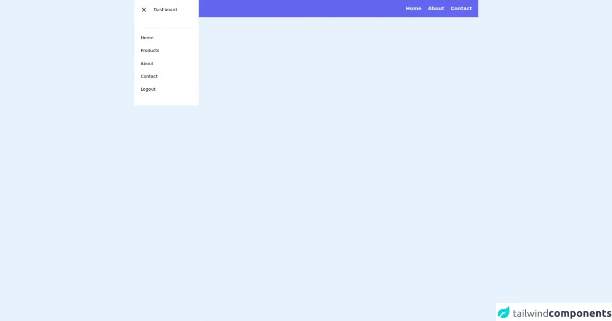
The preview of Sidebar & Navbar ui component
To create a sidebar and navbar with Tailwind CSS, we will use the following classes:
flex: to create a flexible container for the sidebar and navbarflex-col: to create a vertical layout for the sidebarw-64: to set the width of the sidebar to 64 pixelsbg-gray-800: to set the background color of the sidebar to dark graytext-white: to set the text color of the sidebar to whitep-4: to add padding to the sidebarflex-shrink-0: to prevent the sidebar from shrinkingflex-grow: to allow the navbar to growbg-gray-900: to set the background color of the navbar to blacktext-white: to set the text color of the navbar to whitepx-4: to add padding to the navbar
Free download of the Sidebar & Navbar's source code
The source code of Sidebar & Navbar ui component
To create a sidebar and navbar with Tailwind CSS, use the following HTML code:
<header>
  <navbar>
    <div class="flex justify-between px-6 bg-indigo-500 items-center py-4">
      <div class="flex space-x-4 items-center">
        <div>
          <svg xmlns="http://www.w3.org/2000/svg" class="h-8 w-8 cursor-pointer text-white" fill="none" viewBox="0 0 24 24" stroke="currentColor">
            <path stroke-linecap="round" stroke-linejoin="round" stroke-width="2" d="M4 6h16M4 12h8m-8 6h16" />
          </svg>
        </div>
        <h1 class="text-white font-bold text-xl tracking-wide cursor-pointer">Tubemixza</h1>
      </div>
      <ul class="flex space-x-6">
        <li class="text-white text-lg font-semibold tracking-normal cursor-pointer">Home</li>
        <li class="text-white text-lg font-semibold tracking-normal cursor-pointer">About</li>
        <li class="text-white text-lg font-semibold tracking-normal cursor-pointer">Contact</li>
      </ul>
    </div>
  </navbar>
  <navbar>
    <div class="absolute top-0 w-60 bg-white p-6">
      <div class="flex space-x-6 mb-6">
        <span>
          <svg xmlns="http://www.w3.org/2000/svg" class="h-6 w-6 cursor-pointer" fill="none" viewBox="0 0 24 24" stroke="currentColor">
            <path stroke-linecap="round" stroke-linejoin="round" stroke-width="2" d="M6 18L18 6M6 6l12 12" />
          </svg>
        </span>
        <h1>Dashboard</h1>
      </div>
      <ul class="flex flex-col space-y-6 mt-14 border-t py-6">
        <li class="hover:bg-red-500 transition duration-500">Home</li>
        <li class="">Products</li>
        <li class="">About</li>
        <li class="">Contact</li>
        <li class="">Logout</li>
      </ul>
    </div>
  </navbar>
</header>
How to create a Sidebar & Navbar with Tailwind CSS?
Follow these six tips to create a sidebar and navbar with Tailwind CSS:
1. Create a flexible container for the sidebar and navbar
Use the flex class to create a flexible container for the sidebar and navbar. This will allow them to adjust their size based on the screen size.
<div class="flex">
  <!-- Sidebar and navbar will be added here -->
</div>
2. Create a vertical layout for the sidebar
Use the flex-col class to create a vertical layout for the sidebar.
<div class="flex flex-col">
  <!-- Sidebar will be added here -->
</div>
3. Set the width of the sidebar
Use the w-64 class to set the width of the sidebar to 64 pixels.
<div class="flex flex-col w-64">
  <!-- Sidebar will be added here -->
</div>
4. Set the background color and text color of the sidebar
Use the bg-gray-800 class to set the background color of the sidebar to dark gray, and the text-white class to set the text color of the sidebar to white.
<div class="flex flex-col w-64 bg-gray-800 text-white">
  <!-- Sidebar will be added here -->
</div>
5. Add padding to the sidebar
Use the p-4 class to add padding to the sidebar.
<div class="flex flex-col w-64 bg-gray-800 text-white p-4">
  <!-- Sidebar content will be added here -->
</div>
6. Create the navbar
Use the flex-shrink-0 class to prevent the sidebar from shrinking, and the flex-grow class to allow the navbar to grow. Use the bg-gray-900 class to set the background color of the navbar to black, and the text-white class to set the text color of the navbar to white. Use the px-4 class to add padding to the navbar.
<div class="flex">
  <div class="flex flex-col w-64 bg-gray-800 text-white p-4">
    <!-- Sidebar content will be added here -->
  </div>
  <div class="flex-shrink-0 flex-grow bg-gray-900 text-white px-4">
    <!-- Navbar content will be added here -->
  </div>
</div>
Conclusion
Creating a sidebar and navbar with Tailwind CSS is easy and straightforward. By using the pre-defined classes provided by Tailwind CSS, developers can create visually appealing and responsive user interfaces without writing custom CSS. Follow these six tips to create a sidebar and navbar with Tailwind CSS like a pro.